
23 February 2026
Project in Hexaarch
Hexaarch - Property Bidding Mobile Application
Hexaarch is a mobile-first property bidding platform designed to modernize the real-estate auction experience through a seamless, transparent, and user-friendly mobile application. The app enables users to discover properties, participate in live bidding, track bidding activities in real time, and manage property-related interactions directly from their smartphones.

Hexaarch Property Bidding Mobile App
Complete UX Case Study
Led by Lohith R with small group of junior designers
Overview
Hexaarch is a mobile-first property bidding platform designed to modernize the real-estate auction experience through a seamless, transparent, and user-friendly mobile application. The app enables users to discover properties, participate in live bidding, track bidding activities in real time, and manage property-related interactions directly from their smartphones.
As the Lead Product Designer, I worked closely with a junior UI/UX designer to lead the complete UX process - from research and strategy to wireframing, interaction design, usability testing, and final high-fidelity UI delivery.
The primary goal of the project was to simplify complex property bidding workflows and create a trustworthy mobile experience that encourages users to confidently participate in property auctions anytime and anywhere.
Project Details
Category | Details |
|---|---|
Product | Property Bidding Mobile App |
Industry | Real Estate / PropTech |
Timeline | 16 Weeks |
Role | Lead Product Designer |
Team | 1 Lead Designer, 1 Junior UI/UX Designer, 2 Developers, 1 Product Manager |
Platform | iOS & Android Mobile App |
Responsibilities | UX Research, User Flows, Wireframes, UI Design, Design System, Prototyping, Testing, Developer Handoff |
Problem Statement
Traditional property bidding platforms are often desktop-focused, difficult to navigate on mobile devices, and lack real-time engagement. Users face several challenges during digital property bidding experiences:
Complicated bidding processes
Poor mobile usability
Delayed bid updates
Limited trust in online transactions
Information overload
Difficulty comparing properties
Lack of onboarding for first-time users
The client wanted a mobile-first solution that allows users to participate in property auctions effortlessly while improving transparency, accessibility, and engagement.
Business Goals
The business objectives for Hexaarch Mobile were:
Increase mobile bidding participation
Improve user engagement and retention
Create a scalable mobile experience
Reduce bidding abandonment rates
Improve real-time bidding interactions
Build user trust in online property transactions
Increase conversion from property browsing to active bidding
My Role & Leadership
As the Lead Product Designer, I was responsible for:
Leading UX strategy and design direction
Planning and conducting user research
Defining mobile user journeys
Designing wireframes and interaction flows
Establishing the mobile design system
Mentoring and guiding a junior designer
Conducting usability testing
Collaborating with developers for implementation
Presenting design solutions to stakeholders
The junior designer supported UI explorations, component refinement, responsive layouts, and visual consistency under my guidance.
Research Phase
Research Goals
The research phase focused on understanding:
How users interact with property apps on mobile
Pain points during bidding workflows
User trust concerns during financial transactions
Mobile usage behavior during property exploration
Expectations for real-time bidding experiences
Research Methods
We used a combination of qualitative and quantitative research methods.
1. Stakeholder Interviews
We interviewed:
Real estate agents
Property owners
Internal sales teams
Business stakeholders
Key Insights
Most users preferred browsing properties on mobile devices
Real-time notifications were considered critical
Users wanted faster bidding actions
Simplicity and trust were major priorities
Mobile responsiveness directly affected engagement
2. User Interviews
We interviewed:
First-time home buyers
Experienced investors
Real-estate professionals
Pain Points Identified
Pain Point | User Feedback |
|---|---|
Confusing bidding experience | “I’m not sure what happens after placing a bid.” |
Poor mobile layouts | “Some property apps feel cluttered on mobile.” |
Fear of scams | “I don’t fully trust online bidding platforms.” |
Slow updates | “I miss bidding opportunities because notifications are delayed.” |
Difficult comparisons | “It takes too long to compare properties on mobile.” |
3. Competitor Analysis
We studied:
Zillow
MagicBricks
Housing.com
Auction.com
NoBroker
Key Findings
Most competitor apps focused mainly on listings rather than live bidding experiences. Major gaps included:
Weak real-time bidding interactions
Poor onboarding experiences
Limited bidding transparency
Overloaded mobile interfaces
Complicated navigation systems
This created an opportunity for Hexaarch to differentiate through mobile UX.
User Personas
Persona 1 - First-Time Buyer
Name
Priya Nair
Goals
Buy a property safely
Understand bidding clearly
Explore properties easily on mobile
Frustrations
Confusing bidding terminology
Fear of losing money
Lack of transparency
Persona 2 - Property Investor
Name
Karan Malhotra
Goals
Monitor multiple bids quickly
Receive instant updates
Bid efficiently during live auctions
Frustrations
Slow navigation
Delayed notifications
Time-consuming comparison workflows
UX Strategy
Based on research findings, we defined four major UX principles.
1. Mobile-First Simplicity
The experience needed to feel lightweight, intuitive, and optimized for mobile interactions.
2. Transparency & Trust
Users should always understand:
Current bid status
Time remaining
Bid rankings
Property authenticity
3. Real-Time Engagement
The app should create urgency and excitement through:
Live bidding updates
Instant notifications
Dynamic activity indicators
4. Faster Decision Making
Users should quickly:
Discover properties
Compare listings
Evaluate pricing
Place bids confidently
Information Architecture
We simplified the app structure for faster navigation.
Main Navigation
Home
Explore
Live Bids
Saved Properties
Notifications
Profile
User Flow
Main User Journey
Explore Properties → Property Details → Place Bid → Live Bid Tracking → Bid Confirmation
The goal was to reduce steps and minimize friction during high-intent actions.
Wireframing Phase
We started with low-fidelity wireframes to validate layouts and mobile interactions quickly.
Screens Designed
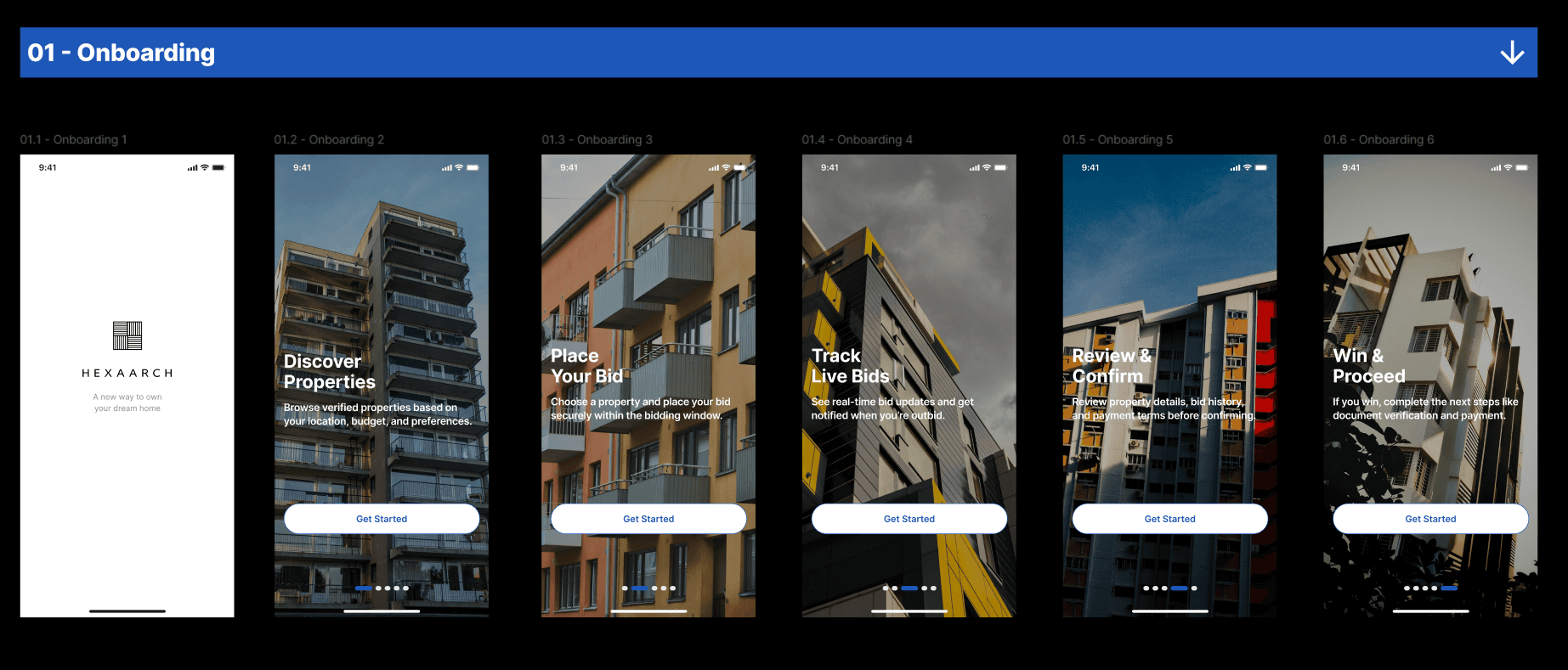
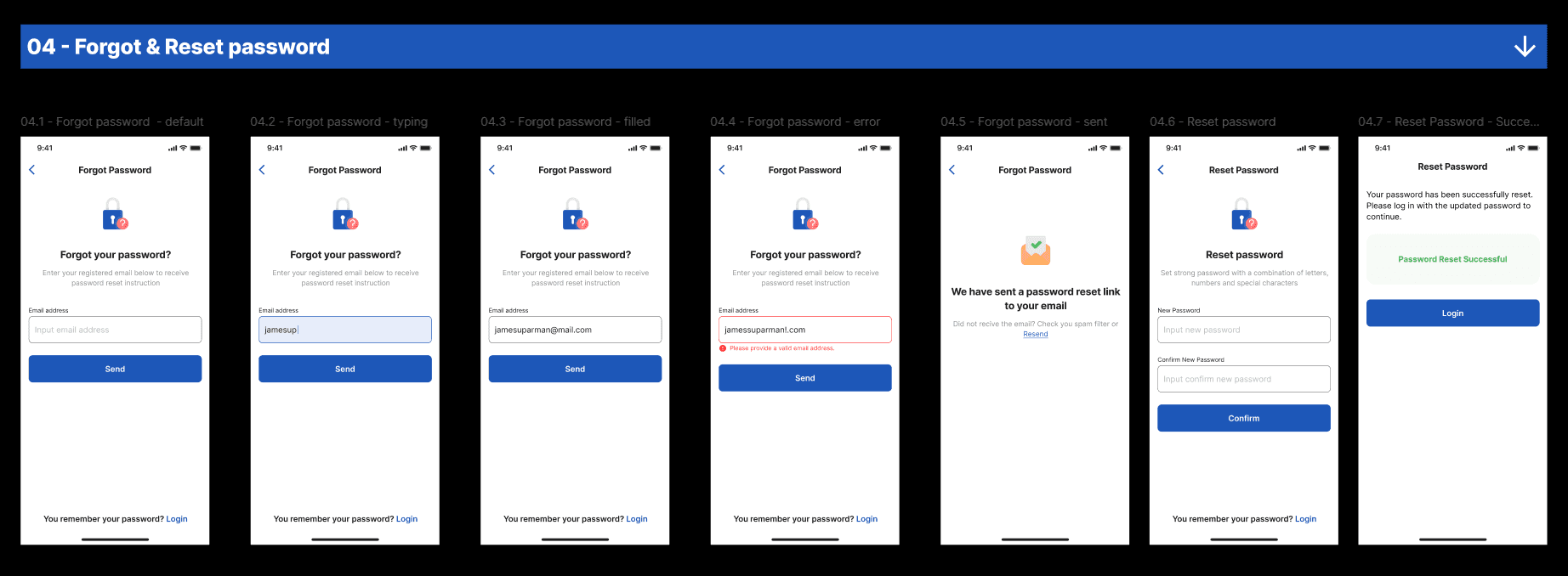
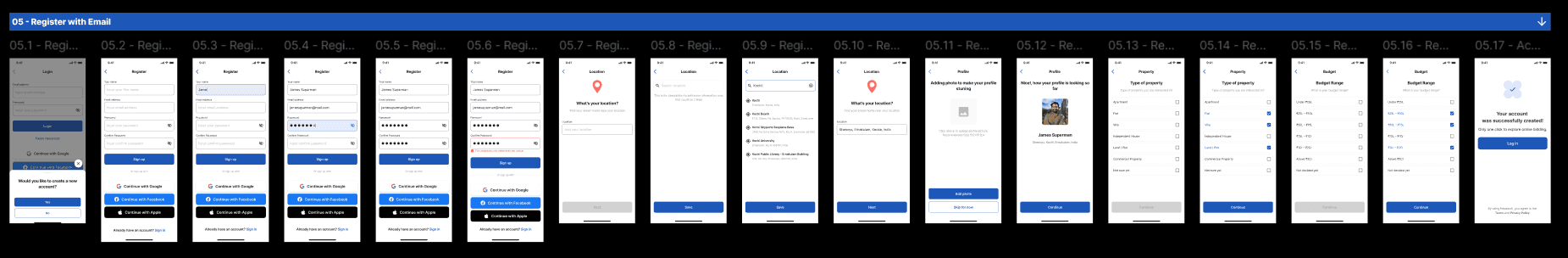
Splash & onboarding
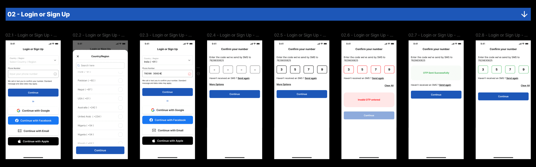
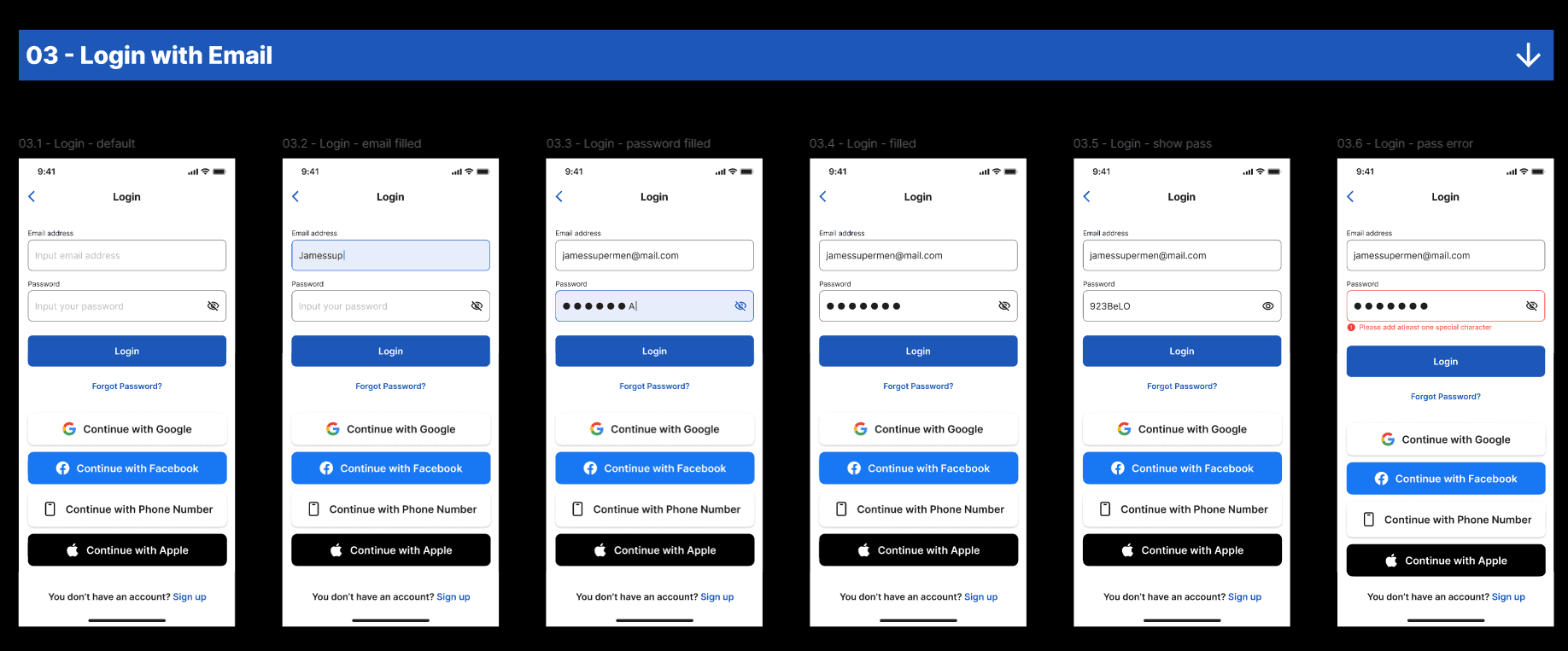
Login & signup
Homepage
Property listing screen
Property details page
Live bidding screen
Bid confirmation flow
Notifications
User profile
Saved properties
UX Improvements Introduced
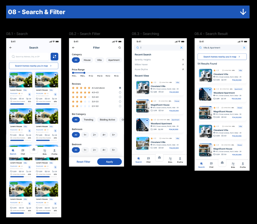
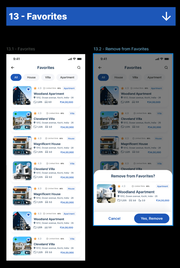
Property Discovery Experience
Problems
Users found it difficult to:
Browse efficiently
Compare listings
Filter properties quickly
Solutions
We introduced:
Smart filtering
Card-based property layouts
Location-focused search
Quick comparison features
Personalized recommendations
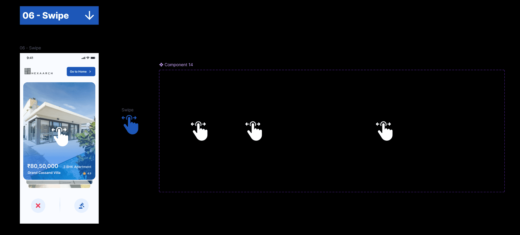
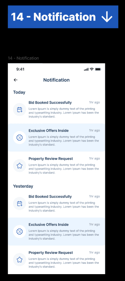
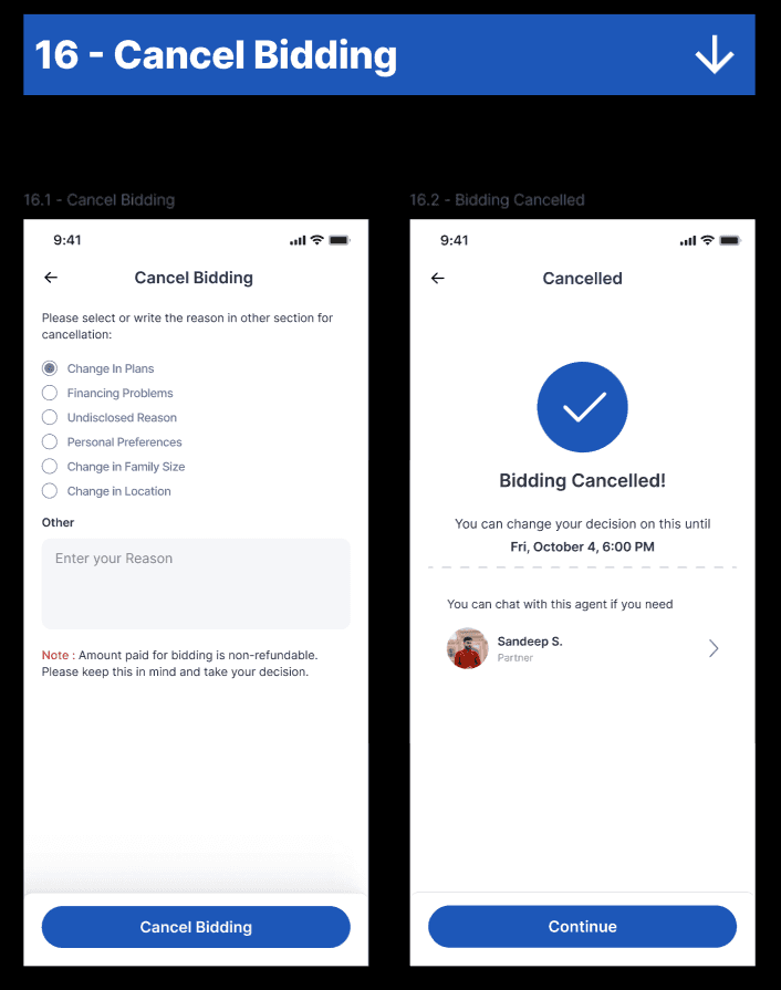
Live Bidding Experience
Problems
Users felt anxious during bidding.
Solutions
We designed:
Live bid updates
Countdown timers
Animated bid indicators
Simplified bid actions
Instant feedback states
Clear success and failure messaging
Trust & Verification Features
To increase trust, we added:
Verified property badges
Seller verification indicators
Transparent bid history
Secure transaction messaging
Property documentation previews
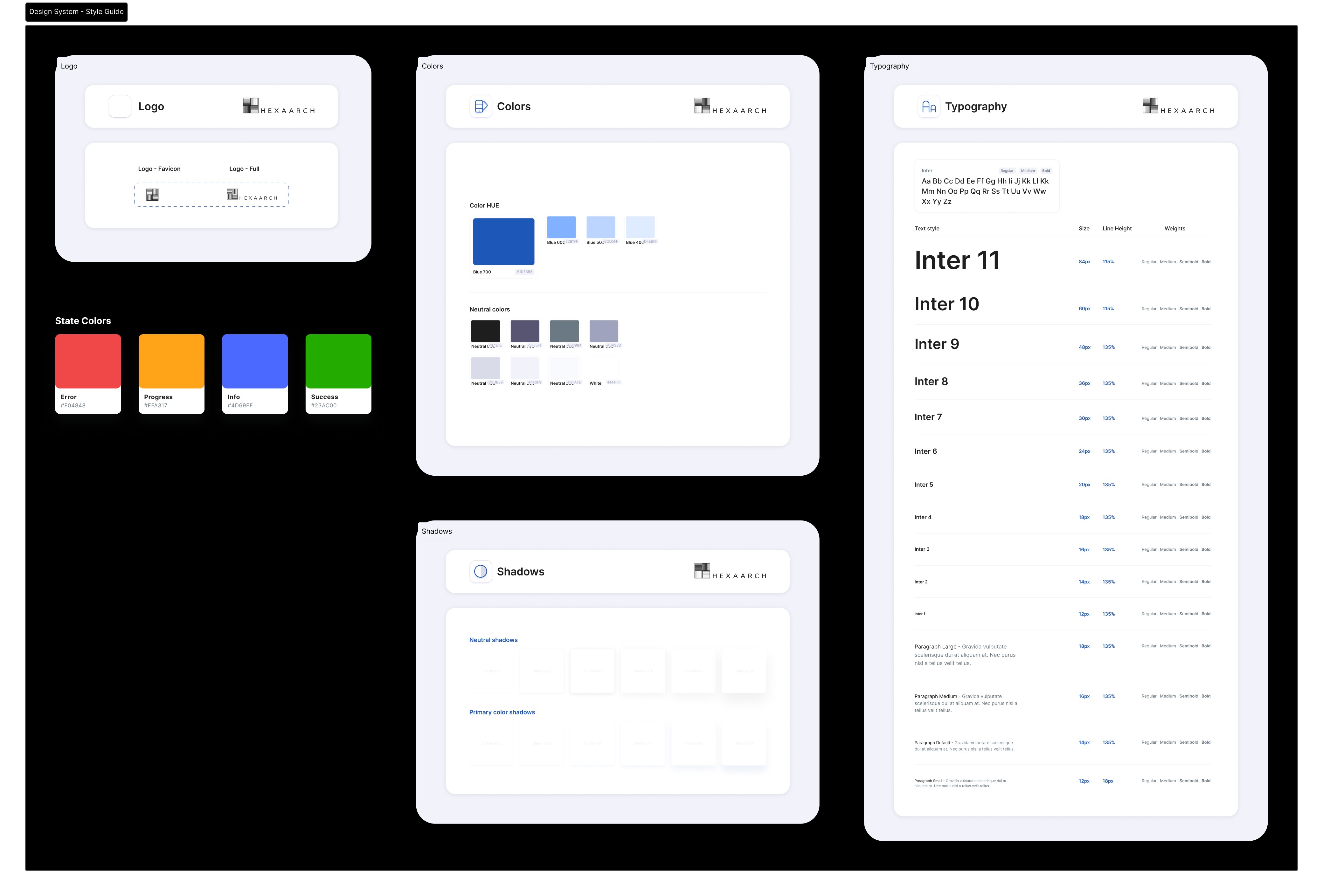
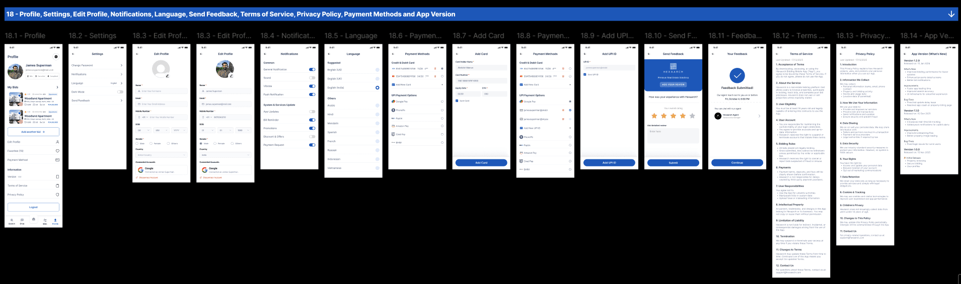
Design System
As the lead designer, I established a scalable mobile design system.
Components Designed
Buttons
Bottom navigation
Cards
Search bars
Filters
Modals
Alerts
Bid status indicators
Tabs
Input fields
Notification components
Typography
We selected a modern typography system optimized for mobile readability.
Goals
Improve readability
Reduce cognitive load
Support faster scanning
Maintain premium visual aesthetics
Color Strategy
We used colors strategically to communicate trust and urgency.
Color | Purpose |
|---|---|
Deep Blue | Trust & professionalism |
Emerald Green | Successful bids |
Orange | Live bidding urgency |
Neutral Gray | Supporting information |
High-Fidelity UI Design
After validating wireframes, we moved into high-fidelity UI design.
Design Focus Areas
Premium mobile aesthetics
Clean visual hierarchy
Real-time interaction feedback
Minimal distractions
Smooth navigation patterns
Home Screen Design
The home screen focused on quick discovery.
Sections Included
Featured properties
Recommended listings
Live auctions
Trending locations
Recently viewed properties
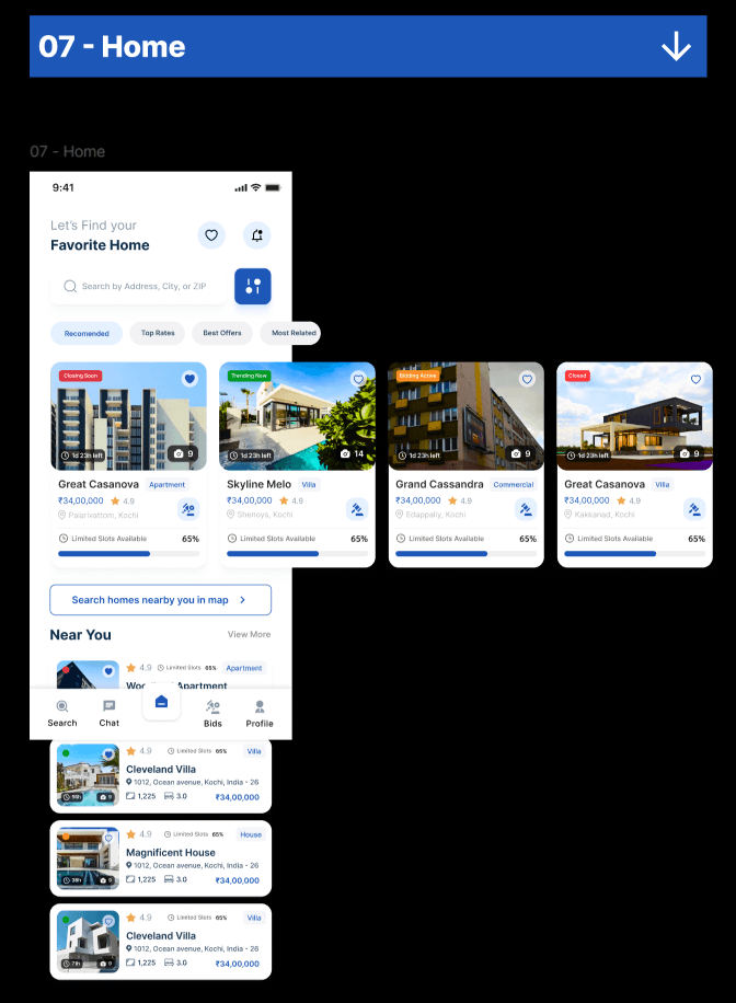
UX Goal
Enable users to discover and engage with properties quickly.
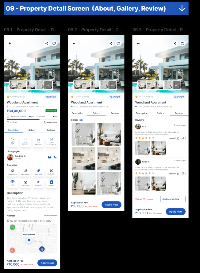
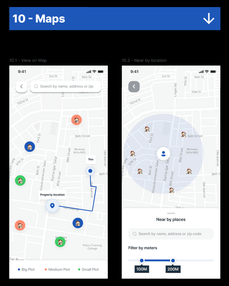
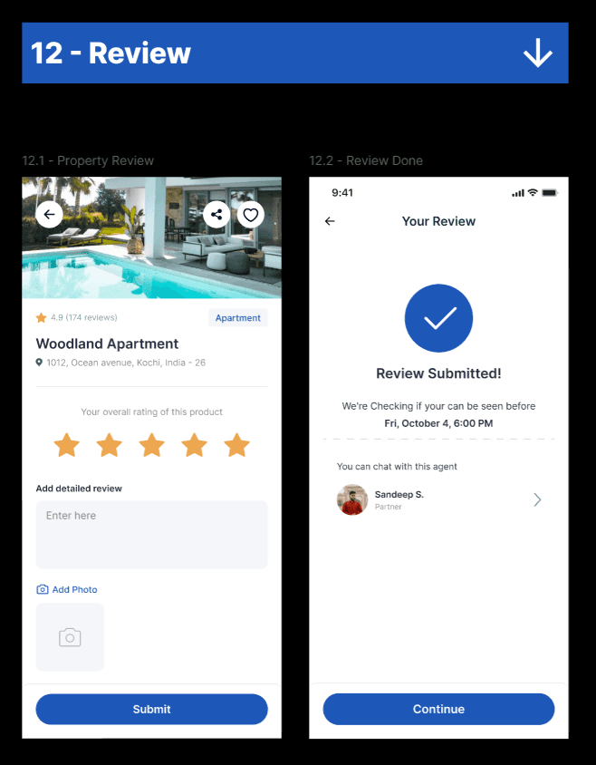
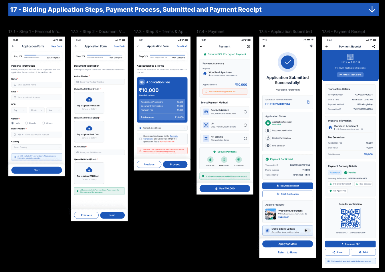
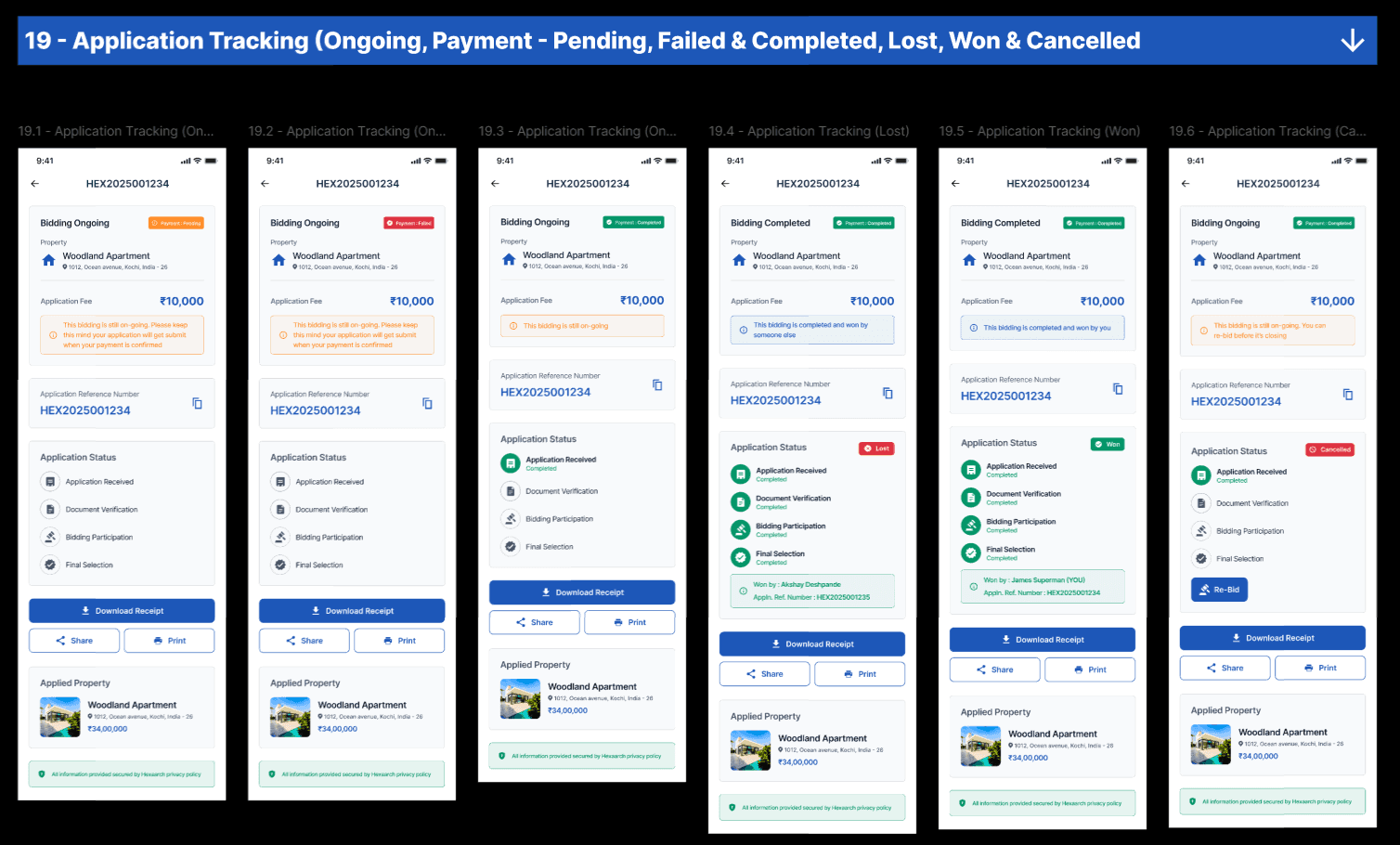
Property Details Screen
This was one of the most important screens in the app.
Key Sections
Property gallery
Pricing overview
Amenities
Bid history
Live bidding status
Property documents
CTA for placing bids
UX Decisions
We prioritized:
Important details above the fold
Sticky bidding CTA
Simplified content structure
Faster decision-making
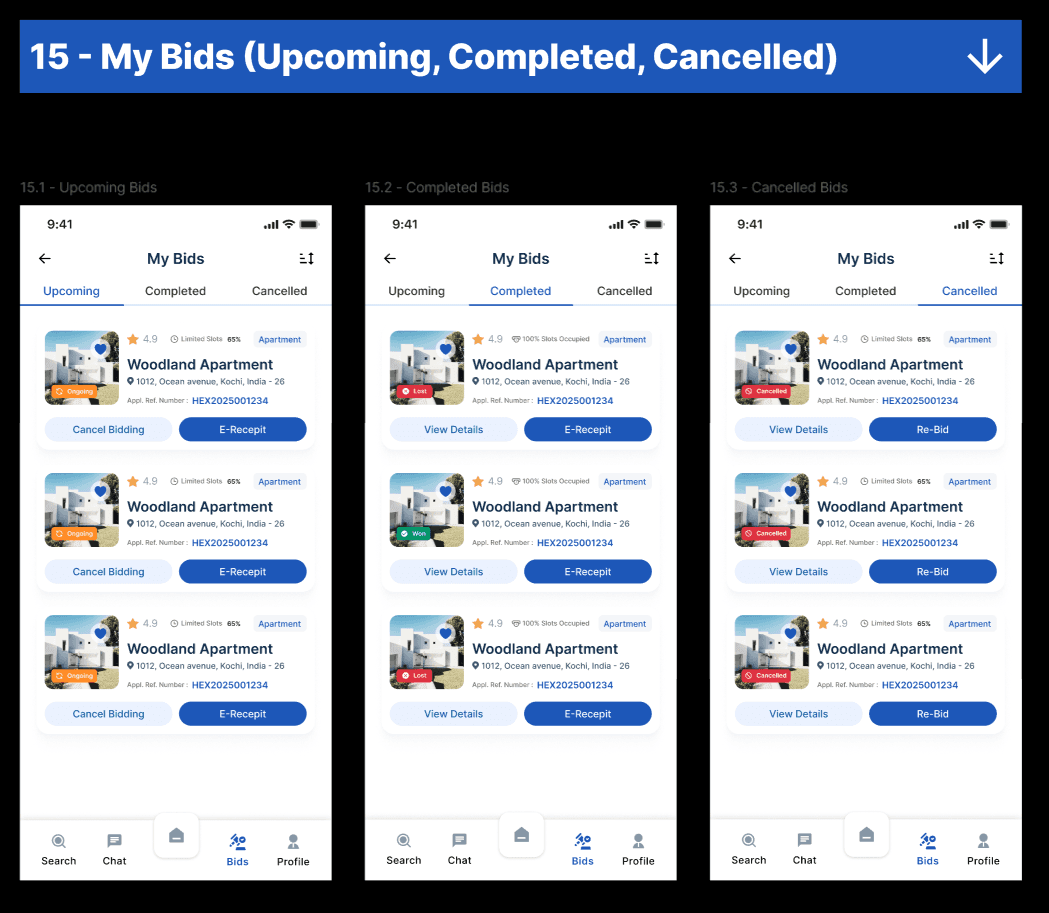
Live Bidding Screen
This screen was designed to create urgency while maintaining clarity.
Features
Real-time bid updates
Countdown timer
Bid ranking visibility
Live participant activity
Quick bid placement
Instant confirmation feedback
UX Goal
Create an engaging yet stress-free bidding experience.
Mobile Interaction Design
Special attention was given to mobile usability.
Optimizations
Thumb-friendly tap areas
Sticky CTAs
Gesture-friendly layouts
Reduced typing effort
Simplified forms
Bottom navigation patterns
Accessibility Considerations
We followed accessibility best practices including:
Proper color contrast
Readable font sizes
Clear touch targets
Consistent navigation
Accessible labels
Error prevention mechanisms
Prototyping & Usability Testing
We conducted usability testing with users across different experience levels.
Testing Goals
Validate mobile navigation
Test bidding workflows
Measure task completion speed
Evaluate user trust and confidence
Identify usability friction points
Usability Testing Findings
Major Findings
1. Users Missed Bid Updates
Some users overlooked active bidding changes during fast-paced auctions.
Solution
We improved visibility using:
Animated bid alerts
Sticky bid information
Real-time update banners
2. First-Time Users Needed Guidance
New users were confused about bidding rules.
Solution
We added:
Interactive onboarding
Tooltip explanations
Guided bidding walkthroughs
3. Property Details Felt Too Dense
Users felt overwhelmed by excessive information.
Solution
We introduced:
Expandable sections
Visual grouping
Progressive disclosure
4. Mobile Filters Were Hard to Access
Some users struggled with filter discoverability.
Solution
We redesigned filters using:
Bottom-sheet interactions
Sticky filter actions
Simplified categories
Iterations After Testing
Based on usability feedback, we refined:
Navigation structure
Bidding interactions
Property information hierarchy
Notification visibility
Mobile accessibility
CTA placements
Onboarding experience
Collaboration Process
As the lead designer, I collaborated closely with cross-functional teams.
Product Manager
To align:
Business goals
MVP priorities
Feature roadmap
Developers
To ensure:
Responsive implementation
Feasible interactions
Smooth animations
Design consistency
Junior Designer
I guided the junior designer in:
Component refinement
Layout consistency
Visual hierarchy
Design documentation
UI quality assurance
Challenges Faced
1. Balancing Simplicity with Real-Time Data
The bidding experience involved large amounts of dynamic information.
We solved this through:
Clear hierarchy
Progressive disclosure
Prioritized information blocks
2. Building Trust in Mobile Transactions
Users were cautious about financial interactions on mobile.
We improved confidence through:
Verification indicators
Transparent bidding visibility
Secure interaction patterns
3. Reducing User Anxiety During Bidding
Live auctions can create pressure.
We addressed this through:
Clear system feedback
Predictable interactions
Guided bidding flows
Final Outcome
The final product delivered:
A modern mobile-first bidding experience
Improved transparency and trust
Faster property discovery workflows
Better user engagement during live auctions
A scalable and responsive design system
Expected Impact
Business Impact
Increased mobile bidding participation
Improved user retention
Higher engagement rates
Reduced bidding abandonment
Better customer trust
Key Learnings
This project strengthened my expertise in:
Mobile-first UX design
Real-time interaction systems
Trust-focused product experiences
Leading cross-functional collaboration
Mentoring junior designers
Designing scalable mobile design systems
Conclusion
Hexaarch successfully transformed the traditional property auction process into a seamless mobile-first experience that enables users to explore, compare, and bid on properties with confidence.
By combining user-centered research, intuitive interaction design, real-time bidding experiences, and scalable UI systems, we created a platform that balances usability, trust, and business goals effectively.
As the Lead Product Designer, this project allowed me to lead the end-to-end UX process, mentor junior talent, collaborate closely with stakeholders, and deliver a high-impact mobile product experience from research to final UI.
