
21 December 2025
Project in Hexaarch
Hexaarch - Property Bidding Web App
Hexaarch is a modern property bidding web application designed to simplify the real-estate bidding experience for buyers, agents, and property owners. The platform allows users to explore listed properties, participate in transparent bidding processes, track bidding activity in real time, and manage property transactions digitally.
End-to-End UX Case Study
Led by Lohith R with a Junior UI/UX Designer

Project Overview
Hexaarch is a modern property bidding web application designed to simplify the real-estate bidding experience for buyers, agents, and property owners. The platform allows users to explore listed properties, participate in transparent bidding processes, track bidding activity in real time, and manage property transactions digitally.
As the Lead Product Designer for this project, I collaborated closely with a junior UI/UX designer to drive the end-to-end product design process - from user research and UX strategy to wireframing, design systems, prototyping, and final high-fidelity UI delivery.
The goal was to create a trustworthy, intuitive, and conversion-focused platform that reduces friction in property bidding while improving user confidence during high-value decision-making.
Project Details
Category | Details |
|---|---|
Product | Property Bidding Web App |
Industry | Real Estate / PropTech |
Timeline | 14 Weeks |
Role | Lead Product Designer |
Team | 1 Lead Designer, 1 Junior UI/UX Designer, 2 Developers, 1 Product Manager |
Platforms | Responsive Web Application |
Responsibilities | UX Research, UX Strategy, User Flows, Wireframes, UI Design, Design System, Prototyping, Developer Handoff |
Problem Statement
Traditional property bidding systems often lack transparency, trust, and usability. Users struggle with:
Complex bidding workflows
Poor visibility into live bid status
Limited trust in online property transactions
Confusing property comparison experiences
Slow communication between buyers and sellers
Lack of real-time updates and notifications
Difficult onboarding for first-time bidders
The client wanted to create a digital-first bidding platform that modernizes the property auction experience while making the process simple, transparent, and accessible for all users.
Business Goals
The primary business objectives were:
Increase user engagement during property bidding
Improve bid completion rates
Build trust through transparent bidding systems
Reduce manual coordination efforts
Enable faster property discovery and comparison
Improve conversion from property exploration to active bidding
Create a scalable platform for future expansion
My Role & Leadership
As the Lead Product Designer, I was responsible for:
Leading the overall UX strategy
Planning and conducting UX research
Defining information architecture
Creating user journeys and task flows
Mentoring and collaborating with a junior designer
Establishing the design system and visual direction
Conducting usability reviews
Collaborating with developers during implementation
Presenting design decisions to stakeholders
The junior designer supported UI exploration, component variations, visual consistency checks, and documentation under my guidance.
Research Phase
Research Objectives
We wanted to understand:
How users currently search and bid for properties
Pain points during digital property transactions
User trust concerns in bidding systems
What information users prioritize before placing bids
How real-time bidding behavior affects decision making
Research Methods
We conducted a combination of qualitative and quantitative research.
1. Stakeholder Interviews
We interviewed:
Real estate agents
Property owners
Internal sales teams
Business stakeholders
Key Insights
Users abandon bidding when pricing updates are unclear
Buyers need more transparency around bid rankings
Mobile responsiveness was essential
Trust indicators heavily influence user confidence
Users compare multiple properties before bidding
2. User Interviews
We interviewed:
First-time home buyers
Experienced investors
Real estate brokers
Major Pain Points Identified
Pain Point | User Feedback |
Confusing bidding process | “I don’t know if my bid is competitive.” |
Lack of trust | “I’m unsure if the bidding is genuine.” |
Poor property comparison | “It’s difficult to compare multiple listings.” |
Information overload | “Too many details make decision-making stressful.” |
No real-time updates | “I miss bidding opportunities.” |
3. Competitor Analysis
We studied:
Zillow
Auction.com
MagicBricks
Housing.com
NoBroker
Findings
Most platforms focused heavily on property listings but lacked:
Clear live bidding experiences
Strong bidding transparency
Real-time engagement mechanisms
Simplified onboarding for new users
Guided bidding flows
This created an opportunity for Hexaarch to differentiate through UX.
User Personas
Persona 1 - First-Time Buyer
Name
Rahul Sharma
Goals
Purchase property safely
Understand bidding process easily
Compare properties confidently
Frustrations
Confusing legal and bidding terms
Fear of losing money
Lack of transparency
Persona 2 - Property Investor
Name
Arjun Mehta
Goals
Quickly identify valuable investments
Place bids efficiently
Monitor multiple properties simultaneously
Frustrations
Slow workflows
Delayed bid updates
Manual communication processes
Defining the UX Strategy
After consolidating research insights, we defined four core UX principles:
1. Transparency First
Users should always know:
Current highest bid
Bid history
Time remaining
Their bid position
2. Confidence Through Clarity
The interface should reduce anxiety by:
Simplifying information
Providing guided interactions
Using clear visual hierarchy
Showing trust indicators
3. Real-Time Engagement
Users should feel connected to the bidding process through:
Live updates
Instant notifications
Dynamic bidding activity
4. Simplified Decision Making
The experience should help users:
Compare properties faster
Access key information quickly
Reduce cognitive overload
Information Architecture
We restructured the platform architecture to improve discoverability and task completion.
Primary Navigation
Dashboard
Explore Properties
Live Bidding
Saved Properties
Bid History
Notifications
Profile & Documents
User Flow
Main User Journey
Property Discovery → Property Details → Bid Placement → Live Tracking → Bid Confirmation
We optimized each step to reduce friction and improve user confidence.
Wireframing Phase
We began with low-fidelity wireframes to validate layouts and workflows quickly.
Key Screens Designed
Homepage
Property Listing Page
Property Details Page
Live Bidding Interface
User Dashboard
Bid Confirmation Modal
Notifications Center
Profile Management
UX Improvements Introduced
Property Listing Experience
Problems
Users struggled with:
Overwhelming property data
Inconsistent filtering
Poor comparison capabilities
Solutions
We introduced:
Advanced smart filters
Quick comparison cards
Simplified property cards
Location-based search
Visual price insights
Live Bidding Experience
Problems
Users felt stressed during live bidding.
Solutions
We designed:
Real-time bid updates
Countdown timers
Bid activity indicators
Bid confidence messages
Instant success/failure feedback
Simplified bid entry interactions
Trust & Transparency Features
To improve trust, we added:
Verified property badges
Seller verification indicators
Bid history visibility
Secure payment indicators
Property documentation previews
Clear legal information sections
Design System
As the design lead, I established a scalable design system to ensure consistency across the platform.
Components Created
Buttons
Input fields
Dropdowns
Property cards
Bid status indicators
Navigation patterns
Modals
Tables
Alerts & notifications
Empty states
Typography
We used a clean and modern typography system optimized for readability.
Goals
Improve readability of complex information
Create visual hierarchy
Maintain a premium real-estate aesthetic
Color Strategy
We selected colors that communicated:
Trust
Professionalism
Financial security
Real-time urgency during bidding
Color Usage
Color | Purpose |
Deep Blue | Trust & reliability |
Emerald Green | Successful bids |
Warm Orange | Active bidding alerts |
Neutral Gray | Supporting information |
High-Fidelity UI Design
Once wireframes were validated, we moved into high-fidelity UI design.
Key Design Focus Areas
Premium real-estate visual language
Minimal and distraction-free layouts
Responsive design system
Faster scanning of property information
Accessibility and readability
Dashboard Design
The dashboard provided users with:
Active bids overview
Saved properties
Recommended listings
Bid success metrics
Real-time notifications
Upcoming bidding deadlines
UX Goal
Enable users to manage all bidding activities from a centralized interface.
Property Details Page
This was one of the most critical screens.
Key Sections
Property image gallery
Pricing overview
Amenities
Neighborhood insights
Bid history
Live bid status
Property documents
CTA for placing bids
UX Decisions
We prioritized:
Important information above the fold
Clear CTA visibility
Reduced cognitive load
Faster property evaluation
Img. Homepage - Overview (With Sidebar Full View)
Img. Homepage - Overview (With Sidebar Minimized)
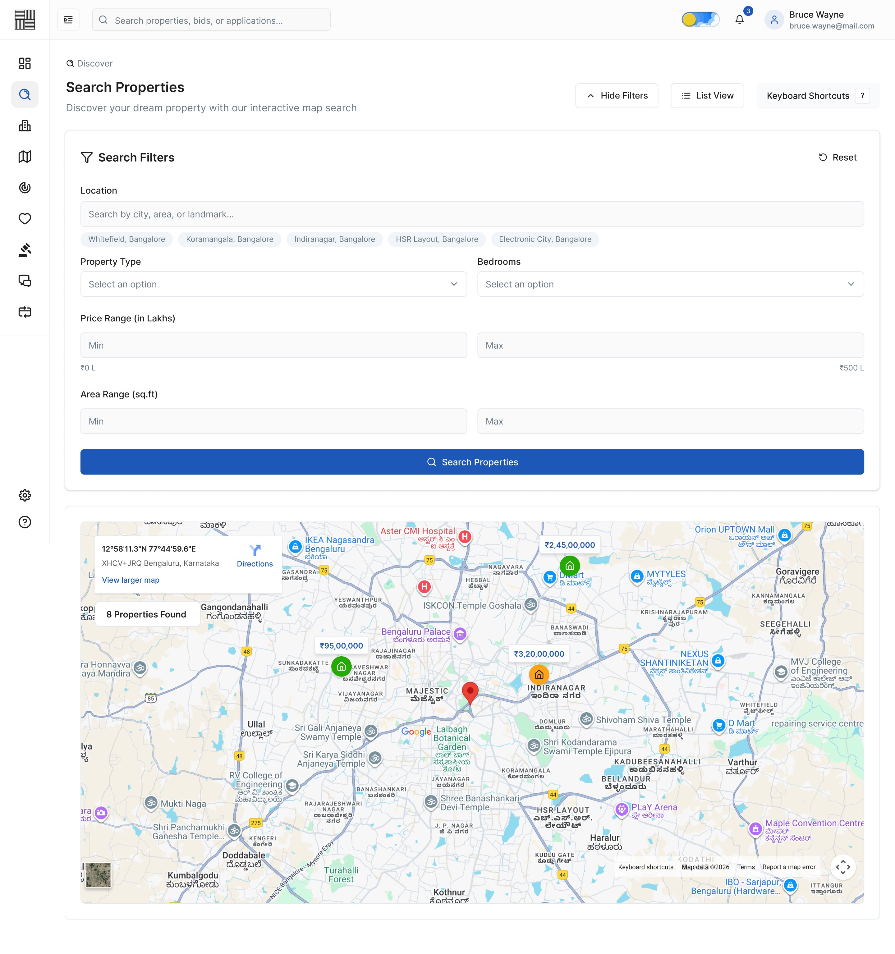
Img. Search Properties - Map View with Filters Shown
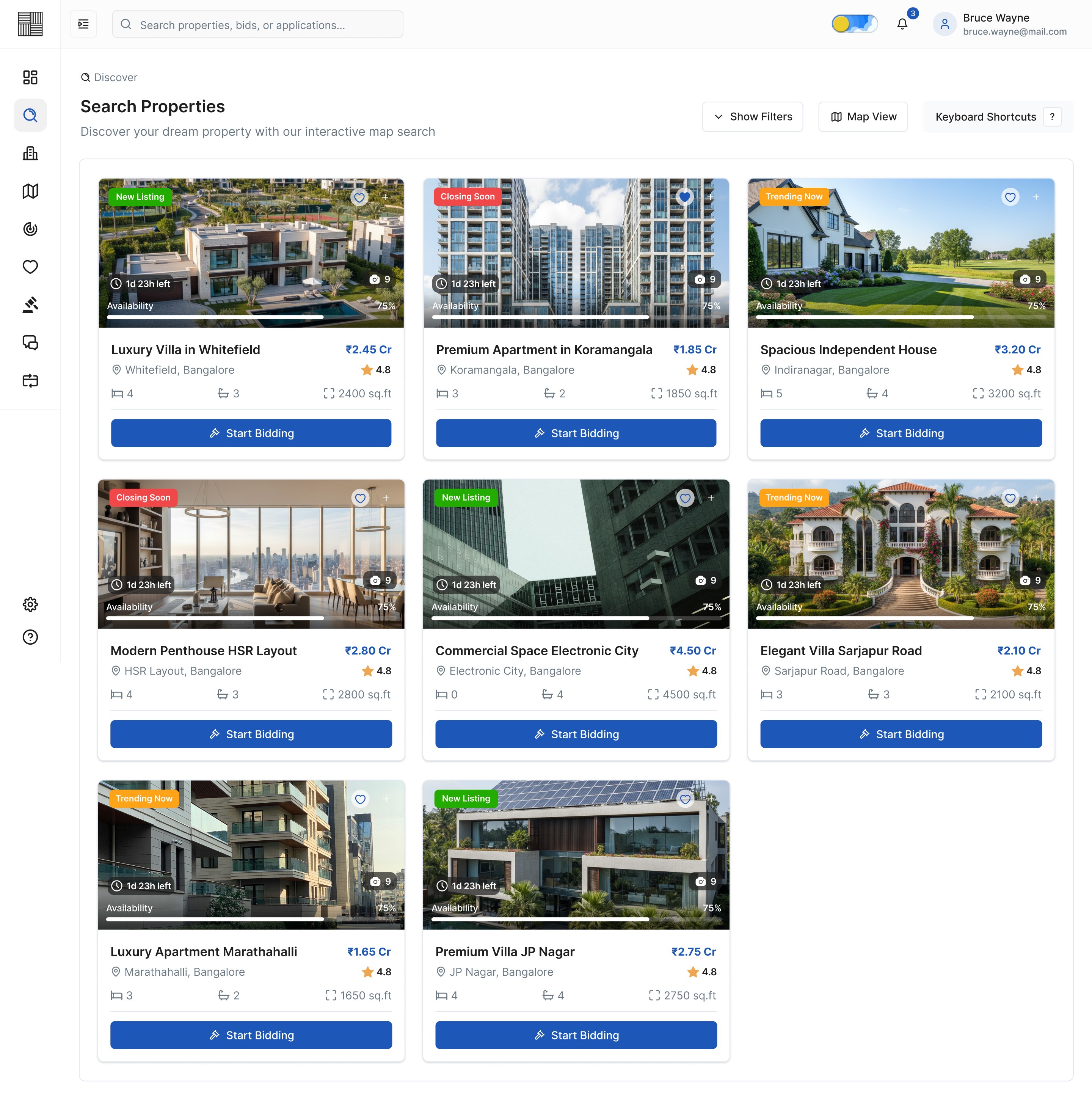
Img. Search Properties - List View with Filters hidden
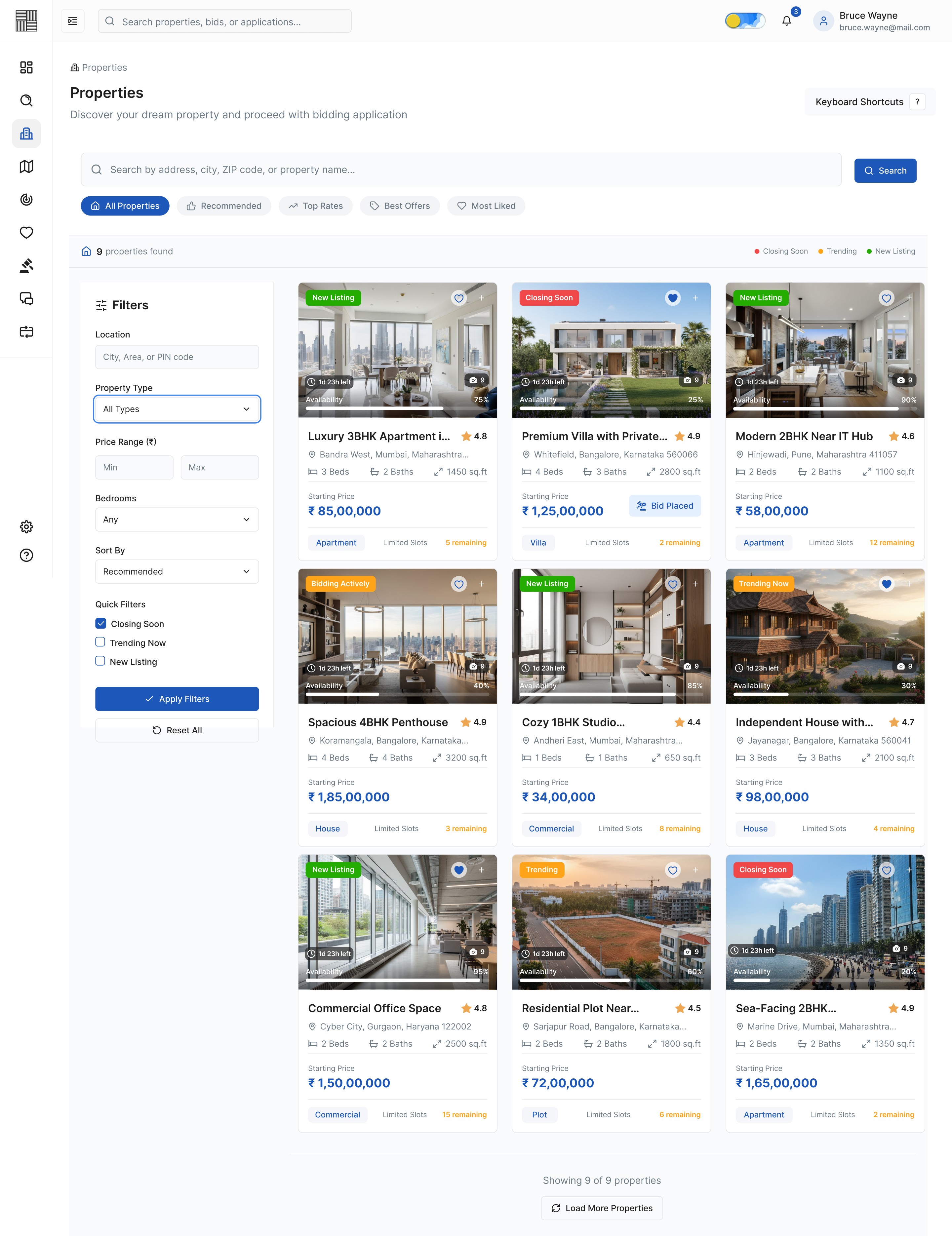
Img. Properties
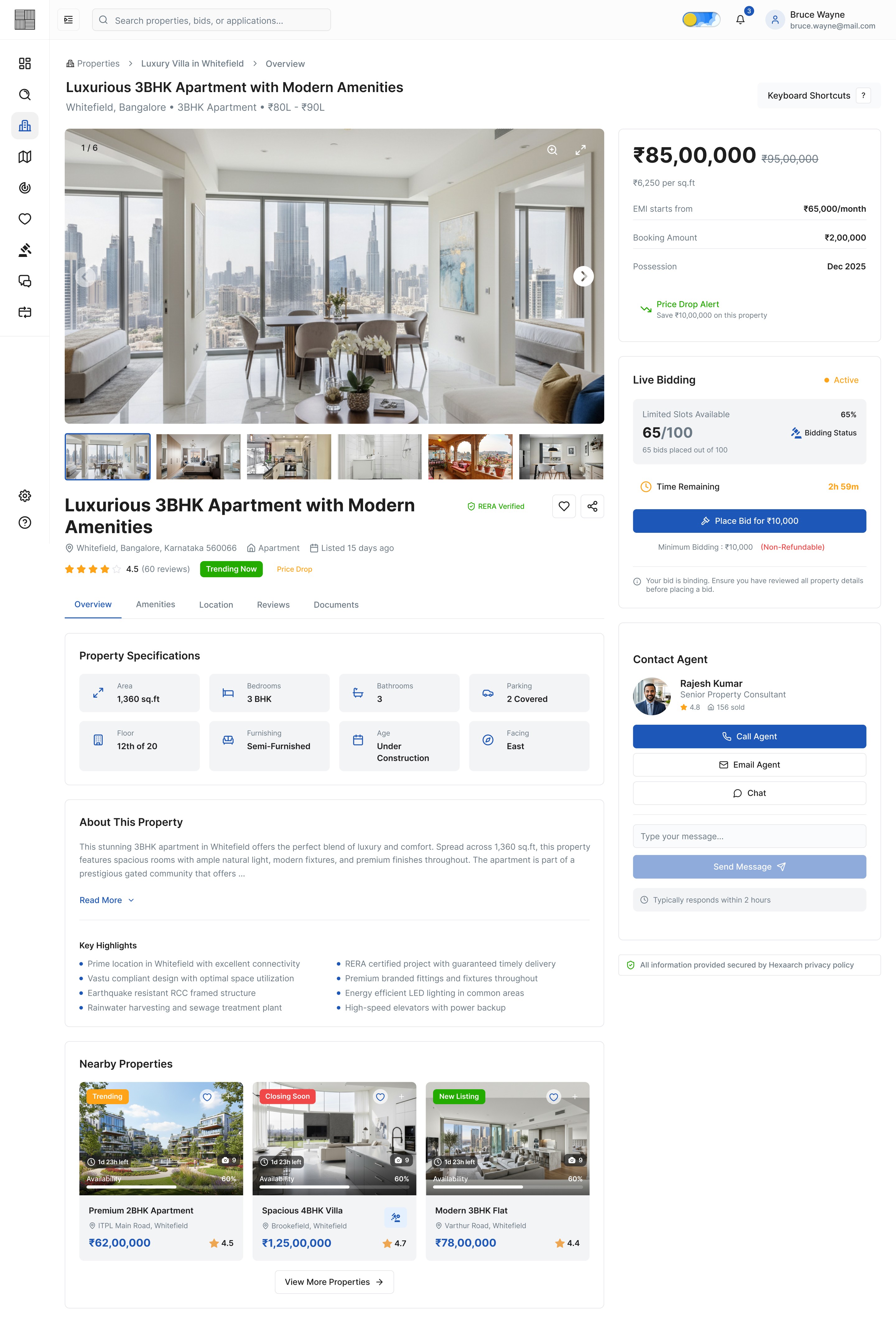
Img. Property Details - Overview
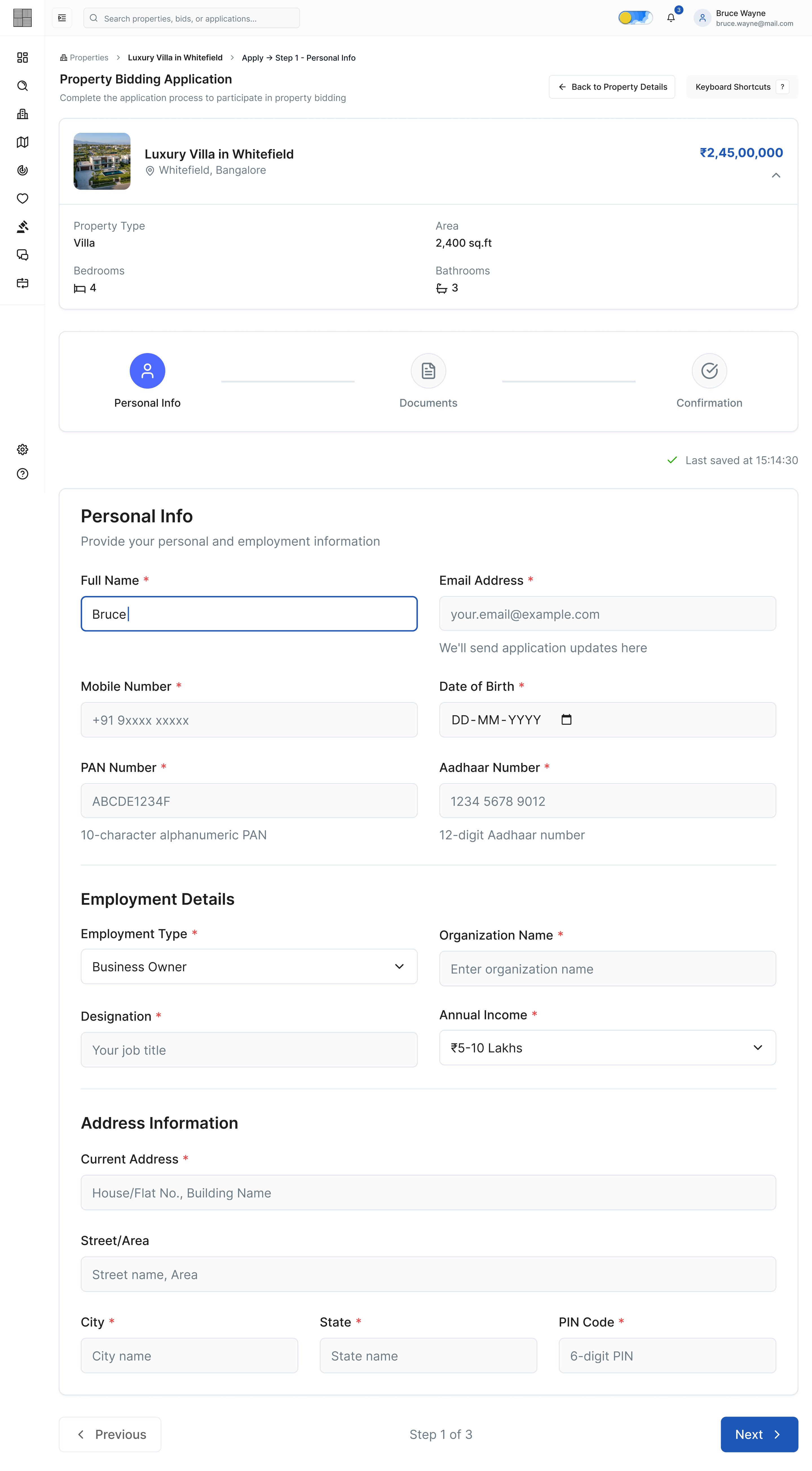
Img. Application - Step 1 - Personal Info
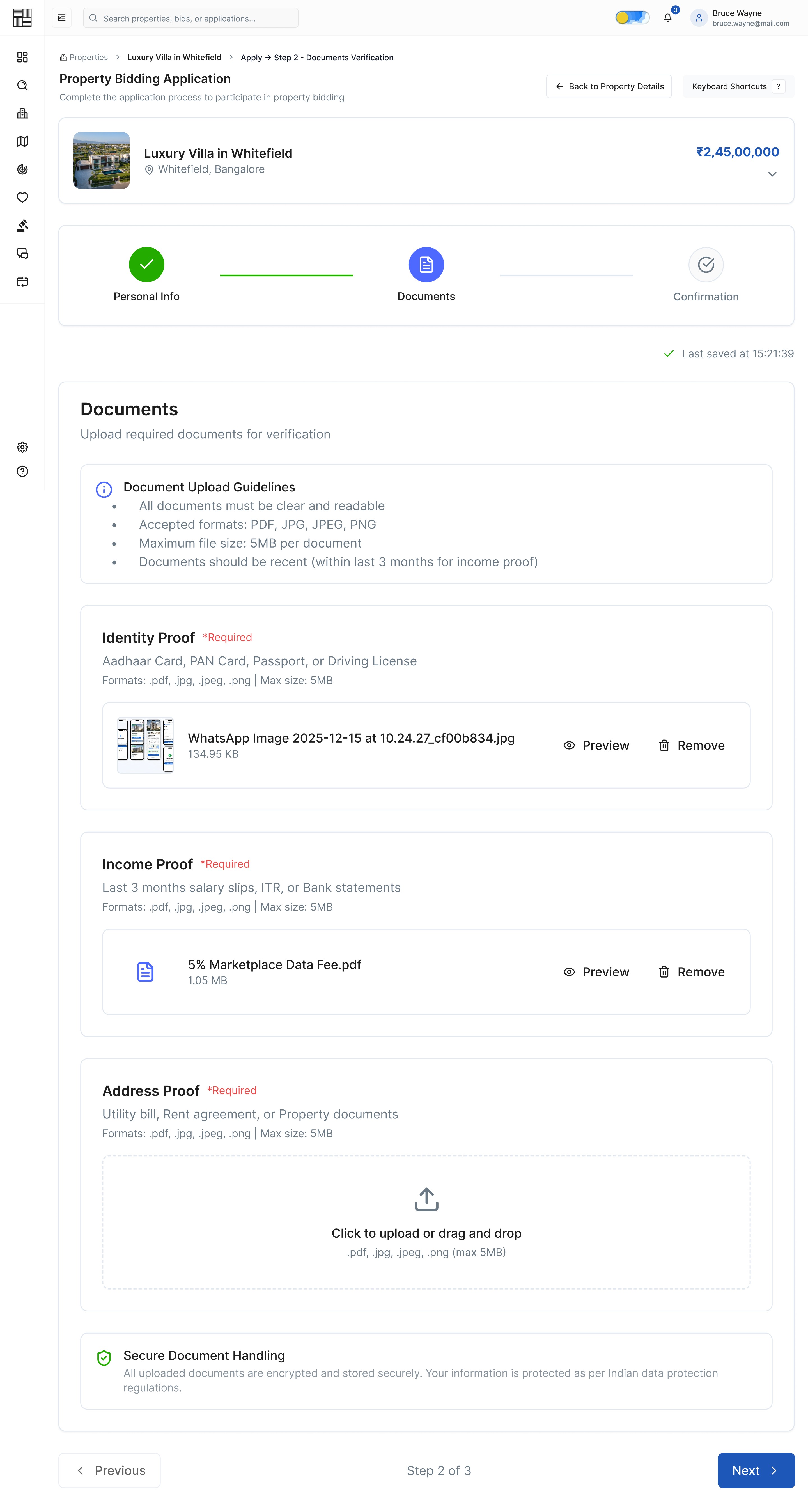
Img. Application - Step 2 - Documents Verification
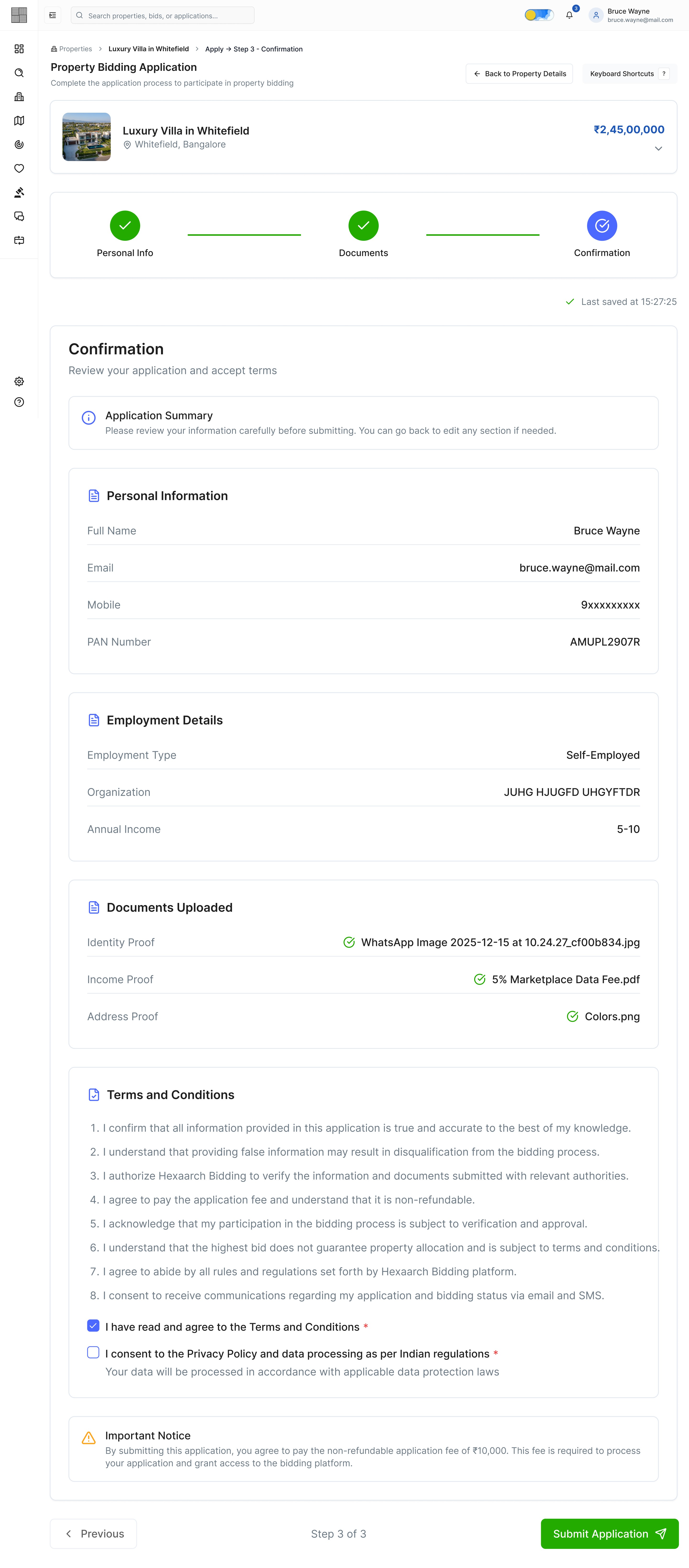
Img. Application - Step 3 - Confirmation
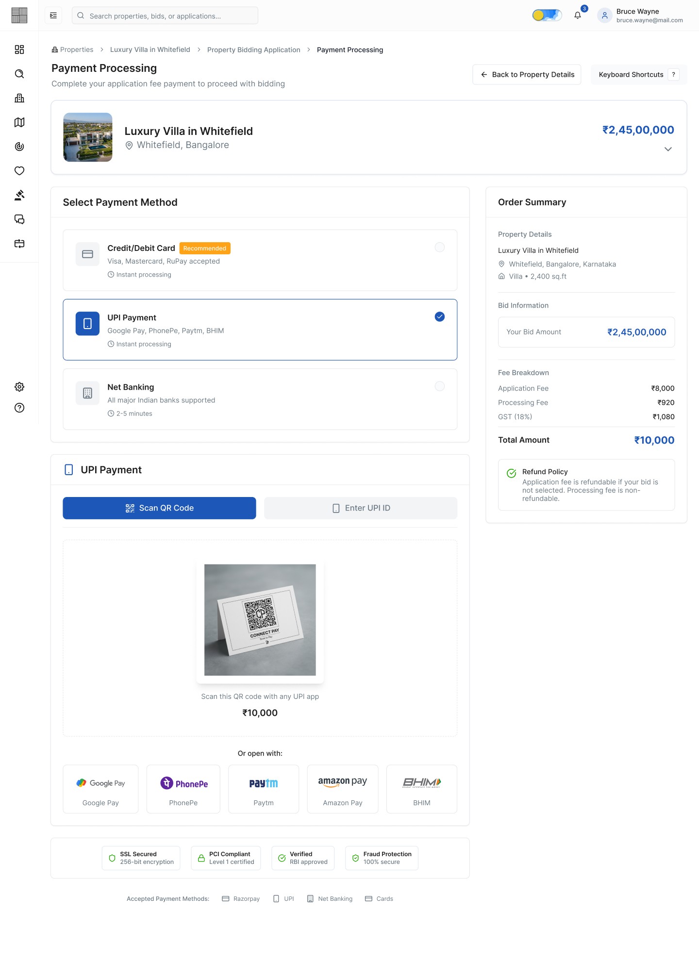
Img. Payment Processing
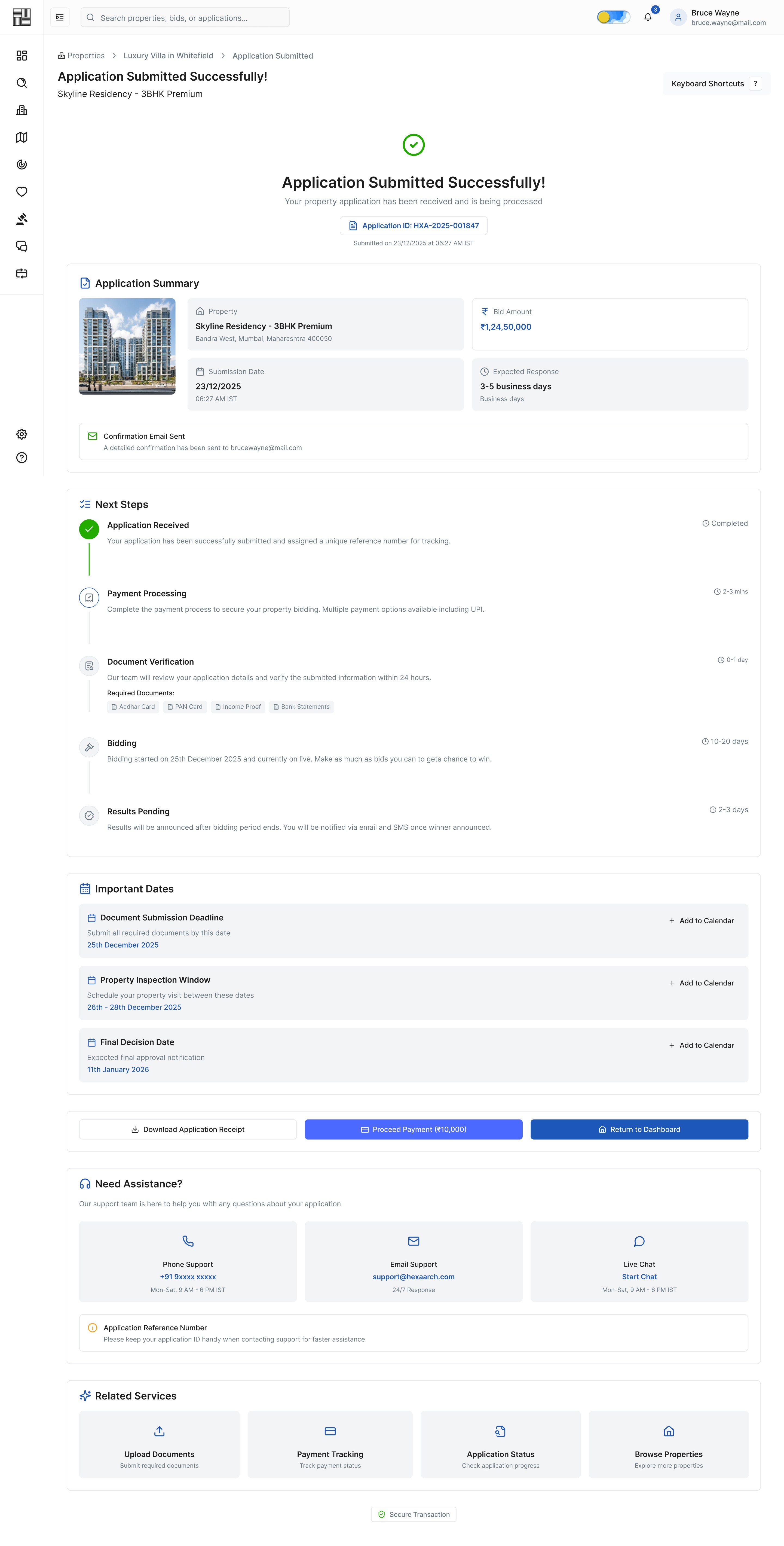
Img. Application Submitted Successfully
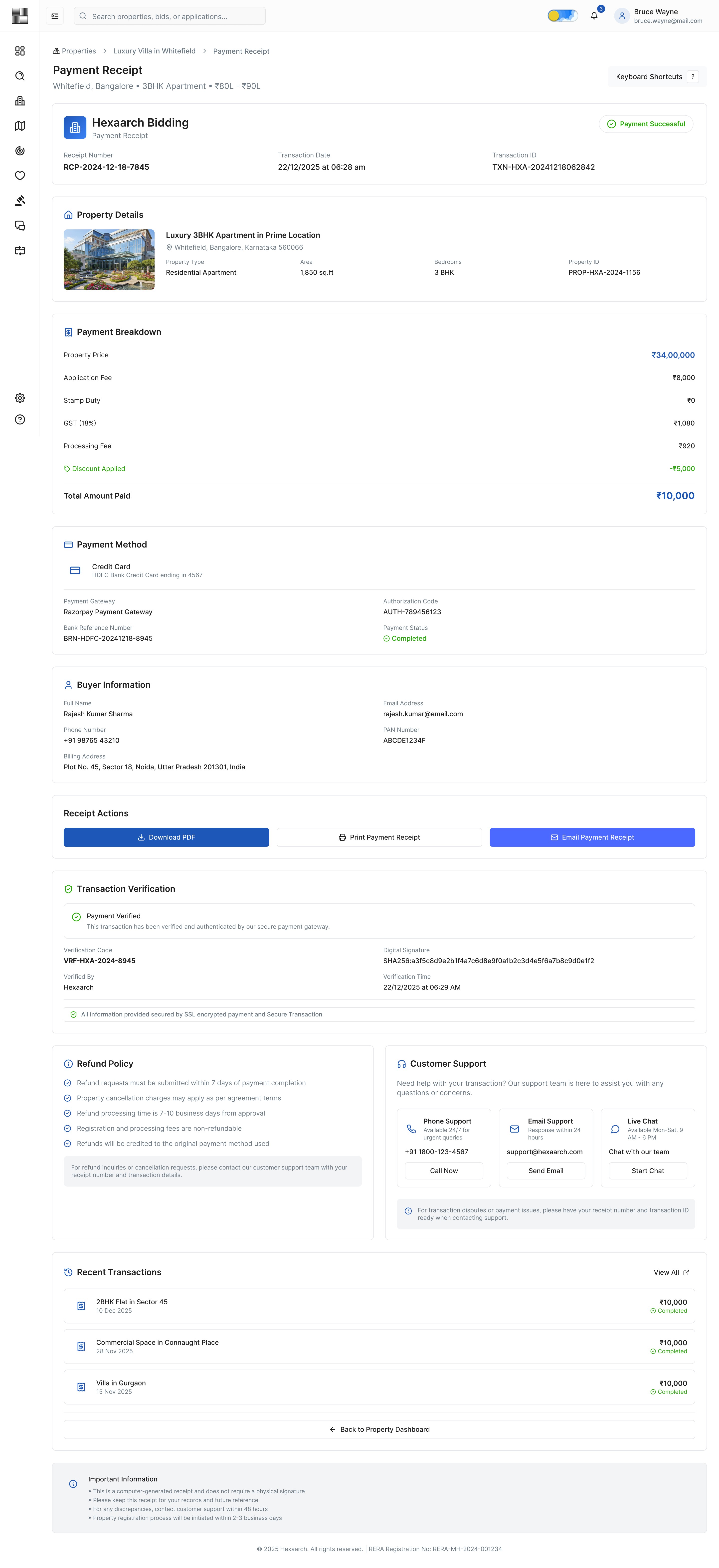
Img. Payment Receipt
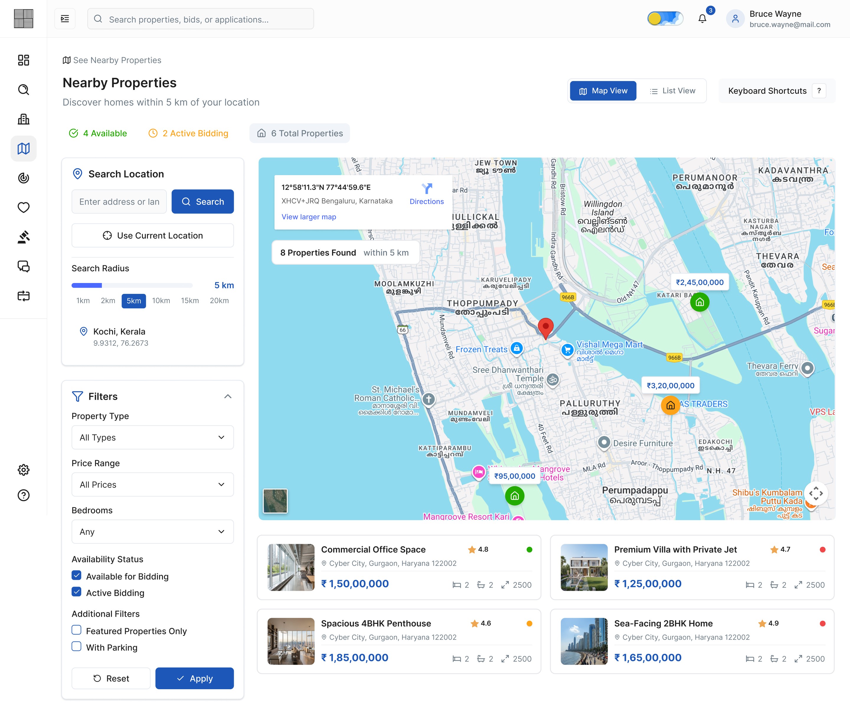
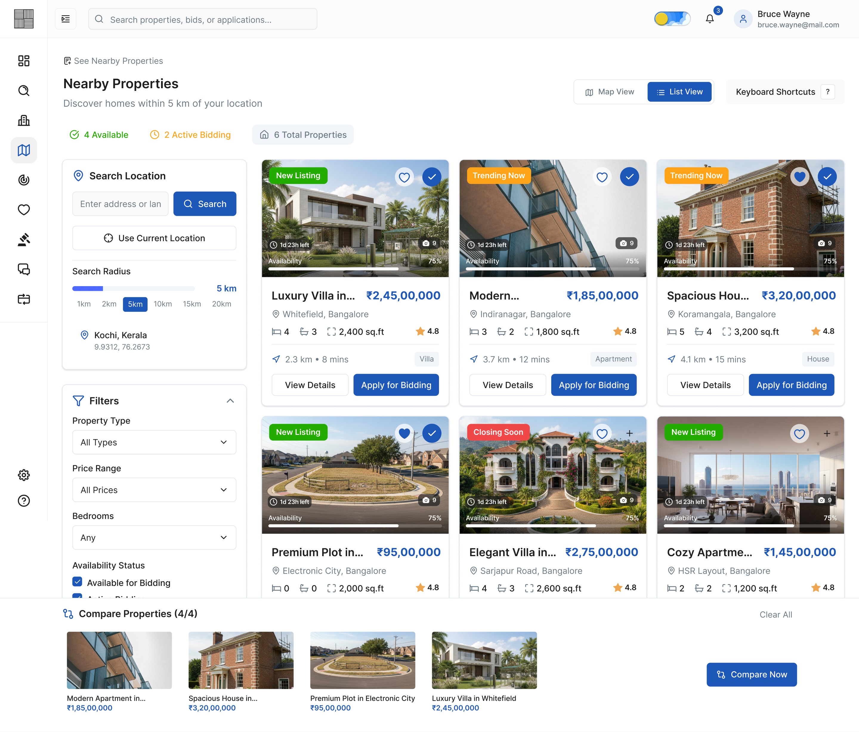
Img. Nearby Properties - Map View
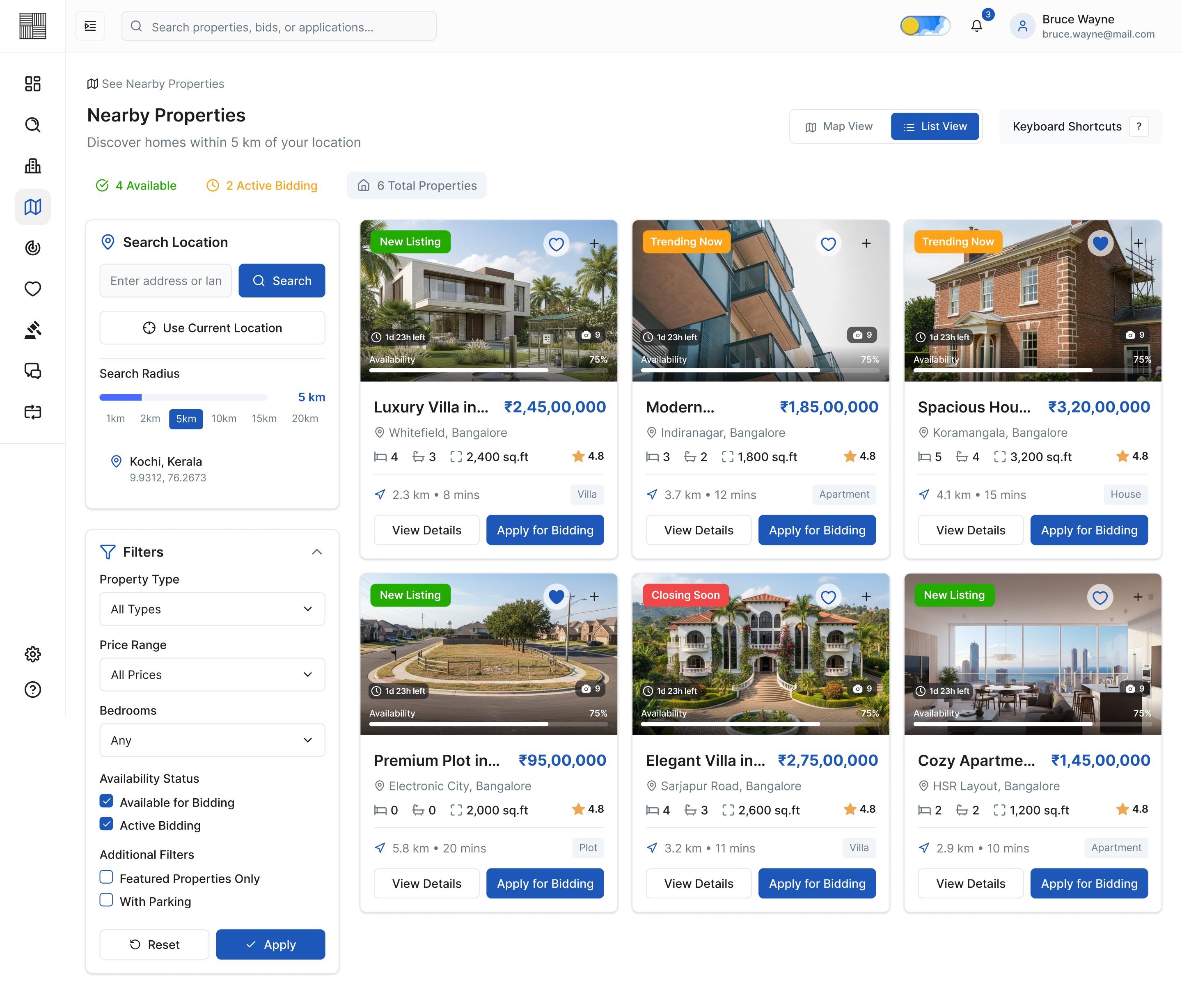
Img. Nearby Properties - List View
Img. Selection for Comparison
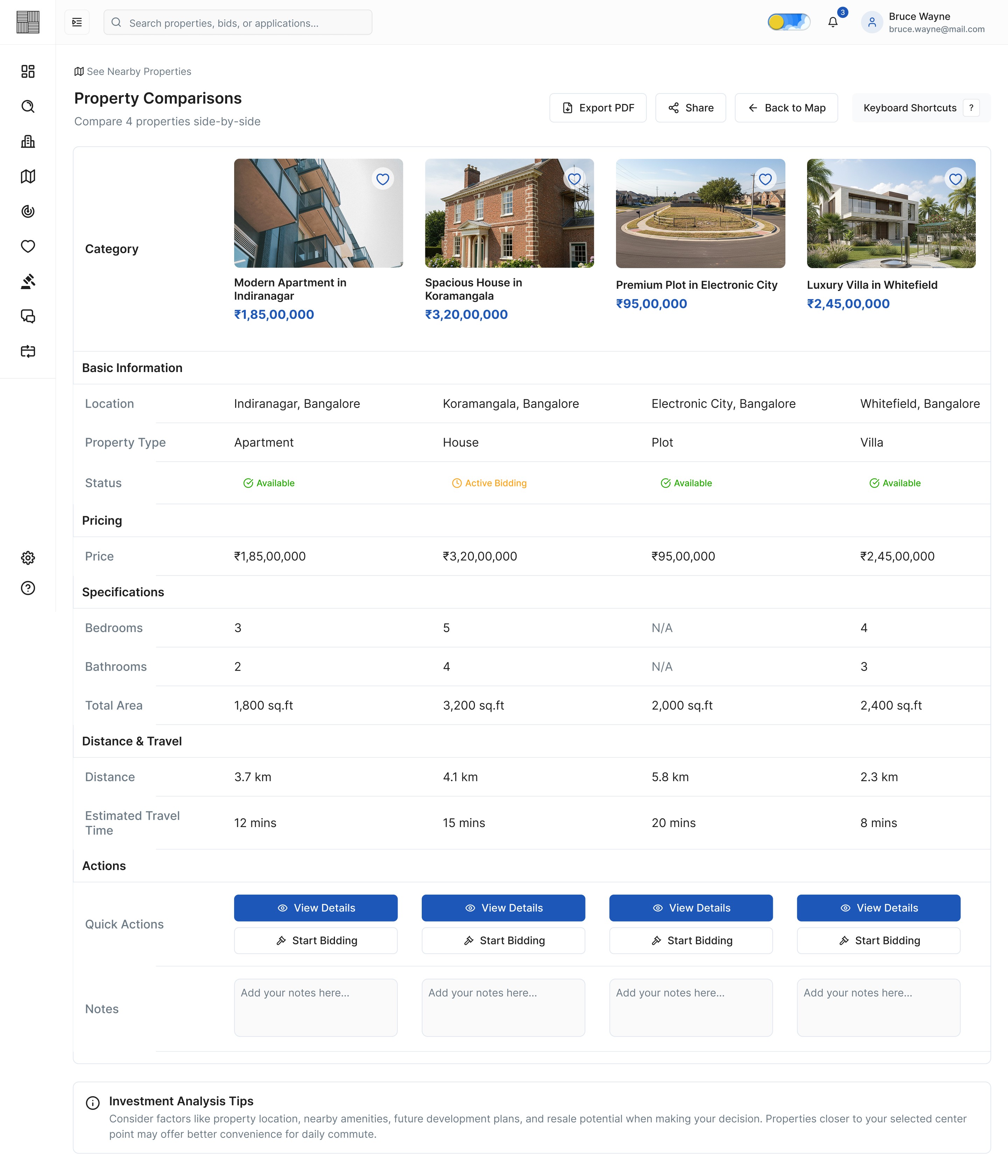
Img. Property Comparisons
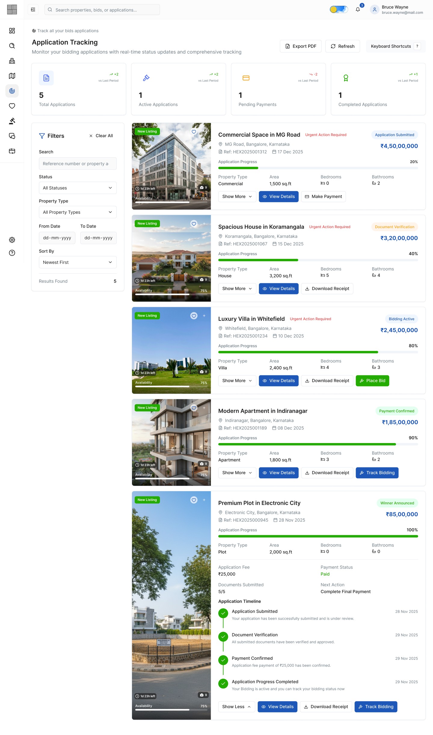
Img. Applications Tracking
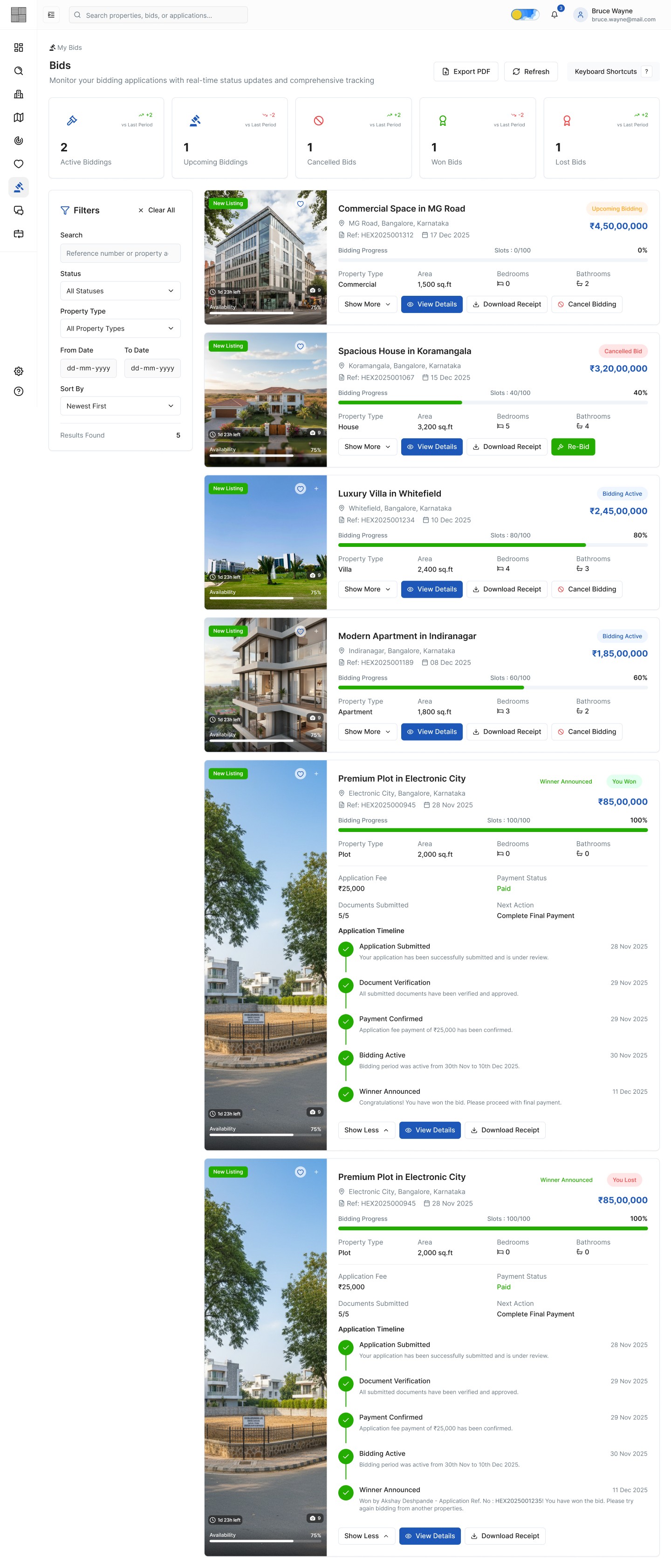
Img. My Bids
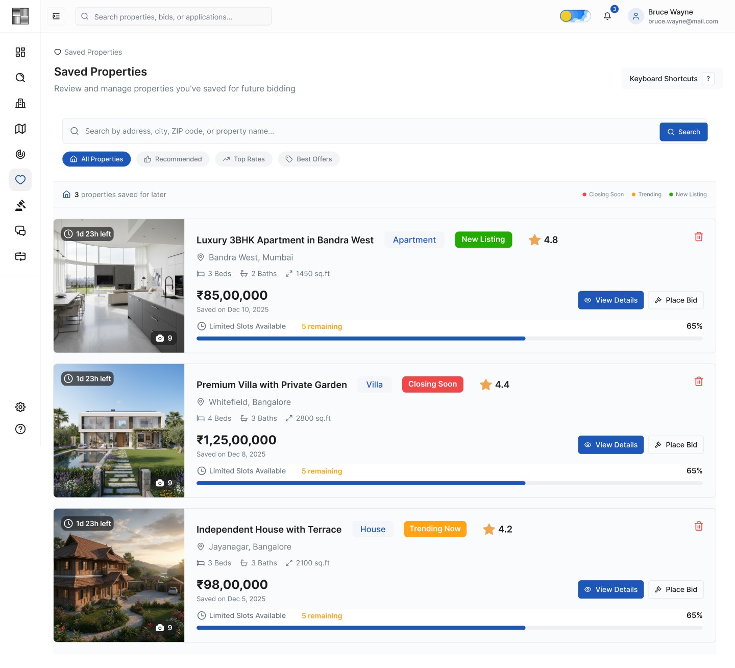
Img. Saved Properties
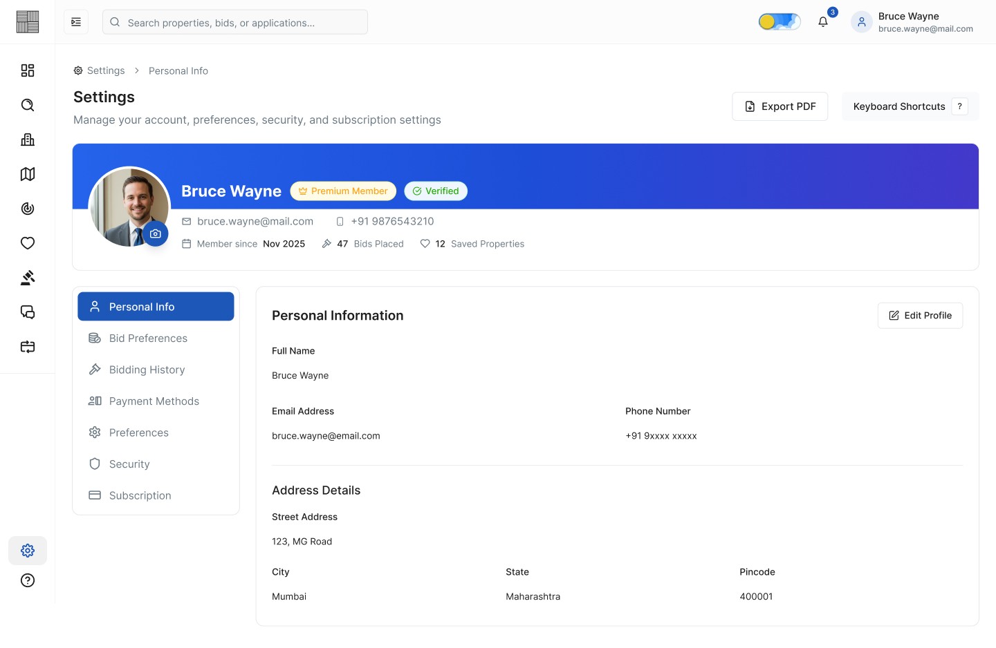
Img. Settings - Personal Info
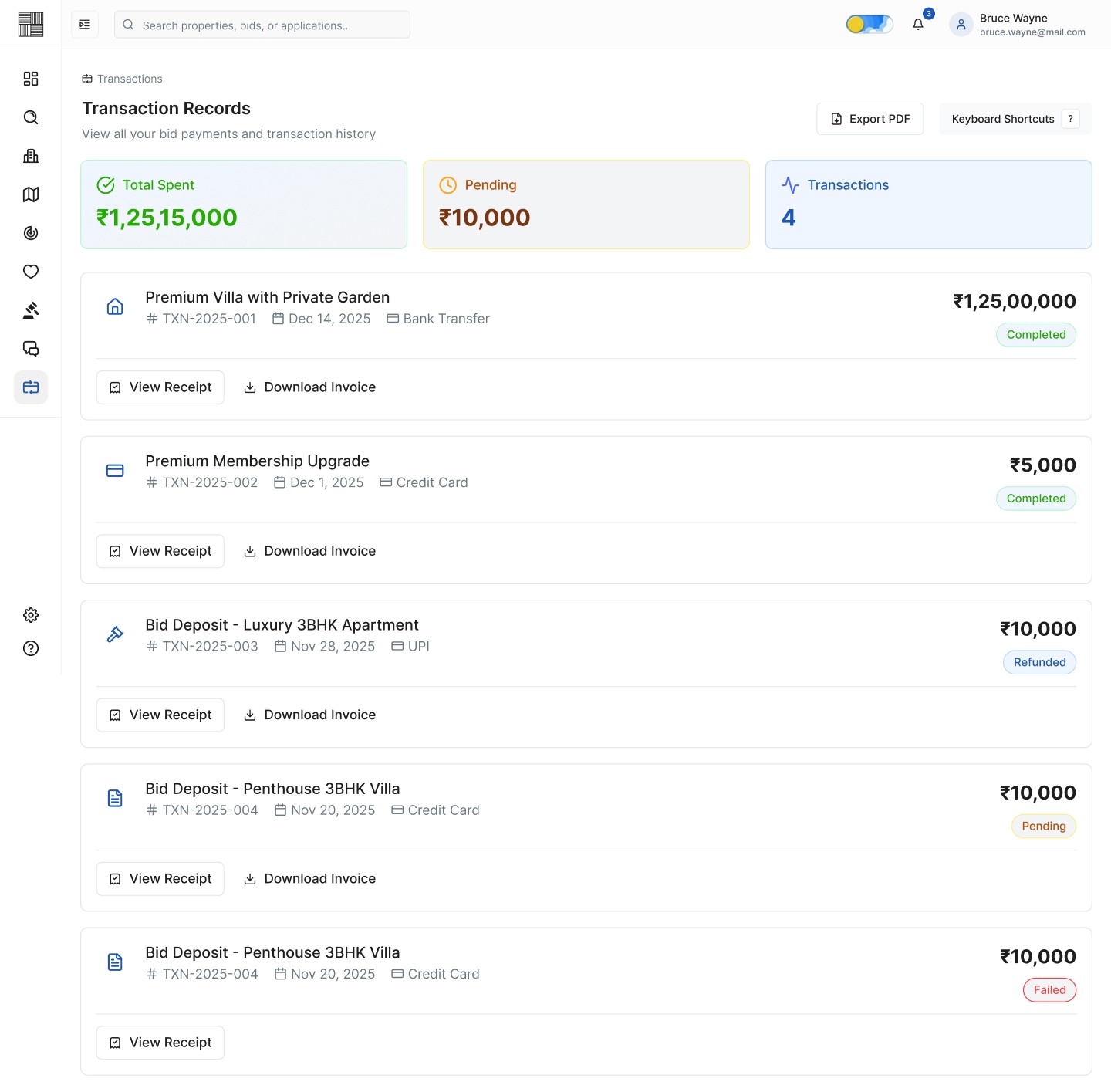
Img. Transaction Records
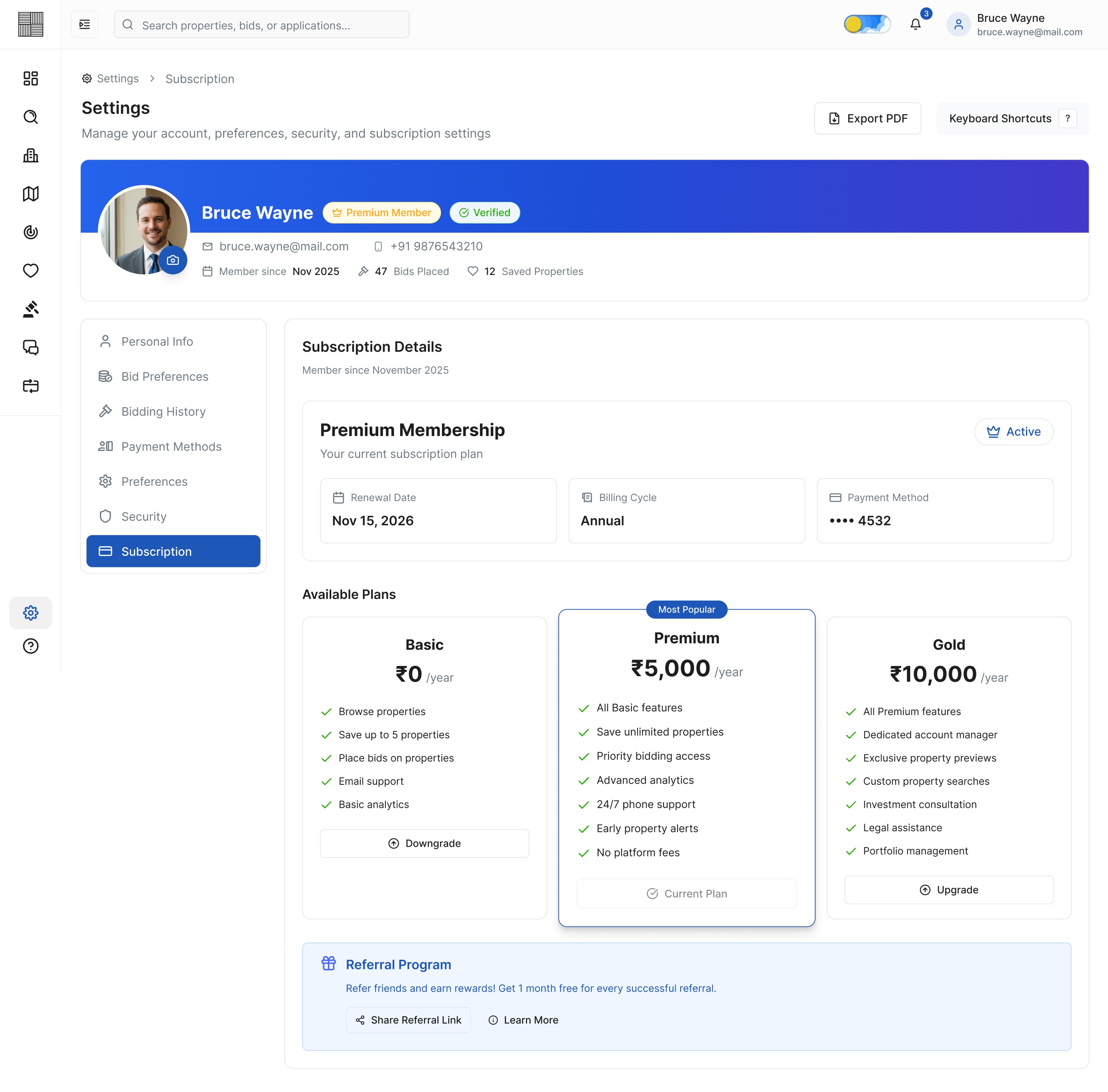
Img. Settings - Subscription
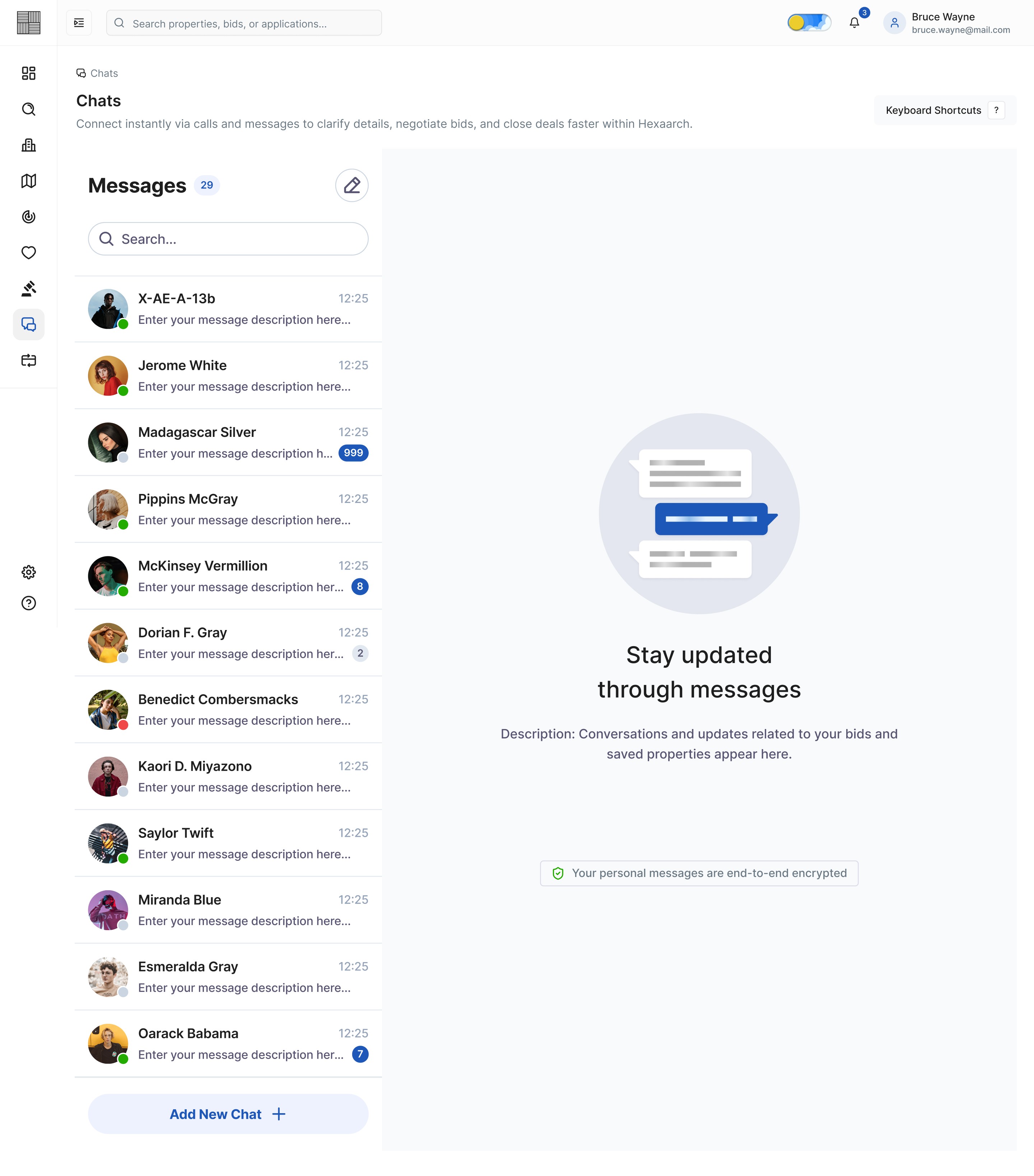
Img. Chats - Messages - Closed Chat
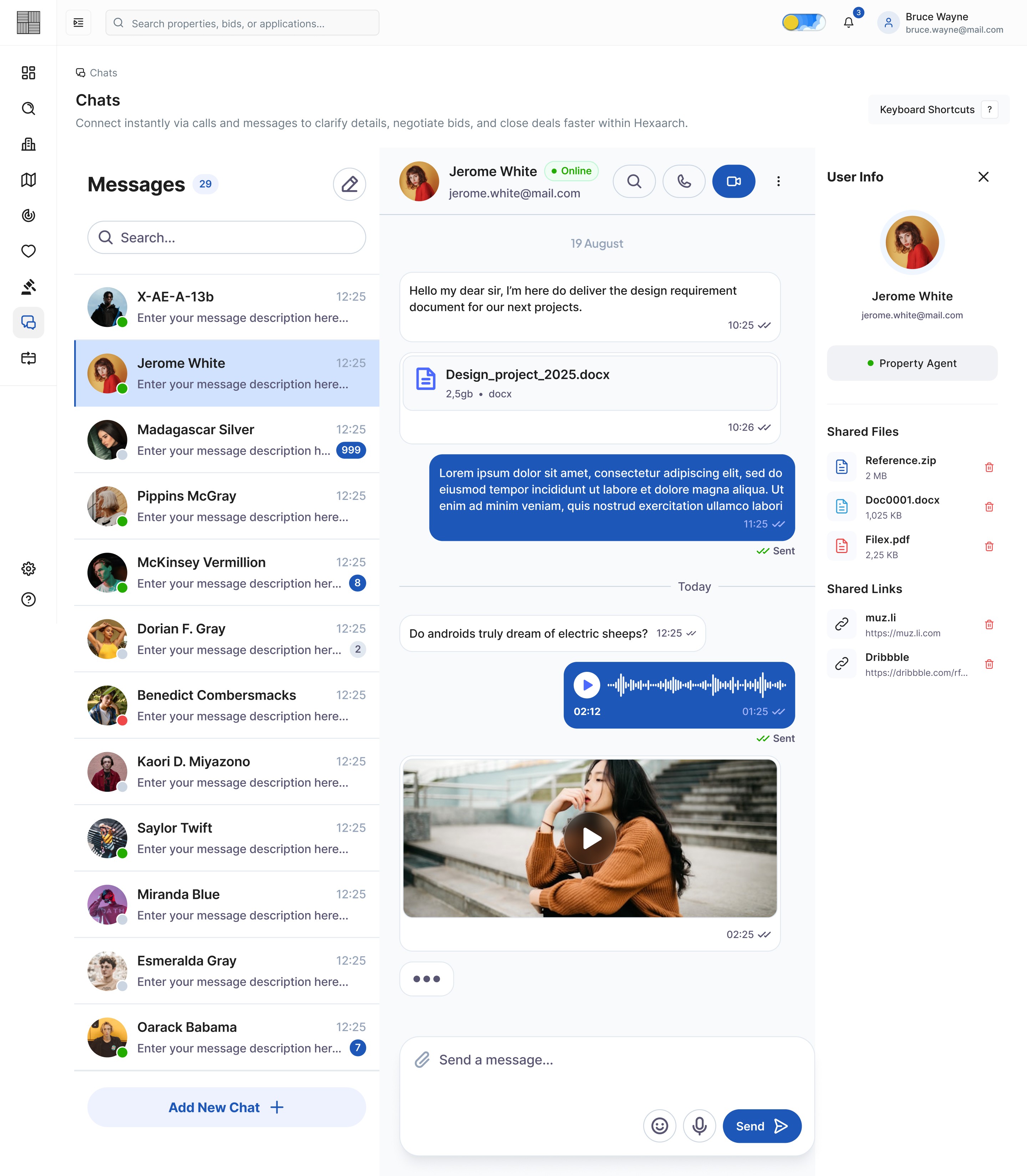
Img. Chats - Messages - Contact Info
Img. Chats - Voice Call
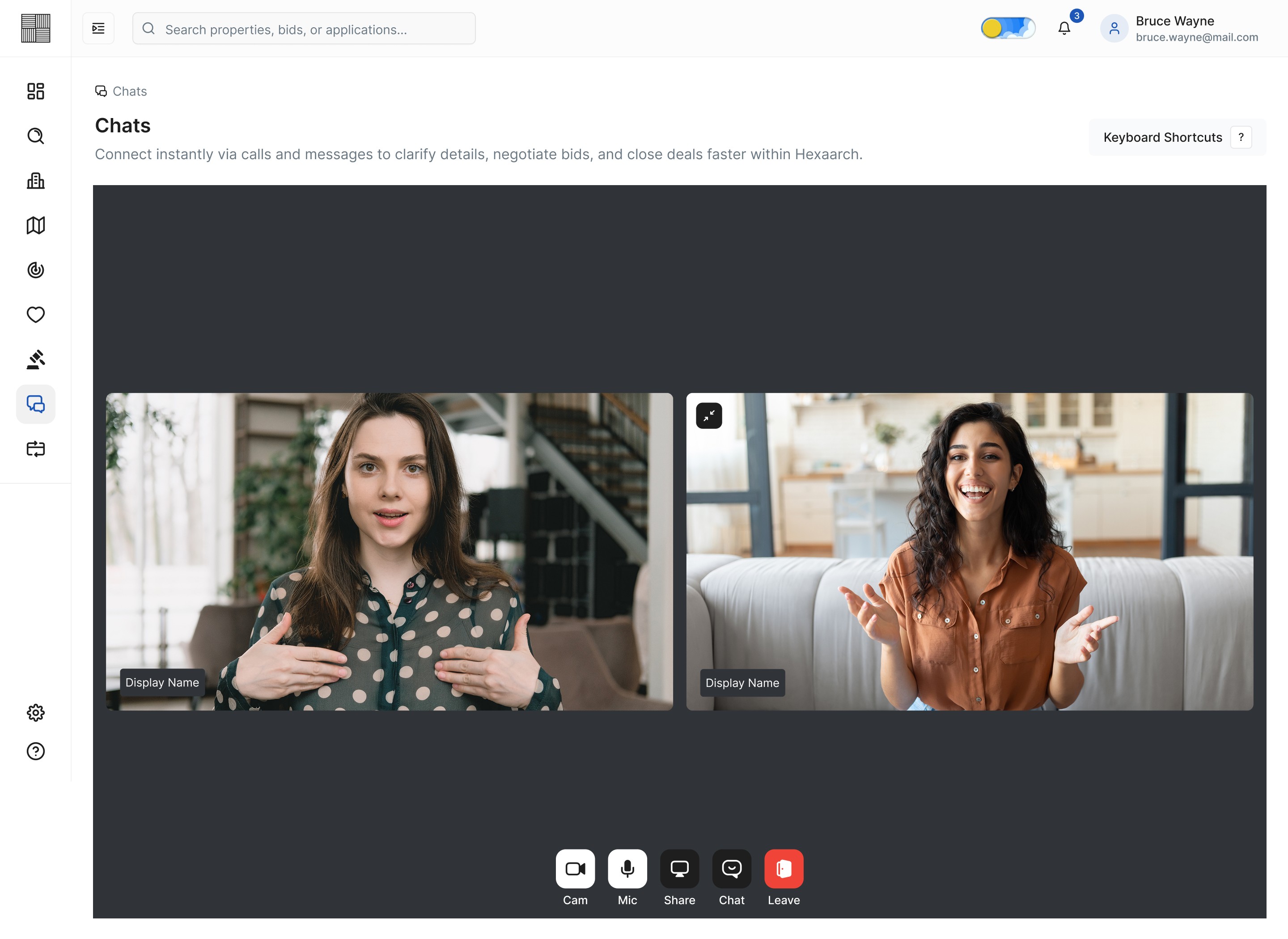
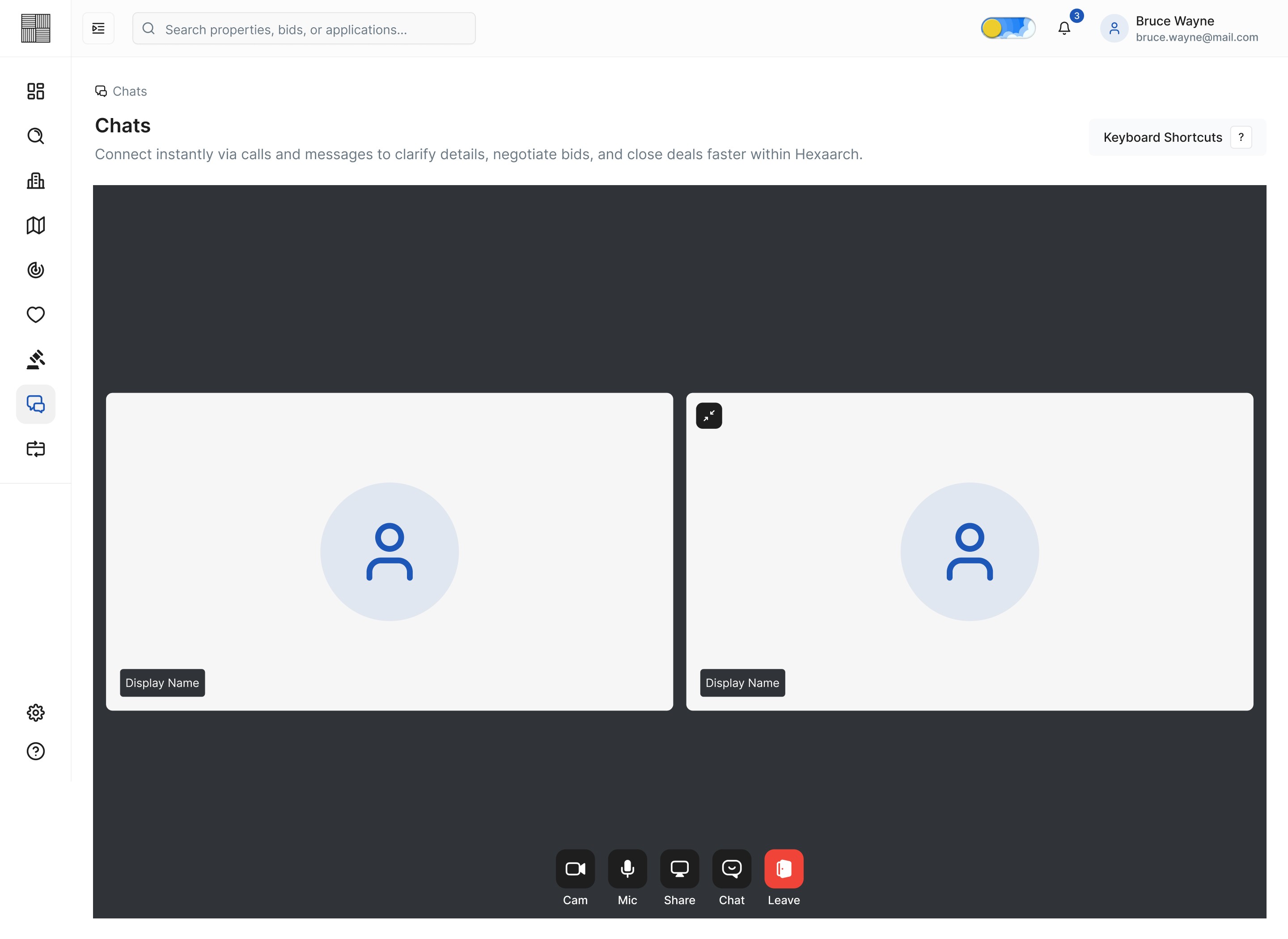
Img. Chats - Video Call - Grid
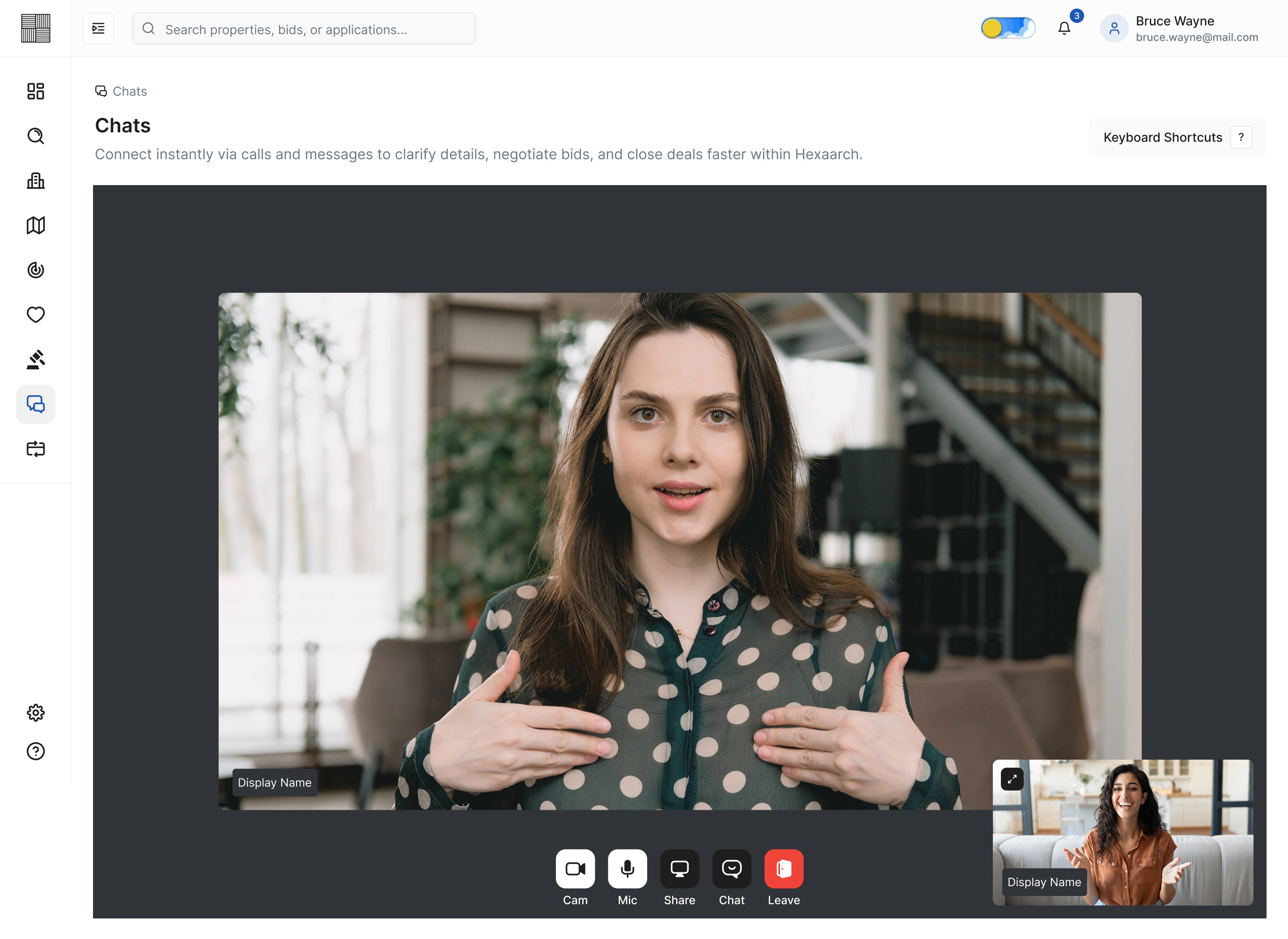
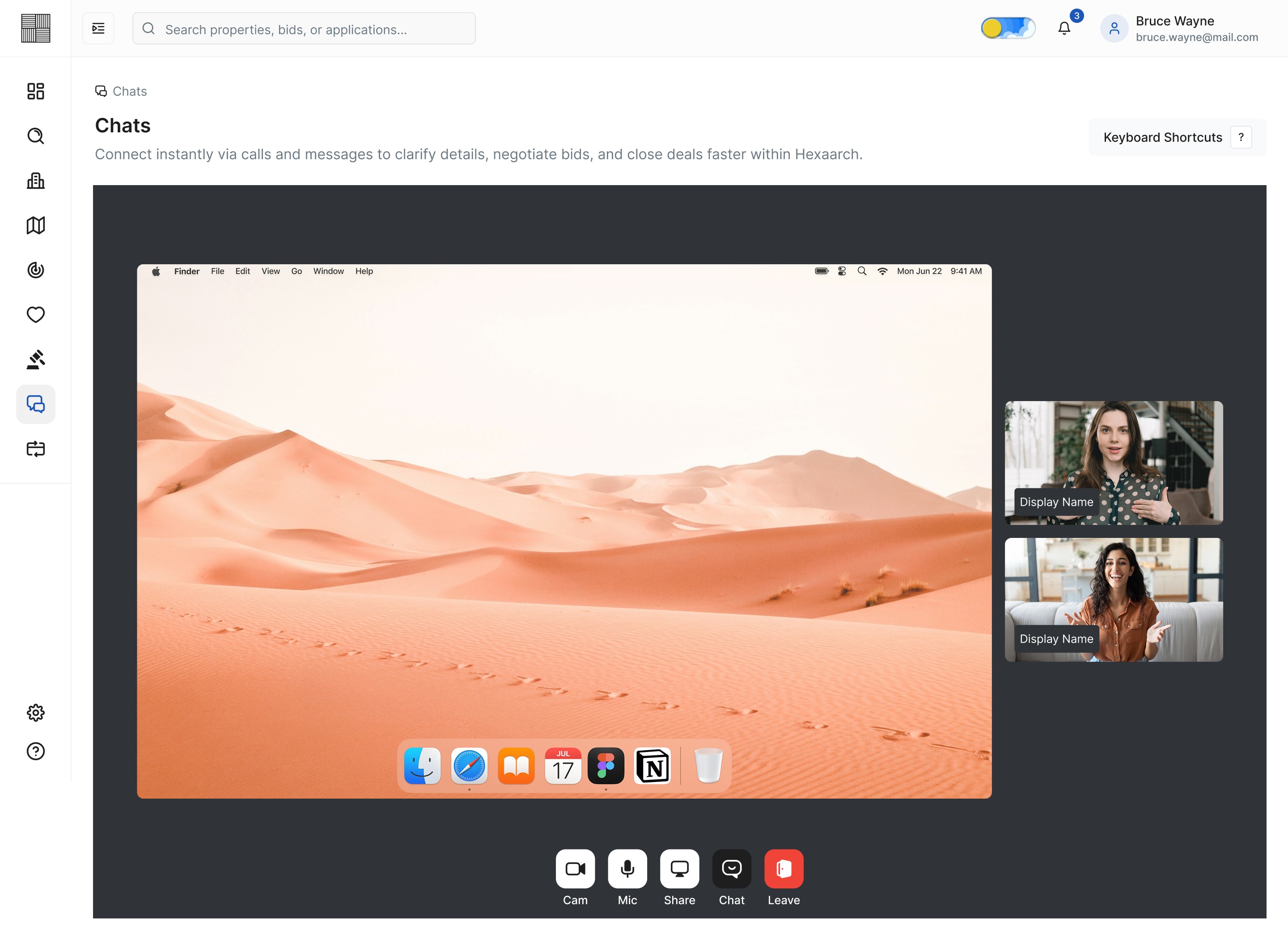
Img. Chats - Video Call - Pop-Out
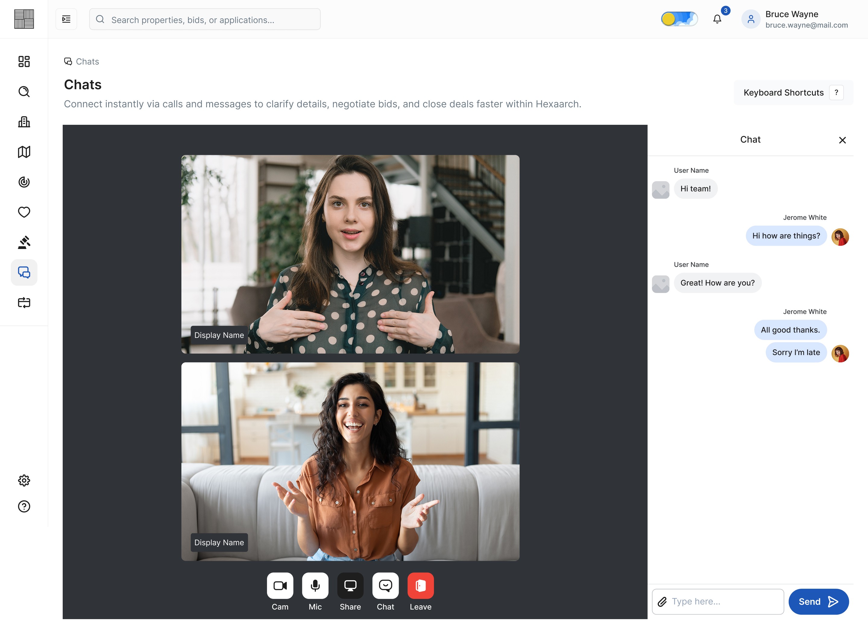
Img. Chats - Video Call - Chat
Img. Chats - Video Call - Screenshare
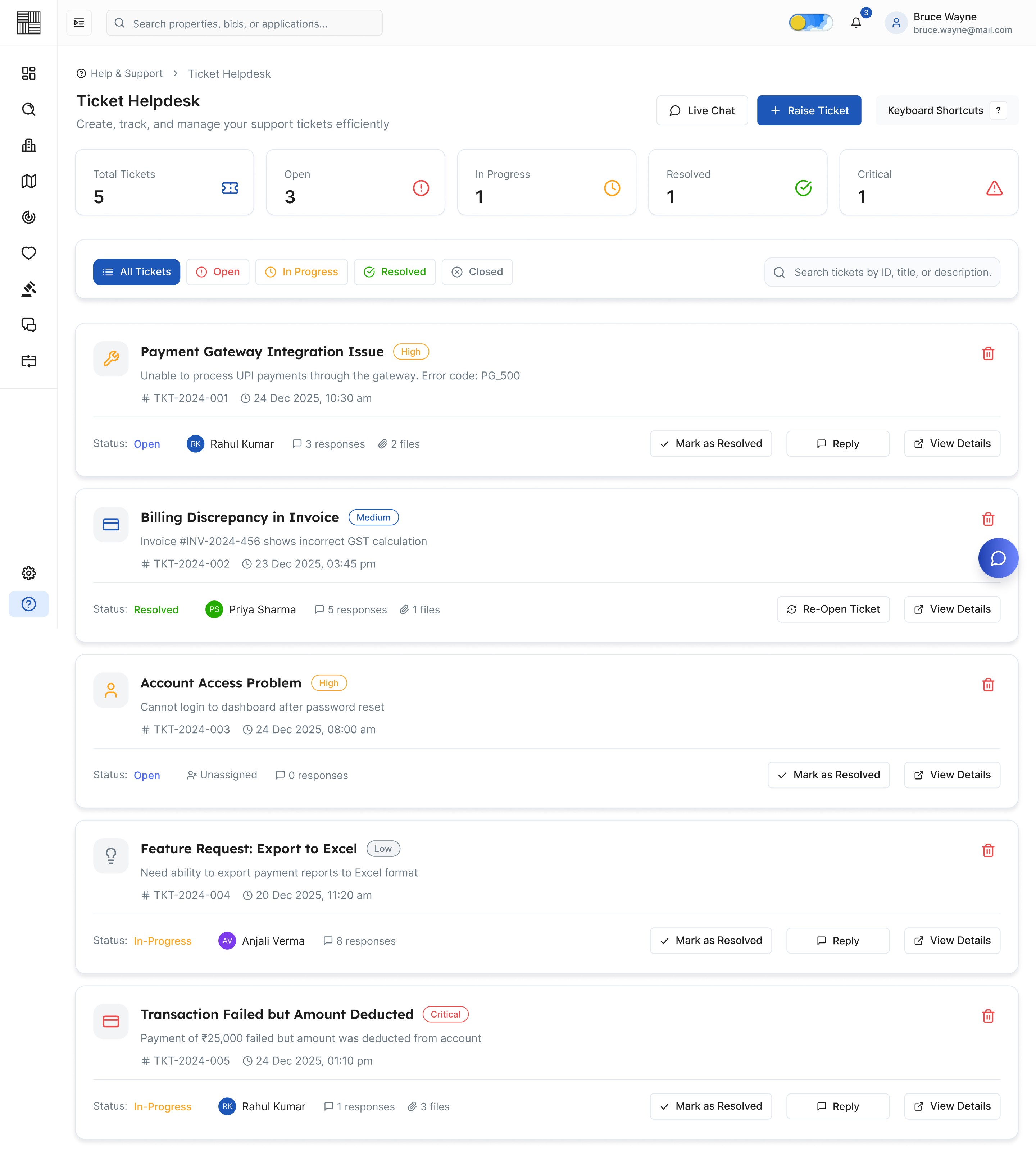
Img. Ticket Helpdesk
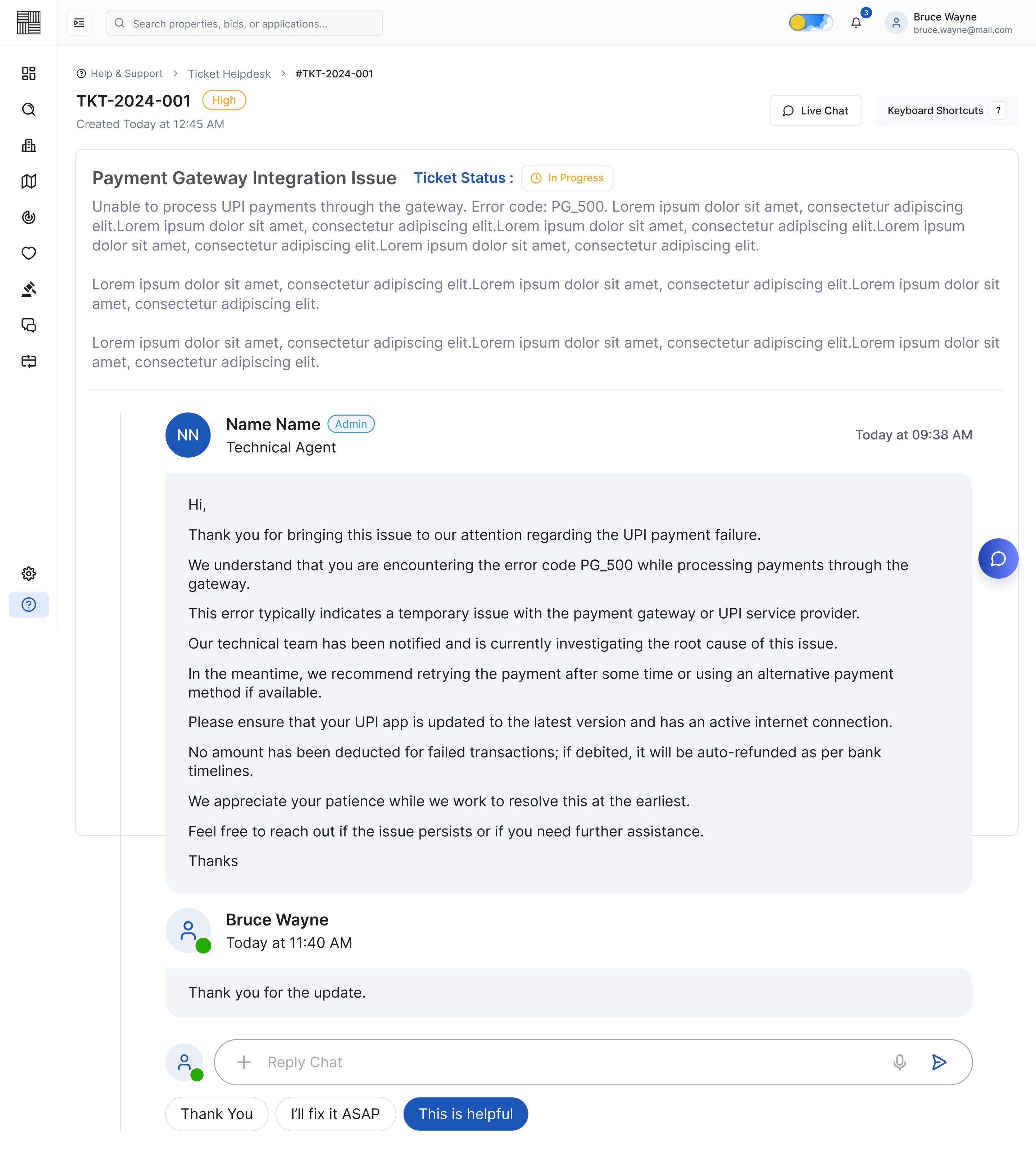
Img. Ticket - View Response
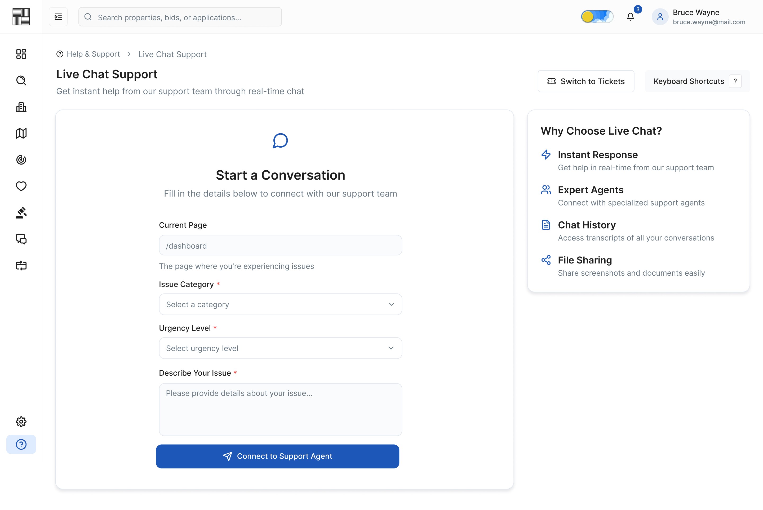
Img. Live Chat Support - Start a Conversation
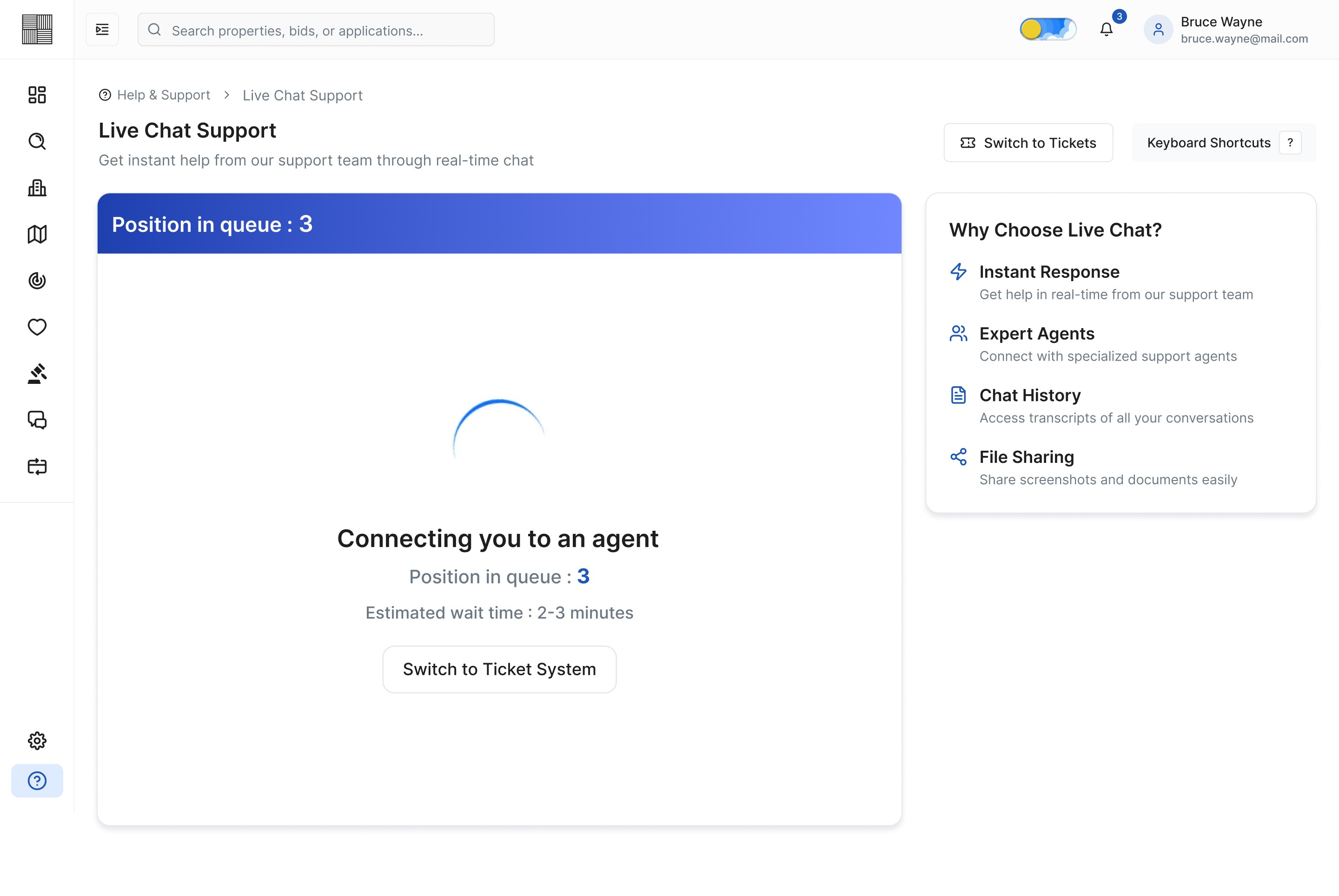
Img. Live Chat Support - Position in Queue
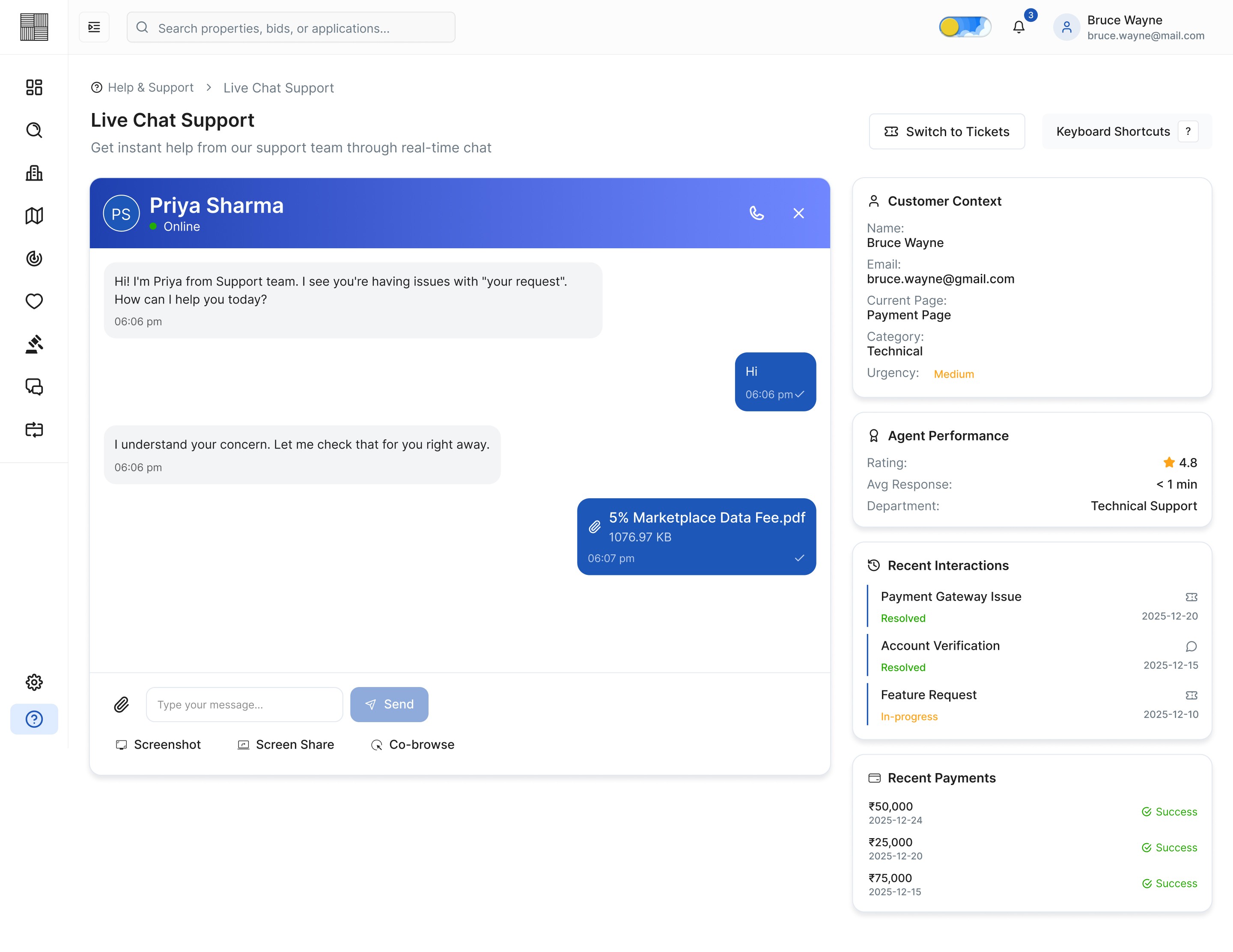
Img. Live Chat Support - Agent Conversation
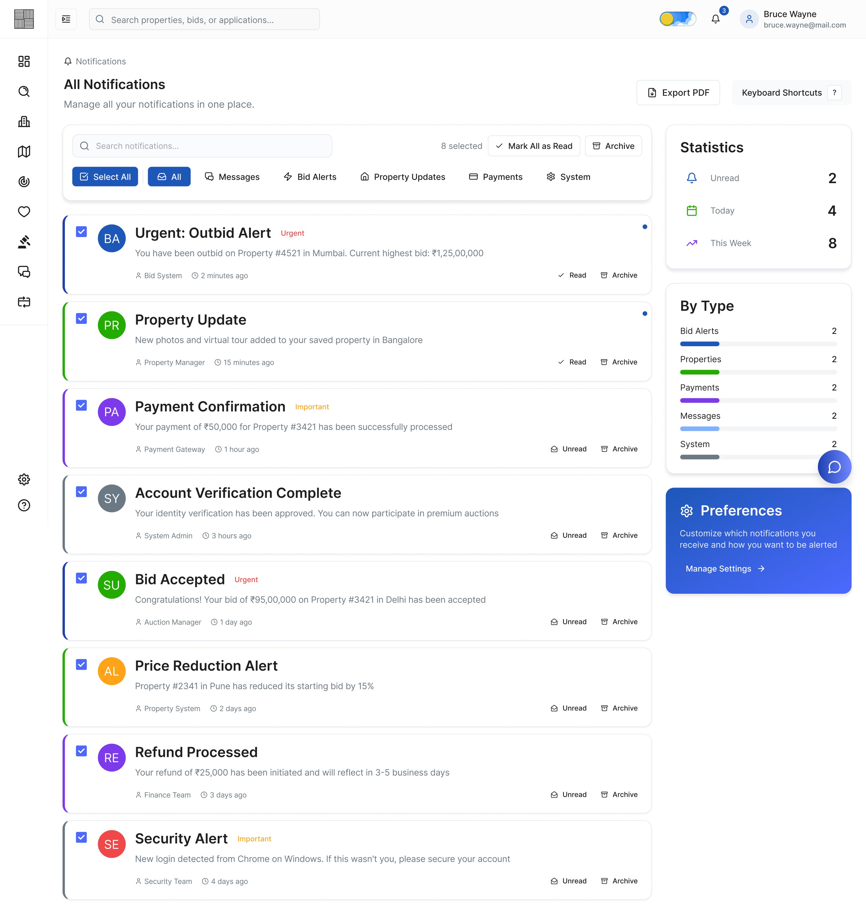
Img. Notifications
Responsive Design
Since many users accessed listings from mobile devices, we designed responsive experiences for:
Tablets
Mobile browsers
Smaller laptop screens
Mobile Optimizations
Sticky bidding CTA
Simplified navigation
Collapsible property sections
Thumb-friendly interactions
Quick filters
Accessibility Considerations
We incorporated accessibility best practices:
Color contrast compliance
Readable typography
Keyboard-friendly interactions
Consistent component behaviors
Clear error states
Accessible form labels
Prototyping & Usability Testing
We conducted usability testing with users from different experience levels.
Test Objectives
Validate bidding workflow clarity
Measure ease of navigation
Evaluate trust perception
Identify friction during bid placement
Usability Testing Findings
To validate the platform’s usability and overall bidding experience, we conducted moderated usability testing sessions with first-time buyers, property investors, and real-estate professionals. The testing focused on navigation clarity, bidding confidence, task completion speed, and overall user trust during the bidding journey.
Key Findings
1. Users Hesitated Before Placing Bids
Many users were unsure whether they were making the right bidding decision because the platform lacked clear indicators about bid competitiveness and live bidding activity.
Insight:
Users needed more transparency and reassurance before taking high-value actions.
2. Important Bidding Information Was Missed
Participants often overlooked critical details such as bid deadlines, current highest bids, and bid ranking due to information-heavy layouts.
Insight:
The visual hierarchy needed improvement to highlight time-sensitive information more effectively.
3. First-Time Users Felt Overwhelmed
New users found the bidding workflow slightly intimidating because they were unfamiliar with online property auctions and financial terminology.
Insight:
The platform required onboarding support and more guided interactions.
4. Property Comparison Took Too Long
Users opened multiple tabs and manually compared listings because key property insights were not easily scannable.
Insight:
Users needed a faster and more structured comparison experience.
5. Mobile Navigation Needed Simplification
Mobile users experienced difficulty accessing filters, bid history, and property details efficiently on smaller screens.
Insight:
The mobile experience required optimized layouts and simplified navigation patterns.
Improvements Implemented After Testing
Based on user feedback and testing observations, several UX improvements were introduced to improve clarity, confidence, and usability.
1. Improved Bid Visibility
We redesigned the bidding section by:
Highlighting the current highest bid
Adding live bid activity indicators
Introducing countdown timers
Showing user bid rankings clearly
Result
Users understood bidding status faster and felt more confident while placing bids.
2. Simplified Information Hierarchy
We restructured property detail pages by:
Prioritizing important information above the fold
Reducing visual clutter
Grouping related information sections
Improving spacing and typography hierarchy
Result
Users scanned property information more efficiently and made quicker decisions.
3. Added Guided Onboarding
To support first-time users, we introduced:
Step-by-step bidding guidance
Tooltip explanations
Simplified bidding terminology
Interactive onboarding flows
Result
New users felt less intimidated and completed bidding tasks with fewer errors.
4. Enhanced Property Comparison Experience
We added:
Quick comparison cards
Side-by-side property comparison
Visual pricing insights
Save & compare functionality
Result
Users evaluated properties faster and reduced manual comparison effort.
5. Optimized Mobile Experience
We improved the responsive experience through:
Sticky bidding CTA buttons
Thumb-friendly interactions
Simplified filter access
Collapsible content sections
Faster mobile navigation
Result
Mobile users completed tasks more smoothly with improved accessibility and usability.
Final Testing Outcome
After implementing the iterations, follow-up usability testing showed noticeable improvements in overall user experience.
Post-Iteration Results
Users completed bidding tasks faster
Confidence during bidding increased significantly
Navigation became more intuitive
Users engaged more actively with live bidding
First-time users required less assistance
Overall satisfaction and trust perception improved
The testing phase played a critical role in refining the platform and ensuring the final product delivered a transparent, intuitive, and user-friendly property bidding experience.
