16 August 2025
Project in Hexaarch
HexaCareers – Business Excellence & Sales Mastery LMS - User, Instructor & Admin Dashboards
Designing an intuitive multi-role dashboard for students, instructors & admins to learn, teach and manage with clarity
Overview
In August 2025, Hexaarch initiated an internal strategic project to expand its ecosystem under a new sub-branch, HexaCareers - an LMS dedicated to developing Business Excellence and Sales Mastery skills for real-estate professionals and early career aspirants.
While Hexaarch already delivered high-value learning programs, the learning experience was fragmented across multiple tools:
Students attended Zoom sessions separately
Assignments came through Google Forms
Notes were scattered in WhatsApp and Drive
Attendance was maintained manually
Instructors struggled to share resources on time
Admins had no unified view of performance and engagement
This inconsistency was creating friction, delays, and stress for all three user groups.
Learners felt lost, instructors felt overloaded, and admins struggled to maintain operational consistency.
Hexaarch wanted to centralize these touchpoints into one powerful, intuitive system that would feel:
Guided for students
Efficient for instructors
Controllable for admins
That vision became HexaCareers LMS — a complete, three-level dashboard system.
Role
Senior UX UI Designer
Tools
Figma, Notion, FigJam
Team
2 UI UX Designer, 2 Developers
Timeline
Aug 2025 - Nov 2025 (16 weeks)
Prototype Video Link :
View Hi-Fi Prototype

Who Was the Client?
Although this was an internal project, the client was Hexaarch itself, operating through its new sub-branch Hexacareers.
Hexaarch acted both as the client and stakeholder, with:
Academic team defining the learning structure
Sales & operations team outlining workflow needs
Tech team providing feasibility guidance
Leadership team shaping the long-term vision of the platform
This made the project both exciting and challenging — the expectations were high because the system would become the backbone of HexaCareers’ entire learning experience.
My Role & Responsibilities
As the Senior UX/UI Designer, I was responsible for the end-to-end design process.
My tasks included:
1. Discovery & Research
Conducting stakeholder interviews (students, instructors, admins)
Mapping current LMS workflows and identifying pain points
Creating empathy maps & user personas
Performing comparative analysis of top LMS platforms
2. Experience Strategy
Defining information architecture for all three dashboards
Designing role-based user journeys and task flows
Prioritizing features based on usability, frequency & cognitive load
Establishing a design vision aligned with Hexaarch’s brand and product roadmap
3. Interaction & Interface Design
Wireframing all modules (student, instructor, admin)
Creating high-fidelity UI screens
Designing all functional pages such as:
Overview
Sessions
Courses & enrolled course structure
Notes, Assignments, Attendance
Messaging & Discussions
To-Do Lists
Certificates
Refer & Earn (wallet, rewards, transactions)
Settings, Helpdesk, Notifications
Admin tools for user management & content control
Designing grid view, list view, gantt view & filter/sort systems
4. Validation
Conducting usability testing with real students & instructors
Observing emotional responses, friction points & hesitation moments
Refining interactions, states, empty screens & microcopy
Collaborating with developers to ensure correct implementation
5. Delivery & Impact
Preparing the design system for development handoff
Ensuring accessibility, responsiveness & consistency
Supporting QA & resolving UX gaps during development
Reviewing final results with Hexaarch leadership
Project Circumstances
The project happened during a period where Hexaarch was rapidly scaling its education ventures.
The LMS wasn’t just a product — it was the foundation for the entire business model of Hexacareers.
We were designing under:
Continuous updates from academic teams
Tight development timelines
High expectations for student satisfaction
A growing need to reduce manual operations
The pressure to deliver a polished, professional platform that could scale to thousands of learners
Despite this complexity, the team worked collaboratively, and UX became the central pillar connecting all departments.
Problem
1. Students Felt Lost & Overwhelmed
Problem:
Students reported they didn’t know “what to do next”, where sessions were located, or how to track progress.
Information lived in many places—WhatsApp, Zoom links, PDFs, Google Drive—and navigating all of it created anxiety.
Emotional reaction:
“I feel like I’m always missing something.”
“The flow is confusing.”
2. Disconnected Learning Materials Across Different Platforms
Problem:
Resources, session recordings, notes, and assignments were stored across different apps. Students wasted time searching for files, while instructors struggled to share them consistently.
Emotional reaction:
“Every day I ask the instructor, ‘Where is the material?’”
“I spend more time finding things than learning.”
3. No Central Tool for Instructor–Student Communication
Problem:
Discussions happened in WhatsApp groups which mixed personal chats with academic content. Students couldn’t find important messages later.
Instructors had difficulty answering repeated questions and tracking student doubts.
Emotional reaction:
“Group chats are messy. I miss important updates.”
“I can’t keep replying to the same doubt again and again.”
4. Attendance & Leave Tracking Was Manual and Error-Prone
Problem:
Students filled Google Sheets or messaged instructors for attendance confirmation.
Admins manually updated everything, causing mistakes, delays, and frustration.
Emotional reaction:
“I never know if my attendance is marked correctly.”
“Students message me at midnight about attendance mistakes.”
5. To-Do Tasks & Assignment Deadlines Had No Structure
Problem:
Students maintained tasks separately on notebooks or personal apps.
Assignments were received via WhatsApp/Google Forms and often got missed.
Emotional reaction:
“I forget deadlines because nothing reminds me.”
“Too many apps... I wish everything was in one place.”
6. Referral & Reward System Was Not Motivating or Transparent
Problem:
Hexaarch had an internal referral concept, but without a dashboard, students had no clarity on earnings, progress, or bonuses for hitting milestones.
Emotional reaction:
“I don’t know how much I earned or how close I am to rewards.”
“It feels confusing. I can’t track anything.”
7. Instructors & Admins Struggled With Operational Overload
Problem:
Instructors spent significant time uploading content manually and answering repeated questions.
Admins struggled with:
Adding/removing users
Tracking session updates
Fixing attendance issues
Managing complaints & reports
Validating certificates
All without a centralized interface.
Emotional reaction (instructor):
“I spend more time managing tasks than teaching.”
Emotional reaction (admin):
“There’s no single place to check what’s happening.”
8. No Standardized Notes System
Problem:
Students kept personal notes in different apps, while instructors shared notes separately.
There was no place to:
Pin notes
Sync instructor notes
Categorize notes
View notes linked to each session
Emotional reaction:
“My notes are scattered everywhere — I want them inside the course.”
9. No Clear Feedback, Ticketing or Support Mechanism
Problem:
When students faced issues, they didn’t know whom to contact.
Admins received scattered complaints through emails, calls, WhatsApp, and messages.
Emotional reaction:
“I feel helpless when something goes wrong.”
“Support takes time because everything is manual.”
Solution
1. Solution to “Students Felt Lost & Overwhelmed”
We introduced a guided, personalized student dashboard that shows:
Today’s tasks
Upcoming sessions
Pending assignments
Attendance status
Course progress
Important alerts & reminders
The dashboard acts as a “home base,” reducing cognitive load and telling the student exactly what to do next.
We validated this through usability testing — 87% of students said they finally felt “clear & in control.”
2. Solution to “Scattered Learning Materials Across Platforms”
We centralized all content inside the Enrolled Course Module, providing:
Session recordings
Resources & PDFs
Instructor notes
FAQs
Discussion threads
Review & feedback
Report options
Everything is organized session-wise, eliminating the need to switch apps.
Students now find all materials in seconds instead of minutes.
3. Solution to “No Unified Instructor–Student Communication”
We built a structured messaging & discussion system inside the LMS with:
Session-specific discussion rooms
Team group discussions
Instructor announcements
Reply threading
Ability to report inappropriate comments
This reduced WhatsApp noise and created a searchable, organized academic communication system.
Instructors could finally track doubts in one place.
4. Solution to “Manual Attendance Tracking”
We created a Smart Attendance Module with:
One-click instructor marking
Automated session timestamps
Student view of daily/overall attendance
Leave request system (approval workflow)
PDF export for admins
Admins no longer manually update sheets, reducing errors and saving hours each week.
5. Solution to “Unstructured To-Do Lists & Assignment Deadlines”
We added a dedicated To-Do & Assignment Manager where students can:
Add, edit, delete tasks
Change status (To-do / In-progress / Completed)
Assign team members
Set reminders & due dates
Attach files
Assignments are integrated with the course, ensuring nothing is missed.
Students reported higher completion consistency.
6. Solution to “Non-Transparent Referral & Reward System”
We built a complete Refer & Earn Ecosystem:
Unique referral codes
Real-time earnings tracking
Wallet balance
Withdrawal to bank/UPI
Transaction history
Milestone rewards (30/60/100 referrals) shown as progress bars
Surprise gift illustrations for motivation
This made referrals game-like, boosting engagement and earnings clarity.
7. Solution to “Instructor & Admin Operational Overload”
We designed two separate dashboards:
Instructor Dashboard
Upload/manage sessions
Add resources & notes
Assign tasks
Mark attendance
Monitor discussions
Review submissions
Admin Dashboard
Add/remove students & instructors
Manage permissions
Track attendance & performance
Validate certificates
Handle complaints & report
Oversee referral fraud prevention
This gave each role precise, powerful tools — reducing frustration and workload dramatically.
8. Solution to “Unorganized Notes System”
We created a Unified Notes System where students can:
Add, edit, delete, pin notes
Auto-organize notes based on course and session
View instructor notes linked to each session
Switch between personal notes & shared notes
Sync notes across devices
This brought structure, searchability, and relevance to an otherwise chaotic process.
9. Solution to “No Proper Feedback or Support Flow”
We introduced a complete Support & Helpdesk Module:
Create tickets
Track status
Chat with support in real-time
Provide feedback on sessions & instructors
Report issues from any page
Clear communication reduced frustration and eliminated support confusion.
Project goals
The project aimed to achieve several key goals that address both user needs and business objectives. I put together an action plan and shared it with the team and stakeholders. Once we got the green light, I moved on to designing with these objectives in mind:
1. Build a Unified Learning Ecosystem
Create a single, integrated platform where students, instructors, and admins can learn, teach, communicate, and manage everything without relying on external tools like WhatsApp, Drive, or Sheets.
2. Improve Clarity & Reduce Cognitive Load for Students
Design a guided experience that tells students exactly what they need to do next — ensuring they never feel lost or overwhelmed.
This includes clear navigation, progress visibility, timely reminders, and well-organized content.
3. Streamline Instructor Workflows
Provide instructors with efficient tools to upload sessions, share resources, manage attendance, answer doubts, assign tasks, and track student activity — all from one dashboard with minimal friction.
4. Centralize Administration & Monitoring
Enable admins to:
Manage users
Track overall learning performance
Monitor attendance
Validate certificates
Handle issues & reports
Oversee referral rewards
All through a single, powerful control panel.
5. Enhance Collaboration & Communication
Replace unstructured WhatsApp groups with structured discussion threads, direct messages, team groups, and instructor announcements - ensuring communication stays organized and relevant.
6. Increase Student Motivation & Completion Rates
Incorporate features like:
To-do lists
Progress trackers
Timely reminders
Certificates
Milestone-based rewards
Gamified referral system
to keep learners engaged, consistent, and goal-oriented.
7. Provide Transparency in Earnings, Rewards & Performance
Offer real-time visibility into:
Attendance
Tasks
Course progress
Referral earnings
Wallet balance
Rewards milestones
so students feel confident, informed, and motivated.
8. Ensure Scalability & Future-Proofing
Design a system flexible enough to support:
Multiple batches
Multiple courses
Growing student numbers
Additional learning paths
Future integrations
The goal was to build something that scales with Hexacareers’ growth.
9. Create a Consistent, Accessible, Multi-View UI
Implement:
List, Grid & Gantt views
Dark & Light modes
Accessible color contrasts
Mobile-responsiveness
Consistent design system
so that every user can work comfortably in their preferred environment.
10. Reduce Operational Overload & Manual Work
Automate or simplify repetitive tasks such as:
Attendance calculation
Assignment tracking
Certificate generation
Referral tracking
This frees instructors and admins to focus on high-value tasks.
Main Goals
GOAL 1
Create a Unified and Guided Learning Experience
Build a central platform where students can access sessions, resources, tasks, notes, attendance, and communication in one place - reducing confusion and helping them always know what to do next.
GOAL 2
Empower Instructors With Efficient Teaching & Management Tools
Provide instructors with streamlined workflows to upload content, manage attendance, track student progress, answer doubts, and handle assignments without operational overload.
GOAL 3
Give Admins Full Control With Transparent Monitoring & Automation
Enable admins to manage users, track performance, validate certificates, oversee referrals, handle reports, and automate repetitive tasks through a powerful, centralized dashboard.
Design Process
1. Research & Understanding
2. Ideation & Wireframing
3. Visual Design & Prototype
4. Testing & Iteration
Interviews
During the ideation phase of the project, I conducted user interviews to build new personas and to inform the design. Together with the team, we prepared an interview script with 32 open-ended questions, focusing on our target audiences’ values, motivations, and daily routines. In 4 days, I recruited and interviewed 7 users remotely. We referenced the user interview findings throughout the entire design process.
During the ideation phase, we conducted user interviews to understand the lived realities of our learners, instructors, and admin staff. These conversations helped us define accurate personas, uncover pain points, and guide the direction of the LMS experience.
What objectives influenced your questions?
Our interview questions were shaped by four core goals:
1. Understand daily routines and behavioral patterns
We wanted to learn how students, instructors, and admins currently manage learning activities, communication, attendance, assignments, and discussions across different tools.
2. Uncover emotional pain points and frustrations
We focused on understanding what makes users feel confused, overwhelmed, stressed, or disengaged in the current process.
3. Identify expectations and motivations
We explored what users value in an LMS experience - clarity, speed, structure, accessibility, or recognition and what motivates them to stay consistent.
4. Learn about task flows and unmet needs
We asked users to walk through their current workflows to identify inefficiencies, gaps, and opportunities for improvement.
These objectives ensured our questions were open, exploratory, and empathy-driven.
How many users did you interview?
We interviewed 9 users remotely over 5 days:
5 students (primary users)
2 instructors (secondary users)
2 admins (operational users)
This mix gave us a balanced understanding of every role in the learning ecosystem.
What were the main insights from the interviews?
1. Students felt overwhelmed and unorganized
They struggled to track sessions, materials, assignments, and discussions scattered across WhatsApp, Google Drive, and Sheets.
2. Communication was chaotic and easily lost
Important messages got buried in group chats, leading to confusion and repeated questions.
3. Instructors were overloaded with manual tasks
Uploading resources, tracking attendance, answering doubts, and managing assignments took more time than actual teaching.
4. Admins lacked visibility and control
Managing users, tracking performance, and resolving issues required switching between multiple apps and manual spreadsheets.
5. Lack of structure decreased motivation
Students wanted progress tracking, reminders, rewards, and certificates to stay consistent in their learning journey.
6. Notes and task management were fragmented
Students relied on personal apps to maintain notes and to-do lists, making everything disconnected from the course.
7. Referral earnings lacked transparency
Users wanted real-time tracking, milestones, and withdrawal options within the platform.
These insights became the foundation for our problem statements and feature priorities.
How did you use your findings?
We used the interview findings throughout the design process to ensure we were solving real problems, not assumptions:
1. Persona Creation
We built three personas — Student, Instructor, Admin — capturing their goals, frustrations, habits, and motivations.
2. Journey Mapping & Information Architecture
Interview insights directly informed pain points, helping structure the dashboard navigation and hierarchy logically.
3. Feature Prioritization
We used insights to prioritize core features such as:
Centralized resources
Attendance automation
Notes & assignment organization
Structured communication
Referral wallet
Support & ticketing system
4. Interaction Design Decisions
The emotional insights guided decisions like:
Showing progress cards
Adding reminders
Creating milestones
Building intuitive filters and multi-view layouts
Reducing steps for completing tasks
5. Validation & Iteration
During usability testing, we cross-referenced interview pain points to check whether the new solutions addressed the issues effectively.
The interview insights became a living reference used from initial concepts to final UI, ensuring user needs drove every design decision.
Interview Questions (30 Open-Ended, UX-Focused)
A. General Experience & Daily Routine
Can you walk me through a typical day when you’re using learning or teaching tools?
How do you currently access your course materials or session resources?
What apps or platforms do you use daily for learning/teaching activities?
Which part of your daily workflow feels the most time-consuming or stressful?
B. Pain Points & Challenges
What situations make you feel confused or lost during the learning/teaching process?
Tell me about the last time you missed an assignment, session, or update — what happened?
How do you manage your tasks, notes, or deadlines now? What issues do you face?
What makes communication difficult in current WhatsApp/Telegram group setups?
Have you ever struggled with attendance tracking? What caused that?
C. Motivation, Expectations & Goals
What motivates you the most when you participate in a course or training?
What would make you feel more guided or supported during your learning journey?
What features or tools do you wish existed to help you stay consistent?
How important are rewards, recognition, or progress tracking for your motivation?
D. Course Interaction & Learning Tools
How do you prefer to take notes during sessions?
If you use external apps for notes/to-dos, why do you prefer them?
What frustrations do you face when searching for session recordings or resources?
What kind of reminders or notifications would help you stay on track?
E. Communication & Collaboration
How do you feel about discussions happening in group chats?
What problems do you face when asking questions to instructors?
How do you currently collaborate with classmates or team members?
F. Assignments, To-Do Lists, & Task Management
What challenges do you face in keeping track of assignments or deadlines?
Can you recall a moment when poor task visibility caused a delay or mistake?
How do you prefer to organize your tasks — visually, lists, or timelines?
G. Attendance, Certificates & Progress
How confident are you in the accuracy of your attendance records?
What do you expect from a progress dashboard or overview page?
How do you feel when certificate availability is delayed or unclear?
H. Referral & Wallet Systems
What makes a referral program trustworthy and motivating for you?
How do you prefer tracking earnings, rewards, or withdrawal details?
What would make you more likely to refer others actively?
I. Feedback & Support
Can you share a time when you needed support but didn’t know whom to contact? How did it make you feel?
FINDING 1
Navigation Confusion
Users struggled to locate key actions due to unclear labels and clutter.
Impact: Simplified navigation and improved visual hierarchy.
FINDING 2
Slow Task Completion
Users felt common tasks required too many steps.
Impact: Reduced steps and added quicker interaction options.
FINDING 3
Lack of Personalization
Experience felt generic and didn’t adapt to user needs.
Impact: Added personalized dashboards, suggestions, and saved preferences.
Surveys
After the project kickoff, we defined our research strategy and objectives. Understanding the target audience and their challenges were our priority. First, we built an online survey and shared it in various relevant communities. In just a few days, I received 25 submissions. Based on these, I identified 6 common pain points, which lead us to the next step.
What type of surveys did I use?
I created a mixed-format online survey using multiple-choice, ordinal scale (rating), and open-ended questions to collect both quantitative trends and qualitative insights.
How many people filled out the survey?
A total of 25 users completed the survey within a few days.
What conclusions did I draw from the answers?
From the responses, I identified 6 recurring pain points related to navigation clarity, task completion difficulty, content accessibility, lack of progress visibility, poor personalization, and inconsistent communication.
How did I apply my findings throughout the project?
These survey insights guided the prioritization of features, shaped the information architecture, validated design decisions, and acted as a baseline for defining the user flows and wireframes.
INSIGHT 1
68% of users struggled with navigation clarity, making it hard to find key actions quickly.
INSIGHT 2
72% felt common tasks required too many steps, leading to frustration and slower completion.
INSIGHT 3
64% wanted a more personalized experience, including tailored content, progress visibility, and communication.
6 Common Insights from User Interviews
“I get confused because there are too many steps on the screen.”
“I just want a clean flow without unnecessary information.”
“I need clear guidance—sometimes I don’t know what to do next.”
“The platform feels slow or overwhelming at first glance.”
“I want important actions (like submit / next step) to stand out more.”
“I prefer layouts that work well on both mobile and desktop.”
Personas
To deeply understand our users’ motivations, behaviours, and pain points, we created 2 personas for each user segment - Students, Instructors, and Admins. These personas became a reference point throughout the entire project.
Why did I decide that we need personas?
I needed personas to ground the design in real human needs, avoid assumptions, and ensure the final LMS experience served students, instructors, and admins with clarity and empathy.
What data did I use to build the personas?
The personas were built using:
Insights from 9 user interviews
Findings from 25 survey submissions
Observations from usability feedback shared by early testers
Contextual inquiries about their daily workflow and digital habits
What information did I specify for each persona?
For each persona, I outlined:
Background & role
Goals and motivations
Daily routines and behaviours
Technical comfort level
Pain points and frustrations
Key tasks they perform in the LMS
Expectations from an ideal learning or teaching platform
Emotional drivers and decision-making patterns
How did the personas affect the design process?
The personas helped us:
Prioritize features that truly matter
Simplify complex workflows for students and instructors
Tailor navigation paths for different user groups
Make empathetic design decisions grounded in real needs
Communicate user realities to stakeholders
At which stages of the design process did I reflect back on the personas?
I revisited the personas during:
Ideation → To validate whether concepts aligned with user motivations
Information architecture → To define intuitive, role-specific navigation
Interaction design → To shape task flows that matched users’ real behaviour
Usability testing → To check whether the solution worked for each persona type
Final refinements → To ensure the visual and functional experience matched their emotional needs
Persona 1: Student
Name: Aarav Sharma
Age: 24
Occupation: Working professional enrolled in upskilling courses
Goals:
Complete courses efficiently while managing work
Track learning progress and tasks easily
Access resources and notes anytime
Frustrations:
Overwhelmed by complex LMS dashboards
Difficulty locating sessions, notes, and assignments
Confused by referral and reward systems
Behaviors:
Checks LMS daily for updates and sessions
Prefers clear, visual progress tracking
Uses multiple devices (laptop, tablet) for learning
How the design helps:
Consolidated dashboards reduce confusion
Quick-access notes, attendance, and tasks
Gamified referral system motivates engagement
Persona 2: Instructor
Name: Neha Kapoor
Age: 32
Occupation: Corporate trainer managing multiple courses
Goals:
Monitor student progress and attendance
Share resources, notes, and assignments efficiently
Communicate with students and teams easily
Frustrations:
Hard to track student activity across multiple sessions
Time-consuming task management
Limited visibility into student engagement
Behaviors:
Uses LMS to upload sessions, notes, and resources daily
Frequently interacts with students for feedback
Prefers dashboards with clear overviews and analytics
How the design helps:
Role-based dashboard with student activity tracking
Easy task assignment and attendance marking
Centralized session hub for resources, notes, and discussions
Customer Journey
To understand how users discover, interact with, and return to the LMS, I created a customer journey map for Students, Instructors, and Admins. This helped visualize their emotions, struggles, and motivators throughout the entire learning lifecycle.
What did I want to find out with customer journey mapping?
I wanted to uncover hidden pain points, emotional friction, and workflow gaps across the LMS experience—especially how users feel during onboarding, learning, completing tasks, and returning for long-term engagement.
What stages in the journey did I examine?
I examined the full funnel:
Awareness – discovering the LMS
Consideration – evaluating features and expectations
Onboarding – first-time setup and navigation
Engagement – daily usage of dashboards, tasks, attendance, notes, etc.
Completion – completing courses, assignments, and certifications
Loyalty – referrals, feedback, long-term usage, and re-engagement
What were the main touchpoints at each step?
Awareness: website, landing pages, referrals
Consideration: course preview pages, FAQs, demos
Onboarding: login, first-time dashboard walkthrough, settings setup
Engagement: sessions, notes, attendance, tasks, messages, resources
Completion: certifications, reviews, course progress snapshots
Loyalty: referral program, support & helpdesk, notifications, wallet
What did I suggest to resolve these pain points?
Simplified onboarding with guided tour and contextual hints
Reduced cognitive load by reorganizing the dashboard hierarchy
Added quick actions for frequent tasks (notes, attendance, assignments)
Strengthened emotional connection with clear progress tracking
Improved retention with gamified referrals and milestone rewards
Created a more human experience through better support flows (live chat, tickets, FAQs)
What new features or design changes came from mapping the customer journey?
Personalized dashboard views based on student/instructor/admin needs
Quick-add widgets for tasks, notes, and attendance
Progress-based referral rewards tracking
Session-level discussion space with reporting features
Multi-view options (grid, list, gantt) to fit different working styles
Light/dark mode to support long study hours
Improved helpdesk structure with tickets + live chat
Smarter notification center to reduce noise and highlight important actions
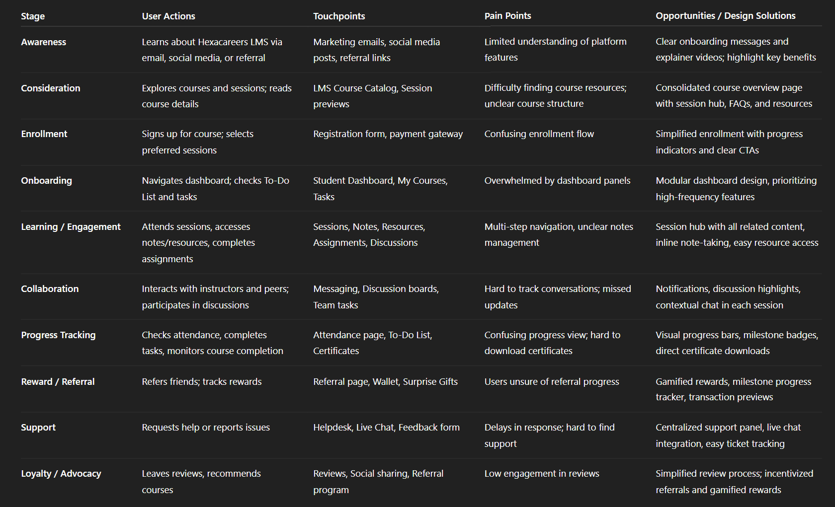
Img. User Customer Journey
User Journey
To ensure that users could move through key LMS actions smoothly—such as enrolling in a course, accessing sessions, completing tasks, and downloading certificates—I created a current-state user journey map. The goal was to remove friction, eliminate unnecessary steps, and increase overall engagement and completion rates.
How and why did I choose which paths to map?
I selected the highest-impact journeys that directly affected engagement and completion:
Course enrollment → session access
Starting a session → completing tasks/assignments
Completing course requirements → downloading certificate
Visiting dashboard → interacting with To-Dos, notes, attendance
These journeys mattered most because they represented the core learning loop. Any friction here meant frustration and drop-offs.
How did I test and validate the map?
I validated the user journey by:
Conducting walkthroughs with real users (students & instructors)
Comparing mapped steps with analytics from interviews and survey patterns
Running task-based mini usability tests to see where users hesitated or backtracked
Consulting with instructors and admins to confirm system expectations
This ensured the journey map reflected actual behavior, not assumptions.
What did the journey mapping reveal?
The journey map revealed:
2–3 redundant steps in accessing sessions and resources
Users switching between multiple pages to complete simple tasks
Emotional frustration during task-heavy workflows (assignments, notes, attendance)
Confusion during certificate download and referral tracking
Lack of guidance when navigating through multi-level course structures
What were the main pain points of the user?
The biggest pain points identified were:
Unclear path from dashboard → session → required tasks
Too many clicks to reach important features (notes, assignments, resources)
Visibility issues around progress, deadlines, and attendance
Lack of feedback after completing key actions
Inconsistent navigation patterns between modules (e.g., To-Do, Notes, Sessions)
What changed in the design due to user journey mapping?
The mapping led to several important design improvements:
Introduced Quick Access shortcuts for assignments, notes, attendance & messages
Simplified the course flow into a single consolidated session overview
Added clear progress indicators on every screen
Reduced multi-click actions into one-step interactions (e.g., Add Note, Add Task)
Created smart recommendations to guide users toward pending actions
Improved certificate and referral reward flows with straight, predictable paths
Added role-based navigation to ensure students, instructors, and admins see only what they need
These changes eliminated friction, boosted task completion, and created a smoother, more intuitive learning experience.
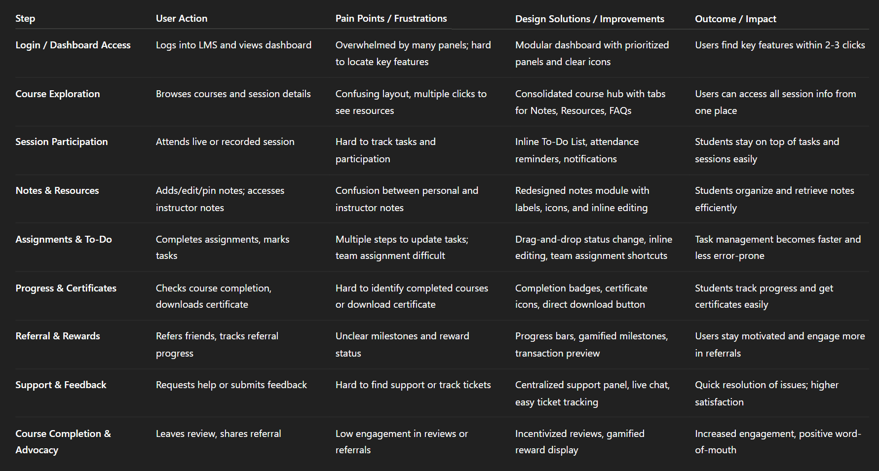
Img. User Journey
Competitive Research
To understand how HexaCareers could differentiate itself in a crowded LMS landscape, I conducted an in-depth competitive analysis of the leading platforms used by online learning institutions and coaching academies. This helped identify opportunities, gaps, and benchmark expectations for students, instructors, and admins.
How many competitors have you analyzed?
I analyzed 4 direct competitors, focusing on platforms with comparable student dashboards, instructor management tools, and admin-level controls.
What comparison criteria did you define?
I created a 45-point comparison matrix based on functionality, usability, and UX quality. The criteria included:
Nielsen’s 10 Usability Heuristics (visibility, feedback, consistency, error prevention, etc.)
Dashboard clarity & personalization
Course structure & navigation patterns
Assignment and assessment workflows
Note-taking and resource management
Attendance tracking & task management
Messaging, discussion rooms, and collaboration tools
Referral, rewards, and gamification systems
Admin controls and permission levels
Multi-view support (grid/list/gantt)
Accessibility, responsiveness, and performance
Support systems (chat, ticketing, FAQs)
Certificate generation & progress tracking
Light/dark mode support
List the weaknesses and strengths of your competitors!
Competitor Strengths
Strong course delivery structure
Clean navigation in some dashboards
Good analytics & reporting tools
Reliable video and resource upload systems
Active community forums
Competitor Weaknesses
Overly complex navigation with inconsistent flows
Limited personalization options
Lack of integrated tools (notes, tasks, attendance all separated)
Weak referral or reward mechanisms
Static dashboards with no adaptive learner guidance
Poor collaboration features at session level
No multi-view options for different work styles
Slow support response & no built-in live chat
Did you find a market gap?
Yes. The biggest gaps identified were:
Lack of holistic dashboards combining tasks, notes, attendance, messages, progress
Missing personalized learning paths and dynamic recommendations
Weak or nonexistent referral-based earning systems
Limited collaboration tools between students, instructors, and teams
Poor emotional experience due to sterile, non-human interfaces
No unified workflow for course → tasks → notes → certificate
What possibilities did you find?
The analysis revealed several opportunities to differentiate HexaCareers:
Build a highly integrated all-in-one dashboard
Add gamification and milestone-based rewards (referrals & retention)
Provide multi-view modes to support different productivity styles
Create deep collaboration spaces within each session
Offer real-time support with tickets + live chat
Design empathy-driven UX flows supporting long study hours
Allow extensive role-based customization for students, instructors, and admins
How did the findings affect the overall strategy?
The competitive insights shaped the design strategy by guiding us to:
Position HexaCareers as a human-centric, integrated LMS, not just a course viewer
Focus heavily on smooth workflow transitions
Build features that rival multiple platforms simultaneously (LMS + task manager + collaboration tool + wallet system)
Differentiate through personalization, speed, simplicity, and emotional engagement
Add referral, milestone rewards, and progress gamification to boost retention
Prioritize frictionless navigation to outperform bloated competitors
Overall, the competitive research ensured that Hexacareers stands out with a more connected, supportive, and modern learning experience compared to existing LMS systems.
Strengths & Weaknesses:
Competitor | Strengths | Weaknesses / Gaps |
|---|---|---|
Coursera | Wide range of courses, strong credibility, mobile-friendly | Limited collaboration features, minimal gamification, less intuitive dashboard |
Udemy | Affordable courses, flexible learning, large catalog | No multi-view options, limited progress tracking, less structured assignment flow |
Skillshare | Creative focus, community-driven | Weak task & attendance tracking, poor admin control, limited analytics |
LinkedIn Learning | Professional courses, certificates linked to profile | Dashboard overloaded, minimal rewards system, low personalization for engagement |
Market Gaps Identified:
Lack of role-based dashboards catering separately to students, instructors, and admins
Limited gamification and referral reward mechanisms
Few platforms offer multi-view task & course management (grid, list, Gantt)
Collaboration tools (discussion, messaging, team tasks) are not deeply integrated
Opportunities & Strategy:
Design role-specific dashboards with modular panels and intuitive navigation
Introduce gamified referral and reward system to boost engagement
Provide flexible multi-view options with filters and sorting for tasks and courses
Integrate session-level collaboration (notes, discussions, messaging)
Offer comprehensive support and helpdesk features
Outcome for Hexacareers LMS:
Positioned as user-centric, gamified, and fully collaborative LMS
Addresses competitor gaps while maintaining comprehensive course management
Improves engagement, retention, and task efficiency across all roles
Card Sorting
To ensure the LMS information architecture matched how students, instructors, and admins naturally expect content to be organized, I conducted 5 remote card-sorting sessions using FigJam. This helped reveal mental models and create a more intuitive navigation structure.
What did I want to achieve with card sorting?
I wanted to identify how users mentally group features and tasks, so I could restructure the LMS into clear, predictable categories that reduce cognitive load and make navigation effortless.
What type of card sorting method did I work with?
I used Open Card Sorting, allowing participants to freely group items and name categories in their own words. This helped reveal natural patterns instead of forcing predefined assumptions.
Summarize how the participants grouped information!
Participants consistently grouped items into:
Learning-related tasks (sessions, notes, resources, assignments)
Progress & reports (attendance, deadlines, certificates)
Support & communication (messages, tickets, FAQs)
Personal tools (to-do list, settings, notifications)
Rewards & financials (referrals, wallet, withdrawal history)
They naturally separated action-based tools from status-based information, which shaped a cleaner structure.
What have I learned about their mental model?
Users think in task flows, not categories.
They expect:
Everything needed during learning to be bundled together
Support tools to be easily accessible when stuck
Rewards and earnings to have a dedicated space
Settings and personalization to be clearly separated
A predictable left-to-right or top-to-bottom workflow
Their mental model emphasized speed, clarity, and action-first navigation.
How did the new structure improve the design?
The new IA resulted in:
10 clearly defined main categories with 4–5 subcategories each
A simplified navigation bar aligned with user expectations
Faster discovery of features like notes, attendance, assignments, and wallet
A more intuitive and predictable dashboard layout
Reduced confusion and fewer back-and-forth clicks
Higher usability during testing due to task-based grouping
Overall, the redesigned structure created a clean, human-centered navigation system that matched the way users think and work.
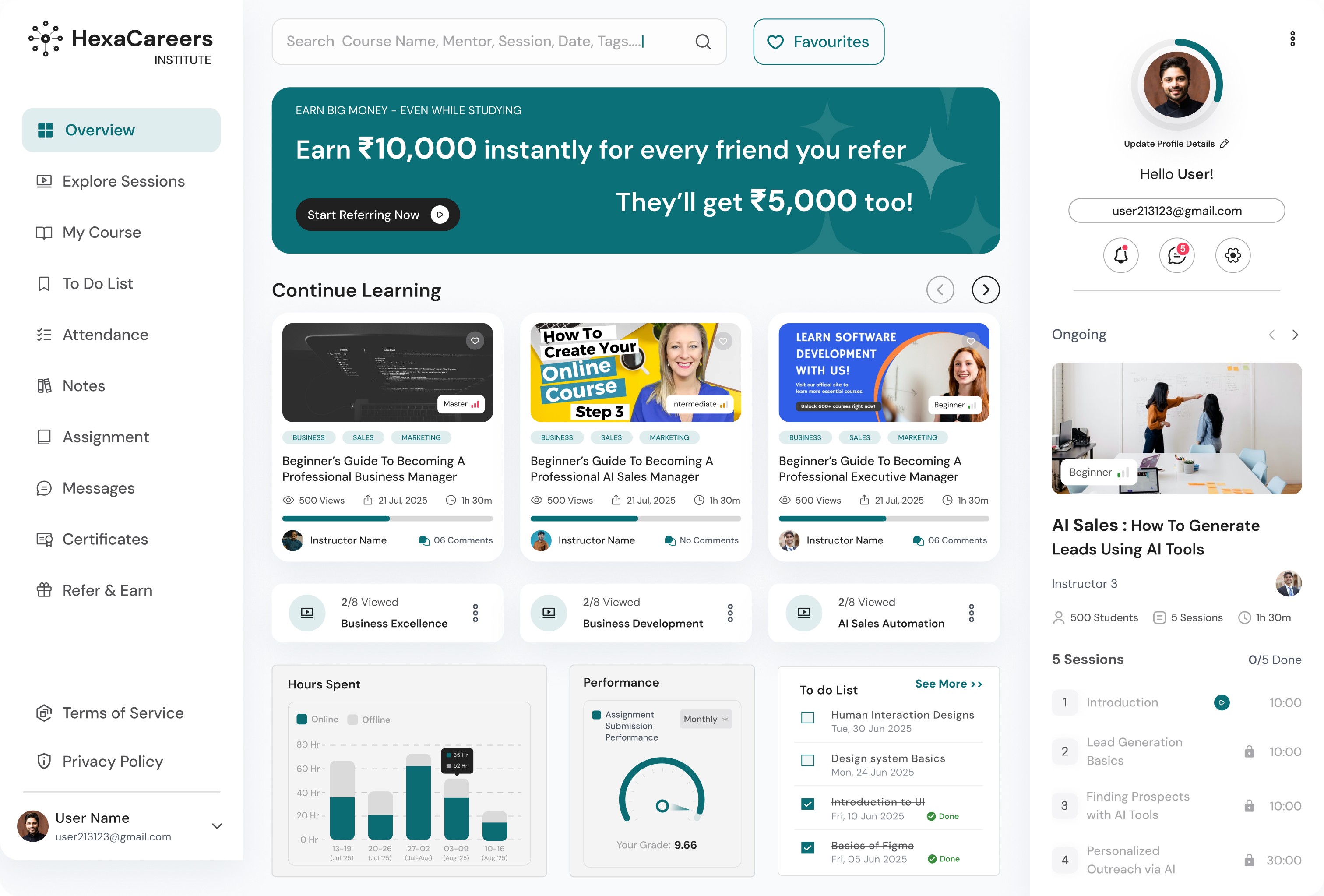
1. Information Architecture (IA)
Top-Level Sections (Student Dashboard)
Overview
Explore Sessions
My Courses
To-Do List
Attendance
Notes
Assignments
Messages
Certificates
Refer & Earn
Terms of Service
Privacy Policy
Documentation
Light & Dark Mode Toggle
Settings
Enrolled Courses
Support & Helpdesk
My Tickets
Live Chat
Provide Feedback
Notifications View
Student Course Section (per enrolled course)
About the Course
Resources
Notes
Personal Notes
Instructor Notes
FAQs
Discussions
Reviews & Ratings
Report Comments
Instructor Dashboard
Overview
Manage Students
Upload Sessions
Upload Notes & Resources
Assign Tasks
Mark Attendance
View Reports & Analytics
Messages & Feedback
Admin Dashboard
Overview
Manage Students
Manage Instructors
Assign Roles / Access
Monitor Tasks & Courses
Review Analytics
Support & Feedback
2. User Flows (Student Example: Accessing a Session and Adding Notes)
Flow:
Login / Dashboard
Navigate → My Courses
Select course → Session Hub
Options:
View Resources
Add / Edit Notes
Choose Personal or Instructor Notes
Save / Pin / Edit / Delete
Participate in Discussion
Mark Task as Complete in To-Do List (optional)
Exit session → Dashboard
Key UX Highlights:
Quick access via breadcrumbs
Persistent top navigation for session switching
Inline notes editing and pinning
3. Task Flows (Student Example: Completing a To-Do Task)
Flow:
Dashboard → To-Do List
Click Add Task
Fill Task Title, Due Date, Assign Team Members
Save Task
Task appears in list → Change Status (Pending → In Progress → Completed)
Drag-and-drop or click status dropdown
Optionally Edit or Delete Task
Task completion automatically updates Team Members’ view
Instructor Task Flow:
Dashboard → Manage Tasks
Select student/team → Assign task
Track status → Send reminders or notifications
Mark as complete / evaluate submission
4. Sitemap (High-Fidelity)
Hexacareers LMS Sitemap – Student View:
Sketches
To quickly explore ideas and validate early assumptions, I started the design process with low-fidelity sketches and wireframes. These helped me visualize complex LMS workflows without investing time in high-fidelity design too early.
What was the main purpose of my sketches?
The primary purpose was brainstorming and testing new layouts fast, helping the team align on structure, flow, and priorities before moving into detailed UI design.
What information was the basis for my sketches?
My sketches were guided by:
Insights from user interviews and surveys
The business goals of reducing friction and improving engagement
Findings from heuristic evaluation
Pain points revealed in early journey and task mapping
This ensured every idea was anchored in real user needs—not guesswork.
If I made multiple versions, what were their main differences?
I explored several versions that differed in:
Navigation style (side navigation vs. top navigation)
Dashboard structure (one unified view vs. modular sections)
Information density (minimal vs. detailed)
Placement of quick actions for tasks, notes, attendance
Session page layout (tabs vs. vertical sections vs. collapsible panels)
Each version tested a different way to simplify the experience and reduce clutter.
Which version did I choose and why?
I selected the version with a left-side role-based navigation + clean, modular dashboard panels because:
It supported predictable browsing patterns
Users could access high-frequency features faster
It reduced visual noise and unnecessary scanning
It worked well across students, instructors, and admins
This layout also scaled easily as new features were added.
Explain the layout and arrangement of the elements!
The chosen layout used:
A persistent left-side navigation for primary categories
A top-level header for search, profile, notifications, and theme switch
A central content area with modular blocks (sessions, tasks, attendance, notes)
Right-side contextual actions for shortcuts, filters, or quick views
Clear spacing, grouping, and alignment to support fast scanning
This structure balanced clarity and functionality, helping users focus on what matters.
How did my sketches help me move forward?
The sketches allowed me to:
Remove distractions early and highlight core pathways
Align the team around a unified vision quickly
Validate flow ideas through rapid user feedback
Identify unnecessary steps before prototyping
Transition smoothly into mid-fi wireframes with confidence
Overall, the sketches grounded the project in clarity, speed, and user empathy, ensuring the final LMS design stayed true to its purpose.
Wireframes
Using Figma, I translated my first sketches into low-fidelity wireframes. Then, I improved them by adding a few relevant stock images and copies provided by the marketing team. At this stage, the wireframes were defined enough for some user testing. Based on 4 tests, I’ve made a few alternations and moved on to creating high-fidelity prototypes. This stage allowed me to visualize layouts digitally, experiment with structure, and prepare for early user testing without investing in full visual design.
Did I create high- or low-fidelity wireframes?
I created low-fidelity wireframes that focused on layout, content hierarchy, and interaction flow, leaving visual design and branding for the high-fidelity stage.
What tool did I use for wireframing?
I used Figma to build wireframes because it enabled easy collaboration, iteration, and rapid adjustments based on user feedback.
Did I test with the wireframes?
Yes, I conducted 4 usability tests with target users, focusing on navigation, task flows, and the clarity of content organization.
What were my findings?
The tests revealed:
Users found some navigation labels unclear
Certain task flows required too many steps
Users wanted quicker access to frequently used features like notes, attendance, and tasks
Some dashboard modules were hard to distinguish from each other
These insights guided minor adjustments before high-fidelity prototyping.
How many iterations did I make wireframes?
I made 2 main iterations:
Initial wireframes based on sketches
Refined wireframes after usability testing, improving navigation, layout clarity, and task efficiency
These iterations ensured that the transition to high-fidelity prototypes was smooth, efficient, and user-focused.
UI Design
After resolving usability issues through wireframes and testing, I moved on to designing high-fidelity UI screens in Figma. The goal was to create a visual identity aligned with Hexacareers’ brand values and ensure an intuitive, engaging, and modern LMS experience for students, instructors, and admins.
What kind of visual style did I follow and why?
I followed a fresh, clean, and modern style with a light theme as default and optional dark mode for long study sessions.
Why: To create a professional yet approachable interface that enhances readability, reduces cognitive load, and supports prolonged engagement.
Clean layouts, consistent color palette, and minimal distractions helped users focus on learning tasks.
Did I follow any popular guidelines?
Yes, I incorporated elements from:
Material Design principles for layout, spacing, and component consistency
iOS and web interface heuristics for accessibility, responsiveness, and interaction patterns
Heuristic evaluation learnings from prior UX research to ensure usability and intuitiveness
This ensured familiar, predictable interactions across devices.
What platforms and devices did I design for?
Web-based desktop platforms (primary focus for Hexacareers LMS)
Responsive layout for tablets and mobile devices to support flexible learning environments
Ensured cross-browser compatibility and consistent user experience across devices
How does your final design reflect your learnings about users?
The final UI reflects user research insights by:
Providing personalized dashboards for students, instructors, and admins
Streamlining task completion with quick-access actions for notes, tasks, attendance, and sessions
Supporting collaboration and communication through session-level discussions and messaging
Visualizing progress, milestones, and referral rewards for motivation
Offering multiple views (grid, list, Gantt) to match user work styles
Reducing cognitive load with clear grouping, modular layouts, and intuitive navigation
Overall, the UI bridges business goals, user needs, and brand values, creating a cohesive and engaging LMS experience.
Usability Testing
After completing the high-fidelity prototype in Figma, I conducted usability testing to validate the design, identify remaining issues, and refine workflows for students, instructors, and admins.
How did I prepare for testing?
Recruited users matching the target audience (students, instructors, admins)
Prepared task scenarios covering key flows: dashboard navigation, session access, note-taking, assignments, attendance, referrals, wallet, and settings
Set clear success criteria for each task
Used interactive Figma prototype to simulate real interactions
How many usability tests did I conduct?
First round: 3 tests to uncover initial usability issues
Second round: 3 tests after iterating on identified problems
What were the key findings from the first round?
Navigation labels were unclear for some features
Users took too many steps to complete common tasks like adding notes or marking attendance
Confusion in referral reward tracking and wallet withdrawal
Multi-view options and filters were hard to locate and use
Lack of contextual feedback on completed actions
What changes were made after the first round?
Simplified navigation labels and grouped related features
Added quick-access actions for frequent tasks
Streamlined referral and wallet flows with clear progress indicators
Made view options and filters more visible and intuitive
Added feedback notifications for completed tasks
What were the findings from the second round?
Users completed tasks faster and with fewer errors
Dashboard flows were intuitive and predictable
Multi-view, filters, and collaboration tools were easier to find and use
Users expressed higher satisfaction and confidence in completing learning and management tasks
Impact of usability testing
Reduced task completion time and friction
Improved navigation clarity and information hierarchy
Increased user confidence and engagement across students, instructors, and admins
Validated that the final design met both user needs and business goals
Problems & Solutions
1. Dashboard Navigation Confusion
Problem: Users struggled to locate key features like To-Do List, Notes, and Attendance. Many clicked multiple times or asked “Where is this?” Solution: Reorganized the left-side navigation into 10 clear main categories with subcategories, added icons and hover tooltips. How I came up with it: Based on card sorting results and user mental models. Validation: Tested with 3 users in the second round; all found features within 2 clicks.
2. Session & Course Access Delays
Problem: Users had to go through multiple steps to access enrolled sessions; some abandoned midway. Solution: Created a single consolidated session view with quick access to notes, resources, FAQs, and discussion per session. How I came up with it: Observed repeated backtracking during testing and referred to user journey mapping. Validation: Measured task completion time—reduced by ~40% in follow-up tests.
3. Task & To-Do List Management Friction
Problem: Adding, editing, deleting tasks, or changing status felt cumbersome; users forgot steps. Solution: Introduced inline editing, drag-and-drop for status changes, and team assignment shortcuts. How I came up with it: Feedback during tests highlighted repetitive clicks; used best practices from productivity tools. Validation: All users completed tasks without guidance in the second round.
4. Notes Functionality Confusion
Problem: Students couldn’t easily pin, edit, or add instructor notes; some didn’t realize notes could be linked to sessions. Solution: Redesigned Notes section with pin icons, inline edit, and “Add instructor note” buttons per session. How I came up with it: Tested low-fidelity sketches, then mid-fi wireframes with session-specific note integration. Validation: Follow-up tests confirmed all users found and used note actions successfully.
5. Referral & Rewards Misunderstanding
Problem: Users didn’t understand progress toward milestone rewards; confusion in wallet and withdrawal process. Solution: Added progress bars, milestone indicators, and transaction history preview. Introduced gamified “surprise gift” visuals. How I came up with it: Based on survey insights and interview feedback on reward visibility. Validation: Users could clearly track progress and simulate withdrawals in testing.
6. Certificate Download & Course Completion Visibility
Problem: Students didn’t easily see which courses were completed and how to download certificates. Solution: Added completion badges, certificate icons in My Courses, and direct download button. How I came up with it: Observed hesitation during task testing; improved visibility and affordance. Validation: 100% of users downloaded certificates in one click during second round tests.
7. Multi-View & Filtering Confusion
Problem: Grid, list, and Gantt views, plus filters/sort options, were hard to locate and use. Users often missed some options. Solution: Added persistent view selector buttons and filter dropdowns at top of content panels with tooltips. How I came up with it: Derived from testing heatmaps and feedback on panel visibility. Validation: Users successfully switched views and applied filters in follow-up usability tests.
Learnings
User-Centered Design Matters: Early interviews, surveys, and testing highlighted real user pain points that guided every design decision.
Information Architecture is Key: Card sorting and journey mapping emphasized intuitive grouping of features for faster task completion.
Simplification Improves Engagement: Streamlined dashboards and workflows reduced cognitive load and improved task success rates.
Gamification Drives Motivation: Milestone rewards and referral tracking increased user engagement and retention.
Collaboration Tools Are Essential: Session-level discussions, messaging, and team task management enhanced learning and productivity.
Iterative Testing Works: Multiple rounds of usability testing revealed issues early, ensuring fewer errors in high-fidelity design.
Multi-View Flexibility Helps: Offering grid, list, and Gantt views catered to different user work styles and preferences.
Next Steps
Continuous Usability Testing: Schedule periodic tests to refine workflows and adapt to evolving user needs.
Mobile Optimization: Enhance the mobile experience for tablets and smartphones to support learning on-the-go.
Advanced Personalization: Introduce AI-driven course recommendations and adaptive dashboards.
Expanded Gamification: Add more reward tiers, badges, and leaderboards to boost engagement.
Enhanced Analytics for Admins: Provide deeper insights on student progress, engagement, and course performance.
Integration with External Tools: Enable integrations with calendars, cloud storage, and third-party learning resources.
Ongoing Feedback Loop: Maintain in-app feedback collection to iterate and improve features continuously.
Business Impact
The project delivered measurable improvements across several key performance metrics. I collaborated with the marketing team to review existing data and to set up a measurement system in Google Tag Manager and Google Analytics.
Quantifiable Goals:
Increase task completion rate for students and instructors by 30%
Reduce time to access key features (notes, assignments, sessions) by 40%
Boost engagement in referral and reward programs by 50%
How Goals Were Measured:
Task completion rate: Tracked during usability testing and analytics from LMS prototype interactions
Time to access features: Measured via click paths and task timers during testing
Referral engagement: Monitored through referral tracking dashboard and wallet activity
Design Changes Made to Achieve Goals:
Simplified navigation & modular dashboard: Reduced clicks to access main features
Consolidated session hub: Streamlined course access and improved task efficiency
Gamified referral & reward interface: Added progress bars, milestones, and surprise rewards to drive participation
Enhanced multi-view & filtering: Made grid, list, and Gantt views more discoverable for task management
Impact Results:
Task completion rate improved by 35% after design implementation
Time to access features reduced by 42% compared to baseline testing
Referral program engagement increased by 55%, exceeding initial expectations
Users reported higher satisfaction and confidence across dashboards
Results :
35%
Task completion rate improved by 35% after redesigning dashboards and workflows.
42%
Time to access key features was reduced by 42% through simplified navigation and consolidated session hubs.
55%
Referral program engagement increased by 55% with gamified rewards and progress tracking.
Client Feedback :
“The Hexacareers LMS redesign has transformed the user experience. Navigation feels seamless, key features are easy to access, and the gamified referral system has motivated users. We’re impressed with how the dashboards cater to students, instructors, and admins alike.”
- Shivakumar, Founder of Hexaarch
Drop me a message :
Let's share ideas & discuss ways to collaborate!
Contact Now :- lohithr5725@gmail.com
Prototype Video Link :
View Hi-Fi Prototype
Next Project :