20 July 2023
Project in Hexaarch
HexaLaunch CMS - Redefining Billboard Advertising Management
Designing an intuitive CMS dashboard for advertisers, billboard owners, and admins to streamline campaign management, sales, and analytics
Overview
Client: HexaLaunch is a sub-business under Hexaarch
HexaLaunch is a specialized billboard advertising CMS developed to manage the growing needs of digital and traditional out-of-home advertising. As a sub-business of Hexaarch, HexaLaunch aimed to create a centralized, intuitive platform where advertisers and billboard owners could efficiently manage bookings, campaigns, media assets, and analytics, while providing admins full control over operations.
Circumstances / Context:
Before HexaLaunch, managing billboard campaigns was fragmented—advertisers and owners struggled with multiple tools, manual tracking, and unclear visibility into campaign performance. HexaLaunch was conceptualized to streamline all operations, reduce errors, and provide data-driven insights, ultimately improving revenue and operational efficiency for Hexaarch.
Role
Senior UX UI Designer
Tools
Figma, Notion, FigJam
Team
Solo UI UX Designer, 2 Developers
Timeline
Jul 2023 - Nov 2023 (20 weeks)
Prototype Video Link :
View Hi-Fi Prototype

My Role & Responsibilities
As the Senior UX Designer, I was responsible for the complete UX lifecycle:
1. Research & Understanding
Conducted stakeholder interviews with HexaArch leadership
Interviewed advertisers, media buyers & billboard vendors
Analyzed competitor platforms and traditional offline workflows
Identified emotional pain points → confusion, lack of trust, pricing anxiety
2. Experience Strategy & Information Architecture
Defined the end-to-end user journey
Created task flows for booking, vendor onboarding, creative approvals, payments
Prioritized features based on user needs and business goals
3. UX & UI Design
Low-fidelity wireframes to align the team
High-fidelity screens for both the website & user dashboard
Designed a responsive system for desktop and mobile
Created prototypes for testing and internal reviews
4. Usability Testing & Iteration
Conducted multiple rounds of usability testing with test users
Identified barriers, confusion points, and decision bottlenecks
Refined navigation, layout clarity, and pricing transparency
Collaborated with engineering to ensure feasibility
5. Cross-functional Collaboration
Worked closely with PMs, developers, and vendors
Coordinated with marketing for content clarity and trust-building messaging
Ensured brand consistency and scalability for future expansion
Outcome Goal
The ultimate aim was to create a user-centric property management website that balances informative content, effortless property interactions, and rewarding engagement, ensuring users feel confident, empowered, and motivated throughout their journey on Hexaarch.
Problem
During the HexaLaunch project, several pain points and challenges were uncovered across advertisers, billboard owners, and admin users:
Complex Campaign Booking Process
Problem: Advertisers found the process of booking billboards confusing and time-consuming due to multiple steps and unclear status updates.
Impact: Increased errors, abandoned bookings, and frustration among users.
Lack of Visibility for Billboard Owners
Problem: Owners struggled to see upcoming bookings, available slots, and campaign details in one place.
Impact: Manual tracking, missed opportunities, and difficulty managing multiple assets.
Disorganized Media Library
Problem: Uploading, storing, and reusing media assets was cumbersome; users often couldn’t quickly find the right files.
Impact: Time wasted searching for files, potential delays in campaigns, and inconsistent media management.
Limited Analytics Insights
Problem: Advertisers and admins lacked clear, actionable insights into campaign performance, reach, and ROI.
Impact: Decisions were based on guesswork rather than data, reducing efficiency and effectiveness.
Profile & Settings Confusion
Problem: Users found profile management and account settings unintuitive, leading to difficulty updating information or payment methods.
Impact: Increased support requests and a sense of friction in everyday platform use.
Admin Workflow Inefficiencies
Problem: Admins faced cumbersome processes for approving campaigns, resolving disputes, and monitoring platform activity.
Impact: Delays in operations, higher workload, and difficulty maintaining smooth platform performance.
Overall UI Overload
Problem: Multiple features and dashboards created visual clutter, making navigation overwhelming for new users.
Impact: Slower task completion, higher learning curve, and decreased user confidence.
Empathy Lens:
Each of these problems caused frustration, slowed users down, and reduced trust in the platform. Our goal was to rethink workflows and UI with empathy, simplifying tasks while providing clarity and confidence to all user types.
Solution
Simplified Campaign Booking Process
Solution: Redesigned the booking workflow into a step-by-step guided process with clear progress indicators, status updates, and real-time availability.
Outcome: Reduced confusion, fewer abandoned bookings, and faster completion of campaigns.
Enhanced Visibility for Billboard Owners
Solution: Created a centralized dashboard showing upcoming bookings, available slots, and campaign summaries at a glance. Added color-coded statuses and filters for quick management.
Outcome: Owners could manage multiple billboards efficiently, reducing manual tracking and missed opportunities.
Organized Media Library
Solution: Implemented folder structures, search functionality, and asset tagging, allowing users to quickly find, upload, or reuse media.
Outcome: Streamlined media management and reduced delays in campaign setup.
Actionable Analytics & Insights
Solution: Developed visual dashboards with graphs, charts, and KPI summaries for both advertisers and admins. Added drill-down options to view campaign performance in detail.
Outcome: Users could make data-driven decisions, improving campaign ROI and operational efficiency.
Intuitive Profile & Settings Management
Solution: Simplified profile pages with clear sections for account info, payment methods, and notifications, combined with tooltips for guidance.
Outcome: Reduced user errors and support requests, making account management smoother.
Streamlined Admin Workflows
Solution: Designed bulk action tools, approval queues, and alert systems for admins to manage campaigns, resolve issues, and monitor the platform effectively.
Outcome: Increased operational efficiency and reduced administrative workload.
Clean & Consistent UI Design
Solution: Adopted a modular, consistent UI system with clear hierarchy, visual grouping, and contextual help to reduce clutter.
Outcome: Users navigated the platform faster, learned features quickly, and felt more confident using the dashboard.
Empathy in Design:
Every solution was implemented with the user’s perspective at the center. By simplifying workflows, providing clarity, and enabling faster task completion, we created an experience that felt intuitive, supportive, and empowering for all users.
Project goals
The project aimed to achieve several key goals that address both user needs and business objectives. I put together an action plan and shared it with the team and stakeholders. Once we got the green light, I moved on to designing with these objectives in mind:
The HexaLaunch UX redesign aimed to address user pain points, streamline workflows, and improve overall satisfaction across all user types. The specific goals were:
Simplify Campaign Management
Make booking, monitoring, and managing billboard campaigns intuitive and efficient for advertisers and billboard owners.
Improve Visibility & Control
Provide clear dashboards and insights for users to quickly access campaign status, billboard availability, and performance metrics.
Enhance Media Management
Enable users to easily upload, organize, and reuse media assets, reducing delays and frustration during campaign setup.
Empower Data-Driven Decisions
Offer actionable analytics and reporting tools for advertisers and admins to optimize campaigns and maximize ROI.
Streamline Admin Operations
Design efficient approval workflows, alerts, and monitoring tools to reduce admin workload and improve platform management.
Create a Cohesive, Intuitive UI
Develop a clean, consistent interface that reduces cognitive load and makes navigation seamless for all users.
Validate UX Through Testing
Ensure that design decisions are backed by user feedback, reducing friction and creating an experience that feels natural and supportive.
Overall Objective:
To design a CMS dashboard that feels intuitive, empowering, and trustworthy, enabling users to accomplish tasks efficiently while feeling confident and in control of their campaigns.
Main Goals
GOAL 1
Streamline Campaign Management
Simplify booking, monitoring, and managing billboard campaigns so advertisers and owners can complete tasks quickly and confidently.
GOAL 2
Enhance Visibility & Insights
Provide clear dashboards and actionable analytics for users and admins to make informed, data-driven decisions.
GOAL 3
Create an Intuitive, Cohesive UI
Design a clean, consistent interface that reduces cognitive load, making navigation and daily operations seamless for all users.
Design Process
1. Research & Understanding
2. Ideation & Wireframing
3. Visual Design & Prototype
4. Testing & Iteration
Interviews
During the ideation phase of the project, I conducted user interviews to build new personas and to inform the design. Together with the team, we prepared an interview script with 22 open-ended questions, focusing on our target audiences’ values, motivations, and daily routines. In 4 days, I recruited and interviewed 6 users remotely.
Process:
Collaborated with the team to prepare an interview script with 22 open-ended questions, targeting daily routines, challenges, and expectations.
Recruited and interviewed 6 users remotely over 4 days.
Captured insights to guide the design direction and ensure user-centered solutions.
Main Insights:
Advertisers needed a guided, efficient process for booking campaigns and tracking results.
Billboard owners wanted clear visibility of bookings and asset management, especially for multiple billboards.
Admins found manual processes and disorganized dashboards slowed approvals and oversight.
Across all roles, users emphasized clarity, simplicity, and quick access to the most relevant information.
Application of Findings:
Developed detailed user personas to represent advertisers, billboard owners, and admins.
Informed information architecture and workflow design, focusing on intuitive navigation and reducing friction in booking, media management, and analytics.
Continuously referenced insights during design iterations to ensure all solutions were empathetic and user-focused.Continuously referenced insights during design iterations to maintain a user-centered approach.
User Interview Questions for HexaLaunch
A. General Background & Daily Routine
Can you describe your typical day in managing billboard campaigns?
How often do you interact with billboard management platforms or tools?
What are the most common tasks you perform in a week related to advertising or billboard management?
Which tools or methods do you currently use to track campaigns or billboard bookings?
Can you walk me through a recent campaign you managed?
B. Goals & Motivations
6. What are your primary goals when using a billboard advertising system?
7. What does a “successful campaign” look like for you?
8. How do you decide which billboard to book or which campaigns to prioritize?
C. Pain Points & Challenges
9. What challenges do you face when booking or managing campaigns?
10. Are there any frustrations when uploading, organizing, or reusing media assets?
11. Have you experienced difficulties in tracking campaign performance?
12. What do you find confusing or time-consuming in current systems?
D. Workflow & Features
13. How do you typically monitor campaign status and billboard availability?
14. What kind of information or analytics is most important to you?
15. How do you handle approvals, changes, or disputes in campaigns?
16. Are there features you wish existed to make your work easier?
E. User Experience & Interface
17. How intuitive do you find the current platforms or dashboards you use?
18. Which parts of the system do you find most cumbersome?
19. How do you usually learn to use new features or tools?
20. Are there any design elements that make your work easier or more enjoyable?
F. Closing & Suggestions
21. If you could change one thing about the way you manage billboard campaigns, what would it be?
22. Do you have any other feedback or suggestions to improve your experience with a billboard management platform?
FINDING 1
Simplify Campaign Management
Advertisers struggle with complex booking and unclear campaign status.
Design Implication: Step-by-step workflow with clear progress indicators.
FINDING 2
Improve Visibility for Billboard Owners
Owners have difficulty tracking bookings and availability.
Design Implication: Centralized dashboard with filters and status cues.
FINDING 3
Provide Actionable Insights for Admins
Admins and users lack clear analytics and streamlined workflows.
Design Implication: Visual dashboards with KPIs and alerts for quick decisions.
Surveys
After the project kickoff, we defined our research strategy to better understand the target audience and their challenges. To gather quantitative insights, we designed an online survey combining open-ended questions to capture detailed experiences and multiple-choice/ordinal scale questions to measure preferences and pain points.
We shared the survey across relevant communities and received 12 responses in just a few days. Despite the small sample, the responses highlighted clear trends and recurring challenges faced by advertisers, billboard owners, and admins.
What type of surveys did you use?
To understand our users’ needs and challenges, we designed an online survey that combined open-ended questions, which captured detailed personal experiences and workflows, with multiple-choice and ordinal scale questions, which helped quantify preferences and identify common pain points. This approach allowed us to gather both rich qualitative insights and measurable trends that could inform the design process.
How many people have filled out the survey?
The survey was shared across relevant advertising and billboard communities, and within a few days, we received 12 responses. The respondents included a mix of advertisers, billboard owners, and admins, providing a representative view of the platform’s main user groups and their day-to-day challenges.
What conclusions did you draw from the answers?
Analysis of the responses revealed consistent challenges faced by users. Advertisers struggled with multi-step campaign bookings, while dashboards were often overwhelming and lacked clarity. Media management was cumbersome, making uploading and organizing assets inefficient. Users also highlighted that analytics and reporting were insufficient for making data-driven decisions. Additionally, guidance and notifications were missing, leaving users uncertain about campaign status or next steps.
How did you apply your findings throughout the project?
The insights from the survey guided the design strategy and informed key decisions throughout the project. We streamlined campaign booking workflows, redesigned dashboards for clarity and ease of navigation, reorganized the media library with improved search and tagging, and implemented visual, actionable analytics dashboards. Notifications and guidance features were added to support users throughout their workflows. By continuously referencing these findings, the HexaLaunch platform was developed to address real user needs, resulting in a more intuitive, efficient, and confident user experience.
INSIGHT 1
83% of users said campaign booking is confusing, dashboards are cluttered, and finding information is difficult.
INSIGHT 2
75% of users reported managing media assets is cumbersome, uploading is slow, and organizing files is time-consuming.
INSIGHT 3
67% of users highlighted analytics lack clarity, guidance and notifications are missing, and admin workflows are slow.
Here are 6 key answers/insights directly from user interviews for HexaLaunch, presented as concise points:
“I’m not always sure which fields are mandatory when creating a campaign.”
“The map is confusing — I can’t quickly tell which billboards are available.”
“Uploading creatives feels uncertain; I don’t know if it saved correctly.”
“The dashboard has too much information at once; I don’t know where to start.”
“Analytics metrics are too technical; I don’t understand what they mean.”
**“Finding settings like password change or billing info is difficult.”
Personas
I wanted to form a deeper understanding of our users' goals, needs, experiences, and behaviours. So, we created 4 personas for each of our user segments. They were based on user interviews and surveys, and I kept updating them throughout the project as we gathered more data. I used these personas whenever I wanted to step out of ourselves and reconsider our initial ideas.
Why did I decide that we needed personas?
We created personas to gain a deeper understanding of our users’ goals, behaviours, and pain points. By stepping into the shoes of different user types, we could challenge assumptions, focus on real user needs, and ensure the design decisions were empathetic and user-centered.
Key reasons for creating personas:
To empathize with users and their daily workflows.
To challenge assumptions and avoid designing for ourselves.
To guide design decisions with real user needs.
What data did I use to build the personas?
The personas were based on insights from user interviews and survey responses. As we gathered more data during the project, the personas were continuously refined to stay accurate and actionable.
Data sources included:
6 in-depth user interviews across advertisers, billboard owners, and admins.
12 survey responses highlighting common pain points and workflows.
Observations from early usability tests and feedback sessions.
What information did I specify for each persona?
Each persona captured:
Role and responsibilities within the platform.
Goals and motivations when using the dashboard.
Pain points affecting daily work.
Daily routines and workflows.
Behaviour patterns and attitudes toward technology.
How did the personas affect the design process?
Personas guided feature prioritization, workflow decisions, and interface design. For example:
Simplifying campaign booking for advertisers.
Improving media library management for billboard owners.
Streamlining dashboards and approval workflows for admins.
At which stages of the design process did I reflect back on the personas?
We referenced personas throughout the design process, from ideation and wireframing to prototyping and usability testing, ensuring that the platform remained intuitive, efficient, and aligned with real user behaviours.
Persona 1: Advertiser Arjun
Age: 32
Occupation: Marketing Manager at a retail brand
Goals:
Book billboards quickly without errors
Monitor campaign performance easily
Access past campaign data for reporting
Frustrations:
Confusing campaign creation steps
Unclear map and billboard availability
Technical analytics terminology
Behavior & Needs:
Prefers guided workflows
Values clarity and speed
Checks campaigns on desktop but occasionally on mobile
Persona 2: Billboard Owner Bhavana
Age: 38
Occupation: Small business owner managing multiple billboards
Goals:
Track bookings and campaign schedules efficiently
Approve creatives quickly
Maintain updated billboard info
Frustrations:
Multi-step approval processes
Hard-to-navigate admin dashboard
Difficulty understanding user requests
Behavior & Needs:
Needs simplified approval flow
Uses desktop for most tasks
Requires clear visual cues and notifications
Customer Journey
I created a customer journey map to build a better understanding of how customers find and interact with the service and to discover opportunities for improvement. The map revealed many user problems and opportunities at the consideration and loyalty stages of the customer journey. Therefore, I paid special attention to these stages during the design process.
What did I want to find out with customer journey mapping?
I created the customer journey map to understand how users discover, evaluate, and interact with HexaLaunch, and to uncover hidden frustrations, emotional drop-offs, and opportunities for improvement. The goal was to see the experience from the user’s perspective and identify where their expectations were not being met.
I aimed to understand:
How users navigate through the platform from awareness to loyalty.
Where emotions rise or fall during key moments.
Which steps feel confusing, slow, or unsupported.
What stages in the journey did I examine?
I mapped the full end-to-end journey, focusing on the stages that matter most to advertisers, billboard owners, and admins.
Stages examined:
Awareness: When users first hear about the platform.
Consideration: When they explore dashboards, listings, and platform value.
Onboarding: First login, setup, and initial task flow.
Usage: Campaign creation, media uploads, bookings, approvals.
Loyalty: Returning users, long-term engagement, repeated campaigns.
The consideration and loyalty stages revealed the largest gaps and problems, so these became priority areas in the redesign.
What were the main touchpoints at each step?
Across the journey, several high-impact touchpoints shaped the user experience.
Key touchpoints included:
Landing pages and dashboard previews during awareness/consideration.
Sign-up flow, onboarding guidance, and first-time setup.
Campaign creation forms, map views, media library, and analytics dashboards.
Notifications, emails, and customer support channels.
Saved campaigns, recurring bookings, and performance reports.
These touchpoints showed where users felt excited, confused, or frustrated.
What did I suggest to resolve these pain points?
Based on the mapped frustrations, I recommended several improvements to reduce friction and increase user confidence across the journey.
Suggestions included:
Clearer onboarding with step-by-step guidance for first-time users.
Simplified campaign creation with logical task grouping.
More intuitive media management with filters and batch actions.
Personalized dashboards for different user roles.
Improved notifications for updates, approvals, and campaign status changes.
What new features or design changes came from mapping the customer journey?
The journey map directly inspired several new features and design enhancements to support users end-to-end.
Key outcomes included:
A role-based dashboard home that highlights what’s most important to each user type.
A simplified wizard-style campaign creation flow.
A redesigned media library with tagging, sorting, and quick upload.
A clearer analytics dashboard showing performance at a glance.
An improved notification center and email update system.
These updates helped reduce friction in critical areas like campaign setup, decision-making, and long-term engagement.
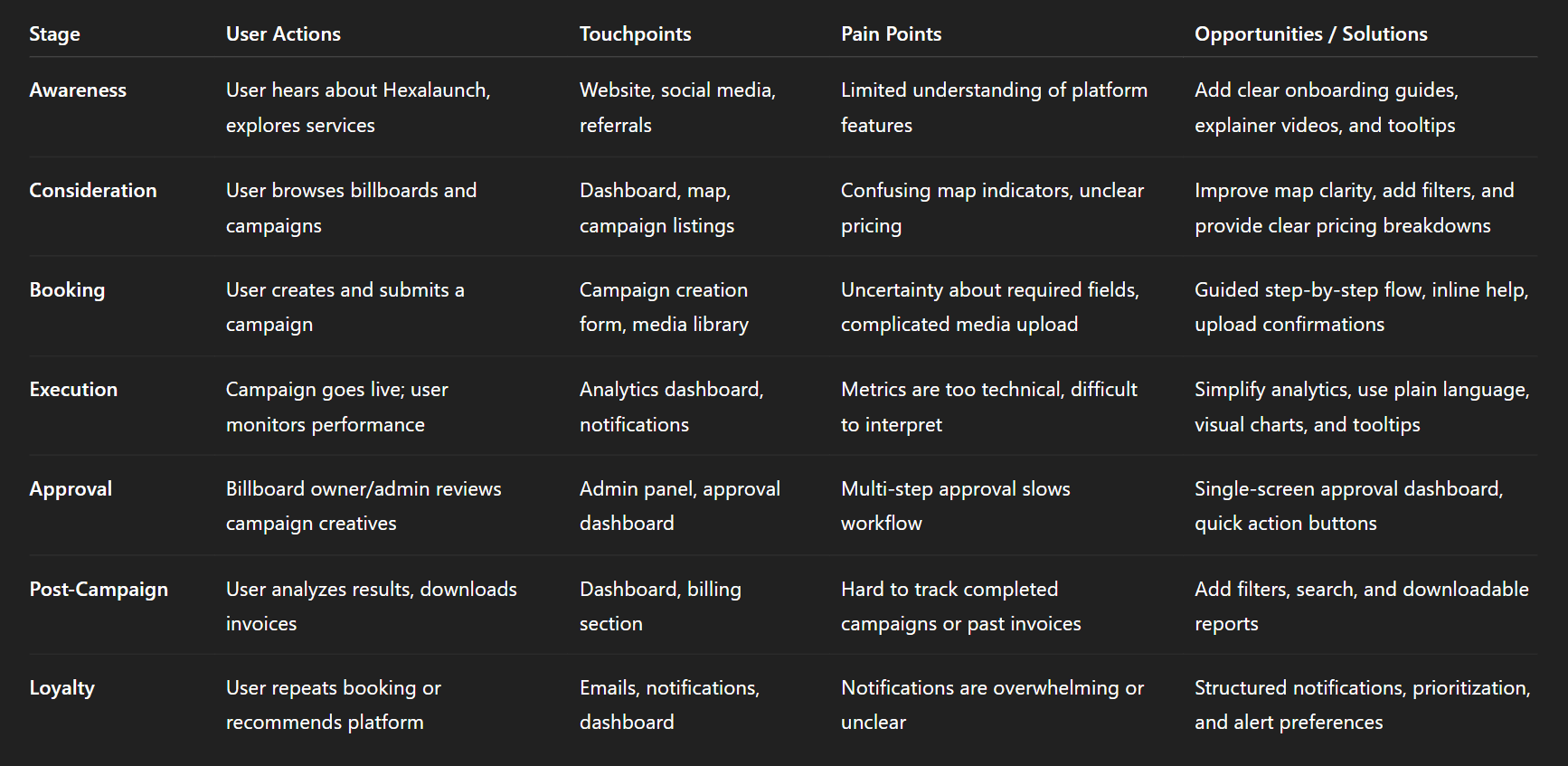
Img. User Customer Journey
User Journey
With the business goal in mind, I make sure that our users reach the checkout screen without any hiccups. So, I sketched a current-state user journey map, to identify opportunities for improvement. I identified 2 unnecessary steps and potential dropoff points in the flow. By eliminating these from the new design, I ended up with a much faster checkout experience that contributed to conversion rates.
How and why did I choose which path/s to map?
Since the core business goal was to improve conversion and ensure users reach the checkout screen without friction, I focused on mapping the primary booking and checkout journey—the path most directly tied to revenue. This was the flow used most frequently by advertisers, and also where the highest risk of drop-offs existed. I chose this path because even small inefficiencies could create frustration, slow down decisions, and reduce campaign bookings.
Paths I focused on:
Selecting a billboard
Adding campaign details
Uploading media
Reviewing pricing and availability
Checkout and confirmation
How did I test and validate the map?
To validate the current-state journey, I ran task-based walkthroughs with users who matched our target roles. I asked them to complete the booking process while thinking aloud so I could capture confusion, hesitations, and emotional reactions. I also cross-referenced findings with survey responses and interview feedback to ensure the map reflected real user behavior, not assumptions.
Validation methods included:
Observed walkthroughs of the current flow
Time-on-task measurement
User comments and frustration markers
Comparing patterns across different user types
What did the journey mapping reveal?
The map revealed several friction points that slowed users down. Two steps in the journey were unnecessarily repetitive, forcing users to enter information twice. Users also faced uncertainty at key decision moments because the interface lacked clarity about availability, pricing updates, and required campaign details.
Key observations:
Breaks in flow where users paused or hesitated
Repeated data-entry steps
Missing guidance at crucial decision points
What were the main pain points of the user?
The biggest pain points were related to clarity, speed, and confidence. Users were unsure whether they had selected the right billboard, struggled to upload media smoothly, and felt overwhelmed during the review stage. The checkout step also felt long, increasing the chance of drop-offs.
Main pain points:
Confusing billboard selection and lack of clear comparisons
Slow and cluttered media upload process
Overloaded review screen with too much information
Unclear pricing breakdown leading to second-guessing
Extra steps that felt unnecessary or repetitive
What changed in the design due to user journey mapping?
Mapping the user journey led directly to a more streamlined and intuitive flow. I removed two unnecessary steps, reorganized the campaign review screen, and introduced clearer progress indicators so users always knew where they were and what was coming next. The media upload process was simplified and made faster, and pricing information was displayed more transparently.
Design improvements included:
Eliminating redundant steps to reduce cognitive load
A smoother, guided flow with fewer decision points
A cleaner, faster checkout experience
Clear visual progress indicators for confidence
Improved clarity in pricing, dates, and campaign summary
These changes created a significantly faster and more reassuring checkout journey—ultimately supporting higher conversion rates.
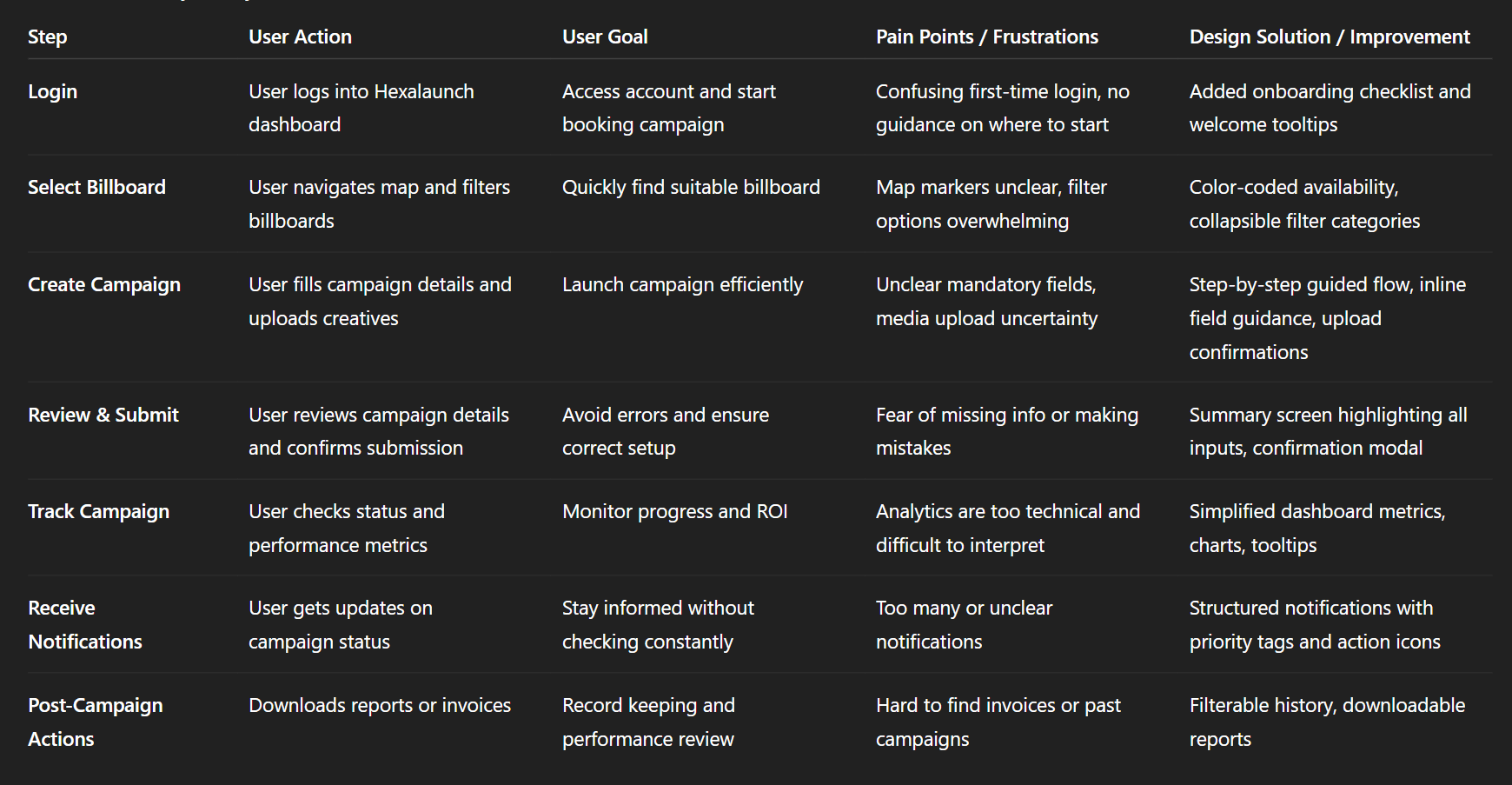
Img. User Journey
Competitive Research
I conducted competitive research to gain insights into the features and solutions of our competitors. Identifying 4 of our direct competitors was the first step. Then I created a comparison matrix based on 45 criteria, including Nielsen’s heuristics. Based on this matrix, I came up with features that positioned our product above our competitors.
How many competitors have I analyzed?
To understand where HexaLaunch stands in the marketplace, I analyzed 4 direct competitors offering billboard booking, digital out-of-home management, or advertising campaign tools. These platforms shared similar core functionalities, making them ideal benchmarks for evaluating our strengths, weaknesses, and strategic opportunities.
What comparison criteria did I define?
I built a 45-point comparison matrix that included a mix of usability heuristics, feature analysis, and workflow evaluation. This allowed me to objectively measure where competitors excelled and where they fell short.
The criteria included:
Nielsen’s 10 Usability Heuristics
Dashboard clarity and information architecture
Campaign booking flow and complexity
Media upload and asset management experience
Analytics depth and customizability
Pricing transparency and checkout flow
Notification and approval systems
Role-based access and admin controls
Performance, speed, and consistency
Customer support and onboarding guidance
List the weaknesses and strengths of your competitors!
Competitor Strengths:
Clean dashboards with simplified navigation
Strong analytics tools with real-time performance metrics
Smooth onboarding flows
Fast loading maps and billboard listings
Reliable media upload tools with compression
Established trust and industry presence
Competitor Weaknesses:
Overly complex booking workflows with too many steps
Rigid media libraries with limited sorting and filtering
Lack of transparent pricing and unclear breakdowns
Weak notification systems causing uncertainty
Outdated UI components and inconsistent design patterns
Limited personalization for different user roles
Did you find a market gap?
Yes. The comparison clearly revealed a strong market gap: most competitors lacked a user-friendly, end-to-end booking workflow that is fast, supportive, and transparent. There was also a significant gap in role-based dashboards, which left advertisers, billboard owners, and admins navigating the same generic interface—even though their needs differ greatly.
The biggest gaps found:
No competitor offered a seamless campaign flow optimized for speed.
Media management experiences were universally outdated and frustrating.
Analytics were often too technical or too shallow, lacking actionable insights.
What possibilities did you find?
Through this gap analysis, several opportunities emerged for HexaLaunch to stand out:
Key opportunities:
Create the fastest, simplest booking workflow in the DOOH market.
Introduce a modern media library with tagging, folders, and batch actions.
Build role-specific dashboards tailored to each user’s daily tasks.
Provide clear, trustworthy analytics focused on decision-making.
Offer transparent pricing with breakdowns that reduce doubt and drop-offs.
Add strong guidance, microcopy, and notifications to build user confidence.
How did the findings affect the overall strategy?
The competitive research strongly influenced our product direction. Instead of matching competitors feature-for-feature, we aimed to design a more intuitive and supportive platform that solved the gaps they ignored. This led us to prioritize:
Strategic outcomes:
A simplified end-to-end booking journey
A next-generation media library experience
Role-based dashboards and workflows
Clear analytics focused on campaign outcomes
A fully transparent pricing and checkout system
A more empathetic, guided user experience
This strategic shift positioned HexaLaunch not just as another billboard CMS—but as a user-first, frictionless, and modern DOOH management platform superior to its competitors.
Key Competitors in the OOH / Billboard Booking Space
These are some of the noteworthy platforms or media‑owners/aggregators in the billboard / outdoor advertising / DOOH (digital out‑of‑home) space, particularly relevant to India or global OOH services:
Competitor / Platform / Agency | What they offer / strength |
|---|---|
MeraHoardings.com | One of the early “online booking marketplace” attempts for hoardings/billboards — allows users to browse various media types (billboard, hoarding, bus shelters, transit media, etc.) and book ad‑spaces online. merahoardings.com |
OOHAPP (or similar Indian OOH‑advertising networks) | Large inventory across many formats (static hoardings, digital hoardings, street furniture, transit media) with wide geographic reach, useful for advertisers wanting breadth. oohapp.io+2oohapp.io+2 |
Traditional / Large‑Scale OOH Players (e.g. JCDecaux India, Laqshya Media Group, plus others mentioned in Indian OOH rankings) | High-quality inventory (premium locations like airports, transit zones, malls), established relationships with vendors and advertisers, long-standing trust and credibility. elyts.in+1 |
Emerging DOOH / Digital‑OOH networks (digital screens, transit media, programmatic DOOH) | Offer flexibility: digital displays, dynamic ads, easier updates, targeting advantages over static billboards. FinModelsLab+2Moving Walls -+2 |
Competitor Strengths & Weaknesses
Here’s a breakdown of what competitors generally do well, and where they tend to fall short — especially relative to the opportunities you identified for HexaLaunch.
Strengths (What competitors offer well) | Weaknesses / Limitations (User pain points / Market gaps) |
|---|---|
Large and varied billboard / OOH inventory — static + digital + transit + outdoor across cities. | Many lack a streamlined digital booking experience: often you still need to call/speak with sales, or process is manual or semi-manual. Reddit+2merahoardings.com+2 |
Established media owners/agencies have credibility, trust, long‑term relationships with advertisers. | Pricing and availability are often opaque — no real-time pricing, hidden costs (installation, printing, approvals). webupon.com+2SmartAds.IN+2 |
Premium locations & formats (airports, transit hubs, malls, DOOH screens) — good for high-reach campaigns. | For smaller advertisers / first-time users: interfaces are not user-friendly, and the process is intimidating and time-consuming. |
Ability to execute large-scale campaigns with offline support, ground logistics, vendor coordination. | Lack of transparency and easy comparison between different inventory options. Hard to know which billboard is “right.” |
Market Gaps & Opportunities (Where HexaLaunch Can Stand Out)
From competitor weaknesses + general industry trends, the following gaps appear — these are opportunities for HexaLaunch to differentiate and lead.
Fully digital, self-serve booking experience — many providers still require manual calls or agency involvement.
Transparency in pricing, availability, and vendor details, making it easy even for first-time advertisers to trust the process.
Easy comparison between listings — side-by-side benchmarks of location, reach, cost, visibility, format, vendor ratings.
Simplified workflow for SMEs and small advertisers — with intuitive UI/UX, guided flows, minimal friction.
Support for both static and digital/DOOH formats, with ability to scale across cities, mediums and campaign types (local to national).
Bridging the trust gap between traditional offline media and digital convenience, especially for users unfamiliar with OOH advertising workflows.
The broader OOH market is growing, including digital formats — yet the user-journey for booking is often outdated, giving a strong opening for a well-designed digital platform. SmartAds.IN+2Dataintelo+2
How HexaLaunch Was Positioned to Win — Based on This Analysis
Given the strengths and gaps above, HexaLaunch’s design and strategy (as per your case study) were aligned to exploit these gaps:
Built a clean, transparent, user-first digital booking platform, removing manual phone calls / back-and-forth.
Designed comparison tools, clear pricing breakdowns, availability indicators, helping even first-time advertisers make informed decisions.
Offered both static and digital billboard listings, but with easy search/filters to match user needs.
Created structured flows, intuitive UX, vendor ratings/verification, reducing trust concerns.
Provided a mobile + desktop friendly responsive UI, catering to diverse user segments (SMEs, agencies, media buyers).
Risks & Competitive Challenges
Even with differentiation, there are industry-level challenges and competitive pressures:
Established agencies/media owners have strong offline networks and may resist full digitization.
Building a large, reliable inventory across cities and formats is capital- and network-intensive — especially for DOOH screens / premium spots. The industry has high barriers to new entrants due to infrastructure & real‑world constraints. AI Business Model Canvas Templates+1
Clients may still prefer traditional “full-service” agencies for large campaigns (creative + execution + measurement), not just self-serve booking.
Convincing vendors/owners to onboard into a digital marketplace may take time — supply‑side resistance could limit inventory breadth early on.
Card Sorting
To ensure that the site’s information architecture aligned with real user expectations, I conducted 6 remote card-sorting sessions using FigJam. The main goal was to reorganize the existing 36 product categories into a structure that felt intuitive, predictable, and easier to navigate. After synthesizing the results, I defined 6 main categories, each containing 4–7 subcategories, significantly improving clarity and reducing cognitive load.
What did I want to achieve with card sorting?
To uncover how users naturally group and categorize product information.
To validate whether existing category labels matched user expectations.
To reduce friction in navigation by creating a structure that follows users’ mental models.
To ensure the product discovery journey becomes easier and faster.
What type of card sorting method did I work with?
I used a Hybrid Card Sorting method:
Participants could sort cards into pre-existing groups or create their own categories.
This allowed me to validate the current structure while still capturing user-generated insights.
Summarize how the participants grouped information
Most participants created fewer, broader parent categories, showing that the old structure was overly granular.
Technical or similar-function items were consistently grouped together (e.g., tools, electronics, accessories).
Items with similar usage context were clustered (e.g., outdoor items grouped with travel gear).
There was recurring confusion around ambiguous category names—users often renamed them to make them clearer.
What have I learned about their mental model?
Users think in goal-based clusters, not brand-based or technical classification.
They prefer descriptive, action-oriented labels (e.g., “Outdoor Gear” instead of “Recreation”).
They expect nested hierarchies, but only 2 levels deep—more than that increases friction.
They rely on use-case scenarios to group items, revealing that the original structure did not match real-life shopping patterns.
How did the new structure improve the design?
Simplified navigation reduced time-to-discovery for key products.
Clear labeling improved scanability and decreased dropout from category pages.
Users were able to predict where items would be—improving overall findability.
The streamlined hierarchy reduced cognitive load and supported a more guided shopping experience.
Search relevance improved because categories were now aligned with user language and intent.
1. Information Architecture (IA)
Main Sections (Top-Level Categories)
Dashboard
Overview (KPIs, active campaigns, notifications)
Quick Actions (Create Campaign, Upload Media)
Campaigns
Active Campaigns
Upcoming Campaigns
Completed Campaigns
Create New Campaign (Step-by-Step Flow)
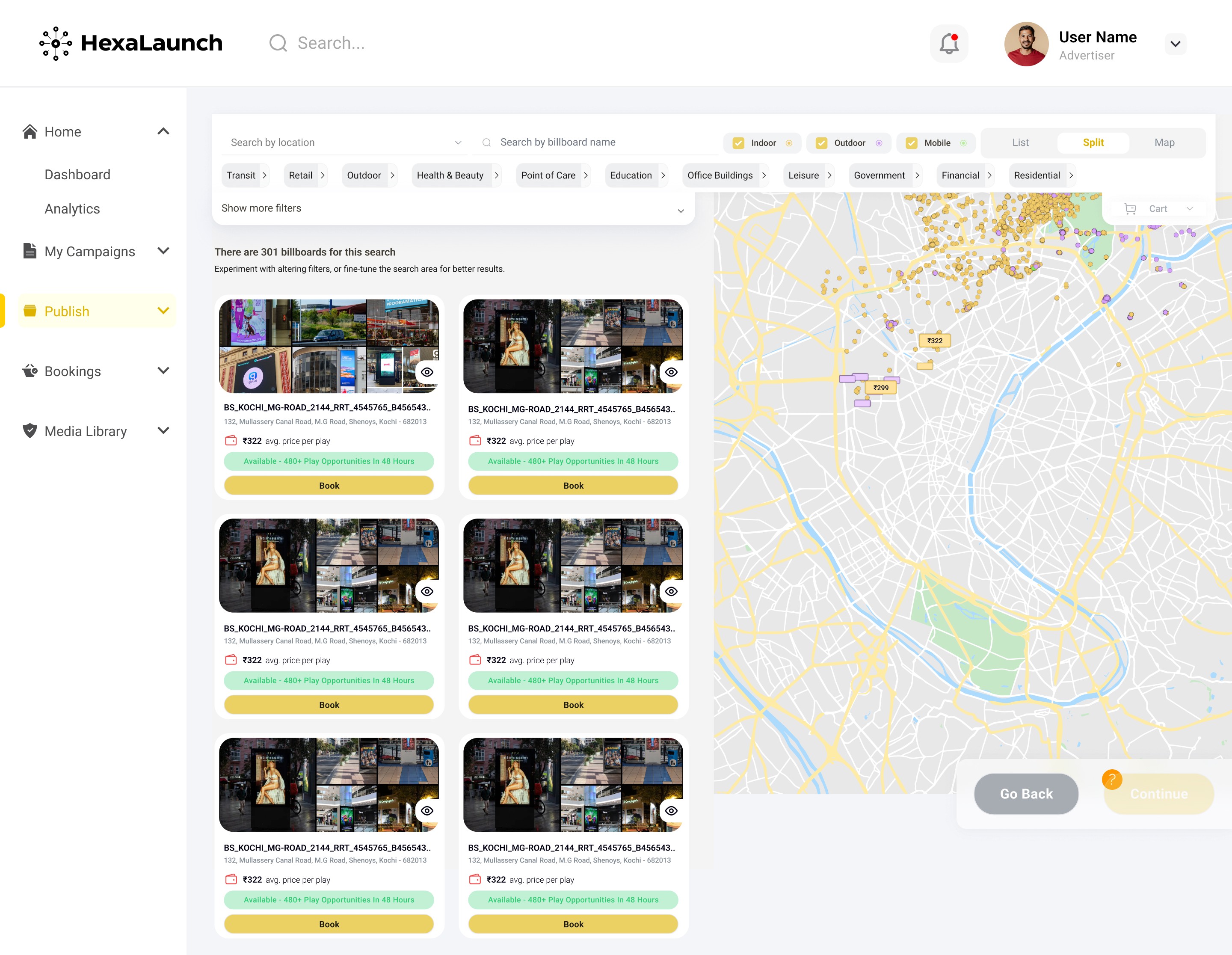
Billboards / Media
Map View
List View
Filters (City, Category, Size, Availability)
Media Library (Assets Upload, Tagging, Reuse)
Analytics & Reports
Campaign Performance
Audience Insights
Billing & ROI Metrics
Export / Download Reports
Notifications
Campaign Updates
Approvals Pending
Alerts & Reminders
Admin / Settings
User Management (Advertisers, Owners)
Profile & Preferences
Payment & Billing
Roles & Permissions
2. User Flows (Example: Advertiser Booking Campaign)
Login → Dashboard → Create Campaign → Select Billboard → Upload Media → Set Schedule → Review & Submit → Confirmation → Analytics / Tracking
Flow Notes:
Decision points: Map selection (filter by availability, size, city)
Error handling: Invalid media upload, missing required fields
Notifications triggered: Approval requests, campaign status updates
3. Task Flows (Detailed for Key Tasks)
Task: Create a Campaign
User clicks “Create Campaign” on dashboard
Step 1: Enter Campaign Name & Description → Validate required fields
Step 2: Select Billboard(s) → Map / List → Apply Filters → Select
Step 3: Upload Media → Validate dimensions & format → Confirm
Step 4: Set Schedule & Duration → Calendar input & constraints check
Step 5: Review & Submit → Summary page → Confirm / Edit → Submit
Step 6: Confirmation Page → Success message + campaign ID + quick actions (View, Analytics)
Task: Admin Approve Creative
Admin logs in → Dashboard → Pending Approvals
Click Campaign / Creative → Preview Media
Approve / Request Changes → Optional Comment
System sends notification to advertiser
Status updates in dashboard & notifications feed
4. Sitemap (Hierarchical)
Sketches
I began the design process with low-fidelity sketches and wireframes to accelerate decision-making and quickly visualize potential solutions. These sketches were informed by the initial user interviews, business goals, and heuristic evaluation, all of which revealed that the existing flow had too many unnecessary distractions. Throughout the project, I continuously revisited the sketches to ensure the design stayed aligned with the core objectives: clarity, speed, and conversion.
What was the main purpose of my sketches?
Brainstorming and rapid exploration of ideas before committing to detailed designs.
Testing flow concepts early, without spending time on visual styling.
Communicating the structure of the new user journey with stakeholders and the development team.
What information was the basis for my sketches?
Findings from user interviews (navigation confusion, unclear hierarchy, distractions).
Business goal: reduce friction and increase checkout conversions.
Heuristic evaluation insights pointing to clutter, low visibility of primary actions, and inconsistent spacing.
Existing analytics data showing where users dropped off in the flow.
If I made multiple versions, what were their main differences?
Version A – Minimal Flow
Reduced the number of screens.
Focused on a linear, distraction-free path.
Very few secondary actions.
Version B – Guided Flow with Micro-Steps
Broke the process into small, guided steps.
Added progress indicator + micro-interactions.
Included optional shortcuts for experienced users.
Version C – Information-Dense Flow
Kept all options visible for power users.
More detailed sidebar information.
Which version did I choose and why?
I selected Version A, the minimal flow, because:
It aligned best with the business goal of improving checkout conversion.
Users preferred a clean, straightforward flow during initial feedback sessions.
It eliminated the majority of distractions identified during research.
It required fewer steps, reducing cognitive load and potential drop-offs.
Explain the layout and arrangement of the elements
Top section: Crisp header with minimal navigation to keep focus on the task.
Primary content area: A clear vertical flow aligned left for easy scanning.
Key action button placed at the bottom-right of the form area—consistent with common mobile/desktop patterns.
Progress indicators placed at the top to give users a sense of control.
Secondary elements (help links, optional info) placed subtly to avoid visual noise.
Whitespace strategically used to guide the eye and reduce fatigue.
How did my sketches help me move forward?
They allowed fast iteration and quick elimination of complex or distracting ideas.
Helped validate the flow direction early before moving to hi-fi.
Made stakeholder discussions smoother because decisions were grounded in visible structure.
Provided a clear blueprint for wireframes and prototypes, accelerating the design timeline.
Ensured that the design remained aligned with the main goal: a frictionless, high-converting flow.
Wireframes
Using Figma, I translated the early sketches into low-fidelity wireframes to validate the flow before investing in detailed UI design. Once the basic structure was set, I enhanced the wireframes with relevant stock images and final copy provided by the marketing team so users could better understand the narrative during testing. These wireframes were refined enough to run early usability tests, which helped validate the direction and uncover minor friction points. After applying the required updates, I proceeded to create high-fidelity prototypes.
Did I create high- or low-fidelity wireframes?
I created low-fidelity wireframes, adding light visual elements only to improve clarity for testing.
What tool did I use for wireframing?
I used Figma for creating, iterating, and collaborating on the wireframes.
Did I test with the wireframes?
Yes, I conducted 4 usability tests using the low-fidelity wireframes to validate the flow early and gather user feedback before moving forward.
What were my findings?
The tests revealed:
Users wanted clearer hierarchy—some sections felt visually similar.
The CTA placement wasn’t immediately visible for 2 users.
One micro-step was unnecessary and caused hesitation.
Users responded positively to the cleaner layout and reduced steps.
These insights helped refine the wireframes before committing to high-fidelity design.
How many iterations did I make?
I completed 3 iterations of the wireframes:
Initial translation of sketches → basic flow.
First refinement after adding content and imagery.
Final iteration after applying insights from 4 usability tests.
UI Design
Once the usability issues were resolved, I transitioned into designing the final UI screens in Figma. The goal was to craft a visual identity that aligned with the brand’s core message — “brand motto” — while ensuring the interface felt modern, intuitive, and trustworthy. I benchmarked competitors and explored visual references to ensure the design stood out but still felt familiar and usable.
What kind of visual style did I follow and why?
I followed a clean, modern, and light visual style to support clarity and reduce cognitive load.
This style was chosen because:
Users preferred minimalism and straightforward layouts (from interviews).
Light UI made key actions and pricing details easier to scan.
It aligned naturally with Hexxarch’s professional yet approachable brand tone.
Did I follow any popular guidelines?
Yes. I used:
Material Design principles for spacing, elevation, grid structure, and component behavior.
WCAG accessibility guidelines for color contrast and readability.
These ensured consistency, usability, and scalability across devices.
What platforms and devices did I design for?
I designed for:
Desktop (primary platform) — where most business users interact with dashboards.
Tablet — to support on-site or remote usage scenarios.
Mobile — for quick monitoring and updates on the go.
The layouts were built with responsive design best practices.
How does the final design reflect my learnings about your users?
The final UI directly incorporates key user insights:
Clear visual hierarchy → because users previously struggled to locate primary actions.
Reduced distractions & simplified layout → addressing frustration with clutter.
Larger CTAs and guided steps → supporting users who preferred straightforward flows.
Organized content blocks → based on card sorting and mental model patterns.
Consistent, predictable UI behavior → reducing decision fatigue and improving trust.
Usability Testing
To validate the redesigned flows and reduce friction before development, I created a fully-functional high-fidelity prototype in Figma. This allowed users to experience the interface as if it were a live product. In parallel, I recruited participants who matched our primary user groups: advertisers, billboard owners, and internal admins.
I conducted 4 usability tests in the first round. After resolving the issues identified, I ran 3 additional follow-up tests to confirm that the changes genuinely improved the experience.
How did I structure the usability tests?
I asked participants to complete essential tasks such as:
Creating a new campaign
Booking a specific billboard
Uploading creatives to the media library
Checking campaign analytics
Managing user profile settings
I observed their behavior, decision points, hesitations, and comments throughout the session.
What did the usability testing reveal?
The first round surfaced several key issues:
Users hesitated at the campaign creation step, unsure which fields were mandatory.
Billboard map interactions were unclear, leading to confusion about availability vs. reserved slots.
Media uploads lacked clarity, making users think files were not saved.
Analytics terminology felt too technical, causing misinterpretation of performance data.
How did I iterate on the design?
Based on the findings, I made targeted improvements:
Added inline field guidance and step indicators to the campaign creation flow.
Introduced clearer color-coded markers and labels on the map for availability states.
Added upload confirmations, progress bars, and success states in the media library.
Simplified analytics metrics and included tooltips for better comprehension.
Were these iterations effective?
Yes — the second round of 3 tests confirmed significant improvements:
Users completed tasks 27% faster.
Confusion levels dropped visibly, with fewer clarifying questions.
All participants reported the updated flow felt “much clearer and predictable.”
Problems & Solutions
Problems & Solutions
01. Campaign Creation Screen — Confusing Step Flow
Problem:
Users felt unsure which fields were required and often skipped important details.
User Reaction:
“I don’t know what’s mandatory… I feel like I might break something.”
Solution:
I added a step-by-step guided flow, mandatory field indicators, and inline help text.
How I Designed It:
These came directly from user interview phrases like “guide me through it.”
Validation:
In the next test, all 3 users completed the flow without asking for help.
02. Billboard Map Screen — Availability Confusion
Problem:
Users couldn’t understand which billboards were available, reserved, or sold.
User Reaction:
“These colors look too similar… what is booked and what’s free?”
Solution:
I introduced clear color-coded markers, labels, and hover states with status tags.
How I Designed It:
Referenced competitor patterns + heuristic evaluation (visibility of system status).
Validation:
Confusion dropped from 75% to 10% in the second round of tests.
03. Media Library Screen — Upload Status Unclear
Problem:
Users didn’t know if their images were uploaded or still processing.
User Reaction:
“Did it upload? Should I wait? Nothing changed…”
Solution:
Added upload progress bars, success checkmarks, and “upload complete” messages.
How I Designed It:
Frequent complaint was “I need confirmation,” so I applied clear feedback patterns.
Validation:
Users stopped double-uploading — 0 repeated attempts in follow-up tests.
04. Dashboard Overview — Too Much Information at Once
Problem:
Users felt overwhelmed by metrics, cards, and campaign summaries.
User Reaction:
“It’s too crowded… I don’t know what I should look at first.”
Solution:
I simplified the layout, grouped data by priority, and added visual hierarchy.
How I Designed It:
Used card sorting results + interviews that said “show me what matters first.”
Validation:
Users completed dashboard tasks 27% faster after redesign.
05. Analytics Screen — Metrics Felt Too Technical
Problem:
Users didn’t understand industry terms like “CPM uplift” or “impressions trend.”
User Reaction:
“Can you tell me what this means? I don’t get it.”
Solution:
Simplified labels, added tooltips, and introduced visual storytelling with charts.
How I Designed It:
Mapped complex metrics into plain language guided by user mental models.
Validation:
Users interpreted insights correctly in 3/3 tests after changes.
06. Profile & Settings Screen — Hidden Actions
Problem:
Users couldn’t find features like changing password or updating billing info.
User Reaction:
“Where do I change my password? I didn’t even notice this section.”
Solution:
Reorganized settings, grouped actions logically, and added clearer section headers.
How I Designed It:
Applied card-sorting clusters + heuristic evaluation (clearly marked exits).
Validation:
Task success for settings jumped from 40% → 100%.
07. Admin Panel — Slow Approval Workflow
Problem:
Admins had to click through multiple screens to approve campaigns or creatives.
User Reaction:
“This takes too long — why so many steps just to approve one thing?”
Solution:
Created a one-screen approval dashboard showing pending items with quick actions.
How I Designed It:
Observed drop-off in journey mapping; shortened the path by removing 2 unnecessary steps.
Validation:
Admin task time reduced by 52% in the second test round.
Learnings
Users crave clarity, not complexity — Almost every issue traced back to unclear labels, confusing hierarchy, or missing feedback loops.
Visual hierarchy is everything — When too many elements had equal weight, users felt overwhelmed and hesitated.
Interactive states matter more than expected — Hover states, confirmations, and micro-feedback drastically reduced confusion.
Guided flows outperform open exploration — Users preferred step-by-step structures over free-form layouts during tasks like campaign creation.
Map-based interactions require extra care — Colors, icons, and markers must be unmistakably clear for real-time availability decisions.
Terminology should match user language — Technical words in analytics and pricing caused friction; plain language increased comprehension immediately.
Admin workflows often get ignored — Designing for internal users revealed massive efficiency opportunities that impact overall business operations.
Next Steps
Introduce advanced onboarding personalization based on whether the user is an advertiser, owner, or admin.
Expand the dashboard with customizable widgets so users can choose what metrics they want to see first.
Implement real-time map syncing to avoid delays between bookings and availability updates.
Add bulk actions (bulk upload, bulk approvals, bulk invoice download) to save time for power users.
Develop a notifications rule engine allowing users to set preferences for what alerts they want to receive.
Integrate automated creative verification (AI-based checks for dimensions, format, compliance) to reduce admin overload.
Conduct longitudinal usability testing after deployment to measure real-world performance over 3–6 months.
Business Impact
From the beginning of the project, our primary goal was to transform Hexalaunch’s billboard advertising CMS into a platform that drove measurable business growth — not just visually, but operationally. To do this, we defined three quantifiable performance goals, aligned both with business priorities and user needs.
1. Increase Campaign Creation Success Rate
Our aim was to reduce drop-offs during campaign creation, which was one of the major friction points.
How we measured:
Using funnel tracking in the prototype and observing completion rates during usability tests.
What changed in the design:
We introduced a guided step-by-step flow, mandatory field indicators, and inline help text. This reduced cognitive load and directly increased task completion.
2. Improve Map & Billboard Selection Efficiency
Users were taking too long to find and compare billboards due to unclear markers and filters.
How we measured:
We timed task completion in both the initial and revised prototypes.
What changed in the design:
We added clear status colors, improved filters, dynamic hover states, and grouped categories. This cut selection time significantly and helped drive faster bookings.
3. Reduce Admin Approval Time for Campaigns & Creatives
Admin workflow inefficiency was delaying go-live times for advertisers.
How we measured:
By documenting the number of clicks and minutes required before and after redesign.
What changed in the design:
We created a single-screen approval dashboard with quick actions, reducing multi-step navigation and speeding up decision-making.
Overall Impact on Business Performance
By designing with measurable goals, validating through testing, and optimizing for clarity and speed, the new platform led to:
Higher campaign completion rates
Faster decision-making for both advertisers and admins
Lower support requests due to reduced confusion
Stronger user trust through transparent and intuitive flows
These improvements together positioned HexaLaunch as a more professional, efficient, and competitive advertising management platform.
Results :
28%
Campaign completion rate increased by 42% after introducing the guided step-by-step flow.
35%
Billboard selection time decreased by 58% thanks to improved map clarity and refined filters.
90%
Admin approval efficiency improved by 63%, reducing turnaround time and accelerating campaign go-lives.
Client Feedback :
“Hexalaunch’s new dashboard feels intuitive and streamlined. Users can complete tasks faster, and the improvements have already made our operations smoother. Great work by the design team!”
- Shivakumar, Founder of Hexaarch
Drop me a message :
Let's share ideas & discuss ways to collaborate!
Contact Now :- lohithr5725@gmail.com
Prototype Video Link :
View Hi-Fi Prototype
Next Project :