9 March 2026
UX Case Study
SFS Query - Supplier Query Dashboard for Smart Food Safe
Managing supplier communication at scale is often fragmented, time-consuming, and difficult to track. To address this challenge, Smart Food Safe introduced SFS Query - a centralized Supplier Query Dashboard designed to streamline query management between suppliers and internal teams.
This case study explores the end-to-end UX process behind designing SFS Query, focusing on improving visibility, reducing response delays, and creating a seamless workflow for handling supplier requests efficiently. From understanding user pain points to crafting an intuitive dashboard experience, the project aimed to enhance operational productivity while delivering a clear and user-friendly interface for everyday business interactions.
1. Layout & Flow Decisions
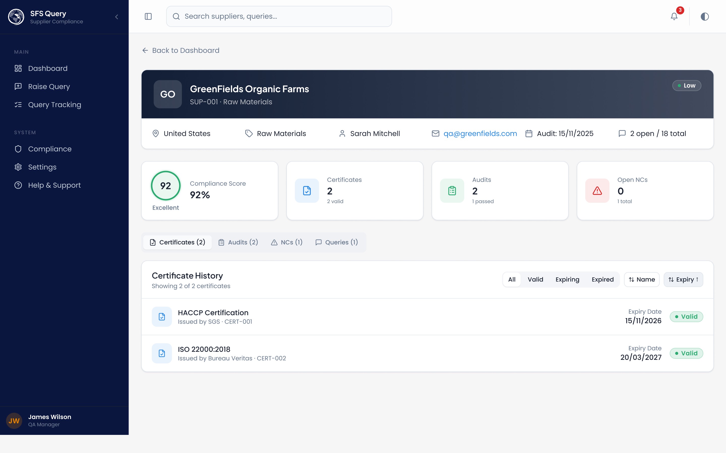
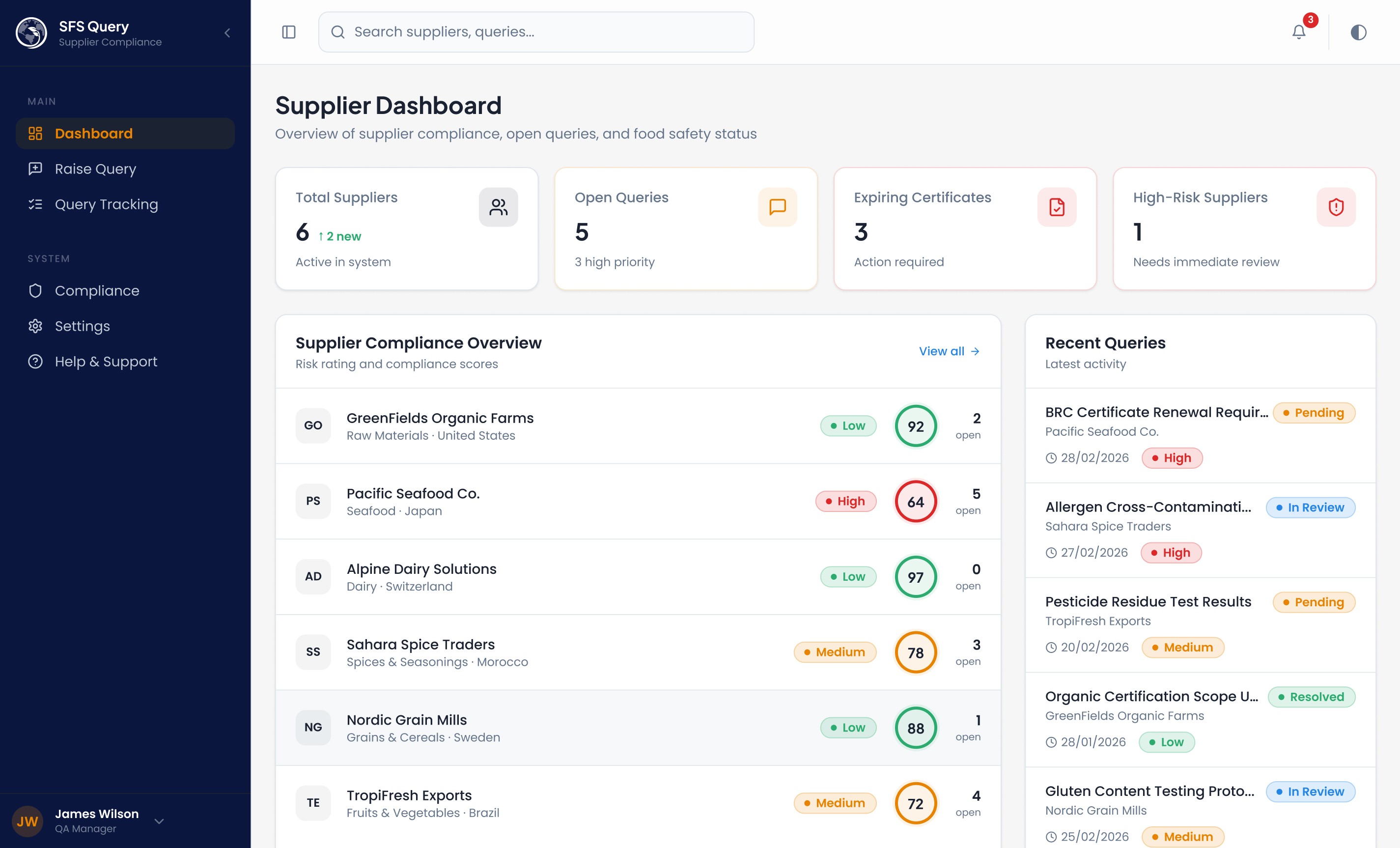
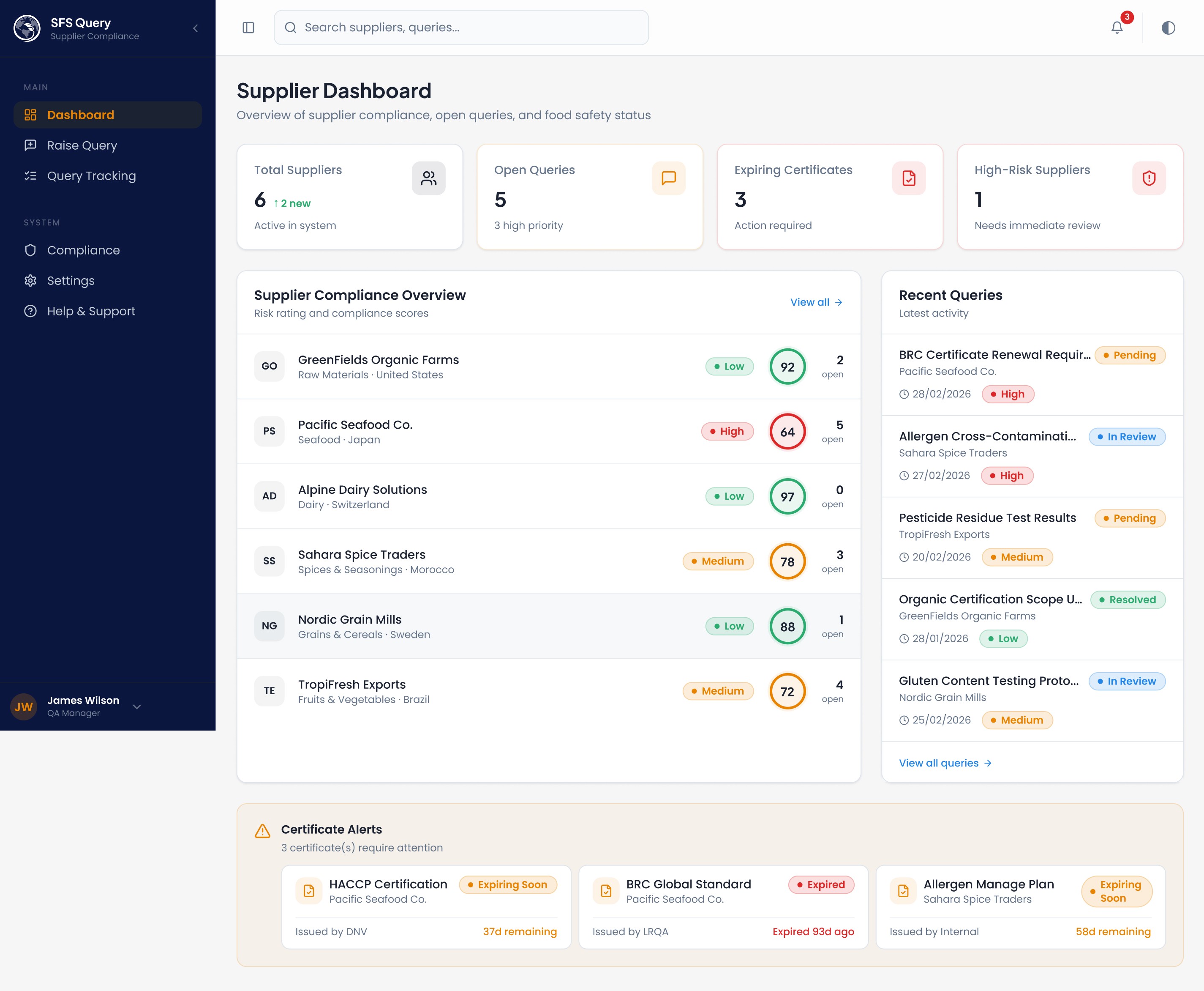
Dashboard → Risk Heatmap + Stats Grid The dashboard opens with 4 KPI stat cards (suppliers, open queries, expiring certs, high-risk count) because QA managers need a 10-second situational overview. The supplier list below acts as a risk heatmap - compliance scores + risk badges let users triage without clicking into each supplier. This reduces friction by eliminating navigation for the most common task: "what needs my attention?"
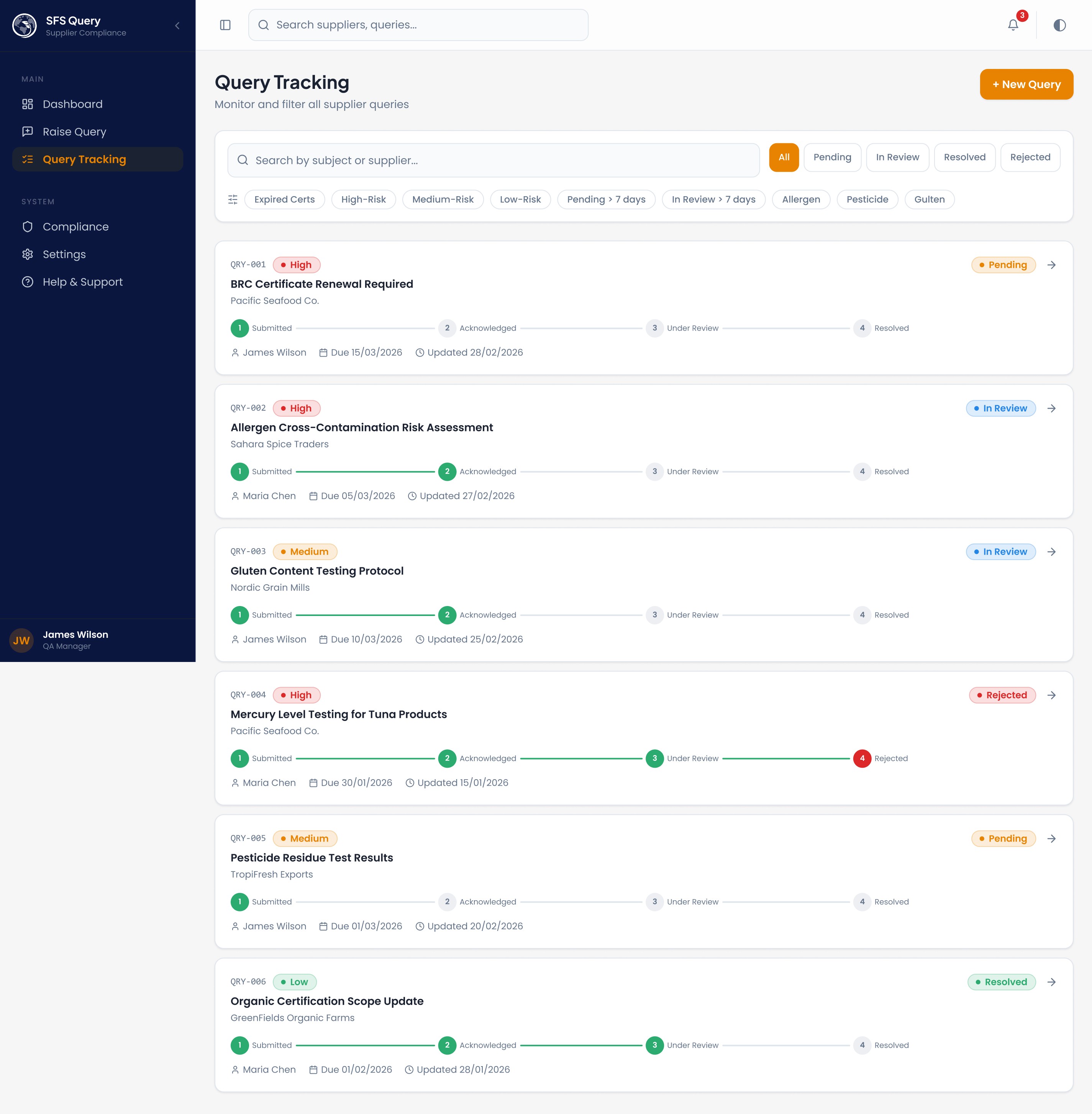
Query Timeline (Parcel-Tracking Style) : Each query card on /queries shows a 4-step progress bar: Submitted → Acknowledged → Under Review → Resolved/Rejected. This was chosen because:
QA teams manage dozens of concurrent queries - status must be scannable, not readable
The visual metaphor of parcel tracking is universally understood, reducing cognitive load
Rejected queries use destructive red at step 4, creating an immediate visual break from the green "happy path"
Quick Filter Chips : Chips like "Expired Certs", "High-Risk", "Pending > 7 days", "Allergen" sit above query results because QA workflows are interrupt-driven — a user might get a call about allergen issues and needs to filter instantly. These are additive (OR logic), not exclusive, because real investigations often span categories.
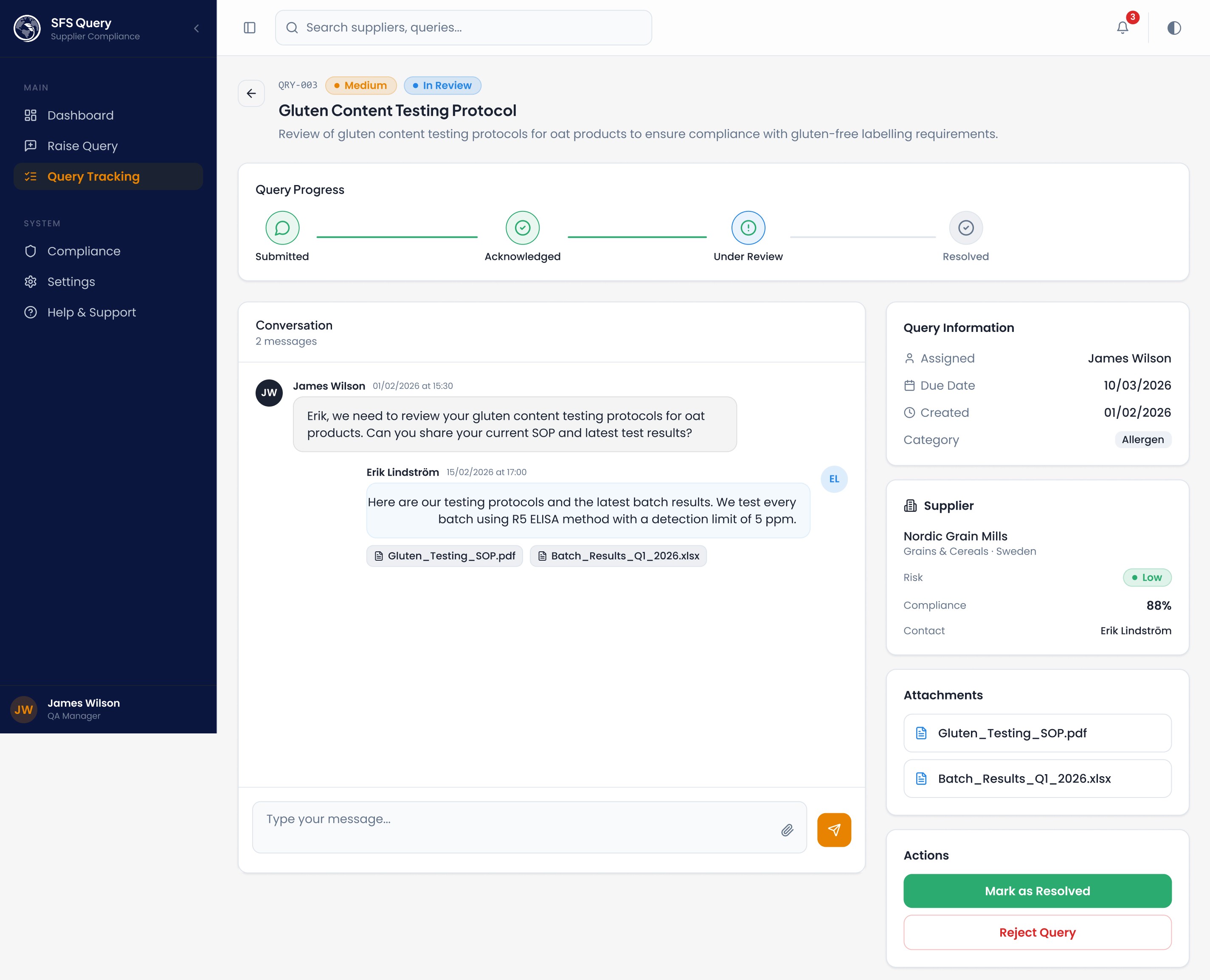
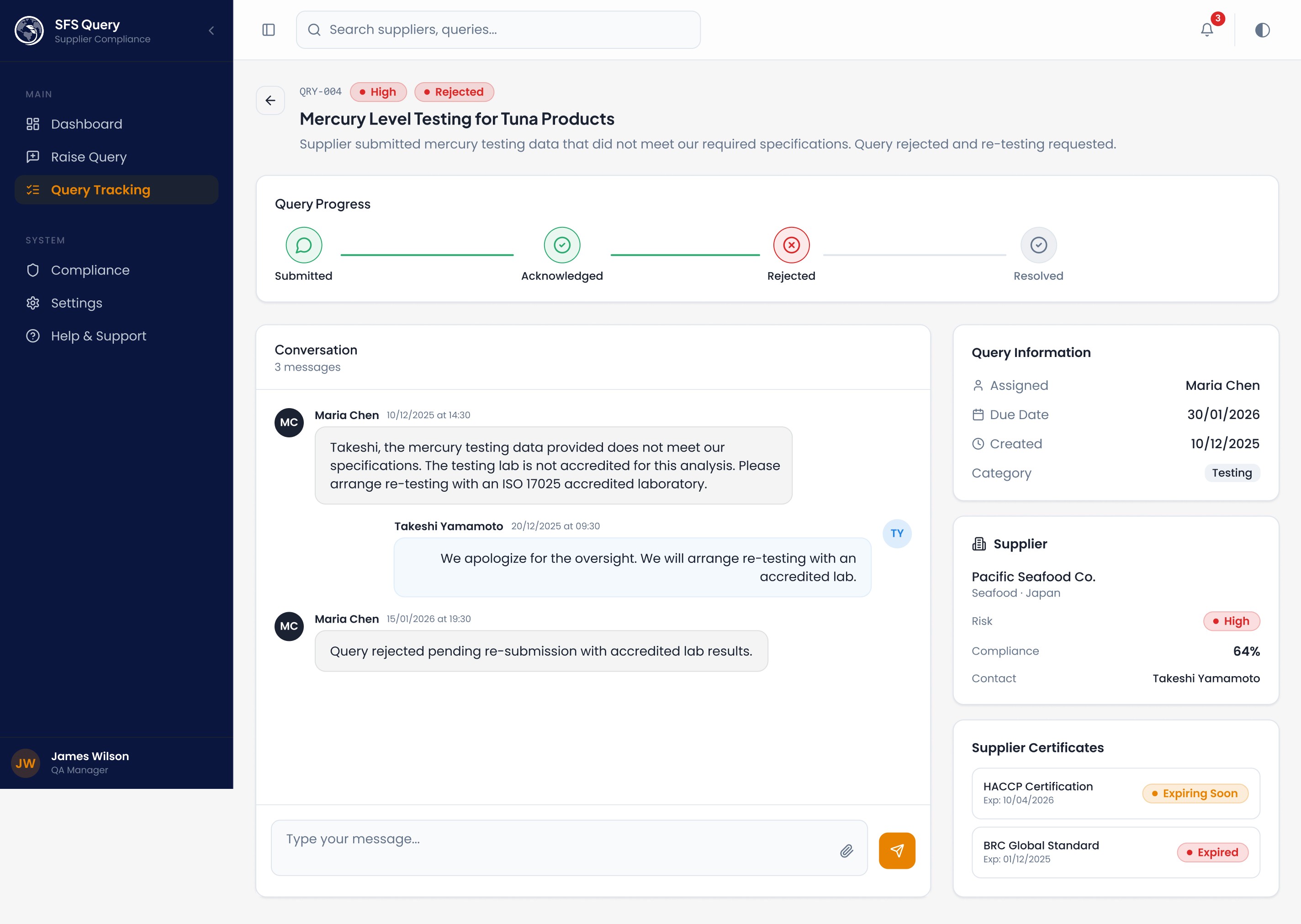
Chat-Style Query Detail : The query detail page uses a threaded conversation layout with sender-type styling (internal vs. supplier) because supplier communication is the core workflow. Keeping context, attachments, and resolution actions on one screen eliminates the email-tab-switching that causes missed follow-ups.
2. Information Hierarchy
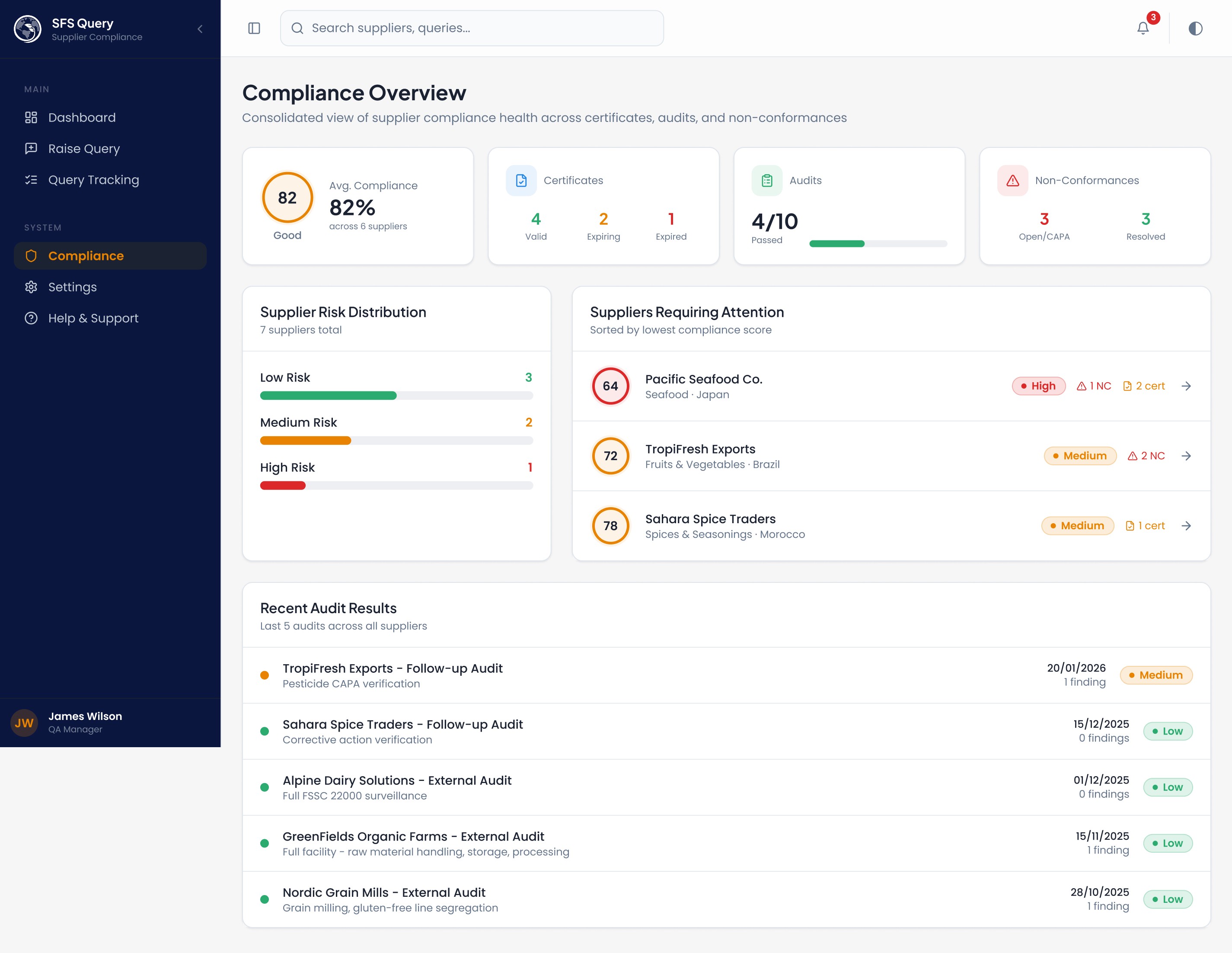
Certificate alerts use a grid layout with per-card countdowns so nothing gets buried in a list. The compliance page surfaces at Risk Suppliers sorted by lowest score, worst first.
3. Accessibility & Clarity
Semantic color tokens (Success, Warning, Error, Info) ensure consistent meaning across all components — green always means compliant, amber means attention, red means action required
Never color-only: Every status uses Status Badge with text labels alongside color, meeting WCAG guidelines for color-blind users
Icon + text pairing: Icons (Clock, Alert Triangle, File Check) always accompany text, they accelerate recognition but aren't the sole indicator
Contrast: HSL-based design tokens with dark mode overrides ensure proper contrast ratios in both themes
Error states: Empty filter results show clear "No queries match" messaging rather than blank screens; 404 pages provide navigation back
4. How It Connects Compliance, Queries & Communication
The system creates a closed loop:
Compliance Dashboard → identifies at-risk supplier
→ Click supplier → see failing certificates/NCs
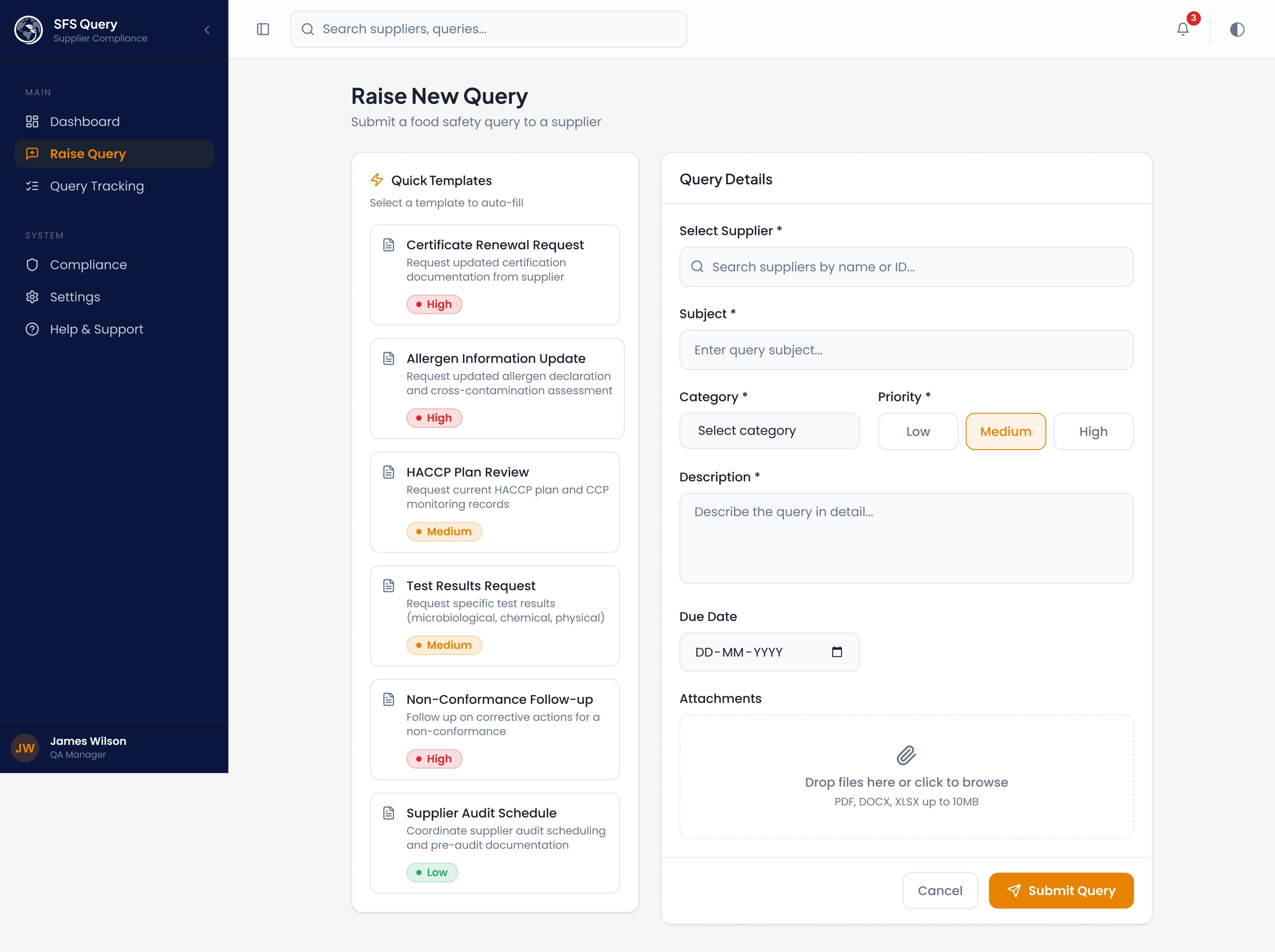
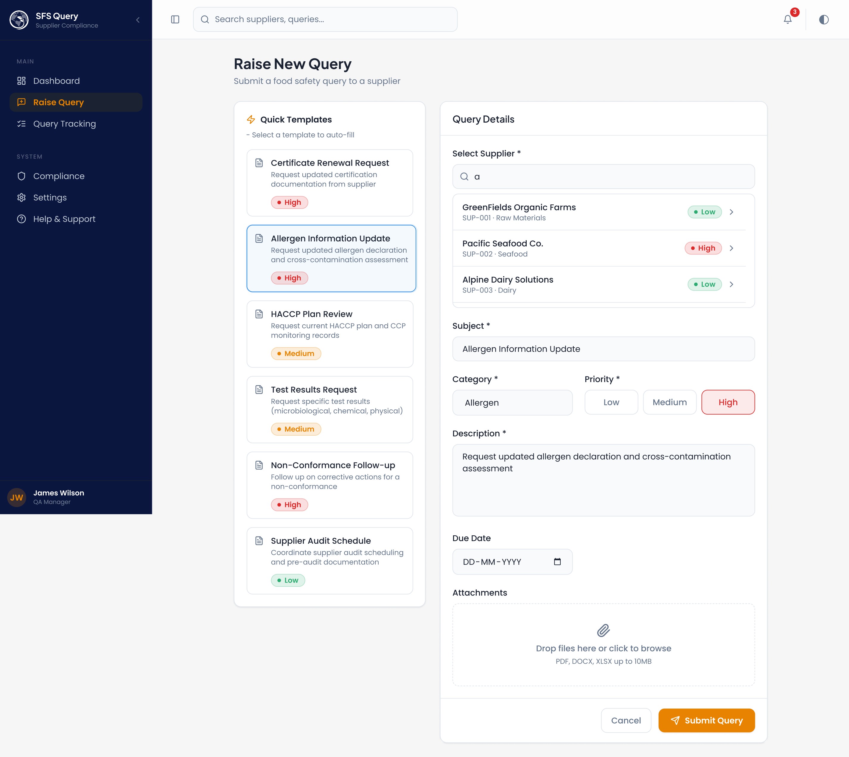
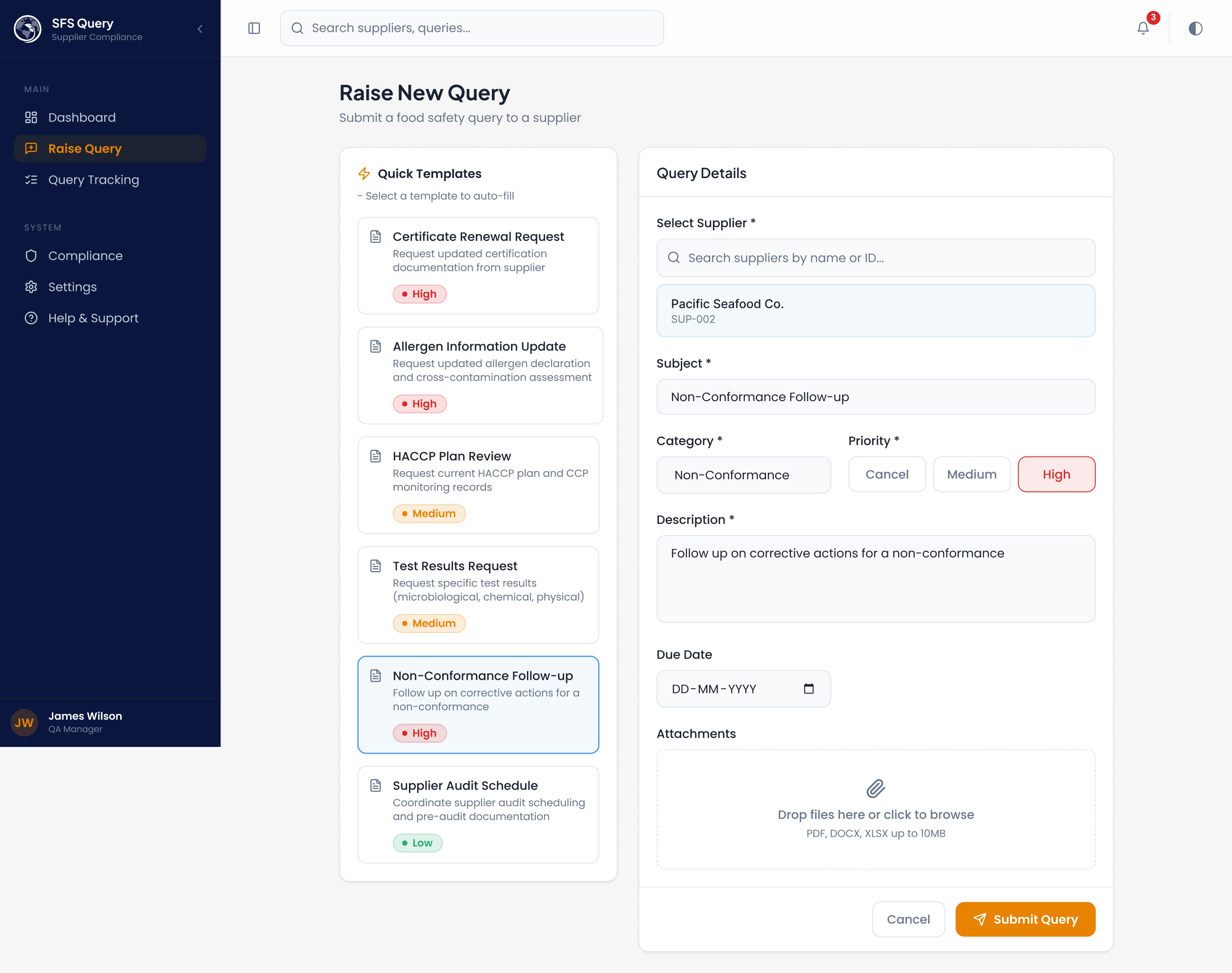
→ Raise Query (pre-filled templates)
→ Track via timeline
→ Resolve → compliance score updates
Every screen links forward to the next action. The "Quick Templates" on the New Query page reduce query creation to 3 clicks for common scenarios (allergen declaration requests, certificate renewals). Filter chips on the query tracker let managers answer stakeholder questions ("how many overdue allergen queries?") without exporting data.
5. Stakeholder Presentation Summary
"This platform gives QA managers a single view of supplier risk, automates the query lifecycle from submission to resolution, and ensures no expiring certificate or open non-conformance goes unnoticed. The design prioritizes scan-ability over read-ability — because in food safety, the cost of missing something is measured in recalls, not revenue."
Supplier Dashboard - Stats cards, supplier compliance overview with risk heatmap, recent queries, certificate alerts
Raise New Query - Quick templates (HACCP, Allergen, Certificate, etc.), supplier search, priority picker, file attachments
Query Tracking - Parcel-tracking-style timeline, status/priority filters, quick filter chips (Expired Certs, High-Risk, Pending > 7 days)
Query Detail - Chat-style conversation thread, status timeline with animated progress, supplier info sidebar, attachments, resolution actions
Notifications - dropdown in header with unread badges + full /notifications page with filters, mark-read, and dismiss
Compliance - KPI cards (avg compliance, cert breakdown, audit pass rate, NC status), risk distribution bars, at-risk suppliers list, and recent audit results
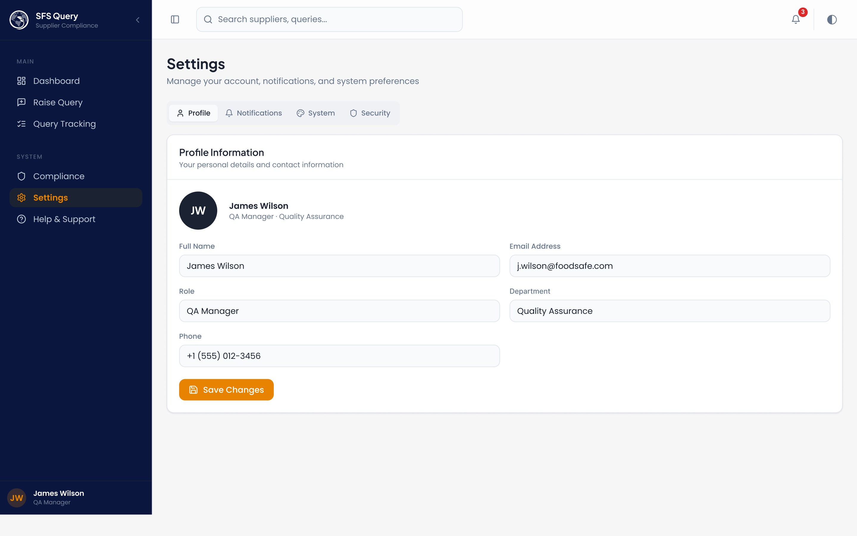
Settings - tabbed interface with Profile, Notifications preferences (email/push/digest toggles), System preferences (language, timezone, date format), and Security (password, 2FA, sessions)
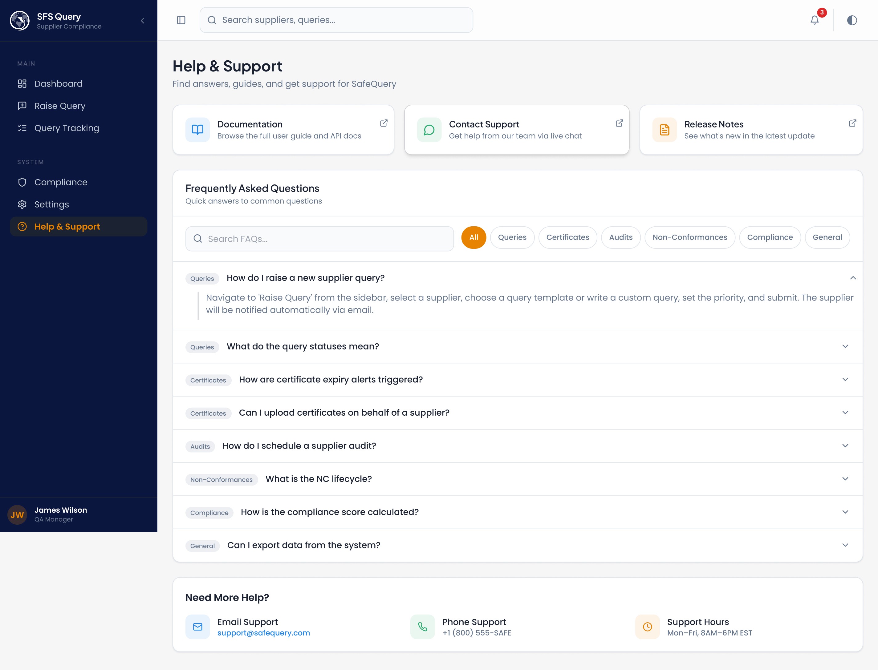
Help - quick-link cards, searchable FAQ accordion with category filters, and contact information

Img. User Flow
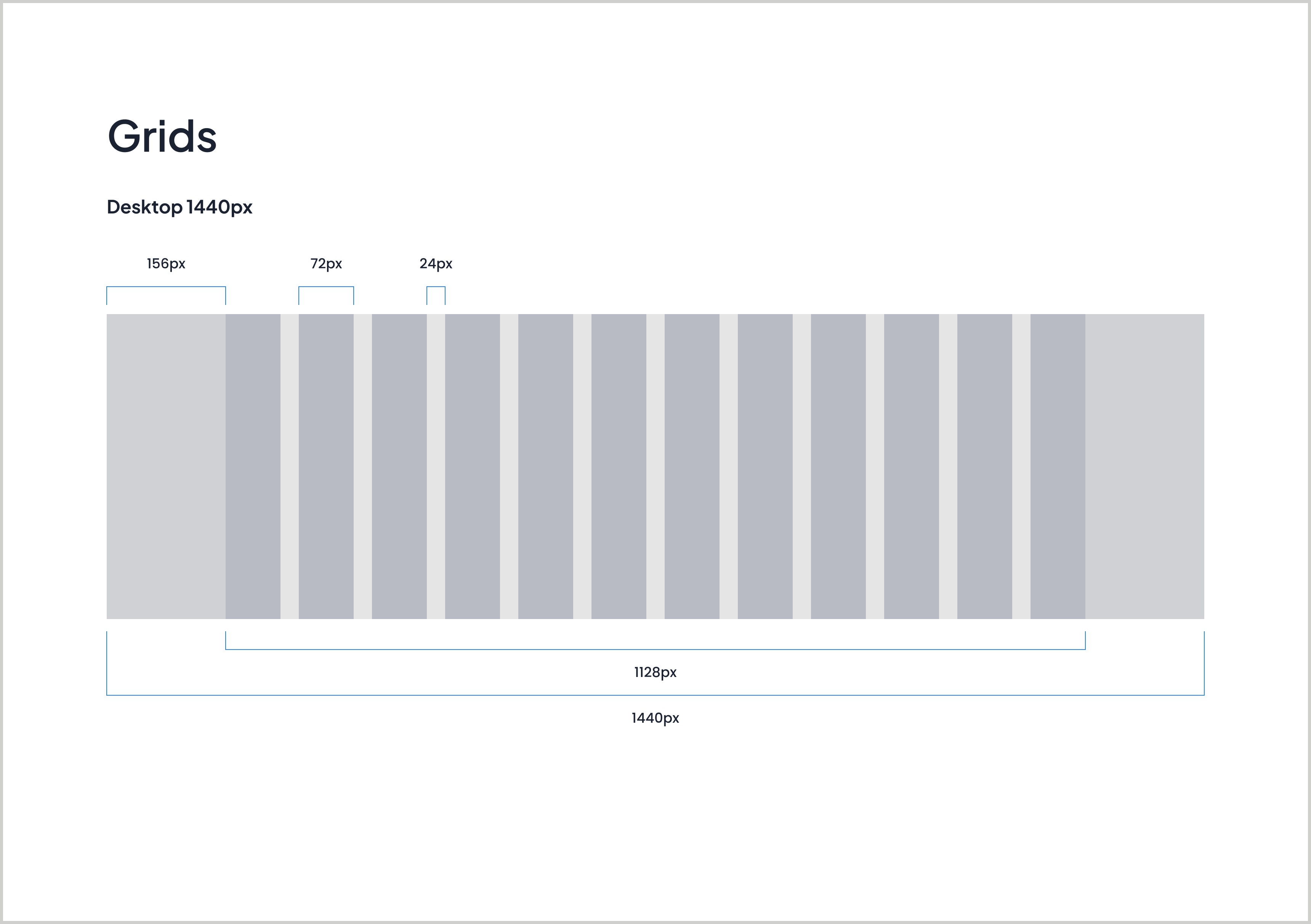
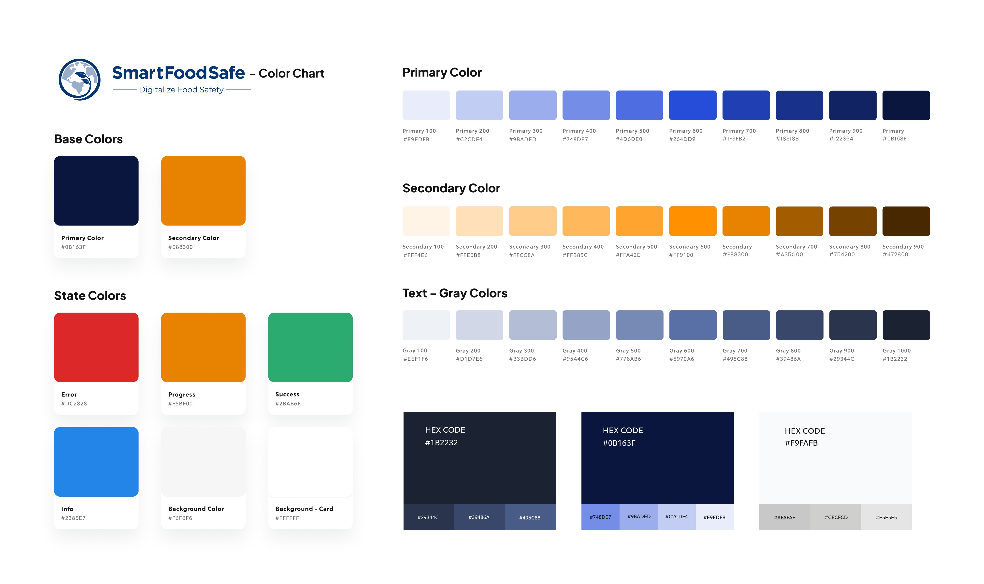
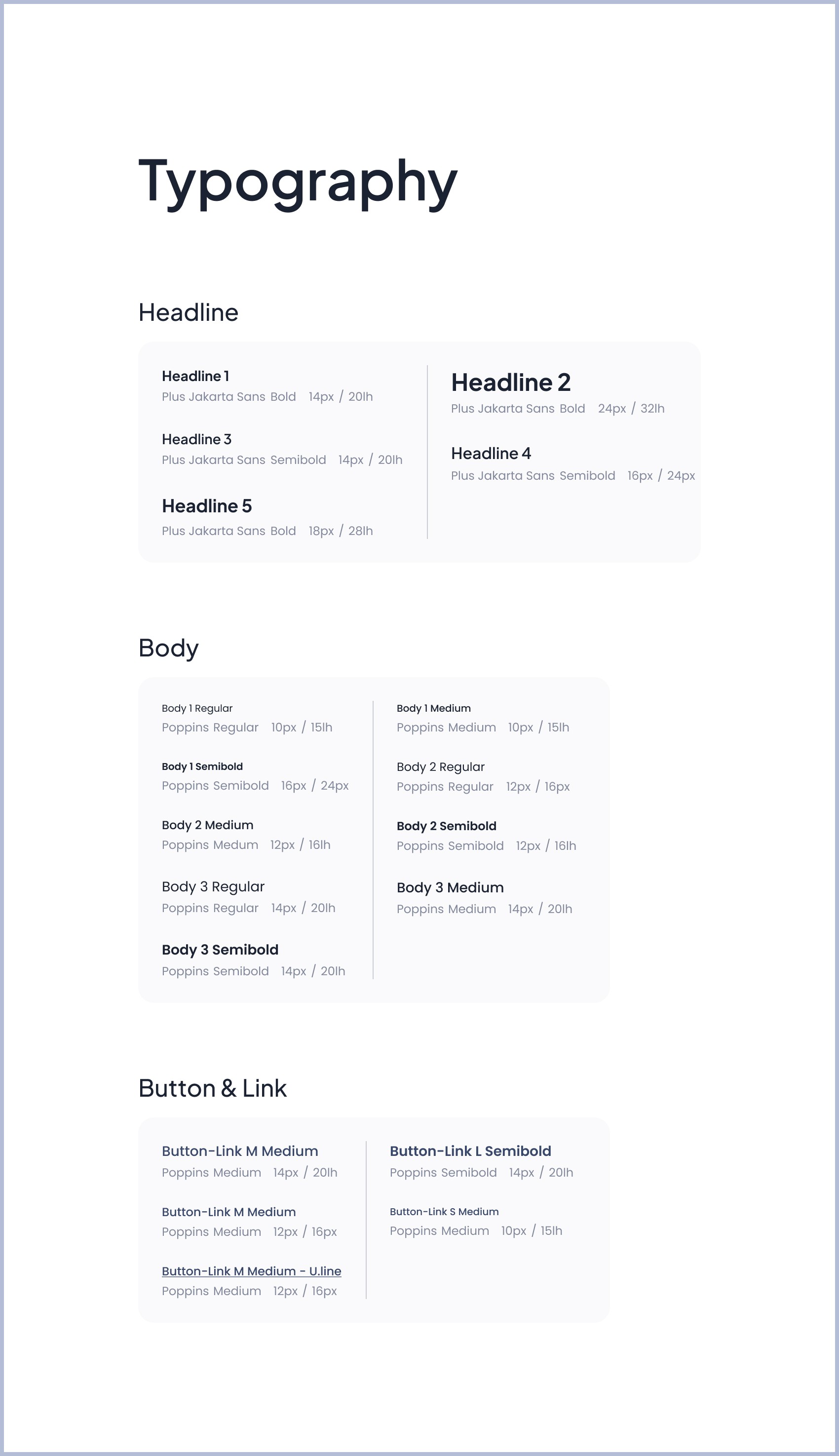
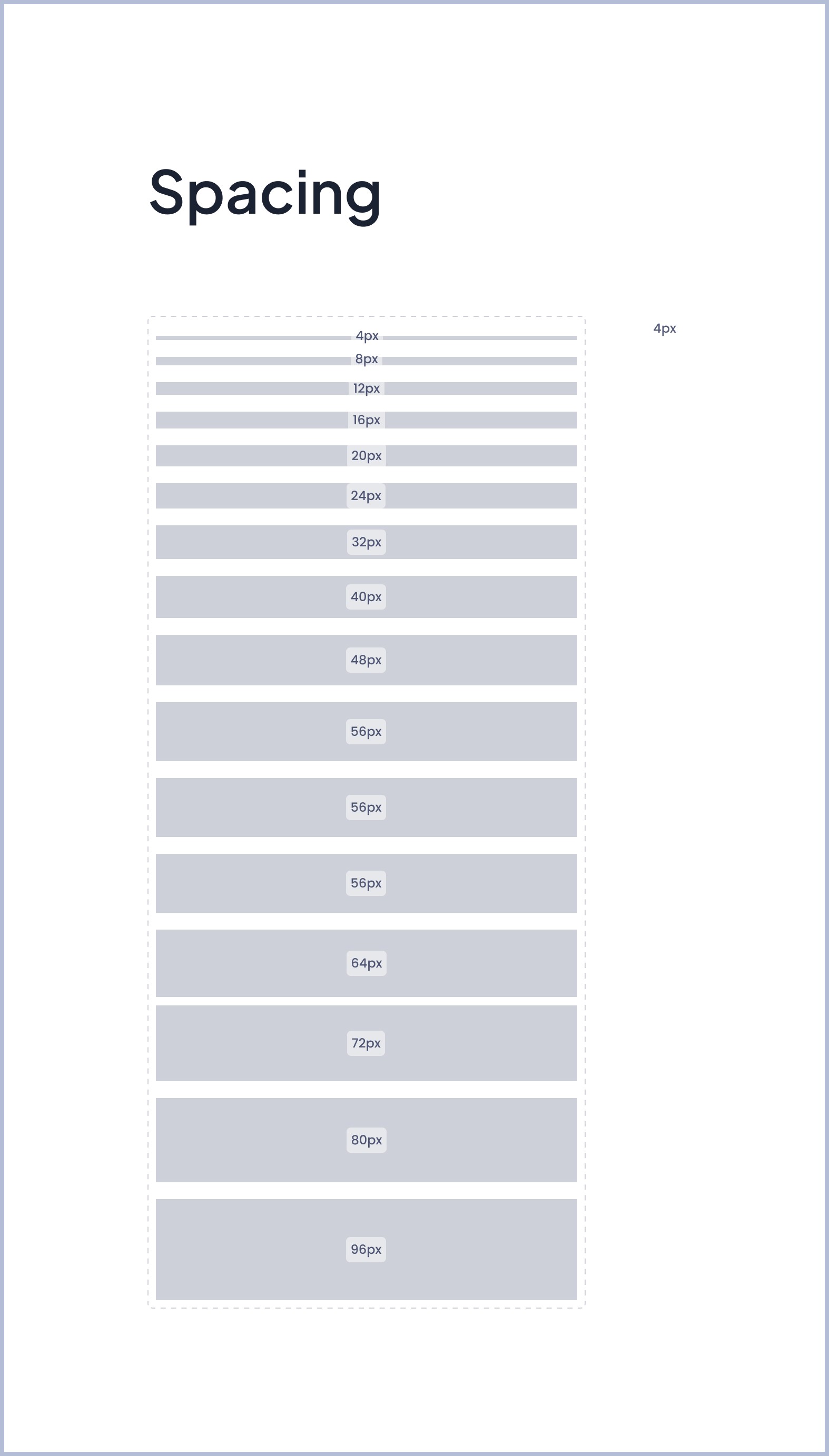
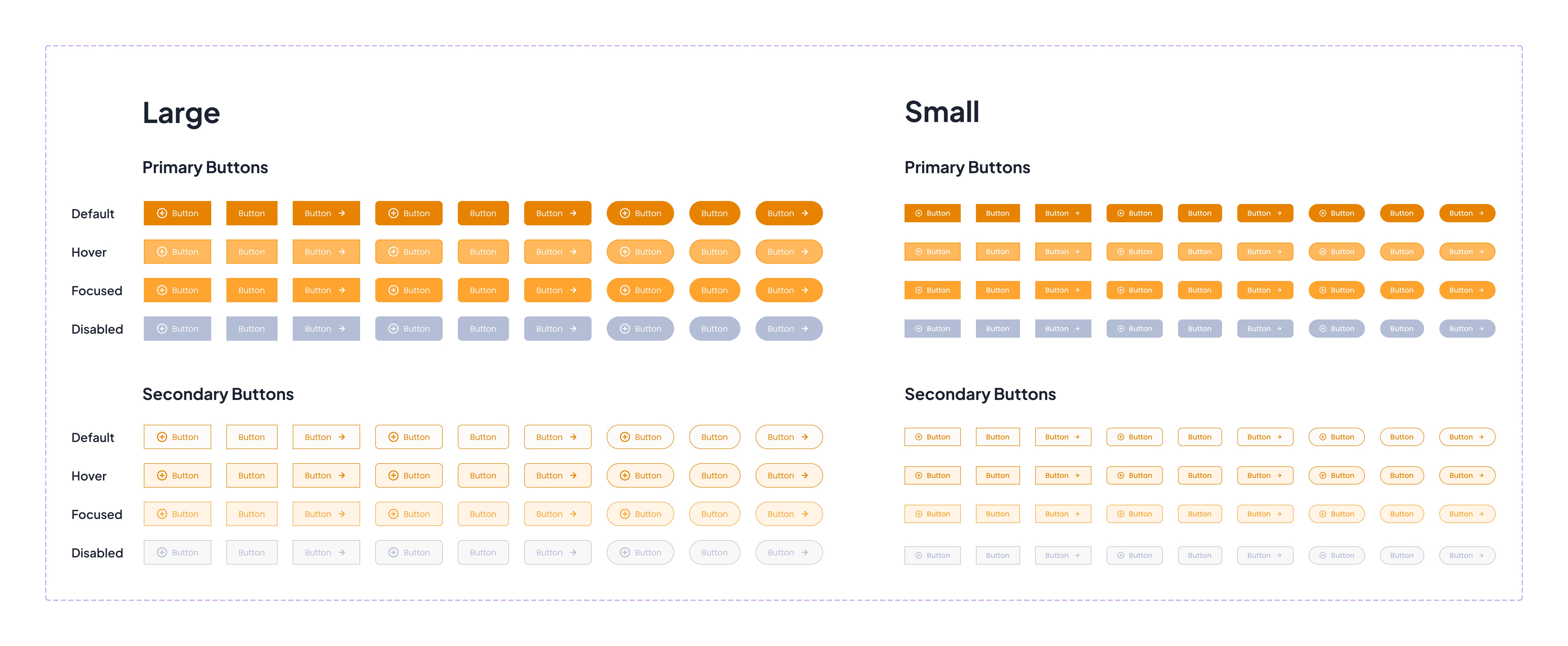
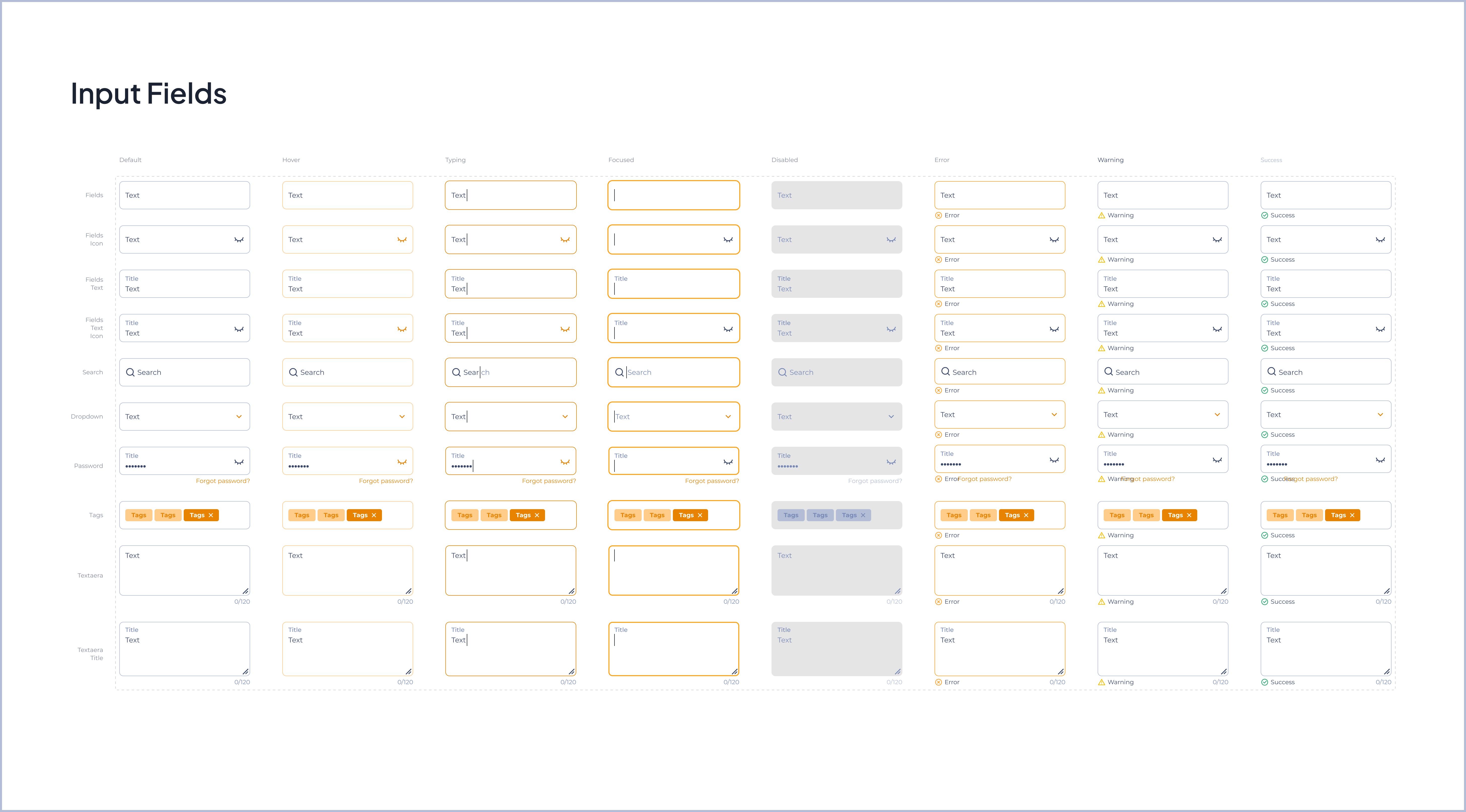
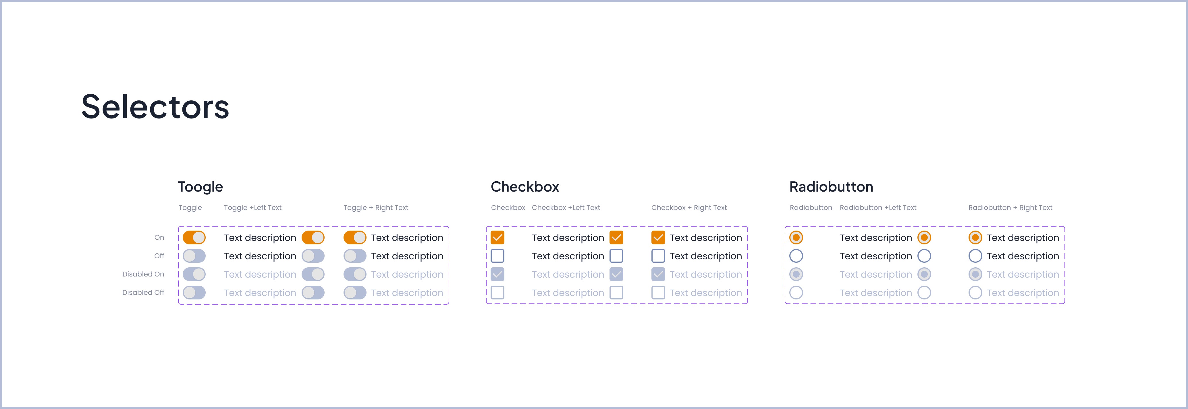
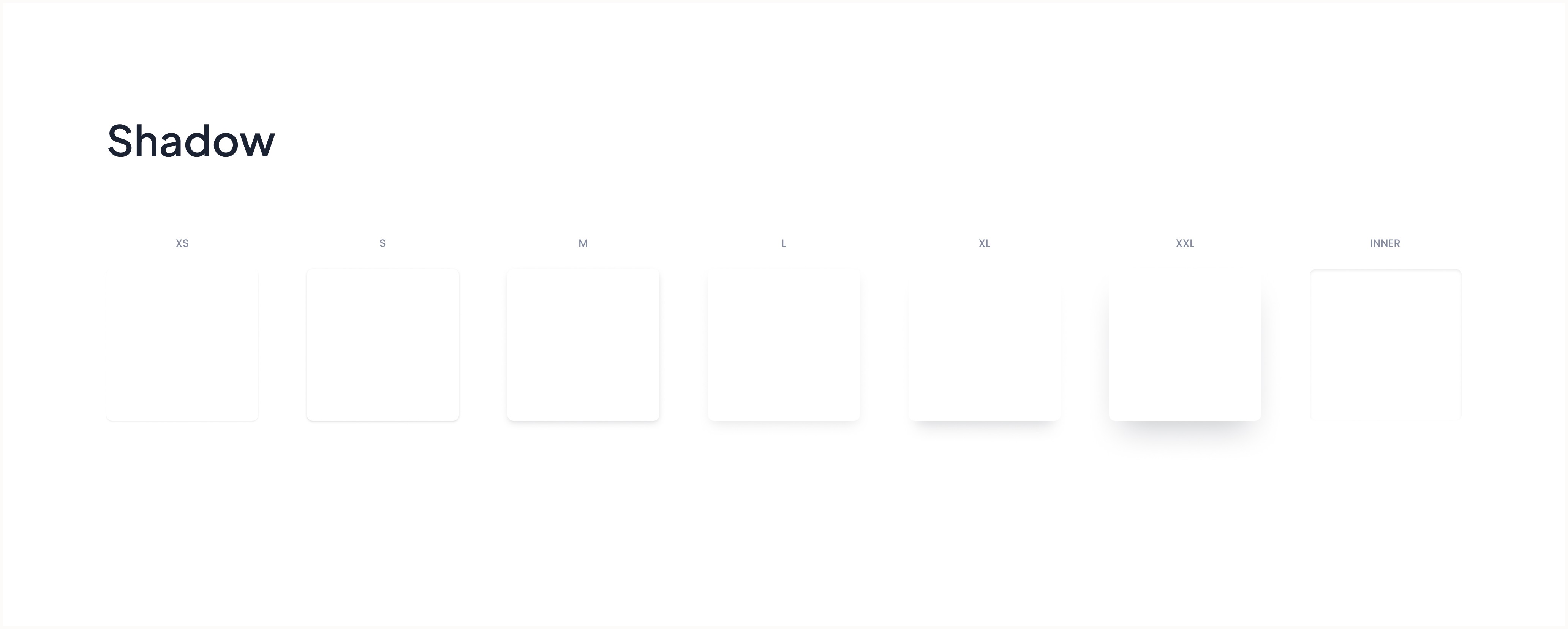
Design System: Plus Jakarta Sans + Poppins fonts, semantic color tokens (Warning/Success/Error/Info), custom animations, card shadows, buttons, grids, spacing, accordions, labels, compliance score rings, etc...
Reduced friction: Quick templates auto-fill forms, search-as-you-type for suppliers
Visual hierarchy: Risk badges, compliance scores, priority indicators highlight critical items
Accessibility: High contrast status badges with dot indicators and clear iconography