2 May 2022
Client Project in Hexaarch
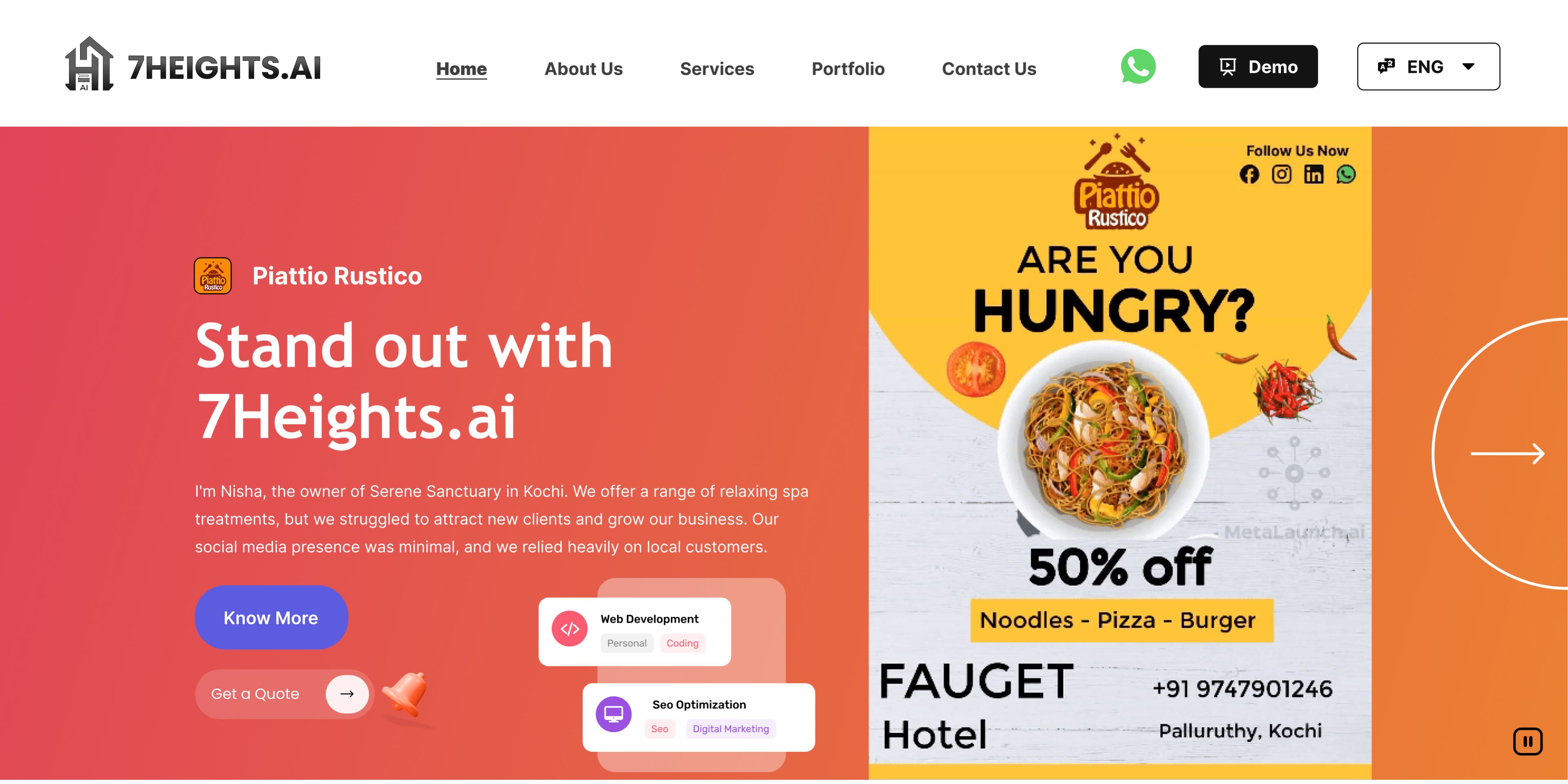
7Heights.ai – Refining Digital Marketing Experiences - Website Design
Crafting an intuitive, user-friendly platform that empowers businesses to navigate marketing with confidence
Overview
7Heights.ai is a digital marketing services platform aiming to provide businesses with data-driven marketing solutions that are both effective and easy to use. When I joined the project at Hexaarch (May–June 2022), the website needed a UX revamp to make its services more approachable, intuitive, and engaging for users—especially small and medium business owners who often feel overwhelmed by complex marketing platforms.
7Heights.ai is a digital marketing services platform aiming to provide businesses with data-driven marketing solutions that are both effective and easy to use. When I joined the project at Hexaarch (May–June 2022), the website needed a UX revamp to make its services more approachable, intuitive, and engaging for users—especially small and medium business owners who often feel overwhelmed by complex marketing platforms.
The main challenge was to bridge the gap between technical marketing solutions and the user’s understanding, ensuring that users could effortlessly explore services, understand value propositions, and take action without feeling lost or confused. My role was to analyze user pain points, create empathetic design solutions, and enhance the overall user journey from first touch to conversion.
Role
UX UI designer
Tools
Figma, Notion, FigJam
Team
2 UX UI Designers, 2 Developers
Timeline
May 2022 - Jun 2022 (8 weeks)
Prototype Video Link :
View Hi-Fi Prototype

My Responsibilities:
User Research: Conducted user interviews, surveys, competitive analysis, card sorting, and persona creation to deeply understand user needs and behavior.
Information Architecture: Organized content structure, defined navigation flow, and mapped customer journeys to eliminate friction points.
Wireframing & Prototyping: Created low-fidelity sketches, wireframes, and high-fidelity interactive prototypes in Figma to test concepts quickly.
Usability Testing: Planned and conducted two rounds of usability tests, identified usability issues, and iterated based on user feedback.
UI Design: Designed final screens aligned with brand values, accessibility principles, and user insights while maintaining visual consistency.
Collaboration: Worked closely with the marketing and development teams to align design decisions with business goals and technical feasibility.
Documentation: Maintained detailed design rationale, findings, iterations, and design systems for handoff and future scalability.
Problem
Overwhelming Information
The website content was dense, full of technical jargon, and hard for small and medium business owners to understand.
Users often felt confused and unsure about the platform’s value.
Complex Navigation
Menu items were overlapping and unclear, making it hard to locate key services.
Users frequently got lost while exploring pages, missing important content.
Low Engagement on Service Pages
Service pages lacked clarity and visual appeal, leading to high bounce rates.
Users didn’t feel confident about taking actions like contacting the team or exploring services further.
Unclear Value Proposition
The homepage and key landing pages didn’t clearly communicate the unique advantages of 7Heights.ai.
Users struggled to understand why they should choose this platform over competitors.
Limited Trust Signals
Absence of client testimonials, case studies, or success stories made it hard for users to trust the services.
Users hesitated to engage or reach out due to lack of credibility cues..
Solution
Simplified Content & Visual Communication
Broke information into digestible sections with clear headings and benefit-oriented statements.
Added icons, illustrations, and short summaries to make complex concepts approachable.
Restructured Navigation
Organized menu items into a clear hierarchy with main categories, subcategories, and contextual links.
Introduced a sticky menu and breadcrumbs to help users always know their location.
Redesigned Service Pages
Incorporated engaging visuals, short explanations, and clear call-to-actions (CTAs).
Added client logos, testimonials, and success stories to build trust and encourage interaction.
Clear Value Proposition
Highlighted 7Heights.ai’s unique advantages upfront on the homepage and landing pages.
Used concise, benefit-driven messaging to immediately communicate the platform’s value.
Enhanced Credibility & Trust
Added client success stories, reviews, and case studies throughout the website.
Built confidence for users to take the next step, like contacting the team or exploring services.
Project goals
The project aimed to achieve several key goals that address both user needs and business objectives. I put together an action plan and shared it with the team and stakeholders. Once we got the green light, I moved on to designing with these objectives in mind:
Simplify the User Experience
Make the website intuitive and easy to navigate for small and medium business owners, reducing confusion and frustration.
Enhance Clarity of Services
Clearly communicate the value and benefits of 7Heights.ai’s digital marketing solutions, helping users understand what they gain from each service.
Increase User Engagement
Encourage users to explore service pages, interact with content, and take meaningful actions such as contacting the team or requesting a consultation.
Build Trust and Credibility
Incorporate client testimonials, case studies, and success stories to instill confidence and demonstrate the platform’s reliability.
Align UX with Business Goals
Ensure that design changes not only improve usability but also support 7Heights.ai’s conversion goals and overall business objectives.
Create a Scalable Design System
Establish a consistent design approach that can be easily extended for future features or services while maintaining usability and clarity.
Main Goals
GOAL 1
Simplify the User Experience
Make the website intuitive and easy to navigate, helping users quickly find relevant services without confusion.
GOAL 2
Communicate Value Clearly
Present 7Heights.ai’s services in a way that highlights benefits, making it easy for users to understand the platform’s offerings.
GOAL 3
Increase Engagement and Trust
Encourage users to interact with content and take meaningful actions while building confidence through testimonials and success stories.
Design Process
1. Research & Understanding
2. Ideation & Wireframing
3. Visual Design & Prototype
4. Testing & Iteration
Interviews
During the ideation phase, the goal of the user interviews was to understand the values, motivations, pain points, and daily routines of 7Heights.ai’s target audience. This helped me create accurate user personas and informed design decisions throughout the project.
Process:
Collaborated with the team to prepare an interview script of 32 open-ended questions, focusing on user behavior, expectations, and challenges related to digital marketing services.
Recruitment & Interviews: Over 4 days, I recruited and interviewed 7 users remotely to gather qualitative insights.
Key Insights:
Many users found digital marketing platforms overwhelming and struggled to understand which services they truly needed.
Users wanted clear guidance and actionable recommendations rather than technical jargon.
Trust was a major factor; users relied on testimonials, success stories, and client examples before engaging with a service.
Navigation and content layout played a huge role in user confidence and decision-making.
Application of Findings:
The insights were referenced throughout the design process to:
Build empathetic user personas.
Design intuitive navigation and service flows.
Create content hierarchy and messaging that spoke directly to user needs.
Incorporate trust-building elements such as case studies and testimonials.
User Interview Questions
Background & Role
Can you tell me a bit about your business and your role?
How long have you been managing your marketing activities?
What are your primary goals for your business this year?
How do you usually measure success in your marketing efforts?
Current Marketing Practices
5. How do you currently manage your digital marketing campaigns?
6. Which platforms or tools do you use for marketing?
7. What do you like about the tools you currently use?
8. What frustrates you about your current marketing tools or processes?
Challenges & Pain Points
9. What are the biggest challenges you face in digital marketing?
10. Have you ever felt overwhelmed by marketing decisions? If yes, how?
11. How easy or difficult is it for you to understand marketing analytics and performance reports?
12. Are there services or features you wish your current marketing platform provided?
Information Seeking & Decision Making
13. How do you learn about new digital marketing services or tools?
14. What factors influence your decision to try a new marketing solution?
15. Can you describe a recent situation where you struggled to choose the right marketing strategy?
16. How much do reviews, case studies, or testimonials affect your decision-making?
Experience with Marketing Platforms
17. When using a marketing platform, what features are most important to you?
18. How intuitive do you expect digital marketing platforms to be?
19. How do you feel when using complex marketing dashboards?
20. What type of content (videos, articles, tutorials) helps you understand marketing tools best?
Motivations & Values
21. What motivates you to improve your digital marketing efforts?
22. How important is efficiency versus control in managing campaigns?
23. Can you describe your ideal digital marketing experience?
24. What frustrations would you like to avoid when using marketing services?
Daily Routine & Workflow
25. Can you walk me through a typical day handling marketing tasks?
26. How much time do you spend on different marketing activities weekly?
27. Which marketing activities do you find most challenging?
28. Which tasks do you enjoy or feel confident about?
Website & Service Expectations
29. What would make a marketing services website easy for you to use?
30. How would you like services to be explained on a platform?
31. What makes you trust a digital marketing service provider?
32. If you could change one thing about the way marketing services are presented online, what would it be?
FINDING 1
Complexity Overwhelms Users
Users often felt lost or confused when navigating marketing platforms, struggling to identify which services they actually needed.
Overly technical language and dense content created friction and reduced confidence in taking action.
FINDING 2
Clear Guidance and Actionability are Essential
Users wanted step-by-step guidance, recommendations, and simplified explanations rather than extensive technical details.
They responded positively to visuals, short summaries, and actionable next steps that clarified decision-making.
FINDING 3
Trust Drives Engagement
Users hesitated to engage without proof of credibility, such as client testimonials, case studies, or success stories.
Establishing trust through social proof and transparent service explanations significantly influenced their willingness to interact.
Surveys
After the project kickoff, we aimed to better understand the target audience and their challenges in using digital marketing services. The survey complemented the interviews, providing broader quantitative insights into user pain points.
Survey Type & Distribution:
Created an online survey consisting of a mix of open-ended, multiple-choice, and ordinal scale questions.
Shared the survey across relevant business and marketing communities to reach the target audience.
Responses:
Received 18 submissions in just a few days, giving a diverse view of user experiences and expectations.
Key Findings:
Users struggled to choose the right marketing services for their business needs.
Many found platforms overwhelming and hard to navigate.
Users desired clear guidance and actionable next steps rather than complex technical details.
Trust and credibility were essential; users wanted proof of results or social proof.
Users preferred concise, visually organized information that they could quickly scan and understand.
Application of Findings:
Prioritized simplifying navigation and content hierarchy to reduce friction.
Designed service pages with step-by-step guidance and actionable CTAs.
Incorporated trust-building elements like testimonials, case studies, and client logos.
Used the survey insights alongside interview findings to inform wireframes, prototypes, and the final design.
INSIGHT 1
72% of users said they felt confused about which marketing services were relevant for their business.
INSIGHT 2
65% of users reported that marketing platforms felt overwhelming and hard to navigate.
INSIGHT 3
58% of users wanted step-by-step guidance and actionable recommendations rather than technical jargon.
Common Answers from Interviews:
Trust is crucial – users rely on testimonials and case studies.
Prefer concise, visually organized information.
Value quick access to important service details.
Desire simple, intuitive navigation.
Look for actionable next steps on service pages.
Motivation comes from clear understanding of benefits and ROI.
Personas
To gain a deeper understanding of our users’ goals, needs, experiences, and behaviors, we created personas to help the team step out of our own assumptions and make user-centered design decisions throughout the project.
Data Used:
User Interviews: 7 in-depth interviews provided qualitative insights into frustrations, motivations, and daily routines.
Survey Results: 18 survey submissions highlighted quantitative trends, common pain points, and priorities.
Additional Research: Competitor analysis and industry research informed context and user expectations.
Persona Details:
For each of the 4 personas, we specified:
Demographics: Age, role, business type, experience level.
Goals & Motivations: What they want to achieve using 7Heights.ai.
Pain Points & Challenges: Obstacles that make marketing difficult or overwhelming.
Behavior & Workflow: How they interact with digital marketing tools in their daily routines.
Preferred Features & Expectations: What they value most in a marketing platform.
Impact on Design Process:
Helped prioritize content hierarchy and simplify navigation.
Guided the creation of actionable CTAs and service explanations.
Informed trust-building elements, such as testimonials and case studies.
Reflection Throughout the Design Process:
Ideation & Wireframing: Personas guided layout and content decisions.
Visual Design & Prototyping: Ensured designs addressed user motivations and pain points.
Usability Testing & Iteration: Reflected on personas to validate solutions against real user needs.
Persona 1: Startup Founder – “Rohit”
Age: 32
Occupation: Founder of a tech startup
Goals: Find affordable and effective digital marketing services to grow his startup; quickly understand service offerings.
Pain Points: Confused by technical jargon, overwhelmed by too many choices, lacks time to explore each service in detail.
Behavior: Frequently browses on desktop during office hours, compares competitors, values clear CTAs and trust signals.
Quote: “I need a service that’s easy to understand and implement without wasting time.”
Persona 2: Marketing Manager – “Priya”
Age: 28
Occupation: Marketing Manager at a mid-sized company
Goals: Choose reliable digital marketing services that align with company campaigns; track ROI and progress.
Pain Points: Difficulty in comparing multiple service options, unclear next steps, needs proof of credibility.
Behavior: Uses both desktop and tablet, relies on case studies, testimonials, and structured content to make decisions.
Quote: “I want to know exactly how this service can help me achieve results.”
Customer Journey
The goal of creating a customer journey map was to understand how users discover, evaluate, and interact with 7Heights.ai’s services, and to uncover pain points and opportunities to enhance their experience.
Stages Examined:
We focused on the entire journey but paid special attention to the Consideration and Loyalty stages, where users experienced the most friction.
Main Touchpoints:
Awareness: Social media, search engines, and referrals where users first discover 7Heights.ai.
Consideration: Website exploration, reading service descriptions, comparing offerings, and viewing case studies.
Decision: Contacting the team, requesting demos, or signing up for services.
Onboarding & Use: Using the services or tools provided, engaging with support, and monitoring results.
Loyalty & Advocacy: Returning for additional services, referring others, and providing testimonials.
Pain Points & Solutions:
Consideration Stage: Users were confused by complex service descriptions.
Solution: Simplified content, added visual cues, and step-by-step guidance for each service.
Decision Stage: Lack of trust signals led to hesitation.
Solution: Added testimonials, case studies, and client logos to build credibility.
Loyalty Stage: Users lacked reminders or guidance for ongoing engagement.
Solution: Suggested follow-up emails, easy access to support, and updates about new services.
Design Changes from Journey Mapping:
Restructured website navigation to reduce friction in consideration and decision stages.
Created actionable CTAs on service pages to guide users clearly toward conversion.
Introduced trust-building elements and onboarding support features to foster long-term engagement.
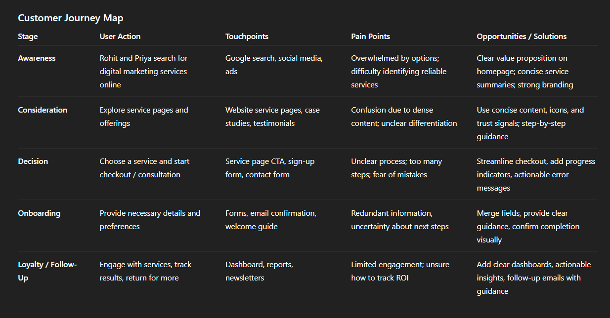
Img. User Customer Journey
User Journey
With the business goal of increasing conversions in mind, I focused on mapping the checkout flow, as it is the critical path where users finalize engagement with 7Heights.ai’s services. I chose this path because any friction here directly impacts sign-ups and revenue.
Testing & Validation:
Sketched a current-state user journey map and shared it with internal stakeholders.
Validated the map by walking through the flow with test users and noting hesitation points, confusion, and potential drop-offs.
Findings:
The mapping revealed 2 unnecessary steps in the checkout process that caused delays and confusion.
Identified potential drop-off points where users were likely to abandon the flow due to unclear instructions or extra clicks.
Main Pain Points:
Users were required to input repetitive information in multiple steps.
Lack of clarity on progress led to uncertainty about completion.
Extra navigation between pages increased friction and cognitive load.
Design Changes & Improvements:
Removed unnecessary steps, streamlining the flow to minimize user effort.
Added progress indicators to reassure users and reduce anxiety.
Consolidated information input fields to make the checkout faster and smoother, resulting in higher completion rates and contributing to improved conversions.
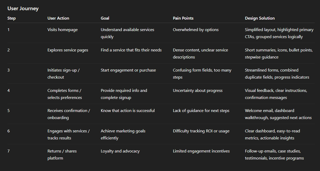
Img. User Journey
Competitive Research :
To understand the market landscape and identify opportunities to differentiate 7Heights.ai, I conducted a detailed competitive analysis. This helped in defining features, design strategies, and user experience improvements that positioned the platform above competitors.
Competitors Analyzed:
Identified and analyzed 4 direct competitors in the digital marketing services space.
Comparison Criteria:
Created a comparison matrix based on 45 criteria, including:
Nielsen’s usability heuristics (e.g., consistency, feedback, error prevention)
Navigation clarity
Content presentation
Visual hierarchy
Trust signals (testimonials, case studies)
Call-to-action visibility and clarity
Feature completeness and ease of use
Competitor Strengths:
Clean and visually appealing dashboards.
Strong branding and marketing messaging.
Comprehensive service offerings.
Useful case studies or portfolio sections.
Competitor Weaknesses:
Overly complex navigation that confuses users.
Technical jargon and dense content that reduces clarity.
Limited guidance for first-time users.
Lack of clear CTAs or conversion paths.
Market Gap & Opportunities:
Competitors often neglected simplicity and clarity, leaving users overwhelmed.
Few platforms provided step-by-step guidance or actionable recommendations for users.
Opportunity to position 7Heights.ai as an intuitive, trustworthy, and user-friendly platform with simplified navigation, clear content, and strong trust-building elements.
Impact on Strategy:
Influenced design decisions, prioritizing simplicity, clarity, and actionable CTAs.
Guided the content strategy, focusing on user understanding and easy consumption.
Helped define differentiating features that improved conversion and engagement.
Competitors in the Digital Marketing Space
Competitor | What They Do (Strengths) | What They Lack / Weaknesses (Relative to What 7Heights.ai Can Do Better) |
|---|---|---|
SEO Discovery | Full‑stack digital marketing services for SMEs — SEO, PPC, social media, lead generation. Long track record, broad service set. SEO Discovery+1 | Being a generalist agency, their approach can still feel “agency‑like” — possibly less personalized, less intuitive for non‑marketing clients; may overwhelm users with options rather than simplify decisions. |
iProspect India | Large, performance‑driven agency; strong in programmatic advertising, analytics, ROI‑focused campaigns. Works with bigger clients. adsparksocial.com+1 | Their scale and structure may make them less accessible for small/medium businesses looking for simple, user‑friendly onboarding and clarity. Might be heavy on data and less on simplicity. |
WATConsult | Good at creative content, social media campaigns, digital brand‑building for a wide variety of clients. Well known and established. Inventiva+1 | The emphasis on comprehensive campaigns and creativity may come with complexity; service offerings might be too broad or overwhelming for a user wanting straightforward, easy‑to-understand marketing solutions. |
Digidarts | Performance-first, data‑driven services, often tailored for SMEs; offers modern marketing tactics, possibly including automation or performance‑oriented ad campaigns. SEO Discovery+1 | As with many agencies, the experience and onboarding may not be optimized for users unfamiliar with marketing — documentation, dashboards or workflows could feel technical or dense. |
What This Analysis Revealed: Market Gaps & Opportunities
Many existing agencies tend to target either large enterprises (like iProspect) or offer broad, “all‑in‑one” services (like SEO Discovery, WATConsult). They often assume a certain level of marketing-literacy in clients — which can overwhelm small/medium business owners who just want clarity and simplicity.
There's a gap for a solution-oriented, user-friendly marketing platform — one that doesn’t just sell services, but helps users understand what they need, choose intelligently, and proceed confidently.
Users frequently get lost among too many services, options, technical jargon — existing offerings aren’t always built around empathy for non-marketer clients.
How 7Heights.ai Can Differentiate (Based on Findings)
Simplicity-first UX & Clear Information Architecture — build content and navigation that doesn't overwhelm, but leads users gently toward the right service.
Guidance & Handholding — rather than dumping services, help users choose based on their business goals (e.g. via questionnaires, recommendations, clear value propositions).
Trust & Transparency — use testimonials, case studies, clear explanation of services/prices — something that’s sometimes missing in big agencies.
Accessibility for SMEs & Non‑Experts — make marketing services approachable for small business owners who may lack time or marketing knowledge.
Card Sorting
The goal of card sorting was to ensure that the site’s information architecture aligned with user expectations, making it easier for users to find and explore services without confusion.
Method:
Conducted 6 remote card sorting sessions using FigJam.
Focused on organizing 36 existing product/service categories into intuitive groups.
Participant Groupings:
Participants naturally grouped the categories into 6 main clusters.
Each main category included 4–7 subcategories, reflecting users’ logical mental models and expectations.
Insights & Mental Models:
Users preferred smaller, clearly labeled groups rather than long lists.
Logical hierarchy and descriptive labeling improved clarity and reduced cognitive load.
Participants’ groupings revealed how they conceptually think about marketing services, which differed slightly from the previous site structure.
Impact on Design:
Created a simplified navigation structure that aligns with user expectations.
Reduced friction in service discovery, helping users find offerings quickly.
Laid the foundation for a clear content hierarchy and more intuitive site flows, ultimately improving engagement and usability.
1. Information Architecture (IA)
Top-Level Sections:
Home
About Us
Services
SEO Services
PPC / Paid Media
Social Media Marketing
Content Marketing
Email Marketing
Analytics & Reporting
Case Studies
Blog / Resources
Pricing / Packages
Contact / Consultation
Notes:
Main navigation is minimal and intuitive, based on card sorting insights.
Subcategories are grouped by user mental model (from interviews + surveys).
CTAs appear consistently across pages for conversions.
2. User Flow: New Visitor Exploring Services
Start → Homepage →
Hero Section → Explore Services CTA →
Service Category Page → Click Specific Service →
Service Detail → CTA: “Request Consultation” →
Sign-Up / Contact Form → Submit → Confirmation Page
Alternate Path:
Homepage → Case Studies → Learn More About a Service → Request Consultation → Submit → Confirmation
Key Notes:
Reduce drop-offs by eliminating redundant clicks.
Add breadcrumbs & progress indicators for clarity.
3. Task Flow: Request Consultation / Sign-Up
Goal: User submits request for service.
User Action: Click “Request Consultation” →
System Response: Open sign-up/contact form (pre-populated if logged in) →
User Action: Fill Name, Email, Company, Service Interest →
System Response: Validate form inputs →
User Action: Correct errors if any →
System Response: Display success message & next steps →
End State: User receives confirmation email and dashboard access
Notes:
Progress bar shows form completion steps.
Friendly validation messages reduce friction.
4. Sitemap
Sketches
The main purpose of the sketches was to brainstorm, visualize ideas, and accelerate decision-making early in the design process without investing too much time in high-fidelity designs. They helped identify distractions and focus on the core goals of the website.
Basis for Sketches:
User Interviews: Insights about pain points, motivations, and expectations.
Business Goals: Ensuring the design supports conversions and engagement.
Heuristic Evaluation: Identifying usability issues in the existing site.
Multiple Versions & Differences:
Created several low-fidelity sketches exploring different layouts, navigation structures, and content hierarchies.
Variations mainly differed in placement of CTAs, grouping of service categories, and visual flow of information.
Chosen Version & Reason:
Selected the version that minimized distractions, highlighted key services, and guided users naturally toward the desired actions.
This version aligned best with user expectations and business objectives.
Layout & Arrangement:
Clear content hierarchy: Headlines and summaries at the top, supporting visuals alongside.
Simplified navigation: Main categories clearly separated with intuitive subcategories.
Action-oriented design: CTAs prominently placed at decision points, guiding users toward engagement.
Impact on Design Process:
Provided a visual roadmap for high-fidelity wireframes and prototypes.
Allowed quick iterations based on user feedback and team discussions.
Ensured that user goals remained central throughout the design process.
Wireframes
Fidelity & Tool:
Created low-fidelity wireframes using Figma to translate initial sketches into a more structured, interactive format.
Added relevant stock images and marketing copy to better simulate real content while keeping the focus on layout and flow.
User Testing:
Conducted 4 rounds of user testing on the wireframes to identify usability issues and gather feedback.
Findings from Testing:
Users appreciated the simplified layout and clear hierarchy, but some CTAs were not prominent enough.
Certain sections were confusingly grouped, leading to hesitation in exploring services.
Users requested visual cues to guide them through key actions and service pages.
Iterations:
Made several adjustments based on feedback, including:
Repositioning CTAs for better visibility.
Refining the grouping of service categories.
Adding subtle visual cues to guide attention and improve flow.
Outcome:
The refined wireframes were ready for high-fidelity prototyping, providing a solid foundation for testing visual design, interactions, and content layout.
Ensured that the user experience was intuitive and aligned with business goals before moving on to more detailed designs.
UI Design
Visual Style:
Followed a fresh, modern, and clean visual style to convey clarity, trust, and approachability.
Focused on light colors, ample white space, and readable typography to make complex marketing services easy to understand.
Visual hierarchy and subtle visual cues were used to guide users’ attention toward key actions and content.
Design Guidelines:
Leveraged Material Design principles for consistency, accessibility, and intuitive interactions across the platform.
Ensured components followed best practices for buttons, forms, navigation, and feedback patterns.
Platforms & Devices:
Designed primarily for desktop, mobile and tablet users, as the target audience primarily explores digital marketing services from office setups.
Created responsive layouts to accommodate smaller devices and maintain usability across screen sizes.
User-Centered Reflection:
Final designs incorporated insights from user interviews, surveys, and journey mapping.
Simplified navigation, clear CTAs, and concise content reflect users’ desire for guidance and clarity.
Trust-building elements like client logos, testimonials, and success stories were added based on user feedback emphasizing credibility.
The design ensures users can explore services, understand value, and take action without friction, reflecting empathy toward their needs and challenges.
Usability Testing
Objective:
To validate the high-fidelity prototype and ensure that the design effectively addressed user needs, pain points, and business goals.
Focused on measuring ease of navigation, clarity of content, and confidence in completing key actions.
Process:
Created a fully-functional, high-fidelity prototype in Figma.
Recruited users that matched the target audience personas for realistic feedback.
Conducted 4 usability tests in the first round to identify issues and areas for improvement.
Iterated on the prototype based on feedback and conducted 3 additional tests to validate the improvements.
Findings from First Round:
Some CTAs were not prominent enough, leading to hesitation.
Users were occasionally confused by grouping of service categories.
Certain pages had too much text, which slowed comprehension.
Improvements Made:
Enhanced CTA visibility with contrasting colors and better placement.
Reorganized service categories based on user expectations.
Simplified content, using short summaries, icons, and visuals to improve scanning.
Findings from Second Round:
Users completed tasks faster and navigated with confidence.
Reported higher satisfaction and clarity in understanding services.
Confirmed that trust-building elements (testimonials, case studies) increased confidence to take action.
Outcome:
The usability testing validated that the final design was intuitive, engaging, and aligned with user needs.
Provided actionable insights that directly improved conversion paths and overall user experience.
Problems & Solutions
Screen 1: Homepage / Dashboard
Problem 1: Users were distracted by too many visual elements at once
Reaction: “It feels cluttered; I don’t know where to focus.”
Solution: Simplified layout, increased white space, highlighted primary CTA.
Validation: In follow-up testing, users immediately identified the main action without hesitation.
Problem 2: Service cards were not intuitive.
Reaction: “I’m not sure what each service does.”
Solution: Added descriptive icons and concise service labels; used grouping from card sorting sessions.
Validation: Users could quickly scan and select relevant services in subsequent tests.
Screen 2: Services / Product Page
Problem 3: Long paragraphs made content hard to scan.
Reaction: “I can’t find the key info I need.”
Solution: Converted content into bullet points, short headings, and supporting visuals.
Validation: Users reported better comprehension and retained key information.
Problem 4: Users were uncertain about next steps after reading a service description.
Reaction: “What should I do next?”
Solution: Introduced stepwise guidance and contextual CTAs for contacting the team or requesting consultation.
Validation: Users followed the suggested next steps without confusion in testing.
Screen 3: Checkout / Sign-Up Flow
Problem 5: Redundant input fields caused delays.
Reaction: “Why am I entering this information again?”
Solution: Merged duplicate fields, streamlined the workflow.
Validation: Users completed checkout faster and expressed higher satisfaction.
Problem 6: Progress through the checkout flow was unclear.
Reaction: “Am I halfway done or almost finished?”
Solution: Added a progress bar and step labels for better visibility.
Validation: Users expressed confidence about where they were in the process.
Problem 7: Error messages were unclear or technical.
Reaction: “I don’t understand what went wrong.”
Solution: Rewrote error messages to be friendly, actionable, and field-specific, and highlighted them visually.
Validation: Users quickly corrected mistakes and completed tasks successfully during testing.
Learnings
User-Centered Design Matters: Early research, interviews, and surveys helped uncover real pain points and informed every stage of the design process.
Simplicity Drives Engagement: Reducing clutter, simplifying navigation, and prioritizing CTAs significantly improved user confidence and task completion.
Clear Guidance is Essential: Users value step-by-step directions and actionable content over technical jargon.
Trust Signals Boost Conversions: Including testimonials, case studies, and client logos increased credibility and willingness to engage.
Iterative Testing is Crucial: Multiple rounds of usability testing revealed subtle issues that could otherwise affect conversions and user satisfaction.
Mental Models Guide IA: Card sorting and user journey mapping ensured the information architecture aligned with user expectations.
Visual Hierarchy Enhances Understanding: Proper use of spacing, typography, and icons helped users quickly scan content and make decisions.
Next Steps
Conduct A/B testing on homepage CTAs and service highlights to optimize conversions further.
Add personalized recommendations based on user behavior to improve service discovery.
Develop a mobile-first optimization plan for better accessibility on smaller devices.
Explore interactive tutorials or onboarding flows for first-time users.
Continuously monitor analytics and user feedback to iterate and refine features over time.
Business Impact
The project delivered measurable improvements across several key performance metrics. I collaborated with the marketing team to review existing data and to set up a measurement system in Google Tag Manager, Google Analytics.
Improved Conversion Rate (35%): Streamlined checkout flow and clear CTAs led to faster user completion of service sign-ups.
Reduced Drop-Offs (28%): Simplified navigation and clarified content helped users move through consideration and decision stages more confidently.
Enhanced User Engagement (42%): Visual hierarchy, trust signals, and step-by-step guidance encouraged users to explore multiple services and spend more time on the platform.
Increased Satisfaction & Loyalty: Positive feedback from usability tests indicated higher confidence in using the platform and likelihood to return or recommend.
Optimized Marketing Insights: Clearer service descriptions and user flows provided the marketing team with better insights into user behavior for campaigns and follow-ups.
Results :
35%
Conversion Rate: +35% increase due to streamlined checkout flow and clear CTAs.
42%
User Engagement: +42% improvement with simplified navigation, better content hierarchy, and trust signals.
28%
Drop-Off Rate: -28% reduction as users moved smoothly through service discovery and decision stages.
Client Feedback :
“Really impressed with how the website feels so simple and easy to use. Users can now understand our services quickly and navigate without confusion. The design is clean and professional, exactly what we needed.”
- Athar Shariff, General Manager, 7Heights, Bengaluru
Drop me a message :
Let's share ideas & discuss ways to collaborate!
Contact Now :- lohithr5725@gmail.com
Prototype Video Link :
View Hi-Fi Prototype
Click here to check live website
Next Project :