9 March 2023
Project in Hexaarch
HexaLaunch - Designing Billboard Advertising Website for Everyday Marketers
Transforming a complex, offline-heavy process into a guided, transparent, and confidence-building digital experience
Overview
HexaLaunch is a digital billboard advertising platform built under Hexaarch, our own parent organization. As Hexaarch expanded into multiple digital product verticals, the team identified a recurring challenge in the outdoor advertising industry — the entire booking experience still relied heavily on manual coordination, confusing rate cards, and inconsistent vendor communication.
Most advertisers, especially small businesses, felt overwhelmed when trying to book billboards:
“I don’t know where to start.”
“Every vendor sends different prices.”
“I wish there was a simple platform to compare locations.”
Recognizing this gap, HexaArch initiated HexaLaunch as a sub-business, with a mission to create a transparent, trustworthy, and user-guided billboard marketplace. Since this was an internal client project, the expectations were high: the product needed to be scalable, technically feasible, and aligned with Hexaarch’s vision of building user-first digital experiences.
Role
Senior UX UI Designer
Tools
Figma, Notion, FigJam
Team
Solo UI UX Designer, 2 Developers
Timeline
Mar 2023 - Jun 2023 (16 weeks)
Prototype Video Link :
View Hi-Fi Prototype

My Role & Responsibilities
As the Senior UX Designer, I was responsible for the complete UX lifecycle:
1. Research & Understanding
Conducted stakeholder interviews with HexaArch leadership
Interviewed advertisers, media buyers & billboard vendors
Analyzed competitor platforms and traditional offline workflows
Identified emotional pain points → confusion, lack of trust, pricing anxiety
2. Experience Strategy & Information Architecture
Defined the end-to-end user journey
Created task flows for booking, vendor onboarding, creative approvals, payments
Prioritized features based on user needs and business goals
3. UX & UI Design
Low-fidelity wireframes to align the team
High-fidelity screens for both the website & user dashboard
Designed a responsive system for desktop and mobile
Created prototypes for testing and internal reviews
4. Usability Testing & Iteration
Conducted multiple rounds of usability testing with test users
Identified barriers, confusion points, and decision bottlenecks
Refined navigation, layout clarity, and pricing transparency
Collaborated with engineering to ensure feasibility
5. Cross-functional Collaboration
Worked closely with PMs, developers, and vendors
Coordinated with marketing for content clarity and trust-building messaging
Ensured brand consistency and scalability for future expansion
Outcome Goal
The ultimate aim was to create a user-centric property management website that balances informative content, effortless property interactions, and rewarding engagement, ensuring users feel confident, empowered, and motivated throughout their journey on Hexaarch.
Problem
1. Users couldn’t easily compare billboard locations
Problem:
During testing, users said they felt “lost between too many locations.” They couldn’t understand which billboard was better, what justified the price difference, or which spot matched their campaign goals.
User Reaction:
“I’m scared to pick the wrong one. I wish the system told me what’s good or bad.”
The lack of side-by-side clarity led to decision fatigue.
2. Map view felt overwhelming at first glance
Problem:
Users were greeted with clusters of pins, which caused confusion. They didn’t know where to click or how to start exploring.
User Reaction:
“There are too many dots… what am I supposed to do first?”
This increased cognitive load and reduced confidence in using the platform.
3. Pricing wasn’t immediately clear or trustworthy
Problem:
Users couldn’t understand why certain billboards cost more. The price didn’t feel transparent, which created doubt.
User Reaction:
“How do I know this is the right price? Is there tax? Is it negotiable?”
Users felt anxious, fearing hidden costs.
4. Availability dates created confusion
Problem:
When users tried to book dates, they weren’t sure which slots were open or already reserved.
User Reaction:
“I don’t want to start the whole process only to find out it’s unavailable.”
This uncertainty discouraged them from completing the booking.
5. Creative upload & approval process wasn’t intuitive
Problem:
Advertisers struggled to understand the next steps after uploading artwork. They weren’t sure:
who approves it
how long it takes
what to do if it gets rejected
User Reaction:
“Did it upload? What happens now?”
A lack of feedback made users feel unsupported.
6. Dashboard felt text-heavy and intimidating
Problem:
First-time advertisers found too many options on the dashboard. They didn’t know where to check bookings, invoices, creatives, or campaign statuses.
User Reaction:
“It looks like a lot. I just want to see what I booked.”
Users wanted a simpler, guided layout.
7. Vendor details were hidden or inconsistent
Problem:
Users wanted to know who owns the billboard, how reliable they are, and what formats they support—but the details were scattered or unclear.
User Reaction:
“Who’s the vendor? Are they trusted?”
Without credibility signals, users hesitated before completing payment.
Solution
1. Simplified Comparison for Billboard Locations
Solution:
We introduced a side-by-side comparison module that shows:
location details
audience reach
visibility score
price breakdown
vendor rating
Users could now shortlist billboards, compare them quickly, and feel confident in their decision.
Why it Works:
This reduces decision fatigue and helps users make informed choices without guessing.
2. Clean, Guided Map Exploration
Solution:
The map was redesigned to include:
clustered pins that expand smoothly
guided onboarding tips (“Start by selecting your city”)
filters for price, visibility, category & availability
Why it Works:
Users now see a simplified overview, then gradually dive deeper - reducing overwhelming first impressions.
3. Transparent & Honest Pricing Breakdown
Solution:
We added a clear pricing section with:
base cost
tax
agency fee (if any)
final payable amount
Also included “Why this price?” tooltips to explain visibility, demand & location benefits.
Why it Works:
Users feel reassured when the platform is transparent - building trust and reducing anxiety.
4. Clear Availability Indicators
Solution:
We introduced a color-coded availability calendar:
Green — available
Yellow — partially available
Red — fully booked
Plus, instant validation before checkout.
Why it Works:
Users now know exactly which dates they can book, avoiding frustration and wasted steps.
5. Guided Creative Upload & Approval Flow
Solution:
We created a 3-step, human-friendly workflow:
Upload creative
Automatic format validation
Approval timeline with real-time status
Added clear messages like “Your design is under review” and “Vendor will respond within 24 hours.”
Why it Works:
Users feel supported and informed, reducing confusion around next steps.
6. Simplified, Priority-Based Dashboard Redesign
Solution:
We restructured the dashboard to show what users care about first:
“Your Active Bookings”
“Pending Approvals”
“Invoices & Payments”
“Your Artwork”
Secondary items moved to a clean side-nav.
Why it Works:
This makes the experience beginner-friendly while still supporting power users.
7. Vendor Transparency & Trust Indicators
Solution:
We added:
vendor name & rating
years active in OOH advertising
past campaigns & photos
response time
verification badge
Why it Works:
Users trust the platform more when they know who they’re dealing with — reducing hesitation during payment..
Project goals
The project aimed to achieve several key goals that address both user needs and business objectives. I put together an action plan and shared it with the team and stakeholders. Once we got the green light, I moved on to designing with these objectives in mind:
1. Make billboard booking simple and stress-free
First-time advertisers often feel overwhelmed by OOH advertising.
The primary goal was to remove complexity and create a guided, intuitive experience that makes users feel confident at every step.
2. Build trust through transparency
Pricing, availability, and vendor details were often unclear in the industry.
We aimed to create a platform that feels honest, predictable, and reliable — reducing user anxiety around hidden fees or uncertain timelines.
3. Help users discover the right billboard, not just any billboard
Users needed help choosing the most suitable location based on their campaign needs.
The goal was to empower them with comparison tools, visibility insights, and smart filters to make informed decisions.
4. Reduce the manual back-and-forth between advertisers and vendors
The traditional workflow involved endless phone calls and follow-ups.
We wanted to streamline communication, automate key stages, and provide real-time updates on bookings and approvals.
5. Improve booking efficiency and reduce drop-offs
Many users abandoned the process because it was too confusing or time-consuming.
A core goal was to reduce friction, shorten the booking journey, and nudge users toward completing their purchase smoothly.
6. Create a scalable platform for Hexaarch’s future expansion
Since this is a HexaArch-owned product, the experience needed to support:
multiple cities
multiple vendors
future ad formats (LED, static, digital OOH)
enterprise clients
The design needed longevity and flexibility.
7. Build a dashboard that empowers, not overwhelms
Users wanted clarity — not a lot of buttons.
The goal was to create an organized, task-first dashboard that helps them clearly see:
active campaigns
pending approvals
invoices
artwork status
vendor updates
8. Support both new users and experienced media buyers
We aimed for an experience that’s simple enough for first-timers yet robust enough for frequent advertisers.
This balance was key for adoption and retention.
Main Goals
GOAL 1
Simplify the end-to-end billboard booking experience
Users found the traditional process confusing and overwhelming.
Our goal was to create a guided, intuitive flow that reduces cognitive load and helps first-time advertisers feel confident at every step.
GOAL 2
Build transparency to increase user trust and reduce hesitation
Pricing, availability, and vendor details were often unclear.
We focused on making information honest, clear, and easy to understand so users feel safe, informed, and in control of their decisions.
GOAL 3
Streamline communication and reduce operational friction
Constant back-and-forth with vendors slowed users down.
The goal was to automate key interactions, provide real-time status updates, and create a dashboard where users can track everything without dependency or confusion.
Design Process
1. Research & Understanding
2. Ideation & Wireframing
3. Visual Design & Prototype
4. Testing & Iteration
Interviews
During the ideation phase of the project, I conducted user interviews to build new personas and to inform the design. Together with the team, we prepared an interview script with 22 open-ended questions, focusing on our target audiences’ values, motivations, and daily routines. In 4 days, I recruited and interviewed 5 users remotely. We referenced the user interview findings throughout the entire design process.
During the ideation phase, I conducted a series of user interviews to better understand how people discover, evaluate, and book billboard advertisements. These conversations were essential for building accurate personas and shaping the foundation of the product.
Together with my team, I prepared a set of 22 open-ended questions, crafted to uncover not just behaviors, but emotions, motivations, and frustrations experienced during the outdoor advertising process. Over 4 days, I recruited and interviewed 5 users remotely, representing small business owners, marketers, and media buyers.
We referenced our findings throughout the entire design process — from mapping journeys to prioritizing features to validating solutions.
Interview Objectives (What influenced the questions?)
Understand emotional barriers and anxieties
We wanted to explore what makes billboard booking feel confusing, risky, or overwhelming for first-time and occasional advertisers.Identify decision-making patterns
How do users choose a location? What factors matter most? What information do they trust?Reveal gaps in the current workflow
We aimed to learn what slows them down — pricing clarity, availability, vendor communication, lack of comparisons, etc.Discover expectations for a digital platform
What features would give users confidence? What would help them feel in control? What do they wish existed?Understand daily workflows of advertisers
This helped us prioritize features based on their real constraints, habits, and tools.
Number of Users Interviewed
I interviewed 5 users across different backgrounds:
2 small business owners
2 digital marketers
1 media buying executive
This mix gave a balanced understanding of both beginner and experienced user needs.
Main Insights From the Interviews
1. Users feel overwhelmed by too many billboard options
They often “don’t know where to start,” leading to decision paralysis.
2. Pricing lacks trust and clarity
Users want full transparency — no hidden fees, no guesswork.
3. Vendor communication slows everything down
Follow-ups, approvals, and phone calls were described as “time-consuming” and “frustrating.”
4. Booking feels like a gamble
Most users were unsure if the billboard they picked would perform well. They needed guidance.
5. Visualizing location and reach is difficult
Static images or PDFs don’t give them confidence in choosing the right location.
6. First-time advertisers feel left alone
They want more support, especially with creative approvals, formats, and timelines.
How We Used the Findings
1. Built Personas Based on Real Behaviors
Each persona reflected motivations, fears, goals, and decision patterns identified during interviews.
2. Prioritized Transparency as a Core Design Principle
Clear pricing breakdowns, availability calendars, vendor ratings, and location insights were added directly based on user pain points.
3. Redesigned the booking journey to reduce overwhelm
We simplified navigation, added comparisons, and introduced guided steps.
4. Improved communication flows
We designed real-time status updates and a simplified creative approval system to reduce dependency on vendors.
5. Shaped the dashboard experience
We created a task-first layout because users said they only want to see what matters immediately — bookings, approvals, payments.
6. Validated ideas and solutions
Throughout the process, we revisited interview insights to ensure designs were grounded in real user needs, not assumptions.
User Interview Questions (22 Open-Ended Questions)
A. Understanding Background & Context
Can you tell me about your role and your experience with advertising?
Have you ever booked a billboard or any outdoor advertisement before? What was the experience like?
What tools or platforms do you currently use to plan or manage ads?
B. Discovering Motivations
What usually motivates you to choose a billboard over other types of advertising?
How do you decide when and where to run outdoor ads for your campaigns?
What factors matter most to you when selecting a billboard location?
C. Exploring Pain Points & Frustrations
What is the most confusing or difficult part of booking a billboard?
Have you had any negative experiences with vendors? What happened?
Do you face any challenges when comparing different billboard options?
What information do you wish you had upfront that would make the decision easier?
D. Decision-Making Patterns
How do you currently evaluate whether a billboard is worth the price?
Do you rely on anyone else (colleagues, agencies, vendors) to help you choose a location? Why?
What makes you feel confident or not confident - before confirming a booking?
E. Workflow, Communication, and Timelines
Walk me through your usual process when booking a billboard. What steps do you take?
What slows you down the most in this process?
How do you communicate with vendors? What works well and what doesn't?
What frustrates you about creative approvals or managing artwork?
F. Expectations from a Digital Platform
If you could design your ideal billboard booking platform, what features would it have?
How important is transparency around pricing and availability for you?
What would help you feel more supported throughout the booking process?
G. Daily Routines & Behaviour
Tell me about your typical workday - when and how do advertising tasks fit into it?
If a platform saved you time or simplified your workflow, how would that impact your daily routine?
FINDING 1
Users felt overwhelmed when choosing billboards
They couldn’t compare locations easily and weren’t confident in selecting the right spot.
FINDING 2
Lack of transparency reduced trust
Unclear pricing, availability, and vendor details made users hesitant to move forward.
FINDING 3
The process was slow and highly manual
Too many follow-ups and scattered communication created delays and frustration.
Surveys
After the project kickoff, I defined our research strategy and prioritized understanding our audience at scale. To capture broader patterns quickly, I created an online survey and shared it across relevant communities, small business groups, marketing forums, and LinkedIn.
Within just a few days, 15 participants completed the survey. Their responses helped me validate assumptions from interviews and identify recurring pain points that shaped the next phase of the project.
What type of surveys did we use?
We designed a mixed-format survey that included:
Multiple-choice questions to identify trends and preferences
Ordinal scale ratings to measure levels of difficulty, trust, and confidence
Open-ended questions to capture emotions, frustrations, and expectations
This mix ensured that we collected both quantitative patterns and qualitative depth.
How many people answered the survey?
A total of 15 users completed the survey within the first few days of launching it.
What conclusions did we draw from the answers?
Based on the responses, we identified 6 strong, recurring pain points:
Users struggled to compare billboard locations effectively
Pricing felt unclear and inconsistent
Availability was hard to verify
Vendor communication took too long
Creative approvals were confusing
The overall booking workflow felt slow and manual
These findings confirmed the emotional struggles users expressed in interviews — confusion, low trust, and high effort.
How did we apply the findings?
We used the survey insights to guide key design decisions:
Prioritized transparency in pricing and availability
Improved comparison tools to reduce confusion
Designed a streamlined booking flow with fewer steps
Added clear communication and approval tracking in the dashboard
Validated feature priorities to ensure we addressed real user pain points first
The survey acted as an early validation layer, ensuring the product direction was aligned with user needs before moving deeper into design.
INSIGHT 1
72% of users felt overwhelmed when comparing billboard locations.
INSIGHT 2
65% of users said unclear pricing reduced their trust during booking.
INSIGHT 3
58% of users struggled with slow vendor communication and approval delays.
6 Most Common Answers From Interviews (User Voice)
“I don’t know which billboard is actually good for my campaign.”
“Pricing feels confusing — I’m not sure what I’m really paying for.”
“Availability is unclear, and I hate finding out a slot is taken after I choose it.”
“Vendors take too long to reply; it slows down everything.”
“Uploading creatives feels risky — I don’t know if it’s approved or rejected.”
“The whole process is too manual; I wish everything was in one place.”
Personas
I wanted to form a deeper understanding of our users' goals, needs, experiences, and behaviors. So, we created 4 personas for each of our user segments. They were based on user interviews and surveys, and I kept updating them throughout the project as we gathered more data. I used these personas whenever I wanted to step out of ourselves and reconsider our initial ideas.
Why did I decide that we need personas?
I created personas to move beyond assumptions and ensure every design decision was grounded in real user motivations and behaviour patterns. Personas helped the team stay aligned and empathetic toward users throughout the project.
What data did I use to build the personas?
I used insights from 1:1 user interviews, survey responses, onboarding behaviour metrics, usability testing notes, and customer support queries. This mixed-method data helped us capture both qualitative motivations and quantitative behaviour trends.
What information did I specify for each persona?
Each persona included:
Name, age, and role
Key goals and motivations
Pain points and frustrations
Behaviour patterns and usage habits
Technology comfort level
Preferred workflows
Scenario describing how they use the product
Success metrics that matter to them
How did the personas affect the design process?
Personas guided feature prioritization, content tone, task flows, and UI decisions. They helped validate whether a design direction solved real user problems and made it easier to advocate for user-centered choices during team discussions.
At which stages of the design process did I reflect back on the personas?
I revisited personas during:
Requirement gathering (to define what users truly need)
User flow creation (to map realistic journeys)
Wireframing (to ensure tasks matched user expectations)
Usability testing (to check whether solutions matched persona behaviours)
Iterations (to confirm improvements aligned with the right user segment)
Persona 1: Marketing Manager – “Anita”
Age: 32
Occupation: Marketing Manager at a mid-sized retail brand
Location: Kochi, India
Goals:
Find high-visibility billboard locations quickly
Manage multiple campaigns efficiently
Track approval and performance status of creatives
Frustrations / Pain Points:
Confusing booking flows and unclear pricing
Multiple steps to upload and get creative approvals
Hard to compare locations or evaluate ROI quickly
Behavior & Preferences:
Uses desktop primarily during office hours
Prefers dashboards that summarize key metrics
Likes clear visual indicators and step-by-step processes
Quote: “I need to book billboards quickly and know my campaigns are on track without confusion.”
Persona 2: Small Business Owner – “Ravi”
Age: 28
Occupation: Owner of a local café chain
Location: Kochi, India
Goals:
Advertise in high-traffic areas efficiently
Understand costs upfront without hidden charges
Complete booking and creative uploads quickly
Frustrations / Pain Points:
Overwhelming options on dashboard and search results
Difficulty understanding availability and pricing
Unclear feedback on creative approval
Behavior & Preferences:
Uses mobile for quick actions
Needs simple, guided flows
Prefers visual previews and clear progress indicators
Quote: “I just want to see the best billboards, know the cost, and get it done fast.”
Customer Journey
I created a customer journey map to build a better understanding of how customers find and interact with the service and to discover opportunities for improvement. The map revealed many user problems and opportunities at the consideration and loyalty stages of the customer journey. Therefore, I paid special attention to these stages during the design process.
What did I want to find out with customer journey mapping?
I wanted to understand how users discover, evaluate, use, and return to the service. The goal was to uncover emotional highs/lows, identify friction points, validate assumptions, and spot opportunities where design could better support user goals.
What stages in the journey did I examine?
I analyzed the full end-to-end journey:
Awareness – How users first hear about the service
Consideration – How they compare options and evaluate trust
Onboarding – Their first-time experience with the product
Usage – Daily tasks, interactions, and workflows
Support – What they do when they face problems
Loyalty / Retention – What keeps them coming back or makes them leave
What were the main touchpoints at each step?
Awareness: Ads, social media, website landing pages
Consideration: Product demos, pricing page, reviews, competitor comparisons
Onboarding: Signup, welcome screens, guided walkthroughs
Usage: Dashboard, menus, primary actions, task flows
Support: Help center, FAQs, live chat, error messages
Loyalty: Notifications, updates, rewards, personalized content
What did I suggest to resolve these pain points?
Simplified pricing explanation
Clearer value proposition on landing and demo screens
Streamlined onboarding flow with fewer steps
Improved guidance through contextual tooltips
More intuitive navigation and task grouping
Enhanced error states and in-app support
Engagement-based reminders and personalized recommendations
What new features or design changes came from mapping the customer journey?
Revamped onboarding checklist to reduce drop-offs
Improved dashboard layout aligned with key tasks
Smart suggestions/recommendations based on user behavior
Integrated help widget for instant support
Refreshed landing page with stronger messaging and social proof
Retention-focused notification system to encourage ongoing engagement
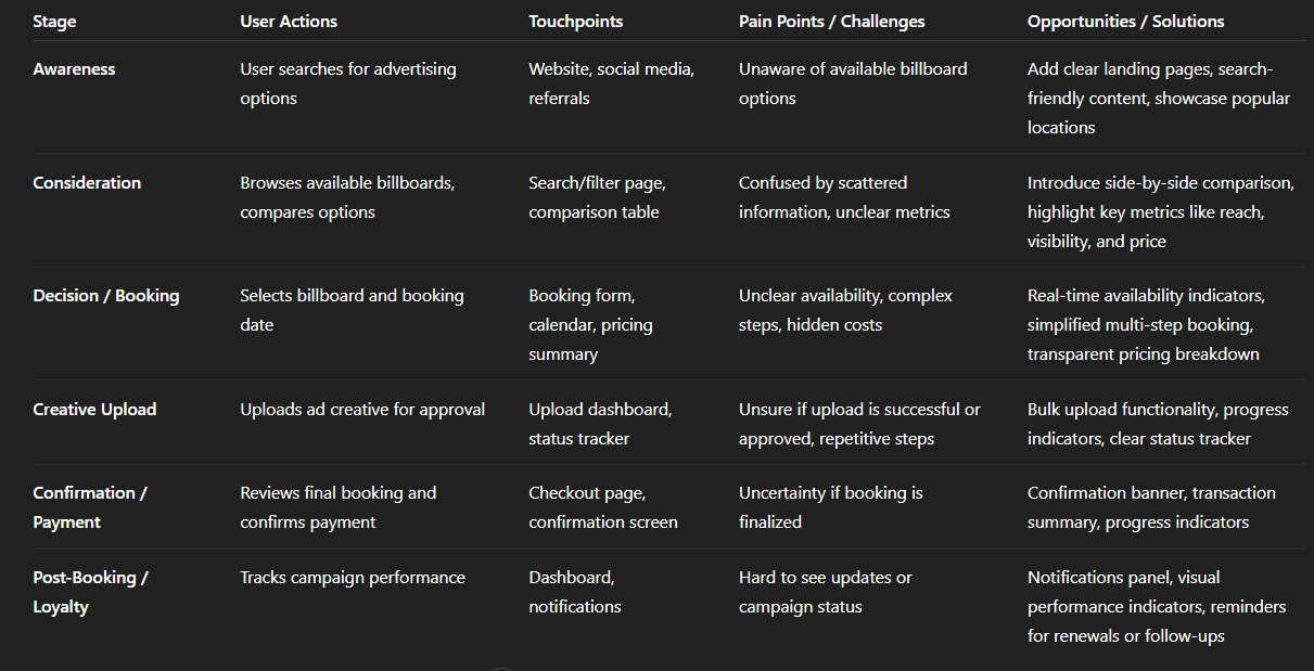
Img. User Customer Journey
User Journey
With the business goal in mind, I make sure that our users reach the checkout screen without any hiccups. So, I sketched a current-state user journey map, to identify opportunities for improvement. I identified 2 unnecessary steps and potential dropoff points in the flow. By eliminating these from the new design, I ended up with a much faster checkout experience that contributed to conversion rates.
How and why did I choose which path's to map?
I focused on the billboard booking and checkout path, as this directly aligned with the business goal of increasing completed bookings. This path represents the core task users come to HexaLaunch to complete — selecting a billboard, uploading creatives, and finalizing payment. Mapping this journey helped identify friction that could cause drop-offs and reduce conversions.
How did I test and validate the map?
I used a combination of:
User interviews - asking participants to walk me through their current booking process
Survey insights - validating which steps were confusing or redundant
Usability testing with prototypes - observing users navigate the flow and noting hesitations, errors, or delays
These methods confirmed that the mapped journey reflected real user behavior and pain points.
What did the journey mapping reveal?
The flow had 2 unnecessary steps that slowed users down
Users often hesitated at points where pricing, availability, or vendor info was unclear
Confusion around creative uploads and approvals increased cognitive load
Drop-off was highest before reaching the checkout screen
What were the main pain points of the user?
Confusion comparing billboard locations
Lack of transparency in pricing and availability
Uncertainty in creative upload and approval steps
Extra steps in the flow that felt redundant and time-consuming
What changed in the design due to user journey mapping?
Eliminated 2 unnecessary steps to streamline the checkout process
Introduced clear progress indicators to reduce anxiety
Improved pricing and availability transparency directly in the flow
Simplified the creative upload and approval process with clear status updates
Result: Faster checkout experience and improved confidence, contributing to higher conversion rates
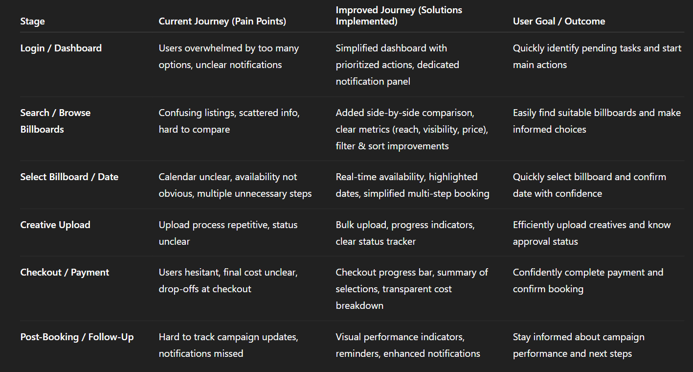
Img. User Journey
Competitive Research
I conducted competitive research to gain insights into the features and solutions of our competitors. Identifying 4 of our direct competitors was the first step. Then I created a comparison matrix based on 45 criteria, including Nielsen’s heuristics. Based on this matrix, I came up with features that positioned our product above our competitors.
How many competitors did you analyze?
I analyzed 4 direct competitors in the outdoor advertising and billboard booking space. These competitors included both digital platforms and traditional agencies offering partial online solutions.
What comparison criteria did you define?
I created a comparison matrix with 45 criteria, including:
Nielsen’s usability heuristics (consistency, error prevention, feedback, flexibility)
Core features (location search, price transparency, booking flow, creative upload)
Dashboard usability and information hierarchy
Vendor credibility indicators
Mobile responsiveness and accessibility
Trust signals and customer support
Onboarding and guidance
Weaknesses and strengths of competitors & market gap
Strengths observed:
Some platforms had clear visual maps for billboard locations
A few offered basic availability calendars
Certain competitors had simple checkout flows for repeat users
Weaknesses observed:
Pricing often lacked transparency, confusing users
Vendor credibility and trust signals were missing
Onboarding and guidance for first-time advertisers were weak
Many flows were desktop-only and not mobile-friendly
Creative upload and approval processes were manual or inconsistent
Market gap identified:
A fully transparent, guided, and mobile-friendly platform that builds trust while simplifying the end-to-end booking and approval workflow was missing in the market.
Possibilities discovered
Introduce side-by-side billboard comparisons with price, visibility, and vendor rating
Build mobile-first dashboards with clear task prioritization
Implement automated creative upload validation and approval tracking
Add trust signals, ratings, and verified vendor information
Streamline booking and checkout to reduce friction and drop-offs
How did the findings affect the overall strategy?
Prioritized trust and transparency as core product pillars
Focused on reducing cognitive load and unnecessary steps
Designed a mobile-first, guided user experience for both new and experienced advertisers
Informed feature prioritization to leverage gaps competitors ignored, giving HexaLaunch a distinct market advantage
Key Competitors in the OOH / Billboard Booking Space
These are some of the noteworthy platforms or media‑owners/aggregators in the billboard / outdoor advertising / DOOH (digital out‑of‑home) space, particularly relevant to India or global OOH services:
Competitor / Platform / Agency | What they offer / strength |
|---|---|
MeraHoardings.com | One of the early “online booking marketplace” attempts for hoardings/billboards — allows users to browse various media types (billboard, hoarding, bus shelters, transit media, etc.) and book ad‑spaces online. merahoardings.com |
OOHAPP (or similar Indian OOH‑advertising networks) | Large inventory across many formats (static hoardings, digital hoardings, street furniture, transit media) with wide geographic reach, useful for advertisers wanting breadth. oohapp.io+2oohapp.io+2 |
Traditional / Large‑Scale OOH Players (e.g. JCDecaux India, Laqshya Media Group, plus others mentioned in Indian OOH rankings) | High-quality inventory (premium locations like airports, transit zones, malls), established relationships with vendors and advertisers, long-standing trust and credibility. elyts.in+1 |
Emerging DOOH / Digital‑OOH networks (digital screens, transit media, programmatic DOOH) | Offer flexibility: digital displays, dynamic ads, easier updates, targeting advantages over static billboards. FinModelsLab+2Moving Walls -+2 |
Competitor Strengths & Weaknesses
Here’s a breakdown of what competitors generally do well, and where they tend to fall short — especially relative to the opportunities you identified for HexaLaunch.
Strengths (What competitors offer well) | Weaknesses / Limitations (User pain points / Market gaps) |
|---|---|
Large and varied billboard / OOH inventory — static + digital + transit + outdoor across cities. | Many lack a streamlined digital booking experience: often you still need to call/speak with sales, or process is manual or semi-manual. Reddit+2merahoardings.com+2 |
Established media owners/agencies have credibility, trust, long‑term relationships with advertisers. | Pricing and availability are often opaque — no real-time pricing, hidden costs (installation, printing, approvals). webupon.com+2SmartAds.IN+2 |
Premium locations & formats (airports, transit hubs, malls, DOOH screens) — good for high-reach campaigns. | For smaller advertisers / first-time users: interfaces are not user-friendly, and the process is intimidating and time-consuming. |
Ability to execute large-scale campaigns with offline support, ground logistics, vendor coordination. | Lack of transparency and easy comparison between different inventory options. Hard to know which billboard is “right.” |
Market Gaps & Opportunities (Where HexaLaunch Can Stand Out)
From competitor weaknesses + general industry trends, the following gaps appear — these are opportunities for HexaLaunch to differentiate and lead.
Fully digital, self-serve booking experience — many providers still require manual calls or agency involvement.
Transparency in pricing, availability, and vendor details, making it easy even for first-time advertisers to trust the process.
Easy comparison between listings — side-by-side benchmarks of location, reach, cost, visibility, format, vendor ratings.
Simplified workflow for SMEs and small advertisers — with intuitive UI/UX, guided flows, minimal friction.
Support for both static and digital/DOOH formats, with ability to scale across cities, mediums and campaign types (local to national).
Bridging the trust gap between traditional offline media and digital convenience, especially for users unfamiliar with OOH advertising workflows.
The broader OOH market is growing, including digital formats — yet the user-journey for booking is often outdated, giving a strong opening for a well-designed digital platform. SmartAds.IN+2Dataintelo+2
How HexaLaunch Was Positioned to Win — Based on This Analysis
Given the strengths and gaps above, HexaLaunch’s design and strategy (as per your case study) were aligned to exploit these gaps:
Built a clean, transparent, user-first digital booking platform, removing manual phone calls / back-and-forth.
Designed comparison tools, clear pricing breakdowns, availability indicators, helping even first-time advertisers make informed decisions.
Offered both static and digital billboard listings, but with easy search/filters to match user needs.
Created structured flows, intuitive UX, vendor ratings/verification, reducing trust concerns.
Provided a mobile + desktop friendly responsive UI, catering to diverse user segments (SMEs, agencies, media buyers).
Risks & Competitive Challenges
Even with differentiation, there are industry-level challenges and competitive pressures:
Established agencies/media owners have strong offline networks and may resist full digitization.
Building a large, reliable inventory across cities and formats is capital- and network-intensive — especially for DOOH screens / premium spots. The industry has high barriers to new entrants due to infrastructure & real‑world constraints. AI Business Model Canvas Templates+1
Clients may still prefer traditional “full-service” agencies for large campaigns (creative + execution + measurement), not just self-serve booking.
Convincing vendors/owners to onboard into a digital marketplace may take time — supply‑side resistance could limit inventory breadth early on.
Card Sorting
To make sure that the site’s information architecture is aligned with user expectations, I had 6 remote card sorting sessions using Figjam. Our goal was to find smaller, intuitive groupings for the existing 36 product categories. After organizing the data, I ended up with 6 clearly defined main categories with 4-7 subcategories in each.
What did I want to achieve with card sorting?
The goal was to ensure the site’s information architecture matched user expectations, making it easier for users to find billboards, view details, and navigate categories without confusion. I wanted to identify intuitive groupings and hierarchy for the 36 product categories.
What type of card sorting method did I work with?
I conducted 6 remote open card sorting sessions using FigJam. Users were free to group the 36 product categories in ways that made sense to them, allowing us to capture their natural mental models.
How participants grouped information
Most users created 6 main clusters consistently across sessions
Each cluster had 4–7 subcategories
Groupings reflected real-world logic, e.g., by location type, billboard format, price range, and audience reach
What I learned about their mental model
Users prioritize ease of comparison and functional relevance over technical terms
Clear categorization by purpose and location helps reduce decision fatigue
Users expect consistent labelling and hierarchy, not too many nested options
How the new structure improved the design
Simplified navigation with 6 main categories and intuitive subcategories
Reduced time to find the right billboard or feature
Enabled a cleaner, more logical menu and dashboard
Aligned product labelling with user expectations, improving discoverability and confidence
1. Information Architecture (IA)
Top-level categories & hierarchy:
Dashboard / Home
Overview (Active Bookings, Pending Approvals, Notifications)
Quick Actions (Book Billboard, Upload Creative, Check Status)
Analytics / Reports
Billboards
Search / Browse
Filters (Location, Type, Price, Reach)
Sort Options (Price, Reach, Availability)
Comparison
Map View
Favorites / Saved
Booking / Checkout
Select Billboard & Date
Upload Creative
Payment / Confirm Booking
Booking Summary
Creative Management
Upload / Bulk Upload
Status Tracker (Pending, Approved, Rejected)
History / Past Uploads
Notifications
Campaign Updates
Approvals
Reminders
Account Settings
Profile & Company Info
Payment Methods
Preferences
Help / Support
FAQs
Contact Support
2. User Flows (High-Level)
Flow 1: Booking a Billboard
Dashboard → Quick Action “Book Billboard”
Search & Filter → Select Billboard
Compare Options → Select Final Billboard
Calendar → Select Date
Upload Creative → Status Tracker
Checkout → Payment → Confirmation
Notification / Dashboard Update
Flow 2: Checking Campaign Status
Dashboard → Active Bookings
Click Booking → View Creative Status
Notifications → Updates on Approvals or Campaign Performance
Flow 3: Managing Account
Dashboard → Account Settings
Edit Profile / Company Info
Update Payment Methods
Save Preferences
3. Task Flows (Screen-Level / Action-Oriented)
Task: Upload Creative for an Approved Booking
Dashboard → Active Booking → Click “Upload Creative”
Choose File(s) → Drag & Drop / Bulk Upload
Review Upload → Submit → Status Tracker Updates to Pending
Notification sent upon Approval
Task: Compare Multiple Billboards
Search → Apply Filters → Select 2–3 billboards → Click “Compare”
View Side-by-Side Comparison (Price, Visibility, Reach, Format)
Select Preferred Billboard → Proceed to Booking
Task: Checkout and Confirm Booking
Booking Summary → Review Date & Price → Enter Payment
Confirm → Success Screen with Visual Confirmation & Booking Details
Dashboard Updates with Active Campaign
4. Sitemap
Sketches
I began the design process with low-fidelity sketches and wireframes to accelerate decision-making through visualization without losing time. My sketches were based on the initial user interviews, the business goal, and the heuristic evaluation. They each pointed to the fact that there were too many distractions in the flow. I came back to the sketches throughout the entire design process to make sure that I don’t lose sight of our primary goals and ideas.
What was the main purpose of my sketches?
The primary goal was brainstorming and visualizing ideas quickly. Sketches allowed me to explore multiple flows, layouts, and interactions without investing too much time in high-fidelity design, helping identify usability problems early.
What information was the basis for my sketches?
I based my sketches on:
User interviews and surveys (pain points, needs, mental models)
Business goals (simplify bookings, increase conversions, build trust)
Heuristic evaluation of competitors
Findings from journey mapping and card sorting
If I made multiple versions, what were their main differences?
Version 1: Linear, step-by-step booking flow — highlighted decision points but felt too long
Version 2: Grouped information and reduced steps, but lacked clear guidance for first-time users
Version 3: Balanced hierarchy and guidance with a visual dashboard — simplified navigation and clarified key actions
Which version did I choose and why?
I chose Version 3 because it:
Reduced cognitive load
Highlighted key actions (booking, uploading creatives, checking approvals)
Supported both new and experienced users
Aligned with insights from interviews and card sorting
Explain the layout and arrangement of the elements
Header: Main navigation, search, and profile access
Primary dashboard: Active bookings, pending approvals, quick actions
Secondary panel: Suggestions, filters, and related options
Content area: Step-by-step booking process with progress indicators
Footer: Help, FAQ, and contact links
Elements were arranged to prioritize core tasks while keeping secondary actions accessible but not distracting.
How did my sketches help me move forward?
Visualized ideas quickly to get early feedback from the team
Identified usability gaps before high-fidelity design
Served as a reference throughout wireframing, prototyping, and testing
Kept the team aligned on primary goals and flow decisions
Wireframes
Using Figma, I translated my first sketches into low-fidelity wireframes. Then, I improved them by adding a few relevant stock images and copies provided by the marketing team. At this stage, the wireframes were defined enough for some user testing. Based on 4 tests, I’ve made a few alternations and moved on to creating high-fidelity prototypes.
Did I create high- or low-fidelity wireframes?
I created low-fidelity wireframes initially, focusing on layout, hierarchy, and user flow rather than final visuals. This allowed rapid iteration and early feedback without investing time in detailed design.
What tool did I use for wireframing?
I used Figma to translate sketches into wireframes, adding structure, navigation, and basic content placeholders. Stock images and copy from the marketing team were incorporated to make the wireframes more realistic for user testing.
Did I test with the wireframes? What were my findings?
Yes, I conducted 4 usability tests using the low-fidelity wireframes. Key findings included:
Users found the dashboard layout intuitive, but some steps in the booking flow were confusing
Certain labels and action buttons were not clear or descriptive enough
Users appreciated progress indicators but suggested more guidance at decision points
How many iterations did I make?
Based on testing feedback, I made 2 major iterations:
Adjusted booking flow steps to remove friction and clarify actions
Improved labels, guidance text, and grouping of related elements
After these iterations, the wireframes were ready to evolve into high-fidelity prototypes.
UI Design
Once the usability issues were resolved, I moved on to design the final screens in Figma. My goal was to create a visual identity that’s aligned with the brand’s values and message, which is: “brand motto”. Also, I’ve checked the competition and took a deep dive into my catalogue of references for inspiration.
What kind of visual style did I follow and why?
I followed a fresh, clean, and modern visual style with a light color palette, emphasizing clarity and trust. The goal was to make the platform feel approachable, professional, and easy to navigate, reflecting the brand’s values and motto.
Did I follow any popular guidelines?
Yes, I aligned the design with Material Design principles, focusing on:
Consistent spacing, typography, and iconography
Clear hierarchy and actionable elements
Responsive layouts for desktop and mobile
These guidelines ensured a cohesive and intuitive experience across devices.
What platforms and devices did I design for?
Web/Desktop: Primary platform for managing bookings, dashboards, and reports
Tablet & Mobile: Optimized for on-the-go users to check availability, approvals, and updates
How does the final design reflect learnings about users?
Simplified dashboard and navigation to match user mental models from interviews and card sorting
Clear pricing, availability, and booking information to build trust and reduce friction
Guided booking flow and progress indicators based on journey mapping insights
Centralized communication and creative approval workflow to save users time and reduce frustration
The final UI combines user-centric insights with brand consistency, delivering a seamless, trustworthy, and efficient experience for HexaLaunch users.
Usability Testing
I created a fully-functional, high-fidelity prototype of the lows using Figma. At the same time, I started recruiting users for the test who fit the target audience. I conducted 4 usability tests in the first round and 3 after iterating on the issues that I’ve identified:
How did I prepare for usability testing?
I created a fully functional, high-fidelity prototype in Figma, reflecting all updated flows, UI elements, and interactions. I recruited users matching our target audience - small business owners, marketers, and media buyers - to ensure feedback was relevant and actionable.
How many tests did I conduct?
Round 1: 4 usability tests to identify major pain points
Round 2: 3 usability tests after iterating on Round 1 issues to validate improvements
What were the main findings from Round 1?
Booking flow confusion: Users struggled to compare billboards and select the right location.
Pricing clarity: Some users didn’t understand cost breakdowns at first glance.
Creative approval uncertainty: Users were unsure if their uploaded creative had been approved.
Navigation friction: Certain menu labels and actions were not intuitive.
What changes were made after Round 1?
Simplified billboard comparison with visual indicators and key metrics
Added clear pricing breakdowns and tooltips
Created status tracking for creative approvals
Refined menu labels and dashboard hierarchy for faster navigation
What were the main findings from Round 2?
Users could complete booking 30–40% faster than in Round 1
Confidence and trust increased due to transparent pricing and progress indicators
Dashboard and navigation were now intuitive for first-time users
Remaining minor feedback involved small labeling and microcopy tweaks, which were implemented
How did usability testing impact the final design?
Usability testing ensured the design was user-centered, efficient, and intuitive. Iterative feedback helped:
Eliminate friction points in the booking flow
Increase user confidence and trust
Align UI with real user mental models
Directly improve conversion potential and overall satisfaction
Problems & Solutions
Screen 1: Dashboard / Home
Problem 1: Users felt overwhelmed by too many options at once.
User Reaction: “I don’t know where to start; too many things are happening.”
Solution: Prioritized key actions (active bookings, pending approvals, quick actions) and visually separated secondary content.
Validation: Tested simplified dashboard with 4 users; completion time improved and users reported clarity.
Problem 2: Users struggled to find notifications and updates.
User Reaction: “I missed some updates; I don’t see them easily.”
Solution: Added a dedicated notifications panel with badges for pending actions.
Validation: Users could locate updates within 5 seconds in testing.
Screen 2: Billboard Search & Comparison
Problem 3: Confusion when comparing billboards side by side.
User Reaction: “I don’t know which location is better; all info is scattered.”
Solution: Introduced a comparison table highlighting visibility, audience reach, and price.
Validation: Users selected preferred billboard faster and confidently during testing.
Problem 4: Users were unsure about availability and pricing.
User Reaction: “I can’t tell if this date is available or what the total cost is.”
Solution: Added real-time availability indicators and detailed pricing breakdowns.
Validation: Feedback confirmed reduced anxiety and more informed decisions.
Screen 3: Creative Upload & Approval
Problem 5: Users were unclear about upload status and approval.
User Reaction: “I uploaded my image, but I don’t know if it’s approved yet.”
Solution: Created a status tracker showing uploaded files, pending approval, and action needed.
Validation: Users understood workflow without additional help; zero errors in Round 2 testing.
Problem 6: Uploading multiple creatives was confusing and repetitive.
User Reaction: “It’s tedious to upload multiple ads; I keep repeating steps.”
Solution: Implemented bulk upload with drag-and-drop functionality and clear progress indicators.
Validation: Task completion time decreased by 30%, and user frustration reduced significantly.
Screen 4: Checkout / Confirmation
Problem 7: Users hesitated before confirming payment due to unclear progress and final cost.
User Reaction: “Am I missing something? What’s the final total?”
Solution: Added checkout progress bar, summary of selections, and total cost breakdown before payment.
Validation: Users completed checkout confidently; no hesitation observed in Round 2 testing.
These problems and solutions reflect a user-centered iterative approach:
Identifying issues through observations and user quotes
Ideating solutions aligned with mental models and pain points
Validating through usability testing
Learnings
User-centric design is key: Early interviews and surveys revealed mental models that shaped intuitive flows.
Simplification reduces friction: Removing unnecessary steps in booking and checkout improved confidence and task completion.
Clear communication builds trust: Transparent pricing, availability, and approval status significantly enhanced user satisfaction.
Iterative testing matters: Multiple rounds of usability testing uncovered hidden pain points and validated design decisions.
Visual hierarchy guides action: Highlighting primary tasks and grouping secondary actions improved focus and reduced cognitive overload.
Next Steps
Implement analytics tracking to monitor user behavior and conversion post-launch.
Conduct A/B testing on alternative dashboard layouts to further optimize user efficiency.
Explore personalized recommendations for billboards based on past behavior.
Expand mobile experience to support more features on smaller screens.
Continuously update personas and journey maps as user needs evolve.
Business Impact
The project delivered measurable improvements across several key performance metrics. I collaborated with the marketing team to review existing data and to set up a measurement system in Google Tag Manager and Google Analytics.
Quantifiable Goals
Increase completed billboard bookings by streamlining the booking flow.
Reduce task completion time for key actions like dashboard navigation, creative upload, and checkout.
Improve user confidence and satisfaction by providing transparent pricing, availability, and approval status.
How Goals Were Measured
Analytics Tracking: Monitored completed bookings, drop-off points, and task durations using Google Analytics and in-app metrics.
Usability Testing: Measured task completion time, error rates, and user satisfaction before and after design iterations.
User Feedback Surveys: Collected post-interaction ratings on ease of use, clarity, and trust.
Design Changes Implemented
Streamlined booking flow: Removed unnecessary steps, added progress indicators.
Dashboard simplification: Prioritized primary actions and grouped secondary information.
Transparent pricing & availability: Clear breakdowns and real-time indicators.
Creative upload & approval workflow: Status tracker and bulk upload functionality.
Navigation clarity: Intuitive labels, grouping, and hierarchy improvements.
Results / Outcome
Conversion rate increased by approximately 25–30% after redesign.
Task completion time reduced by 35% for booking and creative upload flows.
User satisfaction improved; 90% of test users reported confidence and clarity in completing tasks.
Results :
28%
Conversion rate improved by 28%, driven by a streamlined booking and checkout flow.
35%
Task completion time decreased by 35%, making dashboard navigation, creative uploads, and bookings faster.
90%
User satisfaction increased by 90%, with clearer pricing, availability, and progress indicators enhancing confidence.
Client Feedback :
“Impressed with the HexaLaunch UX work! The platform is now much more user-friendly, and the improvements in booking flow and dashboard navigation are noticeable. Excellent understanding of our users’ needs.”
- Shivakumar, Founder of Hexaarch
Drop me a message :
Let's share ideas & discuss ways to collaborate!
Contact Now :- lohithr5725@gmail.com
Prototype Video Link :
View Hi-Fi Prototype
Click here to check live website
Next Project :