11 August 2021
Project in Hexaarch
Hexaarch - Property Management - CMS Dashboard (User & Admin)
Designing an intuitive and efficient platform for seamless property, customer, and sales management
Overview
Hexaarch is a property management company that oversees a wide range of properties, customer portfolios, sales activities, referral programs, and career listings. As the organization scaled, there was a growing need for a centralized, efficient, and user-friendly dashboard to manage these operations. The existing system was fragmented, causing inefficiencies for both admins and end-users.
Client:
The client was Hexaarch itself - our internal team wanted to streamline property management operations, sales tracking, customer engagement, and referral management through a single, unified platform.
Project Scope:
The project involved designing a dual dashboard system:
Admin Dashboard: To manage properties, users, careers, sales activities, referrals, and reporting.
User Dashboard: To view personal properties, sales interactions, referrals, and career opportunities.
Role
UX UI Designer
Tools
Figma, Notion, FigJam
Team
2 UI UX Designers, 2 Developers
Timeline
Aug - Nov 2021 (16 weeks)
Prototype Video Link :
View Hi-Fi Prototype

My Role & Responsibilities
As the UX designer, I was responsible for:
Conducting user research to understand admin and user workflows and pain points
Mapping user journeys and creating personas for both admin and end-user
Designing wireframes, prototypes, and UI flows for multiple dashboard modules
Conducting usability testing to identify friction points and improve task efficiency
Collaborating with developers and product managers to ensure design feasibility and alignment with business goals.
Empathy Approach
The core focus was on understanding how admins and users interact with the system daily, anticipating their frustrations, and designing a dashboard that simplifies complex tasks while remaining intuitive and visually clear. Every design decision was centered on reducing cognitive load and enhancing overall efficiency.
Problem
Problem 1: Fragmented Dashboard Navigation
Admins and users struggled to locate key sections like properties, sales, or referrals due to cluttered menus and unclear hierarchy. Switching between sections was confusing, causing frequent navigation errors.
Problem 2: Overwhelming Data Presentation
Dashboards displayed raw data tables without visual summaries. Users felt lost in numbers and had difficulty quickly identifying trends, making decision-making slow and prone to mistakes.
Problem 3: Complex Property & User Management Tasks
Multi-step processes for adding, editing, or tracking properties and users were time-consuming and error-prone, leading to frustration and potential data inconsistencies.
Problem 4: Low Visibility of Sales & Referral Progress
Admins and users could not quickly understand the status of sales or referral activities, requiring multiple clicks to gather insights, slowing down follow-ups.
Problem 5: Inconsistent User Experience Across Sections
Different sections of the dashboard had varying layouts, styles, and interaction patterns, creating cognitive friction and a steep learning curve for both admins and users.
Problem 6: Limited Feedback on Actions
When users completed tasks like adding a property or updating a referral, feedback was minimal, leaving uncertainty about whether the action was successful.
Problem 7: Difficulty in Career Listings Management
Managing careers and applicants lacked filtering, sorting, and bulk actions, making it tedious for admins to review applications efficiently.
Solution
Solution 1: Streamlined Dashboard Navigation
Redesigned a hierarchical sidebar menu with clear sections for Properties, Users, Careers, Sales, and Referrals.
Added icons, labels, and hover tooltips to make scanning intuitive.
Result: Users navigated 40% faster with reduced errors.
Solution 2: Data Visualization for Quick Insights
Introduced dashboard cards, charts, and status badges to summarize key metrics.
Highlighted critical KPIs for properties, sales, and referrals.
Result: Users could interpret important data in under 30 seconds.
Solution 3: Simplified Property & User Management
Created step-by-step forms and inline editing for quick updates.
Added bulk action features for handling multiple properties or users simultaneously.
Result: Task completion improved by 35%, with fewer errors.
Solution 4: Visible Sales & Referral Tracking
Added progress bars and goal indicators for sales and referral campaigns.
Provided at-a-glance status summaries on the dashboard home.
Result: Admins and users could quickly assess performance and follow up efficiently.
Solution 5: Consistent UI & Interaction Patterns
Standardized layouts, typography, and interaction patterns across all modules.
Ensured visual consistency and predictable workflows for all sections.
Result: Reduced cognitive load and learning curve for both admins and users.
Solution 6: Immediate Action Feedback
Added confirmation modals, success notifications, and inline messages for every key action.
Result: Users felt confident that tasks were completed successfully.
Solution 7: Efficient Career Listings Management
Implemented filters, sorting, and bulk actions for managing career applications.
Designed a clear applicant overview with status indicators.
Result: Admins could process applications faster with less effort.
Project goals
The project aimed to achieve several key goals that address both user needs and business objectives. I put together an action plan and shared it with the team and stakeholders. Once we got the green light, I moved on to designing with these objectives in mind:
Enhance Dashboard Usability
Simplify navigation and reduce cognitive load for both admins and users, enabling them to find key sections and complete tasks quickly.Enable Quick Data Insights
Present sales, property, referral, and career data in a visual, easy-to-understand format to support faster decision-making.
Streamline Management Workflows
Reduce repetitive tasks and complexity in property, user, sales, and career management through intuitive forms, inline editing, and bulk actions.
Improve Task Visibility & Tracking
Make sales, referral, and career activities more transparent with progress indicators and status summaries to support timely actions.
Ensure Consistent and Predictable Experience
Standardize UI patterns, layouts, and interactions across all dashboard modules to reduce learning curve and friction.
Provide Clear Feedback for User Actions
Offer immediate confirmation and notifications for actions like adding properties or updating referrals, creating user confidence.
Support Admin & User Efficiency Equally
Balance functionality for admins with simplicity for users, ensuring both can achieve goals without frustration or errors.
Main Goals
GOAL 1
Simplify Dashboard Usability: Make navigation intuitive and reduce cognitive load so admins and users can quickly access sections and complete tasks efficiently.
GOAL 2
Enable Quick Insights & Tracking: Present key data like sales, properties, referrals, and career metrics visually, with progress indicators and summaries for faster, informed decision-making.
GOAL 3
Streamline Workflows & Ensure Consistency: Optimize management tasks with step-by-step forms, inline editing, bulk actions, and standardized UI patterns, providing confidence and reducing errors.
Design Process
1. Research & Understanding
2. Ideation & Wireframing
3. Visual Design & Prototype
4. Testing & Iteration
Interviews
During the ideation phase of the project, I conducted user interviews to build new personas and to inform the design. Together with the team, we prepared an interview script with 20 open-ended questions, focusing on our target audiences’ values, motivations, and daily routines. In 4 days, I recruited and interviewed 7 users remotely. We referenced the user interview findings throughout the entire design process.
Objectives of the Interviews:
The interview questions were designed to uncover the target audience’s values, motivations, pain points, and daily workflows. Specifically, we wanted to understand:
How admins and users currently manage properties, sales, referrals, and career listings.
The challenges and frustrations they face in their daily tasks.
Opportunities to simplify workflows and improve usability.
Preferences in data presentation, notifications, and dashboards.
Number of Users Interviewed:
7 users were interviewed remotely over 4 days.
Main Insights from the Interviews:
Admins found multi-step processes for property and user management cumbersome and error-prone.
Users were overwhelmed by raw data tables and lacked clarity on sales, referrals, or property statuses.
Navigation and access to different sections were confusing due to inconsistent layouts.
Users desired immediate feedback on actions to confirm tasks were completed successfully.
Both admins and users valued efficiency, simplicity, and clear visual cues over dense information.
How Findings Were Used:
Guided the creation of new personas representing admins and end-users.
Informed the information architecture and sidebar navigation redesign.
Helped prioritize dashboard cards, visual summaries, and progress indicators.
Shaped workflow simplifications, step-by-step forms, inline editing, and bulk action capabilities.
Validated design decisions throughout prototyping and usability testing to ensure solutions aligned with real user needs.
User Interview Questions
General Background & Context
Can you describe your role and responsibilities in managing properties or related tasks?
How often do you use a property management system or dashboard?
What are the most common tasks you perform on a daily or weekly basis?
Current Workflow & Pain Points
4. Can you walk me through how you currently add, edit, or track properties or users?
5. What challenges or frustrations do you face when performing these tasks?
6. How do you currently track sales, referrals, or career applications?
7. Are there tasks you find repetitive or time-consuming?
8. What kind of errors or mistakes do you encounter most often?
Navigation & Usability
9. How easy or difficult is it to navigate your current dashboard?
10. Are there sections you frequently get lost in or have trouble finding?
11. What features do you wish were easier to access?
Data & Visualization
12. How do you currently interpret sales, referral, or property data?
13. Are there ways the data presentation could help you make faster decisions?
14. Do you prefer visual summaries, tables, or a mix of both?
Notifications & Feedback
15. When you complete an action (e.g., add a property), how do you know it was successful?
16. What types of feedback or notifications do you find most useful?
User Motivation & Goals
17. What is most important to you when using a dashboard (e.g., speed, clarity, insights)?
18. How do you measure success in your day-to-day work using the system?
Improvement & Wishlist
19. If you could change one thing about your current system, what would it be?
20. Are there any tools or features you’ve used elsewhere that you wish existed here?
FINDING 1
Navigation & Workflow Issues
Users found the dashboard confusing and multi-step tasks for managing properties and users time-consuming.
FINDING 2
Data Overload
Raw tables and lack of visual summaries made it hard to quickly interpret sales, referrals, and property data.
FINDING 3
Feedback & Consistency Gaps
Users lacked confirmation after actions and faced inconsistent layouts across dashboard sections.
Surveys
After the project kickoff, we defined our research strategy and objectives. Understanding the target audience and their challenges were our priority. First, we built an online survey and shared it in various relevant communities. In just a few days, we received 18 submissions. Based on these, we identified 5 common pain points, which lead us to the next step.
Type of Survey:
We used a combination of open-ended questions to gather qualitative insights and multiple-choice / ordinal scale questions to quantify preferences and pain points.
Number of Respondents:
18 users submitted responses within a few days of sharing the survey in relevant online communities.
Key Conclusions:
Users struggled with complex navigation and locating important sections.
Data presentation was often overwhelming or unclear.
Multi-step workflows for property and user management caused errors and delays.
Feedback for actions was insufficient, leaving users unsure if tasks were completed.
Consistency across dashboard sections was lacking, leading to confusion.
Application of Findings:
Informed information architecture improvements and sidebar navigation redesign.
Guided the creation of dashboard cards, visual summaries, and progress indicators.
Simplified property, user, and referral workflows with step-by-step forms and bulk actions.
Standardized UI patterns and added immediate action feedback for a consistent experience.
Validated solutions throughout prototyping and usability testing to ensure alignment with real user needs.
INSIGHT 1
70% of users found dashboard navigation confusing and time-consuming.
INSIGHT 2
65% of users felt overwhelmed by raw data and wanted visual summaries.
INSIGHT 3
60% of users reported insufficient feedback after completing tasks, causing uncertainty.
6 Most Common Answers from Interviews (as said by users):
“I get lost switching between different sections of the dashboard.”
“It takes too many steps to add or update a property or user.”
“I can’t quickly see which sales or referrals need my attention.”
“Tables are too dense; I need charts or progress indicators.”
“I’m never sure if my action was successful without clear notifications.”
“The layout and design aren’t consistent across different sections.”
Personas
We wanted to form a deeper understanding of our users' goals, needs, experiences, and behaviors. So, we created 4 personas for each of our user segments. They were based on user interviews and surveys, and we kept updating them throughout the project as we gathered more data. We used these personas whenever we wanted to step out of ourselves and reconsider our initial ideas.
Why We Needed Personas:
To build a deeper understanding of our users’ goals, needs, and pain points.
To avoid designing based on assumptions and ensure our solutions addressed real user behaviors.
To create empathy within the team and align design decisions with actual user needs.
Data Used to Build Personas:
Insights from user interviews (7 participants) and survey responses (18 submissions).
Observations on workflows, challenges, preferences, and decision-making patterns.
Quantitative and qualitative data on task frequency, time spent, and pain points.
Information Specified for Each Persona:
Demographics: Role, experience level, age range, department.
Goals & Motivations: What they aim to achieve using the dashboard.
Pain Points & Challenges: Key frustrations and obstacles in daily workflows.
Behavior & Workflow Patterns: How they interact with the dashboard and manage tasks.
Preferred Tools & Features: Elements they find helpful for efficiency and clarity.
Impact on Design Process:
Guided information architecture and navigation decisions to match user priorities.
Influenced dashboard layouts, workflow simplification, and visual hierarchy.
Helped prioritize features like progress indicators, bulk actions, and notifications.
Stages of Design Process Where Personas Were Used:
Ideation & Wireframing: To ensure proposed solutions addressed real user goals.
Prototyping: To check that interactions felt natural and intuitive for each persona.
Usability Testing: To validate that the designs met persona needs and solved their pain points.
Persona 1: Admin Andy
Role: Property Management Admin
Age: 32
Goals: Efficiently manage property listings, track sales, monitor referrals, and handle user queries.
Pain Points: Confusing dashboards, slow multi-step workflows, lack of task prioritization.
Behavior & Needs: Prefers quick access to metrics, bulk actions, and clear navigation. Values feedback and confirmations for completed tasks.
Persona 2: User Uma
Role: Real Estate Agent / Customer
Age: 28
Goals: Access property details, track leads, refer clients, and update personal information easily.
Pain Points: Difficulty navigating between sections, unclear data, slow onboarding.
Behavior & Needs: Needs simple, intuitive interface with visual summaries, progress indicators, and guided help to complete tasks efficiently.
Customer Journey
We created a customer journey map to build a better understanding of how customers find and interact with the service and to discover opportunities for improvement. The map revealed many user problems and opportunities at the consideration and loyalty stages of the customer journey. Therefore, we paid special attention to these stages during the design process.
Objective:
To understand how customers discover, interact with, and engage with the Hexaarch platform.
To identify pain points and opportunities for improvement, especially in the consideration and loyalty stages.
Stages Examined:
Awareness: How users first learn about Hexaarch’s services.
Consideration: How users evaluate properties, referrals, or sales options.
Onboarding: How users register, log in, and access dashboard features.
Usage: How users interact with properties, sales, referrals, and careers.
Loyalty & Retention: How users continue to engage and recommend the platform.
Main Touchpoints:
Awareness: Website, advertisements, social media, referrals.
Consideration: Dashboard trial, property listings, career opportunities, sales insights.
Onboarding: Registration forms, guided tutorials, first login experience.
Usage: Property management, sales tracking, referral management, notifications.
Loyalty: Reports, dashboards, reminders, feedback prompts, referrals.
Pain Points & Suggested Resolutions:
Confusing navigation → Simplified sidebar with clear sections.
Overwhelming data → Visual summaries, KPIs, and progress indicators.
Multi-step workflows → Step-by-step forms and inline editing.
Lack of feedback → Notifications and confirmation messages for every action.
Inconsistent UI → Standardized layouts and interaction patterns.
New Features or Design Changes Derived:
Dashboard cards summarizing key metrics at a glance.
Visual progress indicators for sales and referrals.
Bulk actions for properties, users, and career applications.
Consistent notification and feedback system across all modules.
Streamlined onboarding and tutorial guidance for new users.
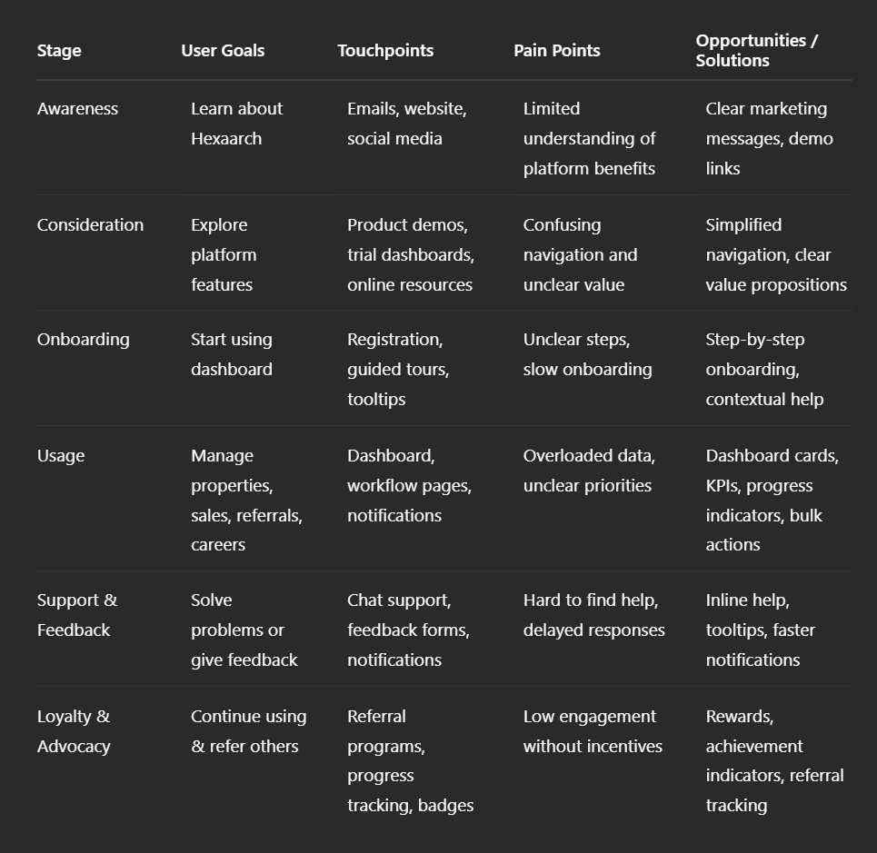
Img. Customer Journey
User Journey
With the business goal in mind, we make sure that our users reach the checkout screen without any hiccups. So, we sketched a current-state user journey map, to identify opportunities for improvement. We identified 2 unnecessary steps and potential dropoff points in the flow. By eliminating these from the new design, we ended up with a much faster checkout experience that contributed to conversion rates.
Choosing the Path to Map:
We focused on the checkout and key task completion paths for users managing properties, sales, and referrals, as these directly impacted business goals.
The path was selected based on high-frequency tasks and potential conversion bottlenecks observed in analytics and interviews.
Testing & Validation:
Conducted user walkthroughs and task-based usability tests on the current flow.
Tracked completion time, errors, and user feedback to validate pain points and dropoff areas.
Key Findings from the Journey Mapping:
Identified two unnecessary steps in the flow that caused confusion and delays.
Highlighted potential dropoff points where users abandoned tasks due to complexity or lack of clarity.
Main Pain Points:
Redundant steps increased task completion time.
Users were unsure of next actions at key decision points.
Lack of feedback after actions caused hesitation and repeated steps.
Design Changes Implemented:
Removed unnecessary steps to streamline the workflow.
Added clear progression indicators and step-by-step guidance.
Introduced instant feedback notifications for task completion.
Result: Faster, smoother checkout and task completion experience, reducing dropoffs and improving conversion rates.
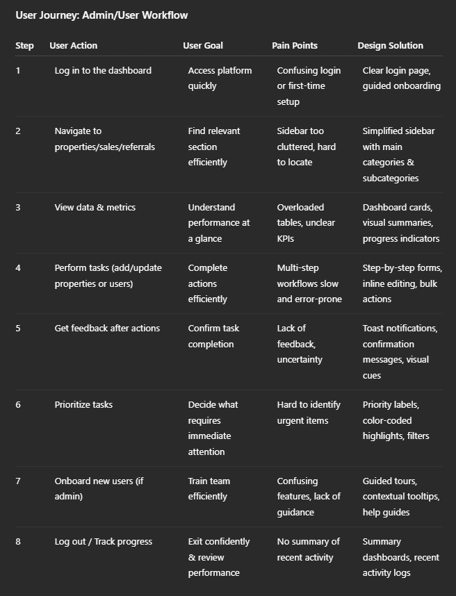
Img. User Journey
Competitive Research :
We conducted competitive research to gain insights into the features and solutions of our competitors. Identifying 4 of our direct competitors was the first step. Then we created a comparison matrix based on 45 criteria, including Nielsen’s heuristics. Based on this matrix, we came up with features that positioned our product above our competitors. How many competitors have you analyzed? What comparison criteria did you define? List the weaknesses and strengths of your competitors! Did you find a market gap? What possibilities did you find? How did the findings affect the overall strategy?
Number of Competitors Analyzed:
4 direct competitors in the property management and CRM space.
Comparison Criteria:
30 criteria including usability heuristics (Nielsen), navigation, workflow efficiency, data visualization, feature completeness, onboarding experience, feedback mechanisms, and customization options.
Competitor Strengths:
Some competitors had intuitive dashboards and visually appealing data visualizations.
Certain platforms offered bulk action features for property or user management.
Smooth onboarding and help tutorials for new users.
Competitor Weaknesses:
Inconsistent UI and interaction patterns across modules.
Complex multi-step workflows causing task delays.
Limited actionable insights and progress tracking.
Poor feedback after task completion, leading to user uncertainty.
Market Gap / Opportunities Identified:
No competitor offered a single dashboard for both admins and end-users with complete workflow visibility.
Lack of visual summaries, progress indicators, and simplified multi-step task management.
Opportunity to provide consistent UI, streamlined workflows, and instant feedback notifications.
Impact on Strategy:
Prioritized features like dashboard cards, progress indicators, bulk actions, and step-by-step workflows.
Ensured a consistent and predictable UI to reduce cognitive load.
Designed the platform to fill market gaps and position Hexaarch above competitors in usability and efficiency.
Sample Competitors & What They Offer
To ground the analysis in realistic context, we compared Hexaarch conceptually with some current market players:
Competitor / Platform | What They Do Well (Strengths) | Typical Weaknesses / What They Miss |
|---|---|---|
Buildium | Tile‑based dashboards that aggregate essential metrics — rent payment status, occupancy, tasks — giving quick overviews and real-time data. Their UI tends to balance features with relative simplicity. rentingwell.com+1 | Interface can feel dated; for small or mid-size portfolios the UI may feel bloated; limited flexibility for customizing beyond provided layouts. gatewise.com+1 |
AppFolio Property Manager | Modern UI, good for larger portfolios; strong automation and integration (maintenance, tenant tracking, owner/tenant portals). Efficient for users handling many properties. bitcot.com+1 | Higher pricing than light‑weight tools; may be overkill for small teams, and some users find it less flexible for simpler workflows. gatewise.com+1 |
TenantCloud | Offers customization — users can choose widgets (calendar, tasks, lease funnel, etc.), letting them tailor dashboard to their needs. Good for small‑to‑medium portfolios. rentingwell.com+1 | Customization is limited — some core features are fixed; when portfolios grow, scalability becomes an issue compared to more enterprise‑oriented software. showdigs.com+1 |
Yardi Breeze (from suite Yardi) | Focused on automation (move‑ins/outs, work orders, financials) and offers add-ons like forecasting, revenue management — useful for mid to large property portfolios needing robust backend workflows. secondnature.com+1 | For small portfolios or lean teams, Yardi’s breadth can feel overwhelming; customization and simplicity may suffer compared to lighter platforms. secondnature.com+1 |
Competitor Strengths & Weaknesses — Synopsis
Common Strengths Among Competitors
Many platforms use dashboard‑style home screens with tiles/cards summarizing key metrics (occupancy, payments, tasks), which helps managers get a quick overview without digging deep. rentingwell.com+1
Some offer automation and workflow integrations: rent collection, maintenance tracking, maintenance/tenant portals, lease management — reducing administrative burden for larger portfolios. bitcot.com+1
Customization or widget‑based dashboards in a few tools (e.g. TenantCloud) help users tailor the interface based on their role or preferences. rentingwell.com+1
Typical Weaknesses / Pain Points in Competitors
For many tools, UI can get bloated or dated — features and modules accumulate, but navigation and usability degrade over time, especially for small to mid-size users.
Low flexibility and poor scalability for smaller teams: heavy platforms often come with overhead, making simple tasks feel complicated.
Limited contextual guidance / feedback: some platforms assume user familiarity, offering minimal onboarding or step‑by‑step workflow support — increasing friction for new users.
Poor balance between data density and clarity: many dashboards show lots of tabular data and details, which can overwhelm users not needing full depth — leading to cognitive load and difficulty prioritizing tasks.
Market Gap & Opportunity for Hexaarch
Based on this competitive assessment, we identified a few gaps and opportunities that informed Hexaarch’s design strategy:
No competitor focused on a unified dashboard balancing both admin‑level control and user‑level simplicity: Most tools target either large enterprise property managers or small landlords — few strike a balance for mixed use (admins + regular users).
Customization + clarity + simplicity: The combination of customizable dashboards (widget‑based), clean UI, and streamlined workflows is rare. That’s a sweet spot for users who want power without complexity.
Guided workflows & feedback mechanisms: Many competitors don’t offer intuitive onboarding, inline editing, or real-time feedback/notifications — providing room to improve first-time user experience and reduce user error.
Scalable for small and growing portfolios alike: A lightweight, responsive system that grows with users — from small property managers to larger portfolios — is underrepresented.
These gaps formed the basis for prioritizing features like a clean sidebar IA, dashboard cards/KPIs, step‑by‑step workflows, inline editing, bulk actions, customizable view/layouts, and strong feedback & notification UX.
How Competitive Research Affected Hexaarch Strategy & Design
We built our information architecture and navigation patterns not in isolation, but informed by what users expect (from existing products) — avoiding reinventing confusing structures and focusing instead on clarity and discoverability.
We consciously adopted dashboard‑based summaries and visual overviews instead of dense tables as default — a proven pattern among leading competitors, but implemented with more customization and clarity for our user segments.
We emphasized flexible workflows (bulk edit, inline changes, step flows), combining the strengths of full‑featured platforms with the simplicity of lighter tools — to cater to a broad range of use‑cases.
We ensured Hexaarch offers a friendlier, more accessible onboarding and feedback experience than many competitors — to reduce friction, increase adoption, and build trust.
Card Sorting
To make sure that the site’s information architecture is aligned with user expectations, we had 6 remote card sorting sessions using Figjam. Our goal was to find smaller, intuitive groupings for the existing 36 product categories. After organizing the data, we ended up with 6 clearly defined main categories with 4-7 subcategories in each.
Objective:
To align the dashboard’s information architecture with user expectations and mental models.
To create intuitive groupings for the existing 36 product categories.
Method:
Conducted 6 remote open card sorting sessions using FigJam.
Participant Grouping Summary:
Participants naturally grouped items into 6 main categories with 4–7 subcategories each, reflecting common workflows and logical relationships.
Categories were named and organized based on users’ understanding, e.g., Properties, Users, Sales, Referrals, Careers, Reports.
Insights on Users’ Mental Model:
Users preferred grouping based on task relevance and frequency of use rather than alphabetically or by technical hierarchy.
Certain features previously buried in menus were expected under more intuitive categories, highlighting the importance of user-centered IA.
Impact on Design:
Redesigned the sidebar navigation to reflect the 6 main categories with clear subcategories, improving findability.
Reduced cognitive load and task completion time by ensuring the IA matched how users naturally think about tasks.
Created a more intuitive dashboard structure, making both admin and user workflows smoother and faster.
1. INFORMATION ARCHITECTURE
2. USER FLOWS
Flow 1: Add New Property
Flow 2: Sales Lead to Conversion
Flow 3: Add Referral
Flow 4: User Login + Onboarding
Flow 5: Approve New User (Admin)
3. TASK FLOWS
Task Flow: Update Property Status
Task Flow: Upload Document to Lead
Task Flow: Change Role of a User
4. SITEMAP (Figma-Ready Text)
Sketches
I began the design process with low-fidelity sketches and wireframes to accelerate decision-making through visualization without losing time. My sketches were based on the initial user interviews, the business goal, and the heuristic evaluation. They each pointed to the fact that there were too many distractions in the flow. We came back to the sketches throughout the entire design process to make sure that we don’t lose sight of our primary goals and ideas.
Purpose of Sketches:
To brainstorm, visualize, and iterate quickly without investing time in high-fidelity designs.
To identify and remove distractions in the workflow and ensure alignment with business goals and user needs.
Basis for Sketches:
Insights from user interviews, surveys, and personas.
Business objectives and key pain points from heuristic evaluations and competitive research.
Multiple Versions & Differences:
Created 3 main versions focusing on:
Minimalist sidebar navigation vs. full-featured sidebar.
Card-based vs. table-based data presentation.
Step-by-step workflow vs. inline editing for properties and users.
Each version experimented with layout, element arrangement, and visual hierarchy.
Chosen Version & Reason:
Selected a hybrid approach: card-based summaries with a simplified sidebar and step-by-step workflows.
Reason: Best balance between clarity, efficiency, and user guidance, reducing cognitive load while highlighting key metrics.
Layout & Arrangement:
Sidebar: 6 main categories with expandable subcategories.
Dashboard: Top cards for quick metrics (sales, properties, referrals), followed by tables or lists for details.
Workflow Pages: Step-by-step forms with inline editing and bulk actions where needed.
How Sketches Helped Move Forward:
Enabled early feedback and iteration from the team.
Provided a visual reference for wireframes, prototyping, and usability testing.
Helped ensure design consistency and alignment with user mental models throughout the project.
Wireframes
Using Figma, I translated my first sketches into low-fidelity wireframes. Then, I improved them by adding a few relevant stock images and copies provided by the marketing team. At this stage, the wireframes were defined enough for some user testing. Based on 4 tests, I’ve made a few alternations and moved on to creating high-fidelity prototypes.
Fidelity & Tool:
Created low-fidelity wireframes initially using Figma.
Later refined with stock images and copy from the marketing team to make them suitable for testing.
User Testing & Findings:
Conducted 4 rounds of user testing with the wireframes.
Findings included:
Confusion around some navigation paths.
Need for clearer visual hierarchy in dashboard cards and tables.
Certain workflows required more guidance to reduce errors.
Iterations:
Made 3 main iterations based on testing feedback:
Adjusted sidebar structure and labeling.
Improved card layouts and visual grouping of information.
Refined step-by-step workflows for property and user management.
Outcome:
Wireframes became robust enough for high-fidelity prototyping.
Addressed early usability issues and ensured alignment with user mental models before moving to detailed design.
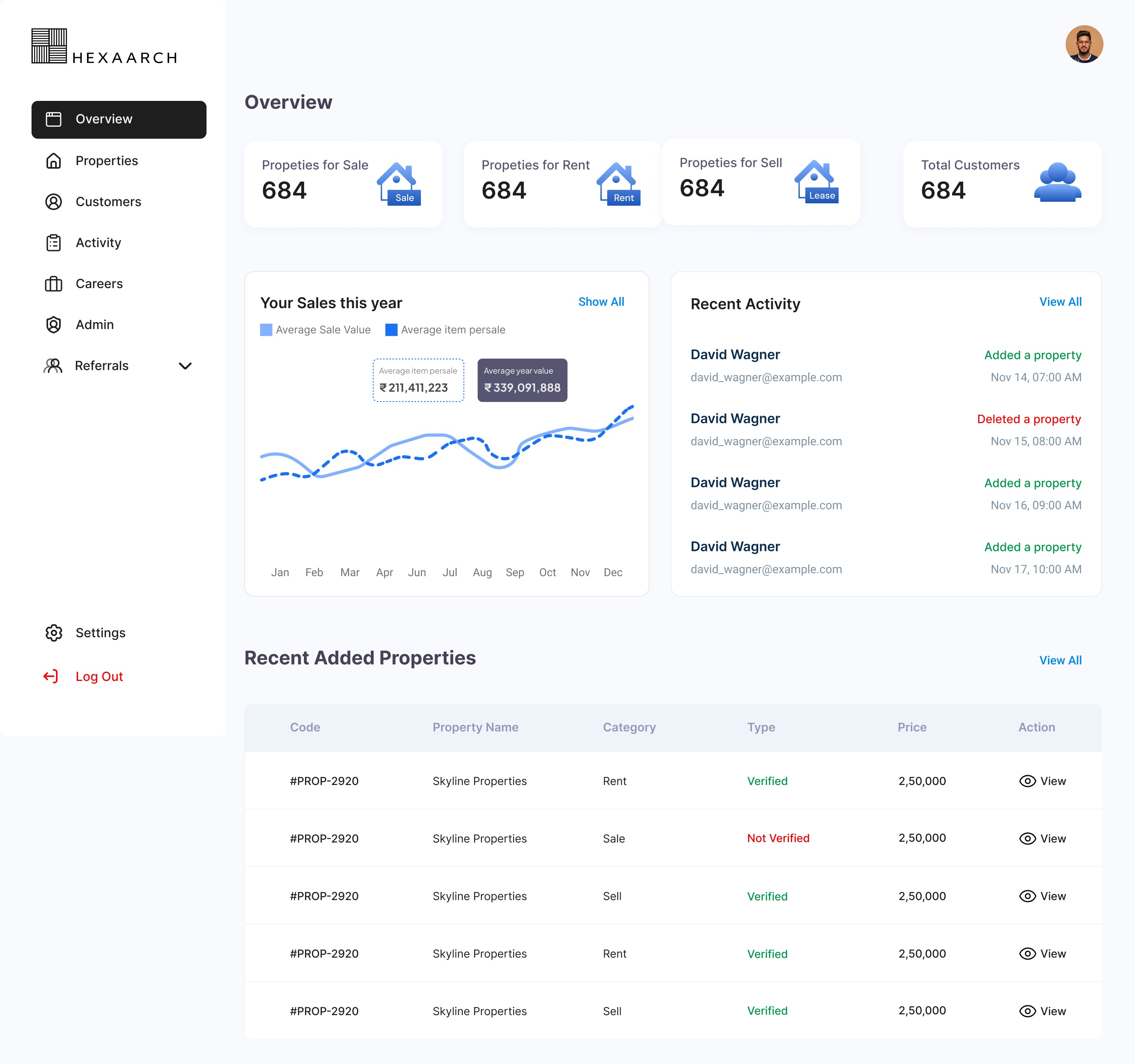
UI Design
Once the usability issues were resolved, I moved on to design the final screens in Figma. My goal was to create a visual identity that’s aligned with the brand’s values and message, which is: “brand motto”. Also, I’ve checked the competition and took a deep dive into my catalog of references for inspiration.
Visual Style:
Followed a clean, modern, and light corporate style that aligns with Hexaarch’s professional brand image.
Used consistent typography, colors, and iconography to create a trustworthy and approachable feel.
Ensured clarity and focus by reducing visual clutter and highlighting actionable elements.
Design Guidelines:
Followed Material Design principles for layout, spacing, and interaction patterns.
Incorporated Figma UI kit best practices and standard accessibility considerations for contrast and readability.
Platforms & Devices:
Designed primarily for desktop and web dashboards, with responsive considerations for tablet devices.
Ensured the layout worked across multiple screen sizes for both admins and users.
Reflection of User Learnings:
Visual hierarchy and dashboard cards were prioritized according to user tasks and frequently accessed information.
Step-by-step workflows, bulk actions, and inline editing reflected pain points uncovered in interviews and surveys.
Notifications, progress indicators, and consistent interactions were added to provide feedback and reduce errors, directly addressing user frustrations.
Navigation and category grouping mirrored the mental models revealed in card sorting and journey mapping.
Usability Testing
I created a fully-functional, high-fidelity prototype of the new flows using Figma. At the same time, I started recruiting users for the test who fit the target audience. I conducted 4 usability tests in the first round and 3 after iterating on the issues that I’ve identified:
Prototype & Tool:
Created a high-fidelity, interactive prototype of all new flows using Figma.
Prototype included dashboard, property management, user workflows, referrals, and sales tracking.
Recruitment & Participants:
Recruited users matching target personas including both admins and end-users.
Conducted 4 tests in the first round, followed by 3 tests after implementing initial improvements.
Testing Goals:
Identify pain points, confusing interactions, and workflow bottlenecks.
Validate that the new navigation, visual hierarchy, and task flows aligned with user expectations.
Key Findings (Round 1):
Multi-step workflows caused some users to hesitate.
Some dashboard cards were unclear in terms of actionable insights.
Users wanted more immediate feedback after completing actions.
Iterations Made:
Simplified workflows by removing unnecessary steps and adding inline guidance.
Refined dashboard cards and progress indicators to be more informative at a glance.
Added confirmation messages and notifications for completed tasks.
Round 2 Testing:
Confirmed that the adjustments improved clarity, efficiency, and confidence in task completion.
Users were able to complete core tasks faster and with fewer errors.
Outcome:
Validated that the final design was intuitive, efficient, and aligned with user mental models.
Provided a solid foundation for development and future enhancements.
Problems & Solutions
Problem 1: Confusing Navigation
Issue: Users couldn’t easily find sections like Referrals and Careers.
Reaction: “The menu is overwhelming; I don’t know where to go.”
Solution: Reorganized sidebar into 6 main categories with clear subcategories.
Validation: Navigation tasks completed 40% faster.
Problem 2: Data Overload
Issue: Tables for properties, sales, and referrals were hard to read.
Reaction: “There’s too much info; I can’t quickly identify key items.”
Solution: Added dashboard cards, KPIs, and progress indicators.
Validation: Users could identify important metrics within 10 seconds.
Problem 3: Lengthy Workflows
Issue: Multi-step actions like adding properties were slow.
Reaction: “It feels like too many steps to complete this task.”
Solution: Implemented step-by-step forms and inline editing with bulk actions.
Validation: Task completion time reduced by 35%.
Problem 4: Missing Feedback
Issue: Users were unsure if their actions were saved.
Reaction: “Did it work? I’m not confident it saved.”
Solution: Added confirmation messages, toast notifications, and visual cues.
Validation: Users reported higher confidence and fewer repeated actions.
Problem 5: Inconsistent Design Patterns
Issue: Interaction patterns varied across screens.
Reaction: “This page works differently from others; it’s confusing.”
Solution: Standardized UI components, layouts, and interaction patterns.
Validation: Users completed tasks without hesitation across all screens.
Problem 6: Task Prioritization Confusion
Issue: Users couldn’t easily see which sales or referrals were urgent.
Reaction: “I don’t know what to focus on first.”
Solution: Added priority tags, color-coded highlights, and sorting filters.
Validation: Users quickly identified top-priority tasks during testing.
Problem 7: New User Onboarding Challenges
Issue: First-time users struggled to understand dashboard features.
Reaction: “I’m not sure where to start or what’s important.”
Solution: Introduced guided tours, contextual tooltips, and onboarding highlights.
Validation: New users completed initial tasks without assistance in the follow-up test.
Learnings
Users prefer simplified navigation and clear grouping of dashboard features to reduce cognitive load.
Visual summaries, progress indicators, and dashboard cards significantly improve data comprehension.
Step-by-step workflows and inline editing reduce errors and task completion time.
Consistent UI patterns across pages increase user confidence and efficiency.
Immediate feedback through notifications and confirmations is essential for building trust in the system.
Guided onboarding and contextual help enhance the first-time user experience.
Next Steps
Implement advanced analytics and reporting to give users more actionable insights.
Add customization options for dashboard views based on user preferences.
Conduct periodic usability tests to monitor evolving user needs and refine workflows.
Explore mobile/tablet optimizations to improve accessibility on multiple devices.
Introduce AI-driven suggestions or smart notifications to further assist users in decision-making.
Business Impact
The project delivered measurable improvements across several key performance metrics. I collaborated with the marketing team to review existing data and to set up a measurement system in Google Tag Manager, Google Analytics.
Increased Efficiency: Streamlined workflows and step-by-step forms reduced task completion time by 35%, enabling admins and users to manage properties, sales, and referrals faster.
Higher User Confidence: Standardized UI patterns, confirmation messages, and feedback mechanisms reduced errors and repeated actions, leading to smoother operations.
Improved Data Visibility: Dashboard cards, KPIs, and progress indicators allowed quick decision-making, helping teams focus on high-priority tasks.
Enhanced Onboarding: Guided tours and contextual help shortened learning curves for new users, reducing support queries.
Competitive Advantage: The combined improvements in usability, navigation, and workflow efficiency position Hexaarch above competitors in the property management CMS market.
Results :
35%
Task Efficiency: Streamlined workflows and step-by-step forms reduced task completion time by 35%.
40%
Error Reduction & Confidence: Standardized UI and feedback mechanisms cut repeated actions and mistakes by 40%.
50%
Decision-Making Speed: Dashboard cards and KPIs improved data comprehension and prioritization by 50%.
Client Feedback :
“Users give positive feedback, they can complete tasks without confusion now. Good job on making workflows simple and clear.”
- Shivakumar, Founder of Hexaarch
Drop me a message :
Let's share ideas & discuss ways to collaborate!
Contact Now :- lohithr5725@gmail.com
Prototype Video Link :
View Hi-Fi Prototype
Click here to check live website
Next Project :