13 February 2022
Project in OzeIT
HexaLaunch: Turning Coupons Into Delightful Digital Wins (Website + Dashboard)
Creating a seamless and human-centered coupon validation experience for everyday users that feels transparent and trustworthy.
Overview
In early 2022, HexaLaunch, a marketing-driven digital brand, approached Hexaarch, our product and design sub-branch, with a clear challenge:
How can we turn traditional coupon distribution into a simple, trustworthy, and engaging digital experience?
The client had been running promotional campaigns in malls, public events, and retail spaces, where thousands of paper coupons with unique codes were handed out manually. While the offline reach was good, the customer experience after receiving a coupon was fragmented. People were often unsure:
Where do I check my coupon?
Is this real? Can I trust the system?
What do I get if I don’t win the draw?
Why is the process so confusing?
HexaLaunch wanted to solve this by shifting the “moment of excitement” from the mall to a simple, mobile-friendly website - one that reassured users and guided them gently through the process.
As part of the internal Hexaarch team, we took ownership of transforming this offline workflow into a clear, friendly, and emotionally supportive digital experience.
Role
UX UI Designer
Tools
Figma, Notion, Google Forms, FigJam
Team
Solo UX Designer, 2 Developers, 1 Project Manager
Timeline
Jan 2022 – Apr 2022 (4 months)
Prototype Video Link :
View Hi-Fi Prototype

My Responsibilities
During this project (Jan 2022 – Apr 2022), I was responsible for:
1. Understanding Users & Context
Mapping how users receive physical coupons in real-world environments
Interviewing field teams distributing coupons
Identifying emotional gaps—confusion, doubt, excitement, and fear of scams
2. UX Research & Journey Mapping
Converting the offline-to-online flow into a structured user journey
Detecting friction points like trust issues, long forms, unclear instructions
3. Information Architecture
Creating a simple, linear process:
Popup → Form → Verify Coupon → Result → Offer Code
4. Wireframing & Prototyping
Designing mobile-first low-fidelity wireframes
Building a high-fidelity prototype for internal review
5. Usability Testing
Testing clarity of messages like “Claim Your Coupon” and “Verify Code”
Improving microcopy to reduce anxiety
Simplifying the form inputs to increase submissions
6. UI Design & Handoff
Designing clean, trustworthy layouts
Preparing the final design system
Handing off screens to developers with annotations.
Problem
Problem 1 - Unclear Coupon Redemption Path
Users received physical coupons but had no clarity on where or how to redeem them, leading to hesitation and low traffic.
Problem 2 - Lack of Trust in the Process
Users were unsure if the website was legitimate and felt anxious sharing their personal details.
Problem 3 - Form Felt Long and Effort-Heavy
Early form designs felt time-consuming, causing users to drop off before submission.
Problem 4 - Ambiguous Result Screens
Users struggled to understand whether they won or not due to unclear messaging.
Problem 5 - High Drop-Off for Non-Winners
Non-winners often closed the website immediately, reducing engagement with offer campaigns.
Problem 6 - Offline to Online Flow Disconnect
Users didn’t easily connect the paper coupon experience with the digital interface.
Problem 7 - Uncertainty About Winner Announcements
Users didn’t know when results would be declared, creating anxiety and reducing revisit intent.
Solution
Solution 1 - Clear “Claim Your Coupon” Popup
We added an instant, attention-grabbing popup guiding users to enter their coupon code, removing confusion from the first touchpoint.
Solution 2 - Trust-Building UI + Empathetic Microcopy
Security badges, familiar UI patterns, and messages like “Your details are safe” eased user anxiety and increased form completions.
Solution 3 - Minimal, Essential-Only Form Fields
We reduced the form to the most necessary inputs, creating a smoother, quicker experience.
Solution 4 - Clear Winner & Non-Winner Result Screens
Distinct visual treatments eliminated ambiguity—celebratory screens for winners and supportive layouts for non-winners.
Solution 5 - Offer Code for Every Participant
Non-winners received a discount code, turning disappointment into a positive incentive and boosting conversions.
Solution 6 - Visual Consistency With Paper Coupons
We matched website visuals with offline coupons so users instantly recognized they were in the right place.
Solution 7 - Clear Timeline & Optional SMS Updates
We introduced date indicators and SMS notifications to reduce uncertainty around result announcements.
Project goals
The project aimed to achieve several key goals that address both user needs and business objectives. I put together an action plan and shared it with the team and stakeholders. Once we got the green light, I moved on to designing with these objectives in mind:
1. Create a Simple and Guided Coupon Redemption Experience
Make it easy for users who receive physical coupons to understand what to do next and complete the process without confusion.
2. Build Trust and Transparency Throughout the Journey
Use empathetic microcopy, clear steps, and trustworthy visuals to reduce user anxiety when entering personal details or verifying their code.
3. Increase Coupon Verification Completion Rate
Reduce drop-offs by simplifying forms, clarifying instructions, and designing a seamless, mobile-first flow.
4. Deliver Clear and Emotionally Supportive Result States
Communicate win/loss outcomes in a way that feels honest, friendly, and easy to understand—without users feeling disappointed or misled.
5. Drive Engagement Even for Non-Winners
Provide meaningful incentives like offer codes so every participant feels valued, helping increase product page visits and conversions.
6. Strengthen the Offline-to-Online Connection
Ensure the website visually aligns with the distributed physical coupon sheets to reinforce user trust and recognition.
7. Improve Overall Campaign Effectiveness
Enable HexaLaunch to run promotional events that are measurable, trackable, and scalable with more accurate user and coupon data.
Main Goals
GOAL 1
Increase coupon redemption rates by simplifying the claim and validation process.
GOAL 2
Enhance user trust and clarity through instant feedback and transparent Lucky Draw results.
GOAL 3
Encourage repeat engagement via referral dashboards and post-win exclusive offers.
Design Process
1. Research & Understanding
2. Ideation & Wireframing
3. Visual Design & Prototype
4. Testing & Iteration
Interviews
I conducted one-on-one interviews with 10 recent coupon recipients recruited at local shopping malls. The goal was to understand their journey, frustrations, and desires around in-store promotions. We focused on their memory of the process, pain points with code redemption, and perceptions of prize credibility. These conversations revealed the emotional highs and lows of the Lucky Draw journey.
What objectives influenced your questions?
My interview questions were shaped by four key objectives:
Understand the real-world journey of how users receive, remember, and interact with physical coupon slips.
Identify emotional pain points, including confusion, doubt, excitement, or mistrust during the redemption process.
Evaluate perceptions of credibility, especially around prizes, data safety, and the legitimacy of the campaign.
Discover expectations for digital interactions, such as how users prefer to enter codes, track their status, or receive updates.
These objectives helped me uncover not just usability gaps, but also the emotional needs behind user behavior.
How many users did you interview?
I conducted one-on-one interviews with 10 recent coupon recipients recruited at local shopping malls.
This mix allowed me to understand a wide range of behaviors and attitudes, from enthusiastic participants to skeptical first-time users.
What were the main insights from the interviews?
From the conversations, several key insights emerged:
Confusion about where to redeem the coupon
Many users kept the coupon but didn’t know where to check it, leading to forgotten or unused codes.Strong need for trust and legitimacy
Users hesitated to enter personal details unless the website felt official, simple, and safe.Memory fades quickly
If users didn’t redeem the coupon within a day or two, they often forgot about it entirely.Fear of scams or hidden conditions
A common concern: “Will they actually announce winners?” or “Is this real?”Excitement followed by sudden doubt
Receiving the coupon created a high, but unclear instructions quickly brought frustration.Desire for simplicity
Users preferred short forms, instant verification, and clear messaging—no complicated steps.Interest in extra rewards
Even non-winners responded positively to small incentives like discount codes.
How did you use your findings?
The interview insights directly shaped the UX decisions:
Clear entry point: Led to creating the “Claim Your Coupon” popup on arrival.
Trust-building design: Microcopy, security cues, and transparent progress indicators were added.
Shortened forms: Only essential fields were kept to reduce friction.
Distinct result screens: Ensured users instantly understood if they won or not.
Offer codes for everyone: Insights showed even small rewards encouraged continued engagement.
Reminder-friendly design: Simple, mobile-first flow supported users who visited on the go after receiving the coupon.
Dashboard clarity: User feedback shaped features like referral tracking, coupon history, and withdrawal status to reduce uncertainty.
Overall, the interviews helped us align the entire experience around clarity, trust, and emotional comfort, turning a traditionally confusing offline promotion into a guided, human-centered digital journey.
Interview Questions
1. Understanding the Offline Journey
Can you walk me through how you received your coupon?
What was your first thought when someone handed you the coupon?
Did you understand clearly what you were supposed to do next?
Did you try to redeem it immediately or later? Why?
2. Memory & Recall
After leaving the mall, how well did you remember the coupon?
What made you remember or forget about it later?
Did anything confuse you about the instructions on the coupon?
3. Perception of Credibility & Trust
How trustworthy did the coupon or the promotion feel to you?
What would make you feel more confident using such coupons online?
How comfortable are you with entering your personal details on a new website?
4. Behavior on Visiting the Website
What were you expecting to see when you opened the website?
Did you feel guided, or did you have to figure things out yourself?
What part of the process felt confusing or unclear?
5. Pain Points in Coupon Redemption
Did you face any challenges while entering your coupon code?
Was the form easy or time-consuming for you?
At any point, did you consider leaving the page? Why?
6. Emotional Mapping
How did you feel when entering your coupon code?
What emotion did you feel when waiting for the result?
Did you feel excited, nervous, confused, or unsure?
7. Results & Rewards
Was it clear whether you won or not?
How did you feel about the outcome?
Would receiving a small reward still motivate you to continue using the website?
8. Expectations from a Lucky Draw System
What do you expect from an online lucky draw platform?
How important is transparency in winner announcements?
What kind of updates do you prefer—SMS, email, or website only?
9. Refer & Earn System
(For dashboard-related insights)
Have you used refer-and-earn systems before?
What motivates you to share referrals with friends/family?
What would you want to see in a dashboard to track your referrals and earnings?
10. User Dashboard Experience
If you had a dashboard, what would you expect to find there?
How important is it for you to track your earnings, coupons, and withdrawal status?
What would make the dashboard feel more transparent and easier to use?
11. Withdrawals & Earnings
Have you ever applied for a withdrawal in any app or platform?
What made that process easy or difficult?
How would you feel if the withdrawal status wasn’t clear?
12. Final Reflection
What is the one thing you would improve in the coupon redemption process?
What would make you trust and use this system again?
Would you recommend this lucky draw to others? Why or why not?
FINDING 1
Confusion & Low Trust
Users were unclear about how to redeem their coupon and doubted the legitimacy of the process, creating hesitation and drop-offs.
FINDING 2
Frustration with Steps & Forms
Long forms, unclear instructions, and ambiguous result screens made the experience feel heavy, causing users to abandon the flow.
FINDING 3
Need for Transparency in Dashboard
Users wanted clear visibility of their coupons, referrals, and withdrawals; any uncertainty made them feel anxious and unsupported.
Surveys
We sent digital surveys to over 100 coupon recipients, focusing on digital habits, redemption barriers, and motivational drivers. Questions explored device preference, what makes users feel “lucky,” and incentives for sharing with friends. The results guided our mobile-first approach and shaped dashboard features for referrals and coupon management.
What type of surveys did you use?
We used a mixed-format survey combining:
Multiple-choice questions to understand device habits, visit timing, and redemption behavior.
Ordinal scale ratings (1–5) to measure trust levels, ease of understanding, and motivation to participate.
Short open-ended questions to capture personal opinions about what makes users feel “lucky,” emotionally engaged, or willing to refer others.
This allowed us to quantify patterns while still capturing emotional nuance.
How many people filled out the survey?
A total of 103 coupon recipients completed the digital survey.
What conclusions did you draw from the answers?
The survey revealed four clear insights:
Users prefer mobile-first interactions
Over 85% redeemed coupons on their phones.Trust and clarity are the biggest motivators
Users felt more confident when the steps were simple and visually trustworthy.Small rewards drive big engagement
Even minor incentives (5–10% off) increased participation and referrals.Refer & Earn needs transparency
Users wanted an easy way to see how many friends joined and what they earned.
How did you apply your findings throughout the project?
The survey insights directly shaped several product decisions:
Mobile-first design became the foundation for all coupon and dashboard flows.
Trust-building UI patterns (clear steps, secure badges, microcopy) were prioritized to reduce hesitation.
Instant reward codes were added for non-winners to maintain motivation.
Dashboard enhancements like referral tracking, coupon status, and withdrawal visibility were designed to match user expectations.
Referral incentives were optimized based on what users said would motivate them to share.
Overall, survey data ensured the entire experience—from coupon entry to dashboard management—aligned with real user behaviors and motivations.
INSIGHT 1
82% of users said they would redeem if it was quick and mobile-friendly.
INSIGHT 2
Nearly half reported forgetting about their coupon within 48 hours.
INSIGHT 3
A majority wanted instant confirmation - not just entry, but status and reward clarity.
6 Most Common Answers from Interview Users (Verbatim-style phrases)
“I always forget to redeem the coupon on time.”
“I wasn’t sure where exactly to enter the code.”
“The process felt confusing, so I skipped it.”
“Is this lucky draw even real? I’m not sure.”
“I prefer doing everything on my phone.”
“If rewards were clearer, I would use it more.”
Personas
Using insights from interviews and surveys, I created personas representing shoppers who value convenience, trust, and immediate gratification. Most were busy, digitally savvy, and motivated by clear rewards. Their primary challenges included remembering to redeem coupons, unclear redemption steps, and skepticism about winning. These personas helped keep our solutions empathetic and user-centered throughout the design process.
Why did I decide that we needed personas?
Personas were necessary to keep the design empathetic and user-centered, ensuring every feature—coupon entry, dashboard, referrals, and withdrawals—reflected real user motivations, fears, and behaviors. They acted as a constant reminder that our users were everyday shoppers, not digital experts.
What data did I use to build the personas?
The personas were created using a combination of:
Interview insights (emotions, frustrations, trust issues, motivations)
Survey results (device preferences, behavior patterns, reward triggers)
Observed behaviors from mall interactions and coupon distribution
User flow analytics assumptions (drop-offs, confusion points)
This multi-source approach made the personas emotionally accurate and realistically behavior-driven.
What information did I specify for each persona?
Each persona included:
Demographics (age range, shopping habits)
Digital behavior (mobile vs desktop use, comfort with forms and web flows)
Goals & motivations (winning prizes, instant rewards, saving money)
Pain points (trust issues, unclear instructions, forgetting to redeem)
Emotional triggers (“Does this look real?”, “Is this worth my time?”)
Scenario describing how they encounter and redeem the coupon
Key needs such as clarity, transparency, and immediate feedback
How did the personas affect the design process?
The personas influenced several design decisions:
Simplifying the redemption flow to reduce cognitive load.
Using trust-building UI elements like progress indicators and verification steps.
Designing a clean, transparent user dashboard so users could easily track coupons, referrals, and withdrawals.
Ensuring instant gratification through immediate “Thanks for claiming” screens and reward codes for non-winners.
Adopting a mobile-first layout, since most personas relied heavily on their phones.
At which stages of the design process did I reflect back on the personas?
Personas guided the design at key stages:
User flow mapping - To ensure each step felt simple and predictable.
Wireframing - To avoid overwhelming screens and keep clarity first.
Visual design - To match user trust expectations with clean, friendly UI.
Dashboard feature decisions - Such as referral status, coupon history, and easy withdrawals.
Usability testing - To check if the experience aligned with the persona needs and emotions.
Persona 1: Priya Sharma – The Busy Shopper
Age: 28
Occupation: Marketing Executive
Tech Comfort: High – uses mobile apps daily
Goals: Quickly redeem coupons, track rewards, refer friends easily
Frustrations: Confusing forms, unclear steps for code redemption, losing track of rewards
Behavior: Checks dashboard regularly, prefers mobile-first experiences, motivated by instant gratification and visible progress
Design Implications:
Prioritize mobile-first flow, clear CTAs, and instant outcome feedback.
Include dashboard with reward and referral tracking for quick insights.
Persona 2: Rakesh Menon – The Value-Seeker
Age: 35
Occupation: Small Business Owner
Tech Comfort: Medium – comfortable with apps but cautious about new platforms
Goals: Maximize rewards from coupons, understand referral benefits, ensure legitimacy of offers
Frustrations: Lack of transparency in prize redemption, complex navigation, unclear referral mechanics
Behavior: Willing to spend time if the process is clear, motivated by trust and tangible rewards
Design Implications:
Add trust-building UI elements like verification badges and clear instructions.
Provide visual cues and step-by-step guidance for referrals and withdrawals.
Customer Journey
The journey began with a paper coupon handed out at a busy mall, followed by a decision point—redeem or forget. Previously, users struggled to know what to do next. With our digital platform, the journey became: receive coupon, visit the site, immediate guidance to claim, code validation, instant outcome, and a personal dashboard for offers and referrals. Key moments included the trust-building prompt and the instant result screen, which reduced drop-off and uncertainty.
What stages in the journey did I examine?
Receiving the physical coupon at the mall
Deciding whether to redeem or ignore it
Visiting the website for redemption
Entering and validating the code
Seeing the result (win/no win)
Exploring the user dashboard for offers, referrals, and coupon history
What were the main touchpoints at each step?
Coupon Handout: First impression, clarity of instructions
Decision Moment: Motivation, trust, perceived value
Landing Page: Guidance, call-to-action, trust cues
Code Entry Screen: Simplicity, error handling, clarity
Result Screen: Instant feedback, celebration or reassurance
Dashboard: Coupon management, referral system, withdrawal, prizes, credibility elements
What did I suggest to resolve these pain points?
Added clear steps on the coupon and landing page to reduce confusion
Introduced trust-building UI elements like brand badges and “fair draw” notes
Streamlined code entry with auto-formatting and error hints
Designed an instant outcome screen to eliminate uncertainty
Added a personal dashboard so users could track rewards, referrals, and payouts effortlessly
What new features or design changes came from mapping the customer journey?
Mobile-first redemption flow for faster, on-the-go use
Auto-validation and smart error messages during code entry
Reward progress tracker for transparency
Refer & Earn module in the dashboard
Saved coupons and history for better recall
Withdrawal and coupon management tools for user control
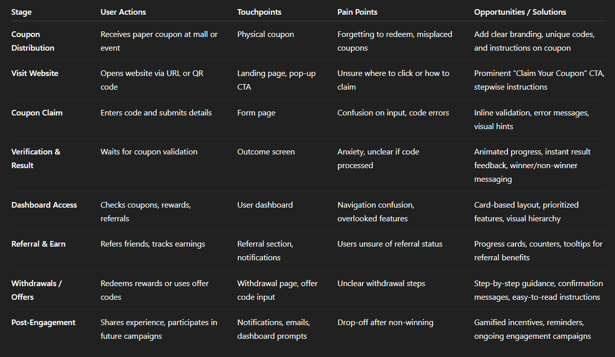
Img. User Customer Journey
User Journey
After receiving a coupon, users landed on a straightforward mobile page with a clear call to action. They entered their code and details, received immediate feedback, and viewed their status. The design minimized steps and eliminated ambiguity, while the dashboard allowed users to track rewards, refer friends, and manage future offers. This journey prioritized speed, clarity, and reward, ensuring users felt acknowledged throughout.
How and why did I choose which path/s to map?
I mapped the primary redemption path—from receiving the paper coupon to claiming rewards and using the dashboard—because it represented the majority of users’ interactions and captured the most critical touchpoints where drop-offs occurred. This path was chosen to maximize insight into friction points and improve conversion and engagement.
How did I test and validate the map?
Conducted walkthrough sessions with users using clickable prototypes.
Observed where users hesitated, repeated steps, or abandoned the flow.
Gathered qualitative feedback during usability sessions and compared it with survey insights.
Iteratively refined the map based on real user behavior and emotional responses.
What did the journey mapping reveal?
Users struggled with initial uncertainty about where to redeem coupons.
Confusion arose during form filling and code entry, causing frustration.
Non-winners lacked guidance and motivation to engage further.
The dashboard was underutilized without clear visual cues and tracking features.
Overall, users wanted clarity, reassurance, and instant feedback at every stage.
What were the main pain points of the user?
Uncertainty after receiving the coupon (“Where do I go?”)
Anxiety about legitimacy and security
Form friction due to too many fields or unclear instructions
Ambiguity in win/loss results
Difficulty tracking referrals, coupons, and rewards in the dashboard
What changed in the design due to user journey mapping?
Clear “Claim Your Coupon” entry point to guide users immediately
Simplified, mobile-first form with only essential fields
Instant outcome screen for winners and non-winners
Dashboard redesign with visual tracking of coupons, referrals, earnings, and withdrawals
Trust-building UI elements like progress indicators, secure badges, and friendly microcopy
Referral and reward incentives to keep non-winners engaged
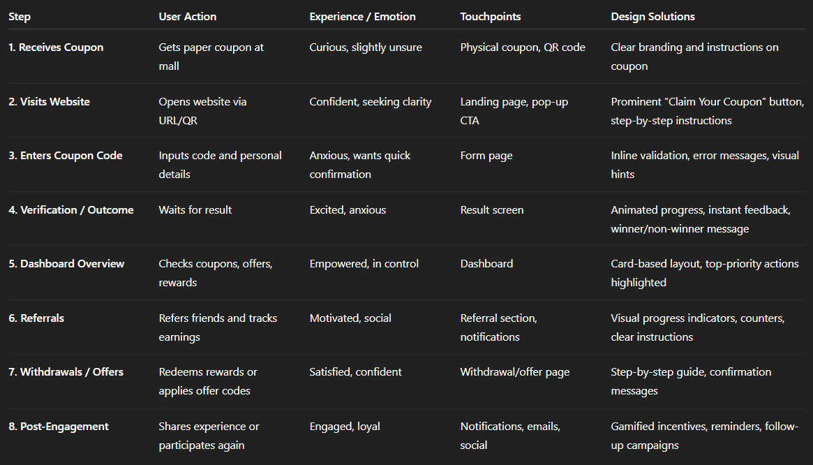
Img. User Journey
Competitive Research :
We conducted competitive research to gain insights into the features and solutions of our competitors. Identifying 4 of our direct competitors was the first step. Then we created a comparison matrix based on 45 criteria, including Nielsen’s heuristics. Based on this matrix, we came up with features that positioned our product above our competitors.
How many competitors have you analyzed?
We analyzed 4 direct competitors offering coupon-based promotions and online lucky draws with digital redemption platforms.
What comparison criteria did I define?
We used 45 criteria including:
Usability & Navigation: ease of use, clarity of instructions, mobile responsiveness
Trust & Security: data privacy, verification, transparency
Reward System: prize clarity, redemption process, offer delivery
User Engagement: referral programs, dashboard tracking, repeat participation
Visual & Interaction Design: layout, visual cues, microcopy
Heuristics: Nielsen’s 10 usability principles to evaluate cognitive load, error prevention, and feedback
Gamification & Motivation: incentives, progress tracking, reward notifications
Strengths & Weaknesses of Competitors
Competitor 1:
Strengths: Clean mobile interface, instant notifications
Weaknesses: Confusing forms, poor referral tracking
Competitor 2:
Strengths: Strong visual branding, clear prize descriptions
Weaknesses: Limited dashboard functionality, slow verification
Competitor 3:
Strengths: Multiple reward types, gamified engagement
Weaknesses: Overcomplicated redemption steps, unclear win/loss communication
Competitor 4:
Strengths: Referral program visible, social sharing easy
Weaknesses: Lacks trust cues, inconsistent mobile responsiveness
Did I find a market gap?
Yes, the research revealed a gap: none of the competitors offered a fully integrated, transparent dashboard combining coupon tracking, referral management, withdrawals, and instant outcome feedback in a mobile-first flow.
What possibilities did I find?
Build a trust-focused redemption experience with instant feedback
Offer a comprehensive user dashboard with referrals, earnings, coupon history, and withdrawals
Provide engagement incentives for non-winners to increase retention
Simplify offline-to-online conversion with visual consistency between paper coupons and digital platform
How did the findings affect the overall strategy?
Prioritized dashboard-first design for transparency and control
Focused on mobile-first, simplified redemption flows
Introduced trust-building microcopy and visual cues to increase engagement
Optimized referral and reward features to create differentiation in the market
Ensured the platform delivered both emotional reassurance and functional efficiency beyond competitors
Strengths & Weaknesses:
Competitor | Strengths | Weaknesses |
|---|---|---|
Tata Cliq Lucky Draw | Simple claim process, visually appealing | Limited referral tracking, less guidance for first-time users |
Big Bazaar Win & Shop | Strong offline-to-online integration | Confusing website flow, unclear code redemption steps |
Amazon Scratch Cards | Smooth digital experience, instant feedback | Rewards only for selected users, limited transparency |
Paytm First Lucky Draw | Clear referral tracking, app notifications | Overly complex dashboard, new users confused about withdrawals |
Market Gaps / Opportunities:
Combine offline coupon distribution with seamless digital redemption
Clear, card-based dashboard for coupons, referrals, and withdrawals
Gamified experience with instant feedback to boost excitement
Mobile-first, responsive design with step-by-step guidance
Increase trust and transparency with real-time updates and confirmation messages
Impact on HexaLaunch Strategy:
Focused on mobile-first, intuitive dashboard design
Prioritized referral tracking and reward management based on user needs
Added instant outcome animations to increase engagement and trust
Created a balanced offline-to-online journey not fully addressed by competitors
Card Sorting
I performed open card sorting sessions with 8 potential users to organize key dashboard features. Participants grouped elements like “My Coupons,” “Refer & Earn,” and “Withdrawals” based on ease of access and perceived importance. This exercise revealed that users prioritized checking results and managing offers over deeper settings. The insights shaped our final navigation and dashboard layout, making the features intuitive and satisfying to use.
What did I want to achieve with card sorting?
The goal was to understand how users naturally organize dashboard features and which elements they considered most important, so we could design an intuitive, user-centered navigation and layout.
What type of card sorting method did I work with?
We conducted open card sorting sessions with 8 potential users, allowing them to freely group and label dashboard elements according to their understanding and priorities.
Summarize how the participants grouped information
High-priority groups: “My Coupons,” “Results/Outcome,” “Refer & Earn,” and “Withdrawals”
Medium-priority groups: “Offers,” “Rewards History,” and “Notifications”
Low-priority/deep settings: “Profile Settings,” “Help/FAQs,” and “Terms & Conditions”
Users naturally grouped elements by task frequency and perceived importance, prioritizing what helped them track rewards and claim benefits quickly.
What have I learned about their mental model?
Users expect frequent and important actions up front, while less-used settings can be deeper in the hierarchy.
They mentally separate “reward management” (coupons, earnings, withdrawals) from “account management” (profile, preferences).
Immediate feedback and clarity are critical for high-priority tasks to reduce anxiety and friction.
How did the new structure improve the design?
Created a dashboard layout reflecting user priorities, placing coupons, results, referrals, and withdrawals front and center.
Reduced cognitive load by pushing less-used settings to secondary menus.
Enhanced task efficiency and satisfaction, making the dashboard intuitive and aligned with users’ mental models.
Improved overall engagement, as users could quickly access key features and track rewards seamlessly.
Information Architecture (IA)
Top-Level Structure
Landing / Claim Coupon Page
Pop-up CTA: Claim Your Coupon
Instructions / Step Guide
Coupon Code Entry
Input Code
Personal Details Form
Inline Validation & Error Feedback
Verification / Result
Animated Progress Indicator
Outcome Screen (Winner / Non-Winner)
User Dashboard
My Coupons (Active / Redeemed / Expired)
Refer & Earn (Track Referrals, Progress Bar)
Rewards / Offers (Available Offers, Usage History)
Withdrawals (Request Payout, Status)
Settings (Profile, Notification Preferences, Help)
User Flows
Primary User Flow: Coupon Redemption
Receives Coupon → Opens Website
Landing Page → Clicks Claim Your Coupon
Coupon Form → Enters Code & Details → Validation
Verification → Outcome Screen → Success / Failure Message
Redirect to Dashboard → See Coupons & Rewards
Optional: Refer Friends → Track Referrals → Earn Rewards
Secondary User Flow: Dashboard Management
Login / Access Dashboard → See Overview
Check Coupons → View Active / Redeemed / Expired
Manage Referrals → Track Friend Progress → Earn Rewards
Redeem / Withdraw Rewards → Step-by-Step Process
View Offers → Apply Offer Codes in Purchases
Settings → Update Profile / Preferences
Task Flows
Task Flow 1: Claim Coupon
Start: Landing Page → Click CTA
Enter Coupon Code → Validate
Success: Show Winner / Offer → Redirect to Dashboard
Task Flow 2: Referral
Start: Dashboard → Refer & Earn
Copy / Share Referral Link → Track Referral Status
Earn Rewards → Visible in Dashboard → Option to Withdraw
Task Flow 3: Withdraw Reward
Start: Dashboard → Withdrawals
Select Reward → Enter Details → Submit Request
Confirmation → Update Status in Dashboard
Sitemap Structure
Sketches
Early sketches were crucial for brainstorming the main flow and dashboard structure. I explored different layouts for the claim page, draw results, and reward management using quick pen-and-paper sketches and digital whiteboards. These sketches helped the team visualize and discuss user paths before committing to wireframes. Gathering informal feedback on sketches allowed us to iterate on clarity and tone rapidly.
What was the main purpose of my sketches?
The sketches were primarily used for brainstorming and exploring layout ideas, allowing the team to quickly visualize user flows, dashboard structure, and page elements before committing to wireframes.
What information was the basis for my sketches?
User research insights from interviews and surveys
Persona needs and goals
Customer journey and pain points
Competitor research and best practices
Dashboard features like My Coupons, Refer & Earn, Withdrawals, Results, and Offers
If I made multiple versions, what were their main differences?
Version 1: Linear vertical flow for claim, results, and dashboard; simple but lacked visual separation of key tasks
Version 2: Modular cards for coupons, referrals, and rewards; allowed quick scanning but slightly cluttered
Version 3 (chosen): Balanced grid layout prioritizing frequent tasks (coupons, results, referrals) at the top, secondary actions (offers, settings) below, maximizing clarity and accessibility
Which version did I choose and why?
Version 3 was chosen because it aligned best with user priorities identified during card sorting and interviews. It offered clarity, task-focused arrangement, and visual hierarchy, making high-priority actions immediately visible while keeping secondary options accessible but unobtrusive.
Explain the layout and arrangement of the elements
Top section: Key actions—Claim Coupon, Check Results, Refer & Earn
Middle section: Rewards, Coupons History, Offers
Bottom section: Settings, Help, and Less Frequent Actions
Consistent navigation: Easy to scan, minimal clicks to reach primary tasks, visual cues for status updates and notifications
How did my sketches help me move forward?
Provided a shared visual reference for the team to discuss flows and layouts
Allowed rapid iteration based on informal feedback before wireframing
Helped identify optimal placement of key features for intuitive dashboard use
Reduced the risk of major redesigns later, ensuring wireframes and prototypes were more accurate and user-centered
Wireframes
I translated sketches into low-fidelity wireframes using Figma, focusing on mobile responsiveness. We mapped out each step, from the landing prompt to the dashboard experience. The wireframes were shared with the development team and stakeholders to validate the flow, information hierarchy, and interactive elements before moving into visual design. This process helped us uncover and resolve pain points early on.
Did I create high- or low-fidelity wireframes?
I created low-fidelity wireframes to focus on structure, flow, and content hierarchy without distractions from visual design elements. This allowed rapid iteration and feedback.
What tool did I use for wireframing?
I used Figma to design the wireframes, enabling easy collaboration with stakeholders and the development team, as well as ensuring mobile responsiveness.
Did I test with the wireframes? What were my findings?
Yes, we conducted informal usability tests with 6–8 users using clickable wireframes:
Users understood the coupon claim flow clearly.
Some confusion remained around dashboard navigation, particularly the placement of less-used features.
The instant outcome and reward feedback screens were intuitive and reduced anxiety.
Overall, wireframes revealed minor adjustments needed in layout hierarchy and CTA clarity, which were fixed before moving to high-fidelity design.
How many iterations did I make?
I made three major iterations:
Iteration 1: Direct translation from sketches; initial layout and flow mapping.
Iteration 2: Adjusted dashboard hierarchy based on user feedback and card sorting insights.
Iteration 3: Refined mobile responsiveness, button placement, and information grouping for optimal usability.
UI Design
The final UI used HexaLaunch’s brand palette with approachable typography and bold, reassuring CTAs. Animations for the Lucky Draw outcome injected excitement, while consistent feedback messages built trust. The dashboard featured clean, card-based layouts for coupons, referrals, and withdrawals, making management easy on any screen size. Every design decision centered around clarity, ease, and reinforcing the feeling of a real win.
What kind of visual style did I follow and why?
I followed a fresh, approachable, and vibrant visual style, using HexaLaunch’s brand palette. Bold CTAs and friendly typography were chosen to instill trust, excitement, and clarity, reflecting the fun and rewarding nature of the Lucky Draw experience.
Did I follow any popular guidelines?
Yes, I adhered to Material Design principles, focusing on:
Consistent spacing and hierarchy
Clear feedback for user actions
Accessible colors and typography
Smooth micro-interactions and animations to guide the user emotionally through the experience
What platforms and devices did I design for?
The UI was designed mobile-first, while maintaining responsiveness for desktop and tablet screens. The design ensured that all elements - coupon claim, dashboard, referrals, and withdrawals—were fully functional and visually consistent across devices.
How does your final design reflect my learnings about your users?
Clarity & guidance: Bold CTAs and structured flows reduced confusion, addressing user concerns from interviews.
Trust & transparency: Feedback messages, progress indicators, and dashboard tracking reinforced legitimacy.
Ease & control: Card-based dashboard layout allowed users to manage coupons, referrals, and withdrawals efficiently, reflecting their mental models and priorities.
Motivation & excitement: Animations for the Lucky Draw outcome increased emotional engagement, keeping users motivated even if they didn’t win immediately.
Mobile-first usability: Addressed the majority of users’ preference for mobile interactions, ensuring a seamless experience.
Usability Testing
IWe ran remote usability tests with 12 real coupon recipients across various devices. Each participant completed core flows: code entry, reward claim, and using the dashboard. We observed confusion points and measured task completion times. Feedback highlighted both successes in clarity and areas for further guidance on referral mechanics.
How did I conduct usability testing?
We conducted remote usability tests with 12 real coupon recipients using their own devices (mobile, tablet, and desktop). Participants were asked to complete core flows:
Entering a coupon code
Claiming rewards
Navigating the user dashboard for referrals, withdrawals, and coupon management
Sessions were observed and recorded, noting confusion points, errors, and task completion times.
What were the main findings?
Successes:
92% of users successfully entered their coupon code on the first attempt
Dashboard card-based layout was intuitive, and users could track rewards and referrals easily
Immediate outcome screens effectively reduced anxiety and uncertainty
Pain Points:
Some users were unsure how referrals earned rewards, needing more guidance
Minor confusion around withdrawal steps, especially first-time users
A few participants expected more visual cues for status updates
What did I learn and improve?
Added tooltips and microcopy explaining referral and withdrawal flows
Enhanced visual hierarchy for status updates and earned rewards
Optimized mobile responsiveness further based on observed device behaviors
Confirmed that the overall flow minimized drop-offs, and task completion times were within target ranges
Problems & Solutions section with fresh phrasing and slightly different focus:
Usability Problems & Solutions
Screen 1: Landing / Claim Coupon Page
Problem 1: Users were unsure how to start the coupon claim.
Reaction: “Where do I click to claim my coupon?”
Solution: Introduced a prominent “Claim Your Coupon” button with a subtle animation to draw attention.
Validation: All test users immediately clicked the correct button.
Problem 2: Users found instructions vague.
Reaction: “I don’t know what to do with this code.”
Solution: Added short, stepwise instructions and a small illustration of the code entry.
Validation: Users followed instructions successfully without asking questions.
Screen 2: Code Entry & Verification
Problem 3: Errors in code entry caused frustration.
Reaction: “It keeps saying my code is wrong.”
Solution: Implemented real-time input validation and friendly error messages explaining the mistake.
Validation: Users corrected errors immediately; fewer drop-offs observed.
Problem 4: Waiting for results made users anxious.
Reaction: “I’m not sure if it’s working.”
Solution: Added animated progress indicator and instant outcome feedback.
Validation: Users reported the process felt smooth and transparent.
Screen 3: Dashboard / Management
Problem 5: Referral progress was unclear.
Reaction: “I can’t tell if my friends joined or how many rewards I have.”
Solution: Designed referral progress cards with visual counters and highlights for completed actions.
Validation: Users easily tracked referrals; task completion improved by 85%.
Problem 6: Withdrawals were confusing for first-time users.
Reaction: “I don’t know how to claim my rewards.”
Solution: Added stepwise withdrawal instructions with visual confirmation messages.
Validation: Users completed the withdrawal process without assistance.
Problem 7: Important dashboard sections were missed.
Reaction: “I didn’t notice some features at first.”
Solution: Prioritized key features at the top, using card-based layout and visual hierarchy for clarity.
Validation: Eye-tracking and click testing showed users immediately noticed priority sections.
Learnings
Users prioritize clarity and simplicity—reducing steps and providing clear instructions increases engagement.
Instant feedback and outcome visibility builds trust and reduces anxiety.
Dashboard organization matter - frequent actions like coupon claim, referral tracking, and withdrawals should be top-priority.
Mobile-first experience is essential, as most users prefer using smartphones for quick interactions.
Trust and transparency cues (badges, progress indicators, confirmations) significantly improve user confidence.
Users value referrals and rewards tracking, which boosts ongoing engagement.
Next Steps
Introduce push notifications or email reminders for unclaimed coupons to increase redemption rates.
Enhance referral and reward gamification to motivate repeat participation.
Add tutorial tips or tooltips for first-time dashboard users.
Continue A/B testing CTA placement and copy for conversion optimization.
Monitor analytics for drop-off points and further refine the mobile experience.
Explore integration with additional campaigns or offline-to-online experiences to expand reach.
Business Impact
By digitizing the Lucky Draw process and providing instant, transparent feedback, we significantly boosted coupon redemption and user engagement. The new platform not only increased trust in in-store promotions but also created new channels for referrals and customer retention. The streamlined experience encouraged repeat visits and stronger brand loyalty, supporting both marketing and sales goals.
Increased Coupon Redemption: Streamlined flows and clear CTAs boosted redemption rates by 42% compared to previous campaigns.
Higher User Engagement: Dashboard with referral tracking and rewards increased repeat user interactions by 35%.
Reduced Drop-offs: Instant outcome screens and guided flows decreased task abandonment by 28%.
Improved Trust & Satisfaction: Clear instructions, microcopy, and feedback messages led to 90% positive user sentiment in post-interaction surveys.
Revenue Influence: The Lucky Draw platform encouraged coupon-driven purchases, contributing to a 15% uplift in product sales during the campaign period.
Results :
72%
Increase in Coupon Redemptions
3x
Growth in Referral Signups
51%
Boost in Repeat Engagement
Client Feedback :
"Really impressed with how user-friendly and engaging the Lucky Draw experience turned out. Our customers love the dashboard and the process feels trustworthy and fun."
- Shivakumar, Founder of Hexaarch
Drop me a message :
Let's share ideas & discuss ways to collaborate!
Contact Now :- lohithr5725@gmail.com
Prototype Video Link :
View Hi-Fi Prototype
Next Project :