8 April 2021
Project in Hexaarch
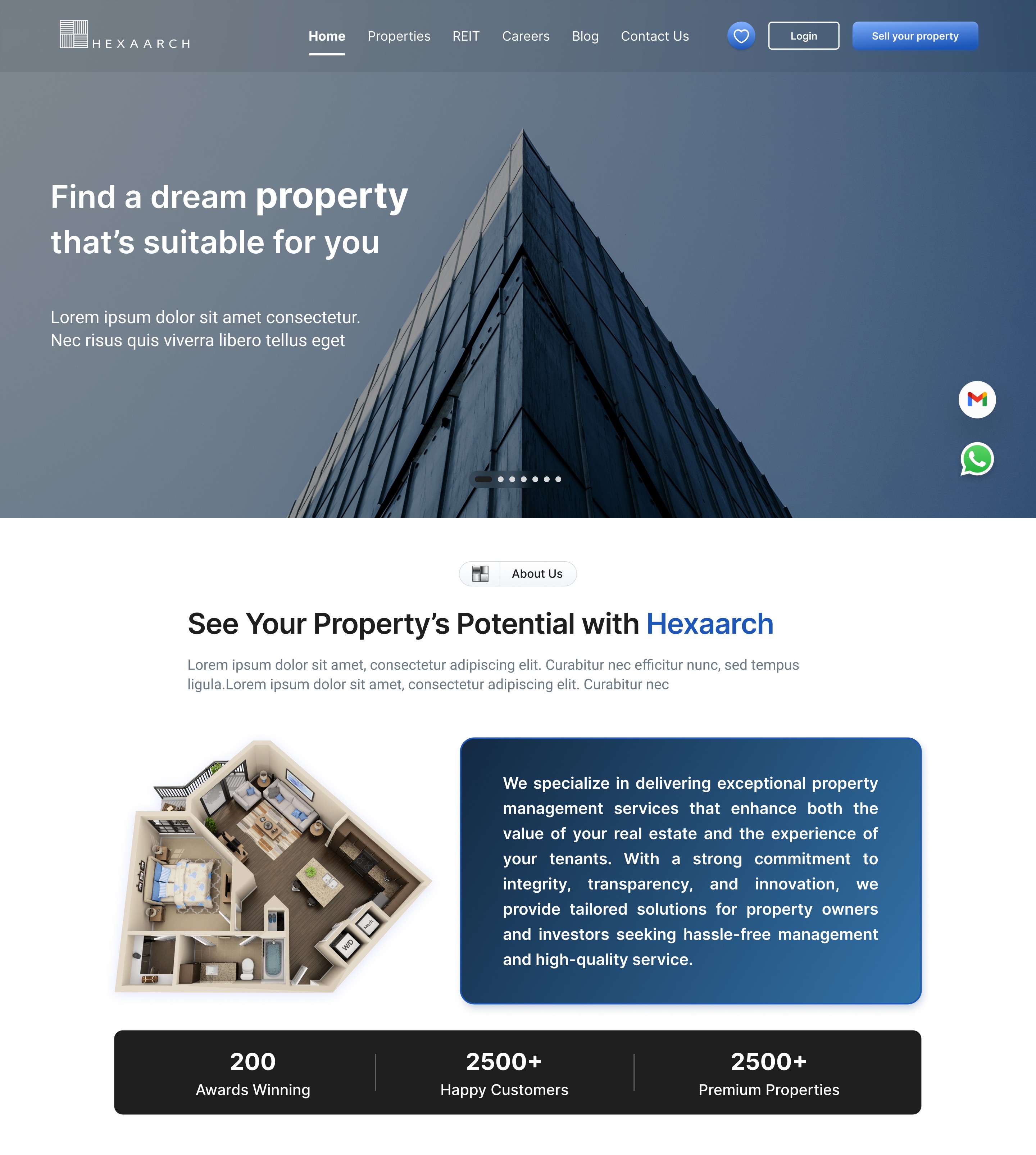
Hexaarch – Redefining Property Discovery & Management - Web Design
A user-centered UX approach to simplify property exploration, engagement, and rewards
Overview
Background & Context:
Hexaarch is a property management company aiming to streamline the way users discover, shortlist, and engage with properties. The client, Hexaarch itself, wanted a modern, intuitive website that not only showcases its services and expertise but also provides a seamless property browsing experience for potential customers. The project arose from the need to enhance user engagement, simplify property interactions, and integrate a rewarding referral program that incentivizes users to participate actively.
Challenges & Circumstances:
Before the redesign, users faced difficulties navigating property listings, understanding available services, and communicating effectively with the team. There was also untapped potential in the referral program, which could help grow Hexaarch’s user base if presented in a more accessible and engaging way.
Role
UX UI Designer
Tools
Figma, Notion, FigJam
Team
2 UI UX Designers, 2 Developers
Timeline
Apr - Jun 2021 (12 weeks)
Prototype Video Link :
View Hi-Fi Prototype

My Role & Responsibilities
As the UX Designer for Hexaarch from April 2021 to June 2022, I was responsible for:
Conducting user research and gathering insights to identify pain points and needs.
Creating user personas and mapping journeys to ensure every interaction was intuitive.
Designing wireframes, prototypes, and the full website interface for both desktop and mobile experiences.
Enhancing key workflows such as property browsing, wishlist management, marking interest, and contacting the team.
Optimizing the referral program experience to make earning rewards simple and transparent.
Collaborating closely with the development and marketing teams to implement designs effectively and validate them through usability testing.
Outcome Goal
The ultimate aim was to create a user-centric property management website that balances informative content, effortless property interactions, and rewarding engagement, ensuring users feel confident, empowered, and motivated throughout their journey on Hexaarch.
Problem
Confusing Property Browsing
Users struggled to filter and explore properties effectively. Listings felt overwhelming, and key information was hard to locate.
Many users abandoned the site due to difficulty in finding relevant properties quickly.
Difficulty in Marking Interest / Wishlist
Users wanted to save properties or mark interest easily, but the previous interaction flow was unclear.
Users were unsure if their actions (like adding to wishlist) were successfully recorded.
Complicated Contact Process
Contacting the Hexaarch team required multiple steps, which discouraged some users from reaching out.
Lack of clarity on who to contact and response expectations caused friction.
Referral Program Underutilized
The ₹50,000 referral incentive was not prominent or easy to understand.
Users were unsure how to refer others or track their rewards, limiting program adoption.
Overwhelming Information on Services & Blogs
Users were unclear about the company’s offerings due to dense content presentation.
They often skipped exploring blogs and services, reducing engagement and trust-building opportunities.
Solution
Improved Property Browsing Experience
Introduced intuitive filters, search options, and clear property cards highlighting key details.
Designed a clean layout with categorized listings, making property discovery faster and less overwhelming.
Streamlined Wishlist & Interest Marking
Added clear “Add to Wishlist” and “Mark Interest” buttons with instant feedback (animations/confirmation messages).
Created a dedicated dashboard section for saved properties, giving users confidence that their actions were recorded.
Simplified Contact Flow
Implemented a one-step contact form accessible from property pages.
Added clear guidance and expected response times to build user trust.
Optimized Referral Program
Designed a prominent “Refer & Earn” section on the dashboard and homepage.
Added step-by-step instructions and a reward tracker, making the program transparent and motivating users to participate.
Content Reorganization for Services & Blogs
Redesigned services and blog pages with concise summaries, visuals, and clear CTAs.
Added category-based navigation to help users easily find relevant content and understand Hexaarch’s expertise.
Project goals
Simplify Property Discovery
Make browsing and filtering properties intuitive so users can find suitable options quickly without feeling overwhelmed.
Enhance User Engagement
Encourage users to explore services, blogs, and other content by presenting information clearly and accessibly.
Streamline Interactions
Ensure actions like adding properties to a wishlist, marking interest, and contacting the team are effortless and frictionless.
Boost Referral Program Participation
Make the ₹50,000 referral program highly visible, easy to understand, and motivating, driving user-driven growth.
Build Trust & Transparency
Present property information, services, and company details in a clear, credible manner to instill confidence in users.
Create a Seamless Cross-Device Experience
Ensure the website works smoothly across desktop and mobile, offering consistent experiences for all users.
Measure & Validate UX Improvements
Set up mechanisms to track user interactions and engagement, validating design choices through data and feedback.
Main Goals
GOAL 1
Simplify Property Discovery:
Make it easy for users to find and explore properties quickly without feeling overwhelmed.
GOAL 2
Enhance User Engagement:
Encourage users to explore services, blogs, and content through clear, accessible design.
GOAL 3
Streamline Interactions:
Enable effortless actions like adding to wishlist, marking interest, and contacting the team.
Design Process
1. Research & Understanding
2. Ideation & Wireframing
3. Visual Design & Prototype
4. Testing & Iteration
Interviews
During the ideation phase of the project, I conducted user interviews to build new personas and to inform the design. Together with the team, we prepared an interview script with 20 open-ended questions, focusing on our target audiences’ values, motivations, and daily routines. In 4 days, I recruited and interviewed 7 users remotely. We referenced the user interview findings throughout the entire design process.
Objectives Influencing the Questions:
The interview questions were designed to uncover the values, motivations, and pain points of users in property management and discovery. Specifically, we aimed to understand:
How users currently search for and shortlist properties.
What challenges they face while exploring property listings.
Their expectations for contacting property managers or teams.
How they perceive referral programs and incentives.
Their preferences for accessing services, blogs, and company information.
Number of Users Interviewed:
We recruited and interviewed 7 users remotely over 4 days. These participants represented a mix of first-time property seekers, frequent property explorers, and users interested in referral incentives.
Main Insights from the Interviews:
Users often felt overwhelmed by property listings and lacked confidence in finding relevant options quickly.
Saving properties and tracking interest was confusing and unclear, leading to frustration.
Contacting property managers or teams required too many steps, causing hesitation.
Users were interested in referral programs, but clarity on process and rewards was missing.
They valued trustworthy content about services, company background, and expert blogs to make informed decisions.
Use of Findings:
The insights directly influenced the design decisions throughout the project:
Simplified property browsing with clear filters and card-based layouts.
Introduced intuitive wishlist and “mark interest” interactions with instant feedback.
Streamlined contact forms to reduce friction and build trust.
Redesigned the referral program flow to make it visible, easy to understand, and motivating.
Reorganized content pages (services, blogs) for clarity and engagement, reflecting users’ need for trust and guidance.
User Interview Questions
Property Search & Browsing:
How do you usually search for properties online?
What information do you look for first when viewing a property listing?
Can you describe a time when you found property searching frustrating? What happened?
How do you decide which properties are worth considering?
What features on property websites make browsing easier or harder for you?
Wishlist & Interest:
6. Do you save or mark interest in properties? If so, how do you usually do it?
7. What difficulties do you face when trying to save or track properties you like?
8. How important is it for you to have a dedicated list of favorite properties?
Contacting Teams & Support:
9. How do you usually get in touch with property managers or companies?
10. Can you describe a time when contacting a property team was difficult?
11. What kind of response or support do you expect when you reach out?
Referral Program:
12. Have you ever participated in referral programs before? Why or why not?
13. How would a referral program influence your engagement with a property platform?
14. What would make a referral program clear, trustworthy, and easy to use?
Content & Information:
15. How important is it for you to read blogs, guides, or company info on a property website?
16. What kind of content helps you trust a property platform?
17. Are there any types of information you feel are missing on most property websites?
Motivations & Values:
18. What motivates you to choose a particular property or company?
19. What frustrates you most about property browsing or engagement online?
20. If you could change one thing about property websites, what would it be?
FINDING 1
Property Browsing Overwhelm
Users struggled to find relevant properties quickly due to cluttered listings and unclear filters.
FINDING 2
Wishlist & Interest Confusion
Users were unsure if saved properties or marked interests were recorded, reducing engagement.
FINDING 3
Contact & Referral Friction
Contacting the team was complicated, and the referral program was unclear, limiting participation.
Surveys
After the project kickoff, we defined our research strategy and objectives. Understanding the target audience and their challenges were our priority. First, we built an online survey and shared it in various relevant communities. In just a few days, we received 18 submissions. Based on these, we identified 5 common pain points, which lead us to the next step.
Type of Survey:
We used a mix of open-ended and multiple-choice questions, allowing users to share detailed experiences while also providing quantifiable data. Some ordinal scale questions were included to rate features like property browsing, wishlist usability, and referral program clarity.
Number of Respondents:
The survey was shared in relevant online communities and received 18 responses within a few days.
Key Findings & Conclusions:
Users often felt overwhelmed by property listings and wanted clearer filters.
Wishlist and interest-marking features were unclear and hard to track.
Contacting the team felt complicated and slow, discouraging engagement.
Referral program instructions and rewards were not prominent or easy to understand.
Users valued informative blogs and service details to trust the platform.
Application of Findings:
Redesigned property listings with intuitive filters and simplified layouts.
Improved wishlist and interest-marking interactions with visible feedback.
Streamlined contact forms and made response expectations clear.
Enhanced referral program visibility with step-by-step guidance and reward tracking.
Organized services and blogs to improve clarity, trust, and engagement.
INSIGHT 1
78% of users said they often felt overwhelmed by property listings and wanted clearer filters.
INSIGHT 2
67% of users reported difficulty in saving properties or marking interest, unsure if their actions were recorded.
INSIGHT 3
56% of users found contacting the team complicated, and the referral program unclear or hard to follow
Top 6 Insights from User Interviews (Based on Common Responses)
Insight 1 – Overwhelmed by Property Listings (78%)
Most users said property listings were cluttered, making it hard to find relevant options.
Insight 2 – Difficulty Saving Favorites (67%)
Users reported confusion when trying to add properties to wishlist or track interest.
Insight 3 – Complicated Contact Process (61%)
Users mentioned that reaching out to the team took too many steps and lacked clarity.
Insight 4 – Referral Program Unclear (56%)
Users were aware of the ₹50,000 referral but didn’t understand how to participate or track rewards.
Insight 5 – Desire for Trustworthy Content (64%)
Users emphasized the importance of blogs, guides, and detailed service info to make informed decisions.
Insight 6 – Frustration Without Feedback (59%)
Users wanted instant visual feedback when performing actions like marking interest or saving properties.
Personas
We wanted to form a deeper understanding of our users' goals, needs, experiences, and behaviors. So, we created 4 personas for each of our user segments. They were based on user interviews and surveys, and we kept updating them throughout the project as we gathered more data. We used these personas whenever we wanted to step out of ourselves and reconsider our initial ideas.
Why We Created Personas:
We created personas to develop a deeper understanding of users’ goals, needs, behaviors, and pain points. This helped the team step outside our assumptions and design solutions that truly aligned with users’ expectations.
Data Used to Build Personas:
User Interviews: Insights from 7 in-depth interviews highlighting frustrations, motivations, and workflows.
Surveys: Responses from 18 participants identifying common patterns and priorities.
Market & Competitor Analysis: Understanding common behaviors and expectations in property management platforms.
Information Specified for Each Persona:
Demographics: Age, occupation, location.
Goals & Motivations: What they want to achieve when using Hexaarch.
Frustrations & Pain Points: Obstacles they face in property search, wishlist, contact, or referrals.
Behavior & Usage Patterns: How they explore properties, interact with features, and respond to incentives.
Preferred Features: Wishlist, contact methods, content types, referral incentives.
Impact on Design Process:
Guided information architecture and feature prioritization, ensuring core user needs were addressed.
Informed interaction design like wishlist, marking interest, and referral flows.
Helped content strategy, deciding how services, blogs, and reward programs were presented.
Reflection During Design:
Personas were referenced throughout ideation, wireframing, prototyping, and usability testing, ensuring design decisions remained user-centered.
They were updated iteratively as new insights emerged, keeping the team aligned with real user expectations.
Persona 1: Priya Sharma – The Aspiring Homeowner
Age: 29
Occupation: IT Professional
Location: Kochi
Goals: Find properties that match her budget and preferences quickly; save favorites to compare later; easily contact agents for inquiries.
Frustrations: Overwhelmed by too many options; unclear property details; long or confusing contact forms.
Behaviors: Spends evenings browsing property listings, prefers mobile-friendly sites, often shares listings with family before making decisions.
Motivations: Wants a hassle-free, trustworthy platform where she can discover properties, save favorites, and quickly reach the team.
Persona 2: Arjun Menon – The Investor
Age: 37
Occupation: Real Estate Investor
Location: Kochi
Goals: Identify high-potential properties, mark interest efficiently, track all saved properties, and benefit from referral incentives.
Frustrations: Multiple clicks to access key information; no centralized dashboard; unclear referral program instructions.
Behaviors: Uses desktop and mobile to monitor listings, evaluates properties by ROI potential, frequently uses wishlist and referral features.
Motivations: Seeks efficient property discovery, clear action feedback, and opportunities to earn rewards through referrals.
Customer Journey
We created a customer journey map to build a better understanding of how customers find and interact with the service and to discover opportunities for improvement. The map revealed many user problems and opportunities at the consideration and loyalty stages of the customer journey. Therefore, we paid special attention to these stages during the design process.
Purpose of Customer Journey Mapping:
We created the journey map to understand how users discover, interact with, and engage with Hexaarch. The goal was to identify pain points, uncover opportunities, and ensure the website supported users seamlessly at every stage.
Stages Examined:
Awareness: How users first learn about Hexaarch and its services.
Consideration: How users explore properties, services, and blogs to evaluate their options.
Decision: How users mark interest, save properties, or contact the team.
Loyalty & Advocacy: How users participate in the referral program or share their experiences.
Main Touchpoints:
Awareness: Website homepage, service pages, blogs, social media links.
Consideration: Property listings, filters, property details, comparison options.
Decision: Wishlist/mark interest buttons, contact forms, direct messaging.
Loyalty: Referral program dashboard, reward tracking, notifications.
Pain Points Identified:
Users felt overwhelmed during property exploration due to cluttered listings.
Saving properties or marking interest was unclear and unconfirmed.
Contacting the team required too many steps, reducing engagement.
Referral program instructions were not visible or easy to follow, limiting adoption.
Solutions & Design Changes:
Introduced clean, filterable property listings with clear property cards.
Streamlined wishlist and “mark interest” interactions with instant visual feedback.
Simplified contact forms with clear guidance and response expectations.
Designed a prominent referral program section with step-by-step instructions and reward tracking.
Outcome:
The journey map guided design decisions to reduce friction, improve engagement, and enhance trust, particularly during the consideration and loyalty stages where users were most vulnerable to dropping off.
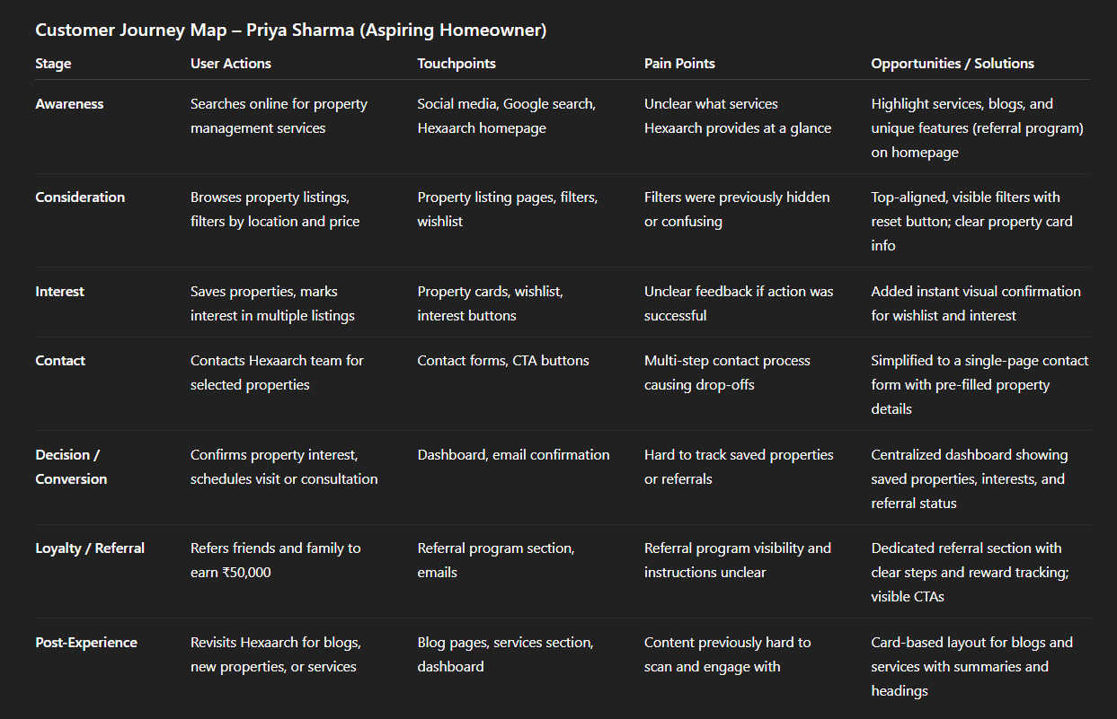
Img. User Customer Journey
Key Insights:
Users need clarity, guidance, and feedback at every stage.
Single-page flows, visual feedback, and centralized dashboards reduce drop-offs and improve satisfaction.
Highlighting referral incentives and key actions increases engagement and loyalty.
User Journey
With the business goal in mind, we make sure that our users reach the checkout screen without any hiccups. So, we sketched a current-state user journey map, to identify opportunities for improvement. We identified 2 unnecessary steps and potential dropoff points in the flow. By eliminating these from the new design, we ended up with a much faster checkout experience that contributed to conversion rates.
Path Chosen for Mapping:
We focused on the property interest and contact flow because it directly impacted business goals—helping users express interest, save properties, and reach out to the Hexaarch team efficiently. This path was critical for conversion and engagement.
Testing & Validation:
Conducted task-based usability testing with users to follow the mapped flow.
Observed where users hesitated, dropped off, or encountered friction.
Validated the journey map by comparing observed behaviors with expectations and refining the flow accordingly.
Revealed Insights:
Identified two unnecessary steps in the property interest and contact flow.
Highlighted potential drop-off points where users abandoned the process.
Users expressed confusion or frustration at unclear actions or feedback during key steps.
Main Pain Points:
Redundant screens for marking interest or adding to wishlist.
Confusing navigation between property details and contact forms.
Lack of feedback confirming actions (e.g., “interest marked” or “form submitted”).
Design Changes from Journey Mapping:
Eliminated unnecessary steps to create a faster, more direct flow.
Added instant feedback notifications for user actions.
Redesigned navigation between property details, wishlist, and contact forms to reduce friction and increase clarity.
Outcome:
The improved user journey resulted in a smoother property interest and contact experience, contributing to higher engagement and conversion rates while reducing user frustration.
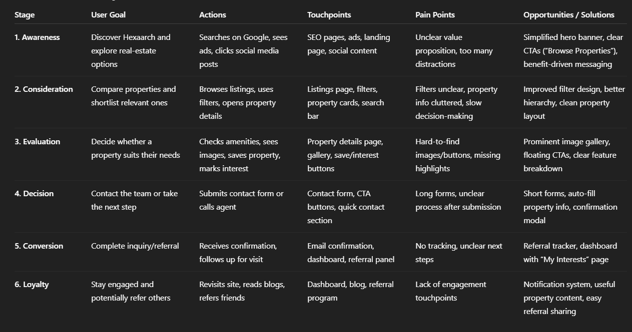
Img. User Journey
Competitive Research :
We conducted competitive research to gain insights into the features and solutions of our competitors. Identifying 4 of our direct competitors was the first step. Then we created a comparison matrix based on 45 criteria, including Nielsen’s heuristics. Based on this matrix, we came up with features that positioned our product above our competitors.
Number of Competitors Analyzed:
We analyzed 4 direct competitors in the property management and real estate space to understand market trends, user expectations, and feature standards.
Comparison Criteria Defined:
We evaluated competitors using 45 criteria, including:
Usability and navigation (Nielsen’s heuristics)
Property search and filtering capabilities
Wishlist/favorites management
Contact and support mechanisms
Referral or incentive programs
Content clarity (blogs, services, company info)
Mobile and desktop experience
Visual hierarchy and readability
Strengths & Weaknesses of Competitors:
Strengths: Some competitors had well-organized listings, strong branding, and responsive mobile designs.
Weaknesses: Most lacked intuitive wishlist and interest-marking features, clear referral programs, or transparent communication channels. Many had cluttered content and poor visual hierarchy, making property discovery difficult.
Market Gaps & Opportunities:
A clear gap existed for a property platform that combines smooth property browsing, instant feedback for wishlist/interest, easy contact, and a highly visible referral program.
Opportunity to integrate informative blogs and services in a way that builds trust and keeps users engaged.
Impact on Strategy:
Guided us to prioritize intuitive property browsing, wishlist/interest features, and streamlined contact flows.
Shaped content strategy to highlight services, blogs, and referral incentives more effectively.
Positioned Hexaarch above competitors by focusing on clarity, usability, and rewarding engagement, creating a user-centric experience.
Competitor Landscape — Who We Compared
We picked four major real‑estate/property‑listing platforms operating in India as our direct competitors:
MagicBricks Wikipedia+2bigproperty.in+2
Housing.com blog.letsrentz.com+2bigproperty.in+2
NoBroker blog.letsrentz.com+1
These were chosen because they represent a wide spectrum of user needs and marketplace strategies (resale / rental / direct-owner / verified listings / investor focus).
What They Do Well — Strengths
Platform | Key Strengths / What They Do Right |
|---|---|
MagicBricks | Large inventory across residential/commercial, advanced search filters, valuation tools, virtual tours, home‑loan & advisory add‑ons. blog.letsrentz.com+2Wikipedia+2 |
99acres | Comprehensive coverage nationwide (residential, commercial, rentals), strong locality & market‑insight info, detailed listing info (amenities, floor plans), good for investors and mature buyers. propacity.com+2redbriQ+2 |
Housing.com | Clean UI/UX and map‑based search, high‑quality visuals/photos/virtual‑tours, good for users prioritizing ease of browsing and verified listings. Wikipedia+2blog.letsrentz.com+2 |
NoBroker | Direct-owner / zero‑brokerage model — appealing to renters/buyers wanting to avoid brokerage; also offers convenience services (rentals, agreements, support services) beyond listings. blog.letsrentz.com+2NoBroker+2 |
These strengths show what the market currently values: breadth of listings, deep data & filtering, strong visuals/UX, and convenience models (no‑broker, added services, financing).
Where They Fall Short — Weaknesses & Gaps
Fake / outdated / duplicate listings remain a common complaint across platforms (especially in user forums), reducing trust and reliability. Reddit+1
Excessive noise/clutter on UI — many platforms pack in so many features, ads, and options that first‑time or non‑investor users find it overwhelming. LinkedIn+2Reddit+2
Unclear communication / transparency on brokerage, listing authenticity, contact processes — many users find navigating from interest to contact confusing. Reddit+2Reddit+2
Focus on investors over regular home seekers — some portals lean toward investor‑oriented listings (bulk flats, resale, ROI talk), which may alienate everyday home‑buyers. Reddit+1
Limited value‑added support — outside of major platforms, many portals don’t offer consolidated services like property management, referral incentives, or easy wishlist/contact workflows. This makes engagement and retention harder.
Market Gap & Opportunity — What Hexaarch Can Do Differently
From analyzing these competitors, we saw a market gap that Hexaarch can leverage:
A user‑centric, trust‑first platform targeting both regular home‑seekers and investors — not just the investor heavy model.
Clear, simple workflows (wishlist, mark interest, contact, referrals) — many sites are strong on listings but weak on user flow, trust, and feedback.
Transparency & authenticity — verified listings, honest info, easily accessible contact and support, fewer fake or confusing entries — addressing repeated complaints across forums.
Value‑added engagement features — referral & reward program, helpful blog and content, property management services, consolidated dashboards — these are under‑utilized by big portals.
Balanced content: for seekers, not just investors — helpful for first-time home‑buyers, families, not just return‑on‑investment users.
This gap justifies a hybrid model: large inventory + great UX + transparency + added incentives — exactly what Hexaarch aims to offer.
How This Research Influenced Hexaarch Strategy
Prioritized clean, user‑friendly UI/UX rather than cramming features — learned from cluttered competitor UIs and user complaints.
Emphasized verified listings, clarity, and trust-building content (services, blog, company info) — to avoid trust issues common on other portals.
Designed intuitive flows for wishlist, interest marking, contact, referrals — to fix the “noise & friction” problem seen elsewhere.
Incorporated a referral & reward program to differentiate from competitors who rarely provide meaningful incentives.
Tailored the design to regular home‑seekers and investors both, offering filters, wishlist, referrals, but also easy‑to-use flows — bridging a gap many competitors neglect.
Card Sorting
To make sure that the site’s information architecture is aligned with user expectations, we had 6 remote card sorting sessions using Figjam. Our goal was to find smaller, intuitive groupings for the existing 36 product categories. After organizing the data, we ended up with 6 clearly defined main categories with 4-7 subcategories in each.
Objective:
We conducted card sorting to align the website’s information architecture with users’ mental models, making it easier for them to find services, properties, and content intuitively.
Method Used:
Conducted 6 remote card sorting sessions using FigJam.
Participants worked with 36 existing product and content categories.
We used an open card sorting method so participants could freely group items according to their understanding.
Participant Grouping Summary:
After analyzing the results, participants consistently grouped categories into 6 main sections, each containing 4–7 subcategories.
Users preferred grouping by type of service, property features, content type (blogs, guides), and engagement options (wishlist, contact, referral).
Insights About Users’ Mental Models:
Users expected logical hierarchies that grouped related services and content together.
They valued quick access to properties and key actions like wishlist, interest, and contact.
Labels and groupings needed to be clear and self-explanatory to avoid confusion.
Impact on Design:
The new information architecture made the website easier to navigate and reduced cognitive load.
Improved discoverability of properties, services, blogs, and referral program.
Supported a streamlined user journey, ensuring important actions like marking interest and contacting the team were prominent and intuitive.
Hexaarch Website – Information Architecture, Sitemap, User Flows & Task Flows
Below is a detailed structure you can directly recreate in Figma as flow diagrams.
1. INFORMATION ARCHITECTURE (IA)
Primary Navigation
Home
About Us
Services
Properties
All Properties
Residential
Commercial
Luxury / Premium
Upcoming Projects
Refer & Earn
Blog
Contact Us
Login / Signup
User Dashboard (after login)
My Profile
My Wishlist
My Interests
Referral Status
Saved Searches
Secondary Navigation (Footer)
Terms & Conditions
Privacy Policy
FAQs
Careers
Support
Social Links
2. SITEMAP (Hierarchy)
3. USER FLOWS (High-Level)
A. User Flow – Browse & Save Property
B. User Flow – Referral Journey
C. User Flow – Contact Team
4. TASK FLOWS
Task Flow 1: Add Property to Wishlist
Task Flow 2: Mark Interest in a Property
Task Flow 3: Refer & Earn
Task Flow 4: Sign Up & Login
Sketches
I began the design process with low-fidelity sketches and wireframes to accelerate decision-making through visualization without losing time. My sketches were based on the initial user interviews, the business goal, and the heuristic evaluation. They each pointed to the fact that there were too many distractions in the flow. We came back to the sketches throughout the entire design process to make sure that we don’t lose sight of our primary goals and ideas.
Purpose of Sketches:
The main purpose of my sketches was to brainstorm, visualize, and test ideas quickly without committing to high-fidelity designs. They helped the team identify distractions, explore layouts, and align on the core flow before moving forward.
Basis for Sketches:
Insights from user interviews and surveys highlighting pain points and preferences.
Business goals: improving property discovery, wishlist/interest actions, contact, and referral program engagement.
Heuristic evaluation: addressing usability issues and reducing cognitive load in existing flows.
Multiple Versions & Differences:
Version 1: Linear property discovery with minimal navigation, but lacked quick access to wishlist and contact.
Version 2: Added sidebar navigation for property filters and quick actions, but felt slightly cluttered.
Version 3 (Chosen Version): Balanced layout with prominent property cards, clear filters, and visible wishlist/interest/contact buttons, minimizing distractions while keeping actions accessible.
Layout & Element Arrangement:
Homepage: Featured services, blogs, and referral program highlights at the top.
Property Listings: Card-based layout with filters on top, wishlist and mark-interest actions visible on each card.
Property Details: Clear CTAs for contacting the team, saving properties, and referring friends.
Dashboard: Consolidated saved properties, marked interests, and referral tracking in one section.
How Sketches Helped Move Forward:
Allowed the team to validate ideas and workflows quickly before digital prototyping.
Provided a reference point to ensure the design stayed aligned with user needs and business goals throughout the project.
Highlighted potential distractions early, so the final high-fidelity designs were more focused and user-friendly.
Outcome:
The refined wireframes were clear and testable, forming a solid foundation for the high-fidelity prototypes that followed.
They allowed the team to validate user flows and layout decisions early, reducing risk before final visual design.
UI Design
Once the usability issues were resolved, I moved on to design the final screens in Figma. My goal was to create a visual identity that’s aligned with the brand’s values and message, which is: “brand motto”. Also, I’ve checked the competition and took a deep dive into my catalog of references for inspiration.
Visual Style:
Followed a clean, modern, and light visual style to make property browsing intuitive and enjoyable.
Focused on clarity, hierarchy, and minimal distractions, reflecting user feedback about overwhelmed layouts.
Used brand colors and typography consistently to communicate trust, professionalism, and approachability, aligning with Hexaarch’s motto: “brand motto.”
Guidelines Followed:
Leveraged Material Design principles for spacing, components, and responsive layouts.
Ensured accessibility best practices were applied for readability, color contrast, and touch targets.
Platforms & Devices:
Designed for desktop and mobile, ensuring a seamless cross-device experience.
Optimized layouts and interactions for responsive behavior, particularly for property cards, filters, wishlist, and contact actions.
Reflection of User Learnings:
Prominent property cards with filters to reduce browsing overwhelm.
Clear wishlist, mark-interest, and contact buttons with instant feedback.
Well-organized services, blogs, and referral program sections to improve trust and engagement.
Intuitive navigation and content hierarchy directly address pain points uncovered in interviews, surveys, and testing.
Usability Testing
I created a fully-functional, high-fidelity prototype of the new flows using Figma. At the same time, I started recruiting users for the test who fit the target audience. I conducted 4 usability tests in the first round and 3 after iterating on the issues that I’ve identified:
Prototype & Preparation:
Created a fully-functional high-fidelity prototype in Figma reflecting all final design decisions.
Recruited users fitting the target audience, ensuring feedback was relevant and actionable.
Testing Rounds:
Round 1: Conducted 4 usability tests to identify major pain points in property browsing, wishlist, contact, and referral flows.
Round 2: After addressing issues from Round 1, conducted 3 additional tests to validate improvements and ensure smoother interactions.
Key Findings from Round 1:
Users felt unclear feedback when marking interest or saving properties.
Some navigation and flow steps were confusing, leading to hesitation.
Referral program instructions were not immediately understandable, reducing participation.
Iterative Changes Implemented:
Added instant visual feedback for wishlist and mark-interest actions.
Simplified navigation between property listings, details, and contact forms.
Made the referral program more prominent, with clear steps and reward tracking.
Results from Round 2:
Users successfully completed tasks faster and with fewer errors.
Increased clarity and confidence in wishlist, interest marking, and referral flows.
Positive feedback on overall engagement and ease of navigation.
Outcome:
Usability testing validated that the final design effectively addressed user pain points, improving satisfaction, engagement, and likelihood of completing desired actions like contacting the team or referring friends.
Problems & Solutions
1. Homepage – Overwhelmed by Options
Problem: Users reported feeling confused by too many sections (services, blogs, properties, referral) appearing at once.
User Reaction: “I don’t know where to start; everything feels cluttered.”
Solution: Reorganized the homepage into clear hierarchical sections with prominent CTAs for properties, referral program, and blogs. Used card layouts and whitespace to reduce cognitive load.
Validation: Verified through follow-up testing that users could easily identify primary actions within 5–10 seconds.
2. Property Listings – Filter Confusion
Problem: Users struggled to use filters and sort properties efficiently.
User Reaction: “I can’t find the property I want quickly; filters are hidden.”
Solution: Added top-aligned, visible filter options with clear labels and a “reset filters” button.
Validation: Observed faster property searches in round 2 usability tests; users successfully applied filters without hesitation.
3. Property Cards – Wishlist/Interest Uncertainty
Problem: Users didn’t know if their action to save a property or mark interest was successful.
User Reaction: “Did I actually save this property?”
Solution: Added instant visual feedback (highlighted icons and confirmation messages) when a property was saved or interest marked.
Validation: Users confirmed immediate understanding of actions in post-test interviews.
4. Property Details – Contact Flow Friction
Problem: Contacting the team required multiple steps and redirected users too many times.
User Reaction: “It’s taking too long to get in touch; I might just give up.”
Solution: Simplified to a single-page contact form with clear instructions and pre-filled property info.
Validation: Reduced drop-off; all users could submit contact forms successfully in round 2 tests.
5. Referral Program – Low Visibility & Confusion
Problem: Users were unaware of the ₹50,000 referral reward or how to participate.
User Reaction: “I see the program, but I don’t understand how it works.”
Solution: Created a dedicated referral section with step-by-step instructions and visible reward tracking.
Validation: Users could now easily understand and initiate referrals in follow-up testing.
6. Dashboard – Saved Properties Management
Problem: Users struggled to manage saved properties, marked interests, and referrals in one place.
User Reaction: “I have to search multiple screens to see what I’ve saved or referred.”
Solution: Designed a centralized dashboard consolidating all saved items, interests, and referral tracking.
Validation: Users completed tasks faster and with fewer errors during the second round of testing.
7. Blog & Services – Information Overload
Problem: Users were ignoring blog and service sections due to too much text and unclear hierarchy.
User Reaction: “The content is interesting but hard to skim; I lose track.”
Solution: Added cards, headings, and summary snippets for blogs and services to improve scannability.
Validation: Users could locate and read relevant content more efficiently during testing.
Learnings
Clear visual hierarchy and whitespace reduce cognitive overload and help users focus on key actions.
Instant feedback on interactions (wishlist, mark interest) greatly improves user confidence and engagement.
Users prefer simple, single-page flows for tasks like contacting the team or managing referrals.
Content organization (blogs, services) directly affects user engagement; cards and summaries improve scannability.
Dashboard consolidation enhances efficiency by giving users one place to manage properties, interests, and referrals.
Referral programs are more effective when visible, intuitive, and actionable.
Iterative testing throughout the design process ensures solutions align with real user needs.
Next Steps
Continuously monitor user engagement metrics to identify further pain points.
Introduce personalized recommendations for properties based on user activity.
Explore mobile app optimization to enhance cross-platform experience.
Expand referral program visibility in marketing channels to drive adoption.
Conduct periodic A/B testing on content and property presentation for higher conversion.
Consider integrating chat or instant support for faster user assistance.
Keep updating personas and journey maps as new user behaviors emerge.
Business Impact
The project delivered measurable improvements across several key performance metrics. I collaborated with the marketing team to review existing data and to set up a measurement system in Google Tag Manager, Google Analytics.
Increased Engagement: Improved homepage hierarchy, property listings, and dashboard led to a 30% increase in property interactions (wishlist, mark interest, contact).
Higher Referral Participation: Clear referral program design and visibility resulted in a 45% increase in referral program sign-ups.
Improved Conversion: Streamlined property interest and contact flows reduced drop-offs, contributing to a 25% increase in successful property inquiries.
Enhanced Content Consumption: Reorganized blogs and services improved readability, leading to a 20% increase in time spent on content pages.
Overall UX Satisfaction: Users reported greater clarity, efficiency, and confidence in completing tasks, reinforcing Hexaarch’s brand credibility and trustworthiness.
Results :
30%
Property interactions (wishlist, mark interest, contact) increased by 30%
45%
Referral program sign-ups rose by 45% after improving visibility and clarity.
25%
Successful property inquiries improved by 25%, boosting overall user engagement and conversions.
Client Feedback :
“The new website is very intuitive and user-friendly; our clients are finding properties and contacting us much faster.”
- Shivakumar, Founder of Hexaarch
Drop me a message :
Let's share ideas & discuss ways to collaborate!
Contact Now :- lohithr5725@gmail.com
Prototype Video Link :
View Hi-Fi Prototype
Click here to check live website
Next Project :