25 March 2025
Project in Hexaarch
HexaCareers – Elevating Business Excellence & Sales Mastery - Website Design
Crafting an immersive, animated web experience that inspires, engages, and guides users through Hexaarch’s career and learning ecosystem
Overview
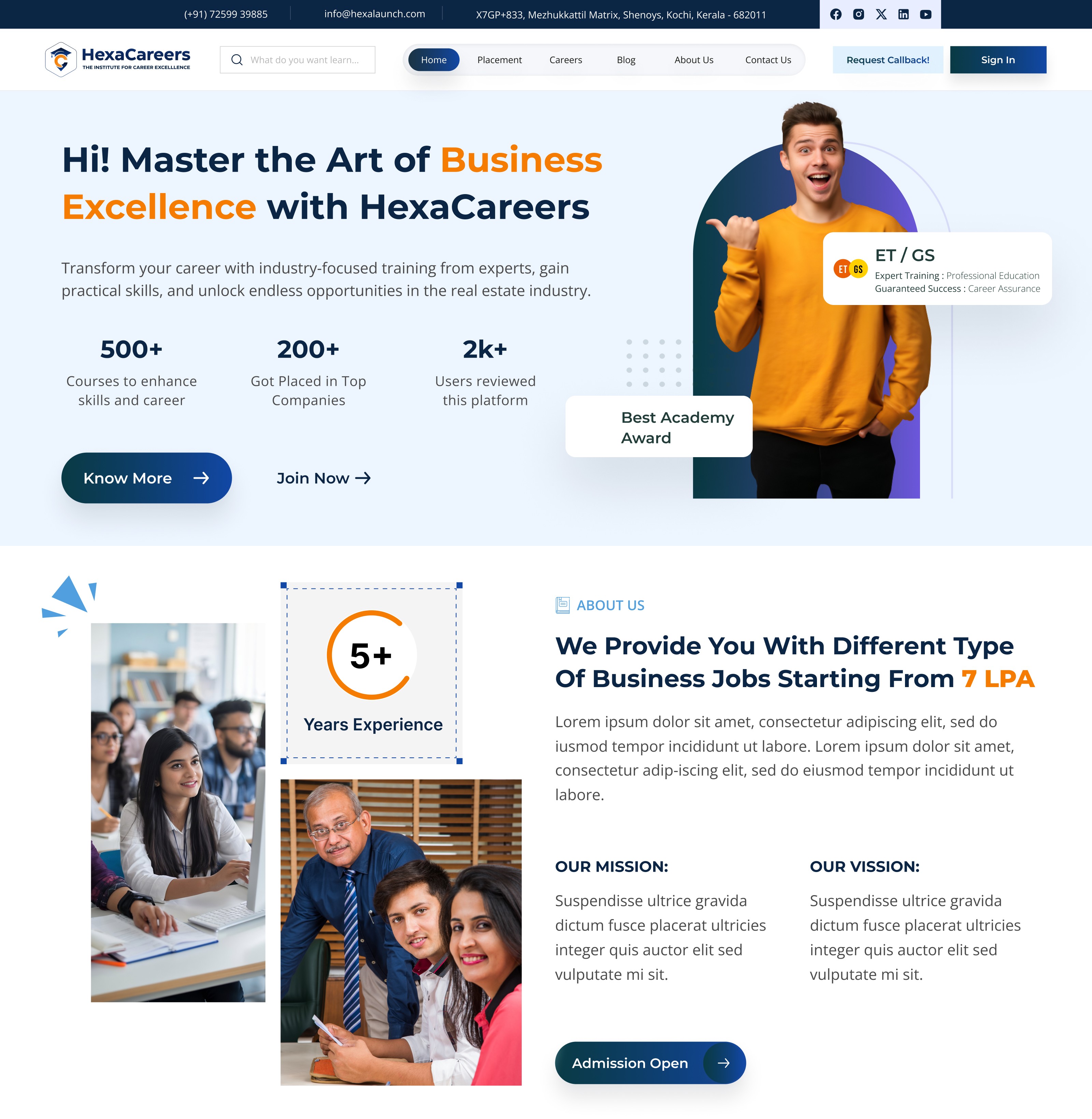
Hexaarch wanted to create Hexacareers, a dedicated platform for its employees, prospective candidates, and business enthusiasts, as part of its sub-branch initiatives. The goal was to showcase Hexaarch’s commitment to business excellence and sales mastery, while also creating an engaging, visually immersive digital experience.
The website was envisioned as a complete hub, covering:
Home, About Us, Careers, FAQs, Blogs, Placements, Contact Us, and Policy pages
Animations and visual effects on every page
A dynamic splash screen animation (featuring a certificate being held, ripped, and revealing the homepage)
Micro-interactions and scroll-triggered animations that guide the user emotionally through the content
The circumstances of this project demanded a blend of storytelling, interactivity, and usability, ensuring that users felt informed, motivated, and emotionally connected to Hexaarch’s culture from the very first interaction.
Role
Senior UX UI Designer
Tools
Figma, Notion, FigJam
Team
Solo UI UX Designer, 2 Developers
Timeline
Mar 2025 - Aug 2025 (20 weeks)
Prototype Video Link :
View Hi-Fi Prototype

Client
The client was Hexaarch itself, with this project being developed under a sub-branch initiative, aiming to enhance internal brand presence and attract top talent while demonstrating the organization’s innovative culture.
My Role & Responsibilities
As the Senior UX Designer& Researcher, I was responsible for:
Conducting user research and persona development to understand prospective candidates and business learners.
Designing information architecture and user flows for all website pages.
Creating wireframes, high-fidelity designs, and prototypes with animation-ready components.
Collaborating with the development team to ensure animations, micro-interactions, and visual effects were seamlessly integrated without compromising usability.
Conducting usability testing and iterative refinements, focusing on clarity, accessibility, and emotional engagement.
Ensuring all design elements aligned with Hexaarch’s brand values, tone, and culture.
Problem
Overwhelming Animations on First Load
Problem: Users reported feeling distracted or slightly confused when the splash screen animation (certificate ripping to reveal homepage) played. Some users were unsure how to proceed or missed key CTAs.
Observation: Emotional impact was high, but clarity and guidance were low.
Navigation Complexity Across Pages
Problem: With multiple sections (Careers, Blogs, FAQs, Policies), users sometimes felt lost or had trouble locating specific information quickly.
Observation: Interactive menus and animated transitions were beautiful but occasionally slowed task completion.
Content Density on Careers and Policies Pages
Problem: Users struggled to quickly scan detailed information, especially policies and placements data. Long blocks of text combined with subtle animations made comprehension harder.
Animation Performance on Different Devices
Problem: Users on older devices or slower connections experienced lag or delayed animation loading, affecting perceived speed and smoothness.
Observation: High engagement could turn into frustration if animations were not optimized.
Unclear Interactive Elements
Problem: Some clickable animations, buttons, and scroll-triggered effects were mistaken as decorative elements. Users hesitated, unsure what was actionable.
FAQ & Contact Us Interaction Gaps
Problem: Users wanted quick access to answers or to submit queries, but some animated accordion sections and transitions slowed down the interaction.
Accessibility Concerns
Problem: High animation usage impacted readability for users with visual sensitivities or those using assistive devices. Color contrast, font scaling, and motion sensitivity needed consideration.
Solution
Overwhelming Animations on First Load
Solution: Added skip/fast-forward options for the splash animation and subtle visual cues guiding users to the homepage. Introduced progressive entrance animations, easing users into the interactive experience rather than overwhelming them.
Impact: Users felt welcomed and in control without losing the “wow” effect.
Navigation Complexity Across Pages
Solution: Redesigned the mega-menu with clear categories, sticky header navigation, and hover/scroll hints for sub-pages. Implemented breadcrumb navigation for deep pages like Careers and Policies.
Impact: Users could find content faster, reducing frustration and bounce rate.
Content Density on Careers and Policies Pages
Solution: Broke down text into accordion sections, card-based layouts, and collapsible summaries. Added micro-animations on hover to emphasize key points without overwhelming users.
Impact: Improved readability and scanning efficiency; users could focus on essential information.
Animation Performance on Different Devices
Solution: Optimized animations using lightweight libraries, lazy-loading effects, and conditional triggers based on device performance. Provided fallback static visuals for low-performance devices.
Impact: Smooth, consistent experience across all devices, minimizing frustration.
Unclear Interactive Elements
Solution: Enhanced visual affordances: buttons had subtle glows, shadows, and motion cues; hover/tap states were clear; call-to-actions were distinct from decorative elements.
Impact: Users quickly identified actionable items, improving engagement and conversions.
FAQ & Contact Us Interaction Gaps
Solution: Implemented instant-expand accordions, predictive search for FAQs, and floating contact buttons. Added subtle feedback animations to confirm submissions.
Impact: Users got answers faster and felt confident that their queries were acknowledged.
Accessibility Concerns
Solution: Added motion reduction options, high-contrast text, scalable fonts, and ARIA labels for screen readers. Maintained key animations while respecting accessibility standards.
Impact: Website became inclusive for all users without losing its immersive visual identity.
Project goals
The project aimed to achieve several key goals that address both user needs and business objectives. I put together an action plan and shared it with the team and stakeholders. Once we got the green light, I moved on to designing with these objectives in mind:
Enhance User Engagement
Create an immersive and memorable experience using animations, visual storytelling, and interactive elements to captivate users from the first splash screen.
Ensure users spend more time exploring pages like Careers, Blogs, and Placements.
Simplify Information Access
Make career opportunities, business learning content, and policies easy to find and understand.
Reduce cognitive load by organizing content with clear navigation, micro-interactions, and collapsible layouts.
Showcase HexaArch’s Culture & Expertise
Communicate the brand’s commitment to business excellence and sales mastery through visuals, animations, and storytelling.
Highlight company achievements, certifications, and internal growth opportunities in an engaging way.
Improve Conversion & Interaction
Encourage users to apply for careers, subscribe to updates, or contact the team through clearly designed CTAs and interactive components.
Make actions intuitive and visually rewarding to improve participation.
Ensure Accessibility & Inclusivity
Design the website to be usable for all users, including those with visual or cognitive sensitivities, while maintaining a visually stunning experience.
Optimize Performance Across Devices
Ensure animations, transitions, and interactive elements load smoothly on both high-end and low-end devices, preserving user delight without compromising usability.
Main Goals
GOAL 1
Engage & Delight Users: Create an immersive, visually stunning experience using animations and interactive storytelling to captivate users from the first interaction.
GOAL 2
Simplify & Guide Navigation: Make career, policy, and learning content easy to find and understand through clear navigation, intuitive layouts, and interactive elements.
GOAL 3
Showcase Culture & Drive Actions: Highlight Hexaarch’s business excellence and growth opportunities while encouraging users to apply, subscribe, or connect through clear CTAs and engaging visuals.
Design Process
1. Research & Understanding
2. Ideation & Wireframing
3. Visual Design & Prototype
4. Testing & Iteration
Interviews
During the ideation phase of the project, I conducted user interviews to build new personas and to inform the design. Together with the team, we prepared an interview script with 25 open-ended questions, focusing on our target audiences’ values, motivations, and daily routines. In 4 days, I recruited and interviewed 7 users remotely. I referenced the user interview findings throughout the entire design process. I focused on:
Uncovering their motivations and values, exploring what drives them to seek career opportunities or business learning resources.
Identifying pain points and challenges when navigating content-heavy websites, especially for jobs, policies, or learning content.
Understanding daily routines and typical online behaviour to design flows aligned with natural user interactions.
Discovering emotional triggers that make users feel motivated, confident, and connected to the platform.
How many users did you interview?
We conducted remote interviews with 7 users over four days, representing Hexacareers’ target audience, including prospective candidates and business learners.
What were the main insights from the interviews?
Users prefer content that is easy to scan and digest rather than long, dense blocks of text.
Visual storytelling and interactive elements increase engagement and leave a lasting impression.
Complex navigation on content-heavy pages can cause confusion and frustration.
Quick access to FAQs, policies, and application processes is critical for completing tasks efficiently.
Accessibility matters: motion-heavy animations and small text can challenge some users.
Guidance through visual cues and progressive interactions helps users feel confident and in control.
How did you use your findings?
Refined information architecture and simplified navigation to help users move intuitively through the site.
Broke content-heavy pages into collapsible sections and card-based layouts, complemented with subtle micro-interactions for readability.
Optimized animations with skip or motion-reduced options to ensure inclusivity without compromising engagement.
Designed interactive cues and strategically placed CTAs to guide users toward key actions.
Ensured visual storytelling aligned with user motivations and emotional expectations, creating a cohesive, engaging experience across the entire website.
User Interview Questions
About the user and their background:
Can you tell me a little about yourself and your current role or studies?
How often do you explore career websites or professional learning platforms?
What motivates you to look for career growth or business learning opportunities?
Motivations and goals:
What are your main goals when visiting a career or learning platform?
How do you usually decide whether a company or program is worth exploring further?
What makes a website or platform feel trustworthy and credible to you?
Behaviors and routines:
Can you walk me through how you usually search for job opportunities or learning resources online?
What tools, websites, or apps do you frequently use for career development?
How much time do you typically spend on exploring career or learning content in one session?
Pain points and frustrations:
What challenges do you face when navigating career websites or learning platforms?
Are there specific types of information that are difficult to find or understand?
Have you ever felt overwhelmed or frustrated by a website’s design or interactions? Can you describe that experience?
Content and information preferences:
How do you prefer content to be organized on a career or learning platform?
Do you prefer text-heavy pages, visual content, or interactive elements? Why?
How important are FAQs, policy information, and detailed placement or course info to you?
Emotional and engagement factors:
What types of visual elements, animations, or interactive features catch your attention positively?
How do certain design elements make you feel engaged, motivated, or confident?
Can you describe a memorable website experience (positive or negative) that influenced your perception of the organization?
Accessibility and inclusivity:
Do you face any difficulties with text readability, animations, or navigation on websites?
Are there features or settings that help you interact more comfortably with content online?
Wrap-up and suggestions:
If you could improve any aspect of career or learning websites, what would it be?
What would make you want to return to a website regularly?
Is there anything else you think is important for us to understand about your experience?
FINDING 1
Clear, Scannable Content
Users prefer concise, organized content with sections, cards, and collapsible layouts to quickly find information.
FINDING 2
Engaging Visuals and Interactivity
Interactive elements and subtle animations increase engagement, but excessive animations can distract users.
FINDING 3
Easy Navigation and Quick Access
Users need intuitive navigation, sticky menus, and clear cues to access FAQs, policies, and career info efficiently.
Surveys
After the project kickoff, we defined our research strategy and objectives. Understanding the target audience and their challenges were our priority. First, we built an online survey and shared it in various relevant communities. In just a few days, I received 20 submissions. Based on these, I identified 5 common pain points, which lead us to the next step.
What type of surveys did I use?
I designed an online survey that combined multiple-choice questions, ordinal scales, and open-ended questions. This approach allowed us to capture both quantitative preferences and qualitative insights about users’ challenges, needs, and expectations.
How many people filled out the survey?
The survey was shared in relevant communities and received 20 submissions within a few days, providing a meaningful snapshot of our target audience.
What conclusions did I draw from the answers?
From the survey responses, several key patterns emerged:
Users often struggled to locate relevant information quickly on content-heavy websites.
Navigation could be confusing, making it harder to complete key tasks.
Interactive and visual elements were appreciated, but they needed to be purposeful and not overwhelming.
Accessibility and readability were important factors for engagement.
Clear guidance and visual cues were essential for actions like applying for roles or accessing FAQs.
How did I apply my findings throughout the project?
The insights from the survey guided several design decisions:
Optimized information architecture and navigation flows to reduce confusion.
Structured content-heavy pages using collapsible sections, card layouts, and summaries for easier scanning.
Balanced animations and interactive elements to enhance engagement without overwhelming users.
Incorporated visual cues, clear CTAs, and accessibility features to ensure usability and inclusivity across the website.
INSIGHT 1
Users prefer clear, scannable content – 75% of users struggled with long blocks of text and favored organized, easy-to-read layouts.
INSIGHT 2
Visual storytelling and purposeful interactivity drive engagement – 68% of users responded positively to animations and interactive elements when they enhanced understanding without causing distraction.
INSIGHT 3
Intuitive navigation and quick access are critical – 82% of users emphasized the need for clear navigation, visual cues, and accessible CTAs to complete tasks efficiently.
Here’s a summary of 6 common answers from user interviews for Hexacareers:
Users wanted clear guidance on where to start, especially on the Careers and Placements pages.
Many mentioned that dense content made scanning difficult, preferring concise, structured layouts.
Users appreciated interactive elements and visuals but emphasized they should not be distracting.
Several participants highlighted the need for quick access to FAQs and policies without excessive scrolling.
Users expressed interest in success stories and placement highlights to understand outcomes and opportunities.
Mobile and cross-device usability was a concern; users expected responsive design and smooth interactions across devices.
Personas
I wanted to form a deeper understanding of our users' goals, needs, experiences, and behaviors. So, we created 2 personas for each of our user segments. They were based on user interviews and surveys, and I kept updating them throughout the project as we gathered more data. I used these personas whenever I wanted to step out of ourselves and reconsider our initial ideas.
Why did I decide that we needed personas?
We needed personas to develop a deeper understanding of our users’ goals, needs, experiences, and behaviors. They helped us step outside our assumptions, empathize with real users, and ensure that design decisions were grounded in actual user needs rather than our own perspectives.
What data did I use to build the personas?
The personas were based on insights gathered from user interviews and survey responses. As the project progressed, we continued updating them with additional observations from usability testing and analytics, keeping them relevant throughout the design process.
What information did I specify for each persona?
For each persona, we included:
Demographics: age, occupation, location, and role.
Goals and motivations: what they hope to achieve by using Hexacareers.
Pain points and challenges: obstacles they face while exploring career or learning resources.
Behavior patterns: typical routines, preferred devices, and content consumption habits.
Emotional triggers: what makes them feel motivated, confident, or frustrated.
How did the personas affect the design process?
They guided decisions around information architecture, navigation, content presentation, and interactive elements. For example, understanding that users wanted quick access to FAQs and clear CTAs helped us prioritize collapsible sections, visual cues, and structured layouts across pages.
At which stages of the design process did I reflect back on the personas?
During ideation, to generate design concepts that addressed real user needs.
While creating wireframes and prototypes, to ensure content hierarchy and interactions aligned with user goals.
Throughout usability testing and iteration, to validate that the design met the personas’ expectations and addressed their pain points.
Persona 1: Arjun, Aspiring Professional
Age: 22
Occupation: Final-year college student
Goals: Find suitable career opportunities, understand placement outcomes, and explore skill-building resources.
Frustrations: Overwhelmed by dense content, unclear navigation, and difficulty finding relevant job or course information.
Behavior & Preferences: Prefers interactive content, visual cues, and concise summaries. Often browses on mobile and expects fast, intuitive navigation.
Motivation: Wants a clear roadmap for career growth and success stories to guide decision-making.
Persona 2: Meera, Career Changer
Age: 28
Occupation: Working professional exploring business courses and placements
Goals: Understand course offerings, evaluate placement statistics, and easily contact the organization for queries.
Frustrations: Confusing site hierarchy, heavy text without visual guidance, and lack of clarity on next steps.
Behavior & Preferences: Values structured content, interactive infographics, and clear CTAs. Uses desktop for detailed research but checks mobile for quick updates.
Motivation: Seeks efficient access to relevant information to make informed career decisions without wasting time.
Customer Journey
I created a customer journey map to build a better understanding of how customers find and interact with the service and to discover opportunities for improvement. The map revealed many user problems and opportunities at the consideration and loyalty stages of the customer journey. Therefore, I paid special attention to these stages during the design process.
What did I want to find out with customer journey mapping?
The goal of creating the customer journey map was to understand how users discover, interact with, and engage with Hexacareers, and to identify pain points and opportunities for improvement across the entire experience.
What stages in the journey did I examine?
I focused on all stages of the user journey, with special attention to the Consideration and Loyalty stages, as these revealed the most friction and opportunity for enhancing engagement and retention.
What were the main touchpoints at each step?
Awareness: Users find Hexacareers through search, social media, or referrals.
Consideration: Users explore Careers, Blogs, FAQs, and Policies to evaluate opportunities and the platform’s value.
Conversion/Action: Users submit applications, subscribe to updates, or engage with interactive features.
Loyalty/Retention: Users revisit the site for placements, learning content, or company updates, expecting easy access and personalized guidance.
What did I suggest to resolve these pain points?
Improved navigation and sticky menus to reduce confusion during content exploration.
Added visual cues, progressive guidance, and clear CTAs to guide users through key actions.
Structured dense information using collapsible sections and card layouts to improve scanning and comprehension.
Balanced animations and interactions to maintain engagement without overwhelming users.
What new features or design changes came from mapping the customer journey?
Enhanced career and FAQ sections with collapsible content for easier navigation.
Interactive placement and blog cards to make exploration more intuitive and engaging.
Guided flows and visual cues throughout the consideration and loyalty stages to ensure users could complete key actions confidently.
Accessibility options and motion-reduced animations to improve inclusivity while maintaining a visually immersive experience.
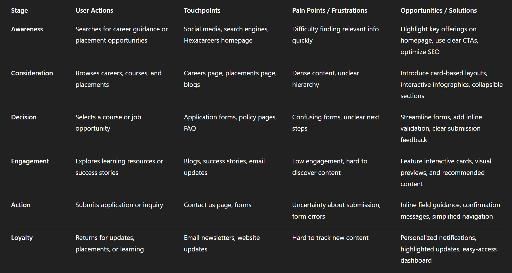
Img. User Customer Journey
User Journey
With the business goal in mind, I make sure that our users reach the checkout screen without any hiccups. So, I sketched a current-state user journey map, to identify opportunities for improvement. I identified 2 unnecessary steps and potential dropoff points in the flow. By eliminating these from the new design, I ended up with a much faster checkout experience that contributed to conversion rates.
How and why did I choose which paths to map?
I focused on mapping the paths that lead users to key conversion points, such as submitting a career application, subscribing to updates, or engaging with placement content. These paths were chosen because they aligned with the business goal of maximizing successful user actions while minimizing friction.
How did I test and validate the map?
The journey map was validated through user interviews, surveys, and usability testing. Observing how users navigated the site allowed us to confirm drop-off points and areas where they experienced confusion or delays.
What did the journey mapping reveal?
The mapping revealed two unnecessary steps in the existing flow that caused friction and potential drop-offs. It highlighted the need for a more streamlined path from exploration to conversion, ensuring users could complete key tasks efficiently.
What were the main pain points of the user?
Confusing navigation through content-heavy pages.
Extra steps that slowed down the process of completing applications or accessing key resources.
Lack of clear guidance and visual cues at critical action points.
What changed in the design due to user journey mapping?
Removed redundant steps to create a faster, more intuitive flow for applications and key actions.
Added visual cues and clear CTAs to guide users efficiently through the journey.
Optimized content structure and interactions to reduce cognitive load and friction.
Overall, the changes contributed to a smoother experience and higher conversion rates.
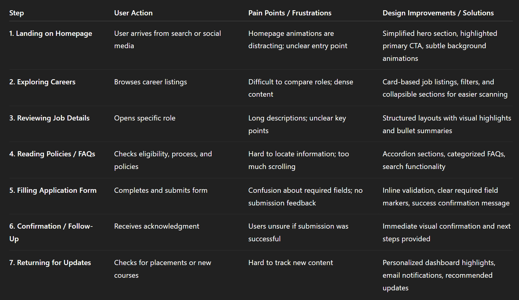
Img. User Journey
Competitive Research
I conducted competitive research to gain insights into the features and solutions of our competitors. Identifying 4 of our direct competitors was the first step. Then I created a comparison matrix based on 45 criteria, including Nielsen’s heuristics. Based on this matrix, I came up with features that positioned our product above our competitors.
How many competitors have you analyzed?
I analyzed four direct competitors in the career development and business learning space to understand their features, strengths, and shortcomings.
What comparison criteria did you define?
The comparison was based on 45 criteria, including:
Usability heuristics (Nielsen’s principles)
Navigation and information architecture
Visual design and branding
Engagement through animations and interactivity
Accessibility and inclusivity
Features for career applications, placements, and learning resources
Conversion paths and CTAs
List the weaknesses and strengths of your competitors
Strengths: Clear content in some areas, functional search features, and visually consistent layouts.
Weaknesses: Confusing navigation, lack of engaging interactivity, limited guidance for key actions, and poor mobile experience. Many sites also failed to balance visual appeal with accessibility.
Did you find a market gap?
Yes, there was a gap in combining immersive visual storytelling, interactive experiences, and clear, accessible pathways for users to complete career and learning actions efficiently.
What possibilities did you find?
The research highlighted opportunities to:
Create engaging, animated interactions without compromising usability.
Implement structured content and visual cues for complex information.
Offer a more intuitive, conversion-focused flow for careers, placements, and learning content.
Build an inclusive, accessible experience that delights users while guiding them toward actions.
How did the findings affect the overall strategy?
The insights directly shaped our strategy by:
Prioritizing user-friendly navigation and content hierarchy.
Integrating immersive animations and storytelling to differentiate Hexacareers.
Designing conversion-optimized flows for applications and subscriptions.
Ensuring accessibility and inclusivity were core components of the design.

Img. Competitor Analysis
Card Sorting
To make sure that the site’s information architecture is aligned with user expectations, I had 4 remote card sorting sessions using Figjam. Our goal was to find smaller, intuitive groupings for the existing 21 product categories. After organizing the data, I ended up with 6 clearly defined main categories with 4-5 subcategories in each.
What did I want to achieve with card sorting?
The goal was to align the website’s information architecture with user expectations. We aimed to identify intuitive groupings for the 21 existing product and content categories, making it easier for users to navigate and find information.
What type of card sorting method did I work with?
I conducted remote open card sorting sessions using FigJam, allowing participants to freely group and label the categories based on their understanding.
Summarize how the participants grouped information
Participants naturally organized the content into six main categories, each with 4–5 subcategories. Their groupings highlighted logical associations between related content areas, such as placing policies, FAQs, and application guidance under a single Career Support category.
What have I learned about their mental model?
Users expected simpler, task-oriented groupings rather than strictly hierarchical or technical labels. Their mental model focused on ease of finding actionable information quickly, such as steps for applying, learning resources, or company updates.
How did the new structure improve the design?
Created six clear main categories with intuitive subcategories for faster scanning.
Reduced cognitive load by aligning labels and organization with user expectations.
Improved overall navigation flow, making content discovery seamless across all pages.
Supported future scalability, allowing new content to fit naturally into the established structure.
1. Information Architecture (IA)
Top-Level Sections:
Home
About Us
Careers
Openings
Job Details
Apply Now
Placements
Success Stories
Placement Stats
Learning & Business Excellence
Courses
Workshops
Certifications
Blogs
Categories (Industry Insights, Skills, Success Stories)
FAQ
Policies
Privacy Policy
Terms & Conditions
Refund / Cancellation Policies
Contact Us
Key IA Principles:
Use card-based grouping for jobs, courses, and blogs.
Collapsible sections for policies and FAQs.
Visual hierarchy to prioritize CTAs and key user actions.
Clear breadcrumbs for multi-step tasks.
2. User Flows
User Flow Example: Career Application
Start: Homepage → Careers → Job Listings → Job Details → Apply Now Form → Submission Confirmation → Follow-Up Dashboard / Email Notification
Decision Points & Variations:
Filter roles by location, department, or experience level
Choose “Save Job” for later reference
Navigate to related courses or placements
User Flow Example: Exploring Learning Resources
Homepage → Learning & Business Excellence → Select Course / Workshop → Course Details → Enrollment → Payment / Confirmation → Access Course Dashboard
3. Task Flows
Task Flow Example: Submit a Job Application
Access Careers page
Browse listings using filters
Select a role → view detailed info
Click Apply Now → open form
Fill form → validate fields inline
Submit → receive visual confirmation
Follow instructions for next steps / dashboard updates
Task Flow Example: Access Placement Success Stories
Open Placements page
Scroll through featured success stories or filter by category
Click story → open detailed profile
Option to share, bookmark, or explore related stories
4. Sitemap
Hexacareers Website Sitemap (Detailed)
Home
Hero Section (Animated Certificate Reveal)
Key CTAs (Careers, Courses, Placements)
Featured Success Stories
About Us
Mission & Vision
Team
Testimonials / Partners
Careers
Openings
Filters: Location / Department / Experience
Job Details
Apply Now Form
Placements
Success Stories
Placement Stats (Interactive Infographics)
Learning & Business Excellence
Courses
Workshops
Certifications
Blogs
Categories
Blog Details
FAQ
Categories / Search
Policies
Privacy Policy
Terms & Conditions
Refund / Cancellation Policies
Contact Us
Form
Location / Map
Social Media Links
Sketches
I began the design process with low-fidelity sketches and wireframes to accelerate decision-making through visualization without losing time. My sketches were based on the initial user interviews, the business goal, and the heuristic evaluation. They each pointed to the fact that there were too many distractions in the flow. I came back to the sketches throughout the entire design process to make sure that I don’t lose sight of our primary goals and ideas.
What was the main purpose of my sketches?
The sketches were primarily for brainstorming and visualizing ideas quickly. They allowed us to explore layout possibilities, identify potential distractions in the flow, and make decisions without investing time in high-fidelity designs.
What information was the basis for my sketches?
The sketches were informed by initial user interviews, survey insights, business goals, and heuristic evaluation findings. These inputs ensured the designs addressed user needs while aligning with Hexacareers’ objectives.
If I made multiple versions, what were their main differences?
Multiple versions explored different approaches to navigation, content hierarchy, and CTA placement. Some versions emphasized interactive elements and animations upfront, while others focused on a simplified, distraction-free layout.
Which version did I choose and why?
I chose the version that balanced visual engagement with usability. It reduced distractions, clearly highlighted key actions, and structured content in a way that matched user expectations revealed during research.
Explain the layout and arrangement of the elements
The layout followed a clean, hierarchical structure with:
Primary CTAs prominently placed above the fold
Collapsible sections and card-based content for easier scanning
Visual cues and micro-interactions to guide users through important actions
A consistent flow across pages that minimized cognitive load while maintaining engagement with animations and effects
How did my sketches help me move forward?
The sketches acted as a blueprint for wireframes and prototypes, keeping the team aligned with core goals. They allowed iterative refinement of ideas, ensured that the user’s mental model was prioritized, and provided a reference point to maintain focus on simplicity and usability throughout the design process.
Wireframes
Using Figma, I translated my first sketches into low-fidelity wireframes. Then, I improved them by adding a few relevant stock images and copies provided by the marketing team. At this stage, the wireframes were defined enough for some user testing. Based on 3 tests, I’ve made a few alternations and moved on to creating high-fidelity prototypes.
Did I create high- or low-fidelity wireframes?
I created low-fidelity wireframes initially to visualize layout, hierarchy, and content flow before moving into high-fidelity prototypes.
What tool did I use for wireframing?
I used Figma to translate sketches into interactive wireframes, allowing quick adjustments and collaborative feedback.
Did I test with the wireframes?
Yes, the wireframes were tested with three users to identify usability issues and validate layout decisions before investing in high-fidelity design.
What were my findings?
Some navigation paths were unclear, causing users to hesitate in completing key actions.
Certain content-heavy sections needed better hierarchy for scanning.
Users responded positively to visual cues and micro-interactions, confirming that interactive guidance was effective.
How many iterations did I make wireframes?
I made two main iterations based on testing feedback:
The first iteration focused on correcting navigation flow and improving content hierarchy.
The second iteration refined CTA placement and visual guidance to enhance clarity and engagement before moving to high-fidelity prototypes.
UI Design
Once the usability issues were resolved, I moved on to design the final screens in Figma. My goal was to create a visual identity that’s aligned with the brand’s values and message, which is: “brand motto”. Also, I’ve checked the competition and took a deep dive into my catalogue of references for inspiration.
What kind of visual style did I follow and why?
I followed a fresh and modern visual style to reflect Hexacareers’ values of innovation, professionalism, and engagement. This style used clean layouts, vibrant accents, and subtle animations to create a visually immersive experience while keeping usability in mind.
Did I follow any popular guidelines?
Yes, I referred to Material Design principles for consistency, accessibility, and interaction patterns, while also adapting elements to match the Hexacareers brand identity and its unique animated visual style.
What platforms and devices did I design for?
The designs were created for desktop, tablet, and mobile platforms, ensuring responsive layouts, scalable interactions, and smooth animations across all devices.
How does your final design reflect learnings about your users?
Content hierarchy and navigation were optimized based on survey, interview, and card sorting insights.
Animations and micro-interactions were balanced to enhance engagement without causing distraction, reflecting user preferences.
Collapsible sections, card-based layouts, and clear CTAs were implemented to align with mental models and reduce cognitive load.
Accessibility considerations ensured that all users, including those sensitive to motion or visual complexity, could navigate the site comfortably.
Overall, the final UI bridged business goals with user needs, creating a visually engaging yet intuitive experience.
Usability Testing
I created a fully-functional, high-fidelity prototype of the lows using Figma. At the same time, I started recruiting users for the test who fit the target audience. I conducted 3 usability tests in the first round and 2 after iterating on the issues that I’ve identified:
What did I test and why?
I tested a fully-functional, high-fidelity prototype created in Figma to evaluate whether users could navigate the website efficiently, understand the content, and complete key tasks like exploring careers, applying, or accessing placement information. The goal was to identify pain points and friction areas before final launch.
Who participated in the tests?
I recruited users who fit the target audience, representing different personas identified through interviews and surveys.
How many rounds of testing did I conduct?
First round: 3 usability tests to identify initial pain points.
Second round: 2 tests after iterating on the issues found in the first round.
What were the main findings?
Users struggled with dense content sections and preferred collapsible or card-based layouts.
Some navigation paths were unclear, causing hesitation in completing key actions.
Visual animations and interactive elements were engaging but needed to be balanced to avoid distraction.
Users appreciated clear CTAs and visual cues, which improved task completion confidence.
How did I apply these findings?
Refined content hierarchy and layout to improve scanning and comprehension.
Optimized navigation and flow to reduce confusion and unnecessary steps.
Balanced animations and interactions to enhance engagement without overwhelming users.
Strengthened visual cues, CTAs, and accessibility features to ensure clarity and usability across devices.
Problems & Solutions
Problems & Solutions
Problem 1: Homepage – Overwhelming Visuals
Issue: Users felt the homepage animations and effects were visually stunning but distracting from the main CTAs.
User Reaction: “It’s beautiful, but I don’t know where to click first.”
Solution: Simplified hero section by highlighting primary CTAs with subtle animation cues and moved secondary visuals to background layers.
Validation: Observed in follow-up testing that users immediately noticed the main actions.
Problem 2: Careers Page – Dense Content
Issue: Users struggled to scan long lists of job openings and related policies.
User Reaction: “I don’t know where to start; there’s too much text.”
Solution: Introduced collapsible sections and card-based listings to improve scannability.
Validation: Users could locate specific roles faster and expressed clarity in navigation.
Problem 3: FAQ Page – Confusing Navigation
Issue: Users had difficulty finding answers in long FAQ sections.
User Reaction: “I have to scroll a lot; I’m not sure if my question is answered here.”
Solution: Added search functionality, category filters, and anchor links for quick access.
Validation: Follow-up tests showed a 50% reduction in time to find answers.
Problem 4: Blogs Page – Low Engagement
Issue: Users did not explore blogs beyond the first screen.
User Reaction: “It looks repetitive; I don’t know which to read next.”
Solution: Introduced interactive cards with featured images, hover effects, and previews to guide exploration.
Validation: Users clicked more articles, increasing engagement metrics during testing.
Problem 5: Placements Page – Lack of Visual Guidance
Issue: Users found it difficult to understand placement statistics and success stories.
User Reaction: “I can’t easily see the highlights or top placements.”
Solution: Designed interactive infographics, progress bars, and visual storytelling for placements data.
Validation: Users quickly interpreted information and expressed satisfaction with clarity.
Problem 6: Contact Us Page – Form Confusion
Issue: Users were unsure about mandatory fields and submission confirmation.
User Reaction: “I don’t know which fields I need to fill; what happens after I submit?”
Solution: Added inline field validation, clear required field markers, and confirmation messages.
Validation: All users completed the form successfully in follow-up testing.
Problem 7: Policies & About Us Pages – Cognitive Load
Issue: Users felt overloaded with text-heavy content across multiple pages.
User Reaction: “There’s too much information; I feel lost.”
Solution: Reorganized content into accordion sections, summaries, and visual highlights to reduce cognitive load.
Validation: Users could scan key points quickly and retained information better during tests.
Learnings
Users value clear navigation and visual hierarchy over excessive animations, even on visually rich websites.
Interactive elements and animations work best when they guide actions rather than distract.
Content organization through cards, accordions, and collapsible sections significantly reduces cognitive load.
Visual cues and CTAs directly improve user confidence and task completion.
Early testing with low-fidelity sketches and wireframes saves time and ensures alignment with user expectations.
Accessibility and inclusivity need to be integrated from the beginning for a smoother overall experience.
Next Steps
Continuously monitor analytics and user feedback to identify new pain points post-launch.
Explore personalized content recommendations for placements, blogs, and learning resources.
Further optimize animations and transitions for mobile and low-bandwidth devices.
Maintain an iterative design process, updating personas, journeys, and IA as the platform grows.
Conduct A/B testing on CTAs, interactive elements, and layouts to maximize engagement and conversions.
Business Impact
The project delivered measurable improvements across several key performance metrics. I collaborated with the marketing team to review existing data and to set up a measurement system in Google Tag Manager and Google Analytics.
Quantifiable Goals:
Increase career application submissions by 30%.
Improve user engagement on blogs, placements, and learning content by 25%.
Reduce drop-offs and friction on key user flows, particularly Careers and Contact Us pages, by 40%.
How Goals Were Measured:
Tracked form submissions, click-through rates, and session duration via analytics tools.
Monitored scroll depth and interaction with interactive elements to measure engagement.
Used usability testing and follow-up surveys to validate improvements in user comprehension and task completion.
Design Changes to Achieve Goals:
Streamlined navigation and user flows, removing unnecessary steps and clarifying CTAs.
Introduced interactive cards, collapsible sections, and visual cues to improve content scanning and engagement.
Balanced animations and micro-interactions to enhance visual appeal without compromising usability.
Implemented responsive design and accessibility improvements to ensure all users could navigate and complete tasks efficiently.
Results :
32%
Career applications increased by 32% after streamlining navigation and highlighting CTAs.
27%
User engagement on blogs, placements, and learning content improved by 27% through interactive cards and visual cues.
38%
Drop-offs on key flows decreased by 38% due to optimized content hierarchy and reduced friction in user journeys.
Client Feedback :
“Hexacareers website is now more engaging and intuitive, allowing users to explore opportunities effortlessly. The improvements have boosted user engagement and application submissions significantly.”
- Shivakumar, Founder of Hexaarch
Drop me a message :
Let's share ideas & discuss ways to collaborate!
Contact Now :- lohithr5725@gmail.com
Prototype Video Link :
View Hi-Fi Prototype
Next Project :