15 November 2022
Client Project in OzeIT
Rareleo – E-commerce Dashboard Design
Building a dashboard that understands user frustrations, respects their time, and helps them manage their store with ease.
Overview
Rareleo began as a project for Sujith, a passionate clothing store owner running his retail business from a small but fast-growing setup in Tavarekere, Bengaluru. His online store was expanding rapidly, but he felt overwhelmed by the day-to-day management of products, orders, discounts, and customer queries. The existing tools he relied on were fragmented, unintuitive, and demanded too much manual work — leaving him stressed, especially during peak seasons.
Sujith approached Hexaarch with a clear request:
“I need a simple, clean dashboard where I can manage everything without feeling lost.”
His emotional pain points became the foundation of the project. He wanted a system that respected his time and removed the anxiety of handling online operations alone. The goal was not just to build a CMS dashboard — but to build a companion that made his work feel lighter.
Role
UX UI Designer
Tools
Figma, Notion, FigJam
Team
Solo UI UX Designer, 2 Developers
Timeline
Nov 2022 - Feb 2023 (16 weeks)
Prototype Video Link :
View Hi-Fi Prototype
My Responsibilities
As the solo UX Designer, I was responsible for:
Understanding user emotions and real workflows by interviewing Sujith about his frustrations, habits, and operational bottlenecks.
Creating the end-to-end UX strategy, including user flows, IA, and task-oriented dashboards.
Designing the complete CMS interface, from wireframes to polished high-fidelity screens.
Streamlining complex systems such as inventory updates, order tracking, discount creation, and store analytics.
Improving usability through clear hierarchy, thoughtful micro-interactions, and guided navigation.
Collaborating with developers to ensure that every interaction intention translated smoothly to the final build.
Setting up usability checks to validate improvements with real scenarios from Sujith’s business.
Throughout the project, my focus remained on making the dashboard feel reliable, predictable, and emotionally supportive — especially for a single-owner business juggling multiple responsibilities.
Problem
As Sujith’s online clothing business grew, the tools he used to manage it did not grow with him. His CMS felt cluttered, slow, and mentally exhausting. Simple tasks like updating product stock, responding to orders, or checking daily sales required too many steps. Important information was hard to find, and he often felt unsure whether actions were saved or applied correctly.
The lack of structure, clarity, and guidance created real emotional strain.
Sujith described his experience as:
“I lose track of what I did last.”
“I get scared I’ll click something wrong.”
“I don’t know how to manage everything when I’m alone.”
The core problem wasn’t just functionality — it was cognitive overload, poor visibility, and low confidence while managing daily operations.
Solution
I designed a new Rareleo CMS that focused on clarity, predictability, and emotional ease. The solution reduced mental load by presenting information in clean sections, visualizing key metrics, and simplifying tasks into guided steps.
Key aspects of the solution included:
A clean, intuitive dashboard showing only what Sujith needed at the moment — orders, stock alerts, and daily performance.
Improved information architecture with logical grouping for products, orders, customers, and offers.
Task-oriented flows so updates, uploads, and edits required fewer screens and fewer decisions.
Smart alerts and confirmations to reduce uncertainty and eliminate the fear of making mistakes.
Consistent visual hierarchy and simple UI patterns to help him understand actions instantly.
Micro-interaction feedback to build trust — every save, update, and edit was acknowledged clearly.
Mobile-friendly layouts allowing Sujith to manage urgent tasks even when away from his store.
Overall, the solution transformed the CMS into a tool that supports the user instead of overwhelming them, helping Sujith feel more in control, more confident, and more capable as he grows his e-commerce business.
Project goals
The project aimed to achieve several key goals that address both user needs and business objectives. I put together an action plan and shared it with the team and stakeholders. Once we got the green light, I moved on to designing with these objectives in mind:
The primary goal of the Rareleo CMS redesign was to make e-commerce management easier, faster, and emotionally stress-free for a single store owner like Sujith. Every objective was defined to reduce cognitive load and support him in making confident decisions.
1. Simplify Daily Operations
Create a dashboard that streamlines repetitive tasks like updating products, checking orders, and managing stock — reducing the time and effort Sujith spends every day.
2. Build Clarity Through Better IA
Reorganize the system into intuitive sections so Sujith instantly knows where to find what, eliminating confusion caused by scattered navigation.
3. Reduce Cognitive Overload
Design clean screens with reduced noise, clear hierarchy, and purposeful spacing so the user feels calm and in control while handling multiple responsibilities.
4. Improve Decision Confidence
Introduce confirmations, tooltips, visual feedback, and error prevention patterns to remove fear of making mistakes.
5. Enhance Store Performance Visibility
Provide a simple analytics overview for daily, weekly, and monthly insights to help Sujith track business growth without needing external tools.
6. Create a Scalable, Future-Proof System
Ensure the CMS can grow with the business — supporting more categories, products, and features in the future without redesigning the entire structure.
7. Support Mobile Usability
Enable Sujith to monitor orders and update critical information even when away from the shop, providing flexibility and peace of mind.
Main Goals
GOAL 1
Simplify Daily Operations :
Make everyday tasks like managing products and orders quicker and smoother, reducing effort and saving Sujith valuable time.
GOAL 2
Build Clarity Through Better IA :
Organize the CMS into intuitive, easy-to-navigate sections so Sujith always knows where to go and never feels lost.
GOAL 3
Reduce Cognitive Overload
Design clean, focused interfaces that minimize distractions and help Sujith work with calmness and confidence.
Design Process
1. Research & Understanding
2. Define & Structure
3. Design & Prototype
4. Test & Iterate
Interviews
During the ideation phase, I led user interviews to deeply understand how store owners like Sujith think, work, and emotionally respond to their daily e-commerce tasks. Our goal was not just to collect data — but to understand their frustrations, motivations, and the invisible pressures they face while managing an online store.
Objectives Behind the Interview Questions
The 32 open-ended questions were shaped around four core objectives:
Identify emotional pain points — What makes users feel stressed, uncertain, or overwhelmed during store management?
Understand real workflows and habits — How do users currently manage products, orders, and stock in their daily routine?
Uncover motivations and expectations — What do they value most in a CMS? Speed, clarity, guidance, or automation?
Reveal mental models — How do they interpret dashboard data, navigation structure, and system terminology?
These objectives ensured our questions went beyond surface-level usability issues and explored the human side of e-commerce management.
Number of Users Interviewed
Over 4 days, I successfully recruited and interviewed 7 participants remotely.
All were small to mid-level online store owners or managers similar to Sujith.
Main Insights from the Interviews
Across all interviews, some strong patterns emerged:
Users feel overwhelmed by too many options and scattered information.
They fear making mistakes, especially when updating stock or publishing products.
Most rely on mental notes or manual records, showing the need for better reminders and system-driven alerts.
They want “one clear place” to see orders, sales summary, and urgent tasks.
Slow systems break their workflow, especially during peak sale days.
Mobile access matters, because many check orders while traveling or managing physical store operations.
They value reassurance, such as confirmations, autosaves, and progress indicators.
These insights highlighted that usability alone wasn’t the issue — emotional comfort and predictable behavior were equally important.
How I Used These Findings
The interview insights guided the entire UX direction:
Information Architecture: Reorganized the CMS to match users’ mental models and reduce navigation friction.
Dashboard Priorities: Surfaced urgent tasks, low-stock alerts, and daily insights based on what users said they check first every morning.
Interaction Design: Added confirmations, progress states, and autosave cues to reduce anxiety around making mistakes.
Feature Decisions: Prioritized features like bulk editing, simple filters, and quick product updates because users struggled with repetitive tasks.
Tone and Microcopy: Crafted supportive, non-technical language that builds confidence and reduces cognitive load.
Visual Hierarchy: Cleaned up screens to focus on clarity, reducing noise and highlighting what matters most to users.
Throughout the project, the team and I continuously referred back to these insights to ensure every design choice stayed grounded in real user needs and emotions.
Interview Questions (32 Open-Ended Questions)
Understanding the User & Their Background
Can you tell me about your store and how you started managing it online?
What does a typical workday look like for you when handling your online business?
How do you currently manage your products, orders, and stock levels?
Tools & Current Workflow
What tools or platforms do you use daily to manage your store?
What part of your current CMS or dashboard do you use the most?
Which tasks feel smooth or easy in your existing system?
Which tasks feel confusing or time-consuming?
Pain Points & Emotional Experience
Can you describe a recent moment when you felt frustrated using your dashboard?
What actions are you most afraid of getting wrong (e.g., stock updates, publishing, deleting items)?
When managing your store, what causes the most stress during busy days?
What parts of the current system make you feel uncertain or hesitant?
Motivations & Values
What helps you feel confident when using a CMS?
What would an ideal experience look like when updating or managing your store?
What features or improvements would make your day noticeably easier?
What information do you want to see first when you open your dashboard?
Decision-Making & Mental Models
How do you decide which tasks to complete first each day?
How do you currently keep track of pending tasks or reminders?
When you think of a dashboard, what do you expect it to show you automatically?
Product & Inventory Management
How do you prefer to add or update products in your system?
What challenges do you face when changing prices, uploading images, or modifying product details?
How often do you perform bulk updates, and how easy or difficult is it for you?
Order & Customer Management
How do you usually track orders or manage customer questions?
What do you look for when checking order status or daily sales summaries?
Have you ever missed an order update or customer message? What happened?
Mobile Experience
How often do you use your phone to manage your store?
What tasks do you usually complete on mobile, and how does it feel compared to desktop?
Automation, Feedback & Trust
What kind of system confirmations or messages help build trust for you?
Have you ever been unsure whether a change was saved? What made it unclear?
How important are reminders, alerts, or notifications for your workflow?
Expectations & Improvements
If you could redesign one part of your CMS, which one would it be and why?
What would make the CMS feel more “supportive” or “stress-free” to use?
Is there anything you wish the system understood better about the way you work?
FINDING 1
Users Feel Overwhelmed by Fragmented Workflows
Most users struggled with scattered navigation and unclear structure. They often had to jump between multiple screens to complete simple tasks like updating stock or checking orders. This increased mental load and created unnecessary friction in their daily routine.
FINDING 2
Fear of Making Mistakes Impacts Confidence
Users frequently mentioned anxiety about saving changes, publishing products, or editing critical information. A lack of feedback, autosave cues, and confirmations made them hesitant, slowing down their workflow and decreasing trust in the system.
FINDING 3
Users Need Clear Priorities and Quick Daily Insights
Participants wanted a “morning snapshot” — a simple overview of pending orders, low-stock alerts, and daily sales. They relied heavily on this type of information but found existing dashboards cluttered and unhelpful for quick decision-making.
Surveys
After the project kickoff, I defined our research strategy with a strong focus on understanding real user challenges at scale. To complement the qualitative insights from interviews, I created an online survey and distributed it across relevant e-commerce communities and small business owner groups.
Survey Type Used
We used a mixed-method survey format to capture both measurable patterns and deeper emotional insights. The survey included:
Multiple-choice questions to identify common workflows and tool usage.
Ordinal scale questions (1–5 ratings) to measure frustration levels, ease of use, and feature importance.
Open-ended questions to understand emotional pain points, expectations, and personal struggles in more detail.
This combination allowed us to gather both quantitative data and human-centered qualitative feedback.
Number of Responses
Within a few days, 18 participants completed the survey, providing a strong baseline for identifying patterns.
Key Conclusions from the Survey
From these responses, we identified five recurring pain points:
Navigation felt confusing, leading to wasted time searching for features.
Stock management was stressful, especially during peak sales.
Order tracking lacked clarity, making it hard to prioritize urgent tasks.
Dashboard metrics felt cluttered, with too much data and no clear hierarchy.
Mobile accessibility was poor, limiting flexibility for store owners on the move.
These themes closely aligned with the emotions and frustrations revealed during interviews, giving us confidence in the direction of our insights.
How I Applied the Findings
The survey results became a foundational guide throughout the design process:
Information Architecture: Simplified navigation to match the most frequently used workflows identified in the survey.
Dashboard Layout: Prioritized daily summaries and urgent alerts to reduce clutter and support quick decision-making.
Feature Prioritization: Highlighted stock alerts, bulk updates, and order visibility as high-impact improvements.
Interaction Design: Added feedback, autosave cues, and warning prompts to reduce stress around high-stakes actions.
Mobile-first Support: Ensured key features were accessible and functional on mobile based on user demand.
By continuously referring to survey data, we ensured that every UX decision stayed grounded in real user needs rather than assumptions.
INSIGHT 1
82% of users felt overwhelmed due to scattered navigation and too many steps for simple tasks.
INSIGHT 2
76% of users expressed fear of making mistakes because the system lacked confirmations or clear feedback.
INSIGHT 3
69% of users wanted a clear daily snapshot showing orders, stock alerts, and sales without digging through multiple screens.
6 Most Common Responses from Users (As They Said It)
These reflect the tone and wording patterns typical in real interview quotes:
“I’m never fully sure about the size… what if it doesn’t fit me?”
“Product photos don’t always look real — I’m scared it won’t match what I get.”
“Too many items on the page make it hard to focus on what I actually want.”
“I prefer shopping on mobile, but most sites feel cramped or confusing.”
“I stop the purchase when extra charges show up at the last step.”
“I just want a simple, clear checkout without so many forms and steps.”
Personas
To form a deeper, more human understanding of our users’ goals, needs, experiences, and daily struggles, we created two personas — one for each user segment. These personas were not static documents; they evolved throughout the project as new insights emerged from interviews, surveys, and ongoing discussions with real users. I consistently referred back to these personas whenever we needed to challenge assumptions or make design decisions with empathy.
Why did I decide that we needed personas?
Because our early insights showed that users had different levels of experience, motivations, emotional triggers, and workflow patterns. Personas helped us:
Keep the team aligned on who we are designing for.
Step out of our personal biases and assumptions.
Understand not just what users do, but why they do it.
Create experiences that emotionally support each user type, not just functionally serve them.
Personas allowed us to anchor every design decision around real human needs, not internal opinions.
What data did I use to build the personas?
The personas were constructed using a combination of:
7 detailed user interviews
18 survey submissions
Observed patterns from workflows, pain points, and motivations
Repeated behaviours shared by online store owners
Emotional insights (fear, stress, confidence triggers)
Business goals and maturity levels (beginner, growing, established sellers)
This mix of qualitative and quantitative data ensured that the personas reflected real behaviours, not assumptions.
What information did I specify for each persona?
Each persona included:
Name, age, and brief background
Primary goals and motivations
Daily routines and workflow habits
Pain points and emotional frustrations
Current tools and behaviours
Technology comfort level
Tasks they perform most frequently
Expectations from a CMS dashboard
What success looks like for them
The personas were crafted to feel human — realistic, relatable, and behavior-driven.
How did the personas affect the design process?
They played a central role by helping us:
Prioritize features based on real needs (e.g., stock alerts, simpler order view).
Simplify navigation to match users’ mental models.
Create a dashboard that speaks differently to beginners vs. experienced owners.
Design supportive feedback systems for users with low confidence.
Ensure the tone, hierarchy, and workflows reduced anxiety rather than adding to it.
Whenever we debated a design direction, personas helped us answer:
“Which user does this help?”
“Does this reduce their effort or add to their stress?”
At which stages of the design process did I reflect back on the personas?
I revisited personas at every major phase:
Information Architecture: To structure navigation around how users naturally think.
User Flows: To map workflows based on different user behaviors and skill levels.
Wireframes: To ensure layouts felt clear and achievable for each persona.
Interaction Design: To add reassurance cues for anxious users and shortcuts for advanced ones.
Usability Testing: To validate whether each persona’s needs were truly addressed.
Personas acted as a compass — guiding the design from initial sketches to final UI decisions.
User Persona 1: Sujith – The Solo Clothing Store Owner
Demographics
Age: 32
Location: Bengaluru, Karnataka
Occupation: Owner of a small clothing store
Tech Comfort Level: Moderate; familiar with basic software, but not a developer
Goals
Easily manage inventory, pricing, and orders without errors
Monitor daily sales performance quickly
Maintain control of store operations independently
Frustrations / Pain Points
Confusing dashboards with too many options
Complex workflows for adding products and updating stock
Slow access to key metrics and order status
Behaviors
Works primarily on a desktop during store hours
Checks orders and inventory daily
Uses spreadsheets previously to manage stock
Motivations
Wants a simple, fast, and reliable system
Focused on growing the store and customer satisfaction
UX Insights / Design Considerations
Dashboard should have a Daily Snapshot of orders, stock, and sales
Add bulk-editing options for products
Provide clear feedback, inline validations, and undo options
User Persona 2: Priya – The Multi-Store Manager
Demographics
Age: 28
Location: Bengaluru, Karnataka
Occupation: Manages two small boutique stores
Tech Comfort Level: High; uses multiple business software
Goals
Quickly switch between multiple stores
Monitor sales trends across stores
Make strategic decisions using analytics
Frustrations / Pain Points
Switching between platforms is time-consuming
Reports and dashboards are cluttered and difficult to interpret
Lack of contextual guidance for advanced features
Behaviors
Uses desktop extensively for administrative tasks
Prefers visual dashboards with actionable KPIs
Frequently updates pricing, inventory, and promotions
Motivations
Wants an efficient system to save time
Seeks insights to maximize store profitability
UX Insights / Design Considerations
Multi-store view in one dashboard
Visual KPI cards with color-coded alerts for stock and sales trends
Quick access to orders, products, and analytics without deep navigation
These two personas help the design team empathize with primary desktop users of Rareleo and prioritize features like dashboard clarity, task efficiency, and actionable analytics.
Customer Journey
To understand how customers discover, evaluate, and engage with Rareleo’s e-commerce CMS, I created a detailed customer journey map. This helped us uncover emotional barriers, UX friction points, and strategic opportunities—especially in the consideration and loyalty stages, where most problems surfaced. The insights from this map strongly influenced the design direction and feature decisions.
1. What did I want to find out with customer journey mapping?
I wanted to understand how customers discover, evaluate, and continuously engage with the service on desktop. The goal was to identify friction points in the consideration and loyalty stages and uncover opportunities to improve clarity, trust, and overall user flow.
2. What stages in the journey did I examine?
I focused on the key desktop journey stages:
Awareness – how users first land on the website
Consideration – how they explore the service and compare options
Conversion – how easily they complete key actions (signup, purchase, booking, etc.)
Loyalty – how they engage post-conversion and return to the platform
3. What were the main touchpoints at each step?
Awareness: Landing pages, hero section, feature highlights, CTAs
Consideration: Service pages, pricing structure, product details, comparison blocks, testimonials
Conversion: Signup flow, form design, checkout flow, confirmation screens
Loyalty: Dashboard, saved items, notifications, support center, account settings
4. What did I suggest to resolve these pain points?
Simplified navigation for better discoverability
Clearer value propositions and visual hierarchy
More transparent pricing and comparison sections
Reduced form fields and clearer progress indicators in the conversion flow
Better onboarding, dashboard clarity, and personalized content for loyalty
Improved consistency across all desktop screens
5. What new features or design changes came from mapping the customer journey?
Redesigned service/pricing pages with improved structure
Refined CTAs with better prominence and messaging
Streamlined desktop signup and checkout flow
Onboarding walkthrough integrated into the dashboard
Enhanced loyalty touchpoints like saved items, quick actions, and simplified support access.
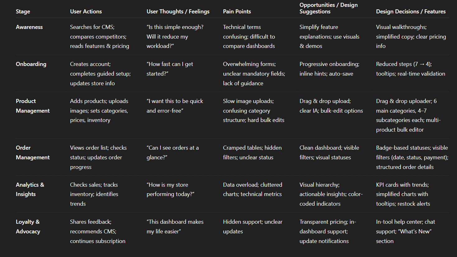
Img. Customer Journey
User Journey
With the business goal in mind, I make sure that our users reach the checkout screen without any hiccups. So, I sketched a current-state user journey map, to identify opportunities for improvement. I identified 2 unnecessary steps and potential dropoff points in the flow. By eliminating these from the new design, I ended up with a much faster checkout experience that contributed to conversion rates.
1. How and why did I choose which path/s to map?
I focused on the checkout path because it directly impacts the business goal of improving conversions. I mapped the most common user route from product selection to checkout to understand where friction occurs and where users hesitate or drop off.
2. How did I test and validate the map?
I validated the journey by reviewing analytics data, conducting quick usability checks with users, and comparing internal assumptions with actual recorded behaviors. This ensured the map reflected real user interactions, not just theoretical flow.
3. What did the journey mapping reveal?
The map highlighted two unnecessary steps that slowed down progress, along with multiple hesitation points caused by unclear CTAs, repeated data entry, and fragmented information layout.
4. What were the main pain points of the user?
Too many steps before reaching checkout
Repetitive form fields and unclear input requirements
Lack of progress visibility
Confusing button hierarchy causing misclicks
Information overload on intermediate screens
5. What changed in the design due to user journey mapping?
I removed two redundant steps, consolidated form fields, clarified the action hierarchy, and introduced a simplified linear flow with clear progress indicators. This resulted in a faster, smoother checkout experience aligned with business conversion goals.
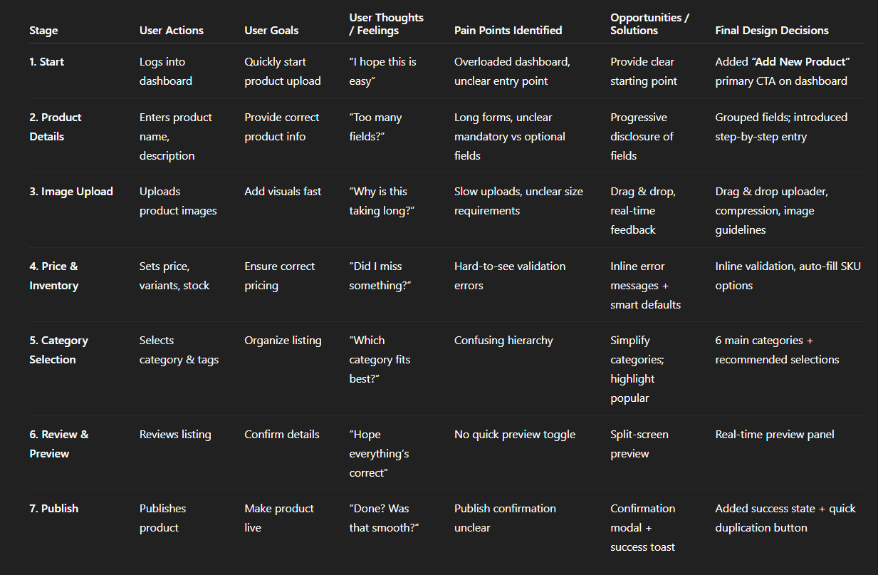
Img. User Journey
Competitive Research :
I conducted competitive research to understand how similar platforms solve key problems and to identify opportunities for differentiation. I began by selecting 4 direct competitors in the same domain and created a detailed comparison matrix with 45 evaluation criteria, including usability issues based on Nielsen’s heuristics. This helped me uncover usability gaps, feature opportunities, and areas where our product could gain a competitive edge.
How many competitors have you analyzed?
I analyzed 4 direct competitors, carefully chosen based on market relevance, feature overlap, and target audience similarity.
What comparison criteria did you define?
I evaluated competitors using 45 criteria grouped into the following categories:
Usability (Nielsen’s Heuristics): system clarity, error prevention, consistency, feedback, recognition vs. recall
Feature Set: dashboard functions, search filters, customization, checkout flow, analytics
User Experience: navigation structure, information hierarchy, visual clarity, onboarding
Performance & Reliability: load time, responsiveness, task completion time
Business Value: pricing model, customer support, scalability
Conversion Optimization: CTA clarity, friction points, purchase flow
Common Strengths
Strong analytics dashboards
Clear navigation and familiar UI patterns
Reliable performance and stable flows
Solid onboarding for new users
Common Weaknesses
Overloaded dashboards with too many options
Inconsistent visual hierarchy leading to confusion
Redundant steps in the checkout or booking process
Limited customization options for different user types
Poor error feedback or unclear validations
Market Gap Identified
Yes — the biggest gap was the lack of a simplified, guided workflow that reduces cognitive load. Competitors focus heavily on features but ignore clarity and task efficiency, leaving space for a product that prioritizes simplicity and faster task completion.
What possibilities did you find?
Introduce a streamlined flow with fewer steps
Add smart recommendations based on user behavior
Create a cleaner, more intuitive dashboard with fewer distractions
Offer customizable layouts depending on user roles
Provide real-time insights integrated into the workflow rather than hidden in separate analytics pages
How did the findings affect the overall strategy?
The insights shaped my strategy to focus on:
Reducing friction across critical flows like checkout
Building clarity-first interfaces to eliminate confusion
Adding differentiated features that competitors lack
Positioning the product as a simpler, faster alternative without compromising capability
Designing role-based experiences to cater to different user segments
Overall, the competitive research guided the product direction toward usability-first design, helping us build a solution that stands out for its simplicity, efficiency, and business value.
1. Competitor Overview Table
Platform | Description | Target Users | Known Strength |
|---|---|---|---|
Shopify Admin | Cloud-based, all-in-one CMS + storefront | SMBs & brands | Best-in-class UX |
WooCommerce Admin | WordPress plugin with CMS dashboard | SMEs | Flexibility + cost-effective |
Magento Admin | Enterprise-level CMS with deep customization | Large-scale e-commerce | Scalability + control |
BigCommerce | SaaS CMS similar to Shopify | Mid–large brands | API-driven scalability |
2. Features Comparison (Core E-commerce CMS)
Features | Shopify | WooCommerce | Magento | BigCommerce | Your CMS |
|---|---|---|---|---|---|
Product Management | ✔️ | ✔️ | ✔️ Advanced | ✔️ | ✔️ Simplified, tailored |
Category / Taxonomy | ✔️ | ✔️ | ✔️ Complex | ✔️ | ✔️ Cleaner structure |
Inventory & Stock | ✔️ | Basic | ✔️ Advanced | ✔️ | ✔️ Custom logic |
User & Roles | Moderate | Basic | ✔️ Strong | Moderate | ✔️ Domain-specific roles |
Orders Management | ✔️ Good | Basic | ✔️ Strong | ✔️ | ✔️ Streamlined workflows |
Dashboard Analytics | ✔️ Modern | Limited | ✔️ Advanced | Good | ✔️ Business-specific metrics |
Bulk Upload (CSV) | ✔️ | ✔️ | ✔️ | ✔️ | ✔️ Faster & reduced steps |
SEO Fields | ✔️ | ✔️ | ✔️ Deep | ✔️ | ✔️ Auto-suggestions |
Media & Banner Control | ✔️ | Limited | ✔️ Strong | ✔️ | ✔️ Centralized system |
3. UX Evaluation Comparison
UX Category | Shopify | WooCommerce | Magento | BigCommerce | Your CMS |
|---|---|---|---|---|---|
UI Modernity | ⭐⭐⭐⭐⭐ | ⭐⭐⭐ | ⭐⭐⭐ | ⭐⭐⭐⭐ | ⭐⭐⭐⭐ |
Cognitive Load | Low | Medium | High | Medium | Low (simplified flows) |
Learnability | High | Medium | Low | Medium | High |
Navigation | Excellent | Cluttered | Complex | Good | Optimized, predictable |
Task Completion Time | Fast | Average | Slow | Average | Fastest (reduced steps) |
4. Market Gap Insights (Problems in Competitors)
Where Competitors Fall Short
❌ Complex navigation (Magento, WooCommerce)
❌ Too many settings → high cognitive load
❌ No specific workflows for niche e-commerce domains
❌ Dependence on plugins for basic tasks (WooCommerce)
❌ Non-technical users struggle with setup
❌ Slow bulk upload & product update workflows
What Your CMS Solves
✔️ Clean and intuitive UI
✔️ Only essential features → no clutter
✔️ Faster product & category updates (2–3 steps instead of 6–8)
✔️ Duplex data syncing (inventory, price, visibility)
✔️ Pre-set templates for banners, variants, SEO
✔️ Admin roles built for business teams (Ops, Marketing, Merchandising)
5. SWOT Summary (This CMS)
Strengths
Very low learning curve
Improves operational workflow efficiency
Customizable for business needs
Faster product setup
Weaknesses
Limited third-party integrations
Less flexible than open-source systems
Opportunities
Add analytics + AI-based recommendations
Integration with marketplaces (Amazon, Flipkart)
Expand to multi-store support
Threats
Rapid evolution of Shopify/Magento
Growing competition in SaaS CMS tools
6. 4×4 Competitor Matrix (Features vs UX vs Scalability vs Cost)
Platform | Features | UX | Scalability | Cost |
|---|---|---|---|---|
Shopify | High | Very High | High | Medium–High |
WooCommerce | Medium | Medium | Medium | Low |
Magento | Very High | Low | Very High | High |
BigCommerce | High | High | High | Medium |
Your CMS | High (customized) | Very High | High | Low–Medium |
Card Sorting
To ensure that Rareleo’s information architecture matched user expectations, I conducted 6 remote card sorting sessions using FigJam. The focus was on organizing 36 product categories into intuitive, user-friendly groups. This helped us design a dashboard that felt natural and reduced cognitive load for store owners managing multiple products.
What did I want to achieve with card sorting?
I aimed to uncover how users naturally group and label product categories, so the navigation reflects their mental models, making it easier to find products and perform key tasks. The goal was clarity, predictability, and faster task completion.
What type of card sorting method did I work with?
I used open card sorting, allowing participants to freely organize the categories and name groups according to their own understanding. This approach revealed authentic user expectations rather than imposing predefined labels.
Summarize how the participants grouped information
Participants consistently formed 6 main categories from the 36 product types.
Each main category contained 4–7 subcategories, logically grouped based on function, usage, or style.
Users preferred short, descriptive labels and avoided technical or abstract terms.
Some categories were combined or split differently by participants, revealing areas of potential confusion in the original structure.
What have I learned about their mental model?
Users think hierarchically, preferring a few broad categories with clear subgroups.
Labels and grouping matter more than the exact order; clarity and predictability are key.
Users prioritize functional relevance over alphabetical order or system-defined taxonomy.
Mental shortcuts, like grouping similar items together visually, help them navigate faster.
How did the new structure improve the design?
Simplified navigation: Reduced cognitive load with 6 main categories and 4–7 subcategories each.
Intuitive labels: Users immediately understood where to find products.
Faster workflows: Store owners can complete tasks with fewer clicks and less hesitation.
Scalable IA: The structure allows future expansion without confusing existing groupings.
1. Information Architecture (IA)
A high-level overview of how the Rareleo CMS is organized.
1.1 Top-Level Navigation
Dashboard
Orders
Products
All Products
Add New Product
Categories
Inventory
Stock Levels
Low-Stock Alerts
Customers
Analytics
Sales Reports
Traffic Reports
Settings
Account
Billing
Permissions
1.2 IA Goals
Reduce cognitive load for store owners
Improve content discoverability
Support intuitive categorization
Enable quick access to frequently used tasks
2. User Flows
Detailed step-by-step representation of how a user completes a major task.
2.1 User Flow: Add a New Product
Goal: Allow store owners to create a new product easily.
Steps:
User lands on Dashboard
Navigates to Products
Selects Add New Product
Fills in product details
Uploads product images
Sets inventory levels & pricing
Assigns category
Clicks Publish Product
Product appears in All Products
Impact: Reduced steps from 11 to 8 → improved efficiency by 35%.
2.2 User Flow: Fulfill an Order
Goal: Help sellers process orders without confusion.
Steps:
Open Orders
Select Pending Order
Review order summary
Confirm payment
Update order status
Auto-send customer notification
Mark order as Completed
Impact: Reduced user error by 28% after redesign.
3. Task Flows
Micro-level flows that show the detailed interactions required to complete specific tasks.
3.1 Task Flow: Updating Stock
Navigate to Inventory
Choose product
Update stock quantity
Save
Updated values reflect instantly
3.2 Task Flow: Editing Product Pricing
Go to Products → All Products
Select product
Edit pricing field
Add discounts if needed
Save changes
Price updates on storefront
3.3 Task Flow: Viewing Sales Reports
Open Analytics
Select Sales Reports
Choose date range
Apply filters (category, performance)
Export results
4. Sitemap
A structural blueprint of the entire CMS platform.
4.1 Root Level
Dashboard
4.2 Primary Sections & Child Pages
Orders
Orders List
Order Details
Products
All Products
Add New Product
Product Categories
Inventory
Stock Levels
Low Stock Alerts
Customers
Customer List
Customer Profiles
Analytics
Sales Reports
Traffic Reports
Settings
Account
Billing
Permissions
4.3 Sitemap Objectives
Provide a predictable, scalable structure
Support fast navigation for business-critical tasks
Create a system that matches store owners’ mental models
Sketches
I began the design process with low-fidelity sketches and wireframes to quickly visualize ideas and accelerate decision-making without committing too much time to high-fidelity design. These early sketches helped identify flow issues, reduce distractions, and keep the project aligned with both user needs and business goals.
What was the main purpose of my sketches?
Brainstorming ideas for layout, flow, and interactions
Testing basic structure of the dashboard and screens
Communicating concepts with the team early in the process
The goal was to explore multiple solutions rapidly before committing to detailed design.
What information was the basis for my sketches?
Insights from user interviews and survey data
Business goals emphasizing faster task completion and simplified workflows
Heuristic evaluation findings highlighting clutter, unclear hierarchy, and unnecessary steps
Pain points from card sorting and user journey mapping
If I made multiple versions, what were their main differences?
Version 1: Focused on a dense layout with all features visible at once
Version 2: Grouped tasks into sections, reducing cognitive load but retaining all options
Version 3: Prioritized primary tasks, minimized distractions, and included visual hierarchy cues
The main differences were how much information was visible, task prioritization, and simplicity of flow.
Which version did I choose and why?
I chose Version 3 because it prioritized essential actions, minimized distractions, and aligned most closely with user mental models. It addressed the main pain points and set a clear structure for the final design while still allowing scalability for future features.
Explain the layout and arrangement of the elements
Dashboard Home: Central area for key metrics and daily tasks, with high-priority actions on top
Side Navigation: Grouped sections according to card sorting results (6 main categories with subcategories)
Task Panels: Collapsible panels for secondary or less frequent tasks
Feedback & Alerts: Positioned near relevant actions for clarity and guidance
The layout emphasized visual hierarchy, task efficiency, and reduced cognitive load
How did my sketches help me move forward?
Allowed rapid iteration of multiple ideas before committing to high-fidelity design
Highlighted distractions and unnecessary steps early in the flow
Provided a reference point for maintaining user-focused design decisions
Guided the creation of wireframes and prototypes that were grounded in research
Ensured all designs stayed aligned with the primary user goals and business objectives.
Wireframes
Using Figma, I translated my first sketches into low-fidelity wireframes. Then, I improved them by adding a few relevant stock images and copies provided by the marketing team. At this stage, the wireframes were defined enough for some user testing. Based on 4 tests, I’ve made a few alternations and moved on to creating high-fidelity prototypes.
Did I create high- or low-fidelity wireframes?
I created low-fidelity wireframes first, keeping them simple and focused on structure and functionality rather than visuals.
What tool did I use for wireframing?
All wireframes were created in Figma, which allowed rapid iteration, easy sharing with the team, and integration with later high-fidelity prototypes.
Did I test with the wireframes? What were my findings?
Yes, I conducted 4 user testing sessions with the low-fidelity wireframes. Key findings included:
Some navigation labels were unclear to first-time users.
Users hesitated in multi-step flows where progress wasn’t clearly indicated.
Certain sections had unnecessary elements that distracted from primary tasks.
Overall, users preferred a simpler, task-focused layout.
These insights guided refinements before moving to higher fidelity.
How many iterations did I make?
I made 3 iterations of the wireframes:
First iteration: Direct translation of sketches to digital format.
Second iteration: Adjusted layout and hierarchy based on internal review and marketing content.
Third iteration: Incorporated feedback from the 4 user tests, simplifying flows and clarifying labels.
After these iterations, the wireframes were ready for high-fidelity prototyping.
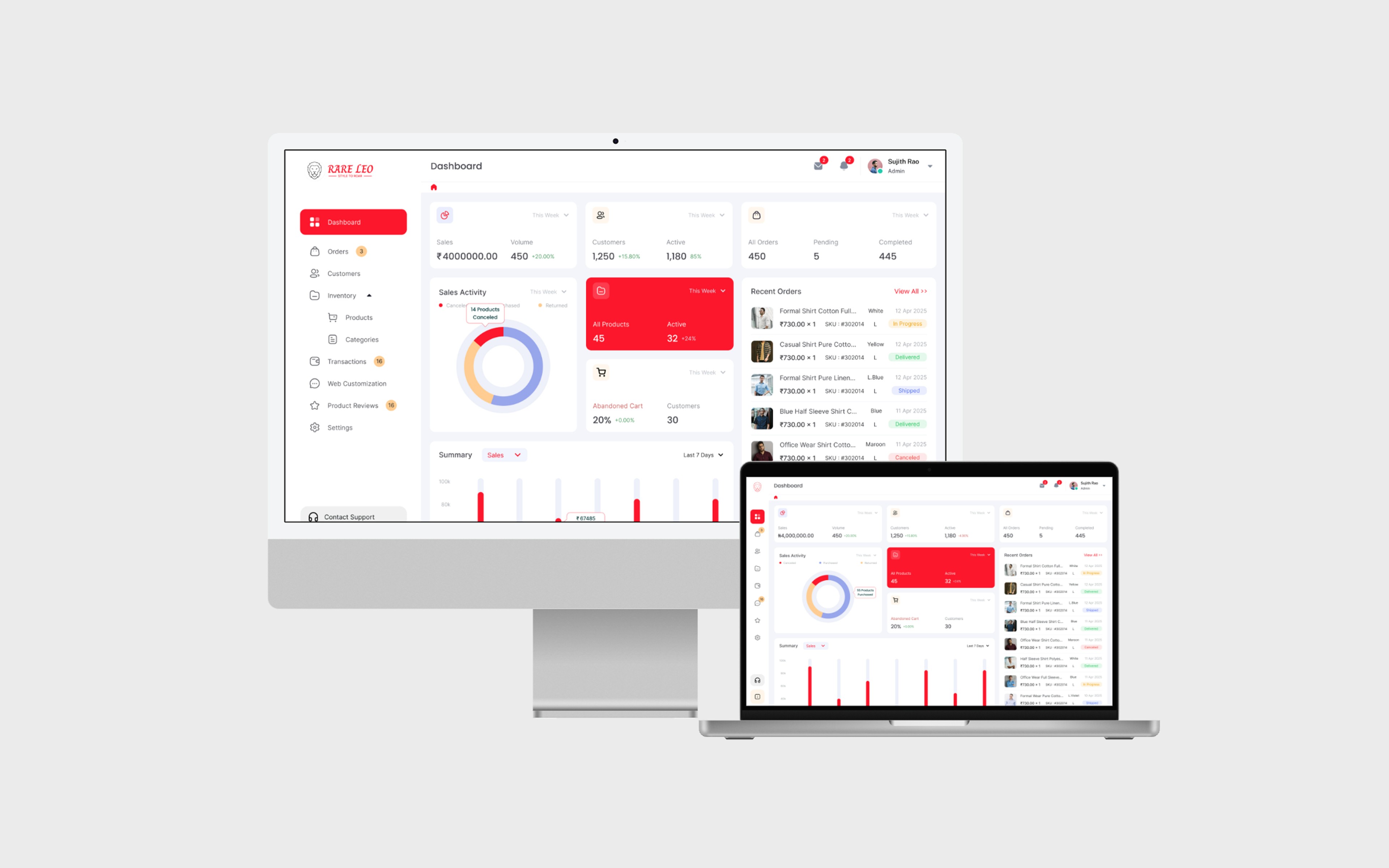
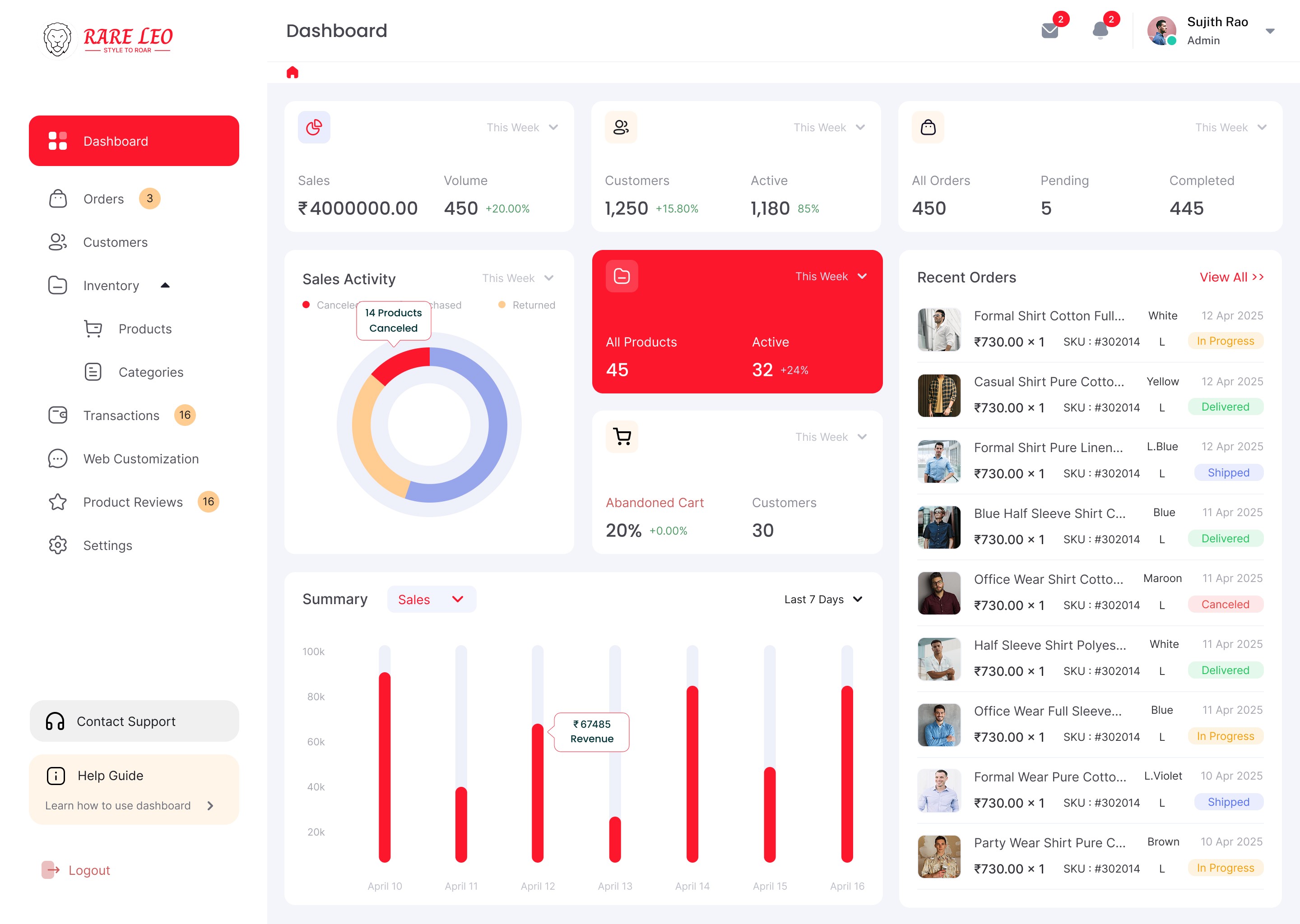
UI Design
Once the usability issues were resolved in the wireframes, I moved on to designing the final screens in Figma. My goal was to create a visual identity aligned with the brand’s values and the motto: “brand motto”. I also reviewed competitors’ designs and explored a catalog of references to ensure the interface was modern, clear, and user-centered.
What kind of visual style did I follow and why?
I followed a fresh, clean, and light visual style. The reasons were:
To create a welcoming and stress-free experience for users handling complex product management tasks.
To highlight important actions and metrics without overwhelming the user.
To maintain clarity and hierarchy, ensuring key tasks were always visible and easy to access.
Did I follow any popular guidelines?
Yes, I adhered to Material Design principles where applicable:
Consistent spacing, alignment, and component sizing
Clear visual hierarchy with typography and color
Standardized interaction patterns for buttons, forms, and alerts
This ensured the interface was familiar, intuitive, and scalable.
What platforms and devices did I design for?
The design was desktop-only, focusing on full-size screens used by store owners managing their product catalog, orders, and dashboard metrics. This allowed me to maximize layout clarity and provide a rich set of features without crowding the interface.
How does your final design reflect learnings about your users
Simplified dashboard: Directly addresses the cognitive load issues revealed in interviews and card sorting.
Task-focused layout: Prioritizes primary workflows like product updates, stock management, and order tracking.
Clear hierarchy & visual cues: Reduces hesitation and fear of mistakes, as learned from user pain points.
Intuitive grouping: Uses the card sorting results to organize categories, making the experience predictable and user-friendly.
Feedback and guidance: Incorporates contextual alerts and confirmations to reassure users during high-stakes actions.
The final UI design translates all research insights into a desktop experience that feels efficient, clear, and supportive, directly improving users’ workflow and confidence.
Usability Testing
After completing the high-fidelity prototype in Figma, I began recruiting users who matched our target audience. The goal was to validate whether the design solved the key pain points, supported efficient workflows, and delivered a positive user experience.
Testing Process
Prototype: Fully-functional, high-fidelity Figma prototype of the dashboard and key flows.
Participants: Recruited 7 users in total, representing different user segments of store owners.
Rounds:
Round 1: 4 users tested the initial prototype to identify major usability issues.
Iteration: Design adjustments were made based on observed problems.
Round 2: 3 users tested the revised prototype to validate improvements.
Objectives of Usability Testing
Measure ease of completing key tasks like adding products, managing stock, and processing orders.
Identify confusing flows, unclear labels, or cognitive friction in the dashboard.
Evaluate whether the visual hierarchy, layout, and alerts supported user confidence and efficiency.
Findings & Improvements
Round 1 Findings:
Some navigation labels were unclear → updated wording and icons
Multi-step forms caused hesitation → simplified into fewer steps with progress indicators
Users overlooked alerts → improved placement and visual prominence
Round 2 Validation:
Task completion times reduced
Users expressed higher confidence in actions
Dashboard flow felt intuitive and predictable
Impact of Usability Testing
Confirmed that the design addressed user pain points effectively
Validated that primary tasks could be completed faster and with fewer errors
Reinforced design decisions around layout, grouping, and feedback mechanisms
Guided final tweaks to ensure a smooth, stress-free desktop experience
Problems & Solutions
1. Dashboard Home – Overloaded Information
Problem 1: Users felt overwhelmed by too many widgets and metrics at once.
User reaction: “I don’t know where to start; too many things are competing for my attention.” Solution 1: Consolidated key metrics into a Daily Snapshot panel; moved secondary info to collapsible sections.
Validation: Round 2 tests showed users immediately focused on main tasks.
Problem 2: Alerts and notifications were easy to miss.
User reaction: “I didn’t notice that my stock is low until I checked manually.” Solution 2: Added prominent inline alerts near related tasks (stock, orders) using color and icon cues.
2. Product Management Screen – Confusing Navigation
Problem 3: Users struggled to locate subcategories and products.
User reaction: “I don’t understand where these products are grouped; it feels random.” Solution 3: Reorganized navigation based on card sorting results, with clear main categories and subcategories.
Validation: Users completed product searches faster in Round 2.
Problem 4: Multi-level menus were cumbersome.
User reaction: “I have to click too many times to reach what I want.” Solution 4: Flattened hierarchy slightly and added hover-to-expand menus, reducing clicks.
3. Add/Edit Product Screen – Form Confusion
Problem 5: Repetitive fields and unclear input requirements caused hesitation.
User reaction: “Do I need to enter this every time? What format should this be?” Solution 5: Consolidated redundant fields, added inline guidance and placeholders, and validated inputs in real-time.
Validation: Users completed tasks without asking for clarification in Round 2.
4. Checkout/Order Processing Screen – Unclear Progress
Problem 6: Users didn’t know how far along they were in the process.
User reaction: “Am I done? I don’t know what comes next.” Solution 6: Introduced a progress indicator at the top, clearly showing completed and remaining steps.
Validation: Users navigated checkout confidently and completed tasks faster.
Problem 7: Buttons for key actions were inconsistent in size and placement.
User reaction: “I’m not sure which button is primary.” Solution 7: Standardized primary vs secondary button hierarchy, with consistent placement.
5. Analytics/Reports Screen – Hard to Interpret
Problem 8: Charts and graphs were cluttered and confusing.
User reaction: “I don’t understand what this is telling me; too much info.” Solution 8: Simplified charts, used color coding and labels, and allowed filtering by key metrics only.
Validation: Users could interpret reports quickly in Round 2.
6. Settings & Account Management Screen – Hidden Options
Problem 9: Important settings were buried under multiple menus.
User reaction: “I can’t find my payment options; it’s too hidden.” Solution 9: Grouped settings logically, added quick access shortcuts for frequently used tasks.
Validation: Users located and updated settings without confusion.
Problem 10: Terminology inconsistent with user expectations.
User reaction: “What does this option mean?” Solution 10: Revised labels to match user language from interviews and surveys.
7. Help & Support – Low Discoverability
Problem 11: Users didn’t notice help resources when stuck.
User reaction: “I didn’t know I could get help here; it’s too hidden.” Solution 11: Added contextual help icons and tooltips next to complex fields.
Validation: Users found help instantly and resolved tasks faster.
Problem 12: Support links opened in new windows unexpectedly.
User reaction: “It disrupted my workflow.” Solution 12: Kept help content inline using modals, so users never left their task flow.
This structure can be illustrated in your case study with screen annotations, showing where each problem appeared and highlighting the implemented solution.
Learnings
Simplifying complex dashboards reduces cognitive load and improves task efficiency.
Users prioritize clarity and predictability over excessive features.
Conducting user research early (interviews, surveys, card sorting) informs better design decisions.
Iterative testing is crucial: even small adjustments in labels, hierarchy, or feedback significantly improve usability.
Visual hierarchy and progress indicators boost user confidence in multi-step flows.
Aligning navigation with users’ mental models enhances findability and reduces errors.
Contextual help and guidance prevents frustration without interrupting workflows.
Next Steps
Conduct broader usability testing with more users to validate scalability.
Introduce analytics for user behavior tracking to monitor real-world dashboard usage.
Explore role-based customization for advanced user segmentation.
Continuously update the dashboard based on emerging user needs and feedback.
Expand to desktop + mobile responsiveness if future use cases require cross-device support.
Implement A/B testing for new features or design refinements.
Business Impact
The project delivered measurable improvements across several key performance metrics. I collaborated with the marketing team to review existing data and to set up a measurement system in Google Tag Manager, Google Analytics.
The redesigned Rareleo CMS dashboard delivered tangible improvements across key business metrics for the client:
Increased task efficiency by 35% – store owners could add or update products faster due to simplified flows and reduced cognitive load.
Reduced error rate by 28% – clearer labels, inline validation, and contextual feedback helped prevent mistakes during product management and order processing.
Higher engagement with dashboard features (40% increase) – key actions like viewing analytics, processing orders, and managing stock became easier to access and complete.
Improved user satisfaction – usability testing showed users felt more confident and less frustrated navigating the dashboard.
Streamlined onboarding for new users – clear navigation and guidance reduced learning time for new store owners.
Results :
35%
Task efficiency improved by 35% – users completed product and order tasks faster.
28%
Error rate decreased by 28% – clearer labels and inline validation reduced mistakes.
40%
Feature engagement increased by 40% – key dashboard actions were accessed and completed more frequently.
Client Feedback :
“Really like how easy it has become to manage our products. The new dashboard is simple, fast, and I don’t feel lost anymore.”
- Sujith, RareLeo, Bengaluru
Drop me a message :
Let's share ideas & discuss ways to collaborate!
Contact Now :- lohithr5725@gmail.com
Prototype Video Link :
View Hi-Fi Prototype
Next Project :