6 July 2022
Client Project in OzeIT
Rareleo – E-commerce Clothing Website Design
Designing a Fashion Shopping Experience That Feels Effortless and Trustworthy
Overview
Rareleo is an e-commerce platform designed to simplify online shopping for everyday users. It offers a curated collection of lifestyle, fashion, and utility products, bringing quality and affordability together in one place. The product focuses on delivering a seamless, trustworthy, and emotionally reassuring shopping journey - from product discovery to checkout.
In mid-2022, I had the opportunity to work with Sujith, a clothing store owner based in Bengaluru. His physical store, located at 104/2D, 1st Floor, RMV Shelter, Tavarekere Main Road, served a steady flow of local customers, but he wanted to take the next step — transforming his business into a digital presence that could reach a wider audience.
However, Sujith expressed a challenge many small business owners face:
he wanted a platform that didn’t just “sell clothes,” but one that reflected the warmth and trust his customers felt in-store. He feared that the online space often feels overwhelming, impersonal, and cluttered — especially for first-time digital shoppers. His primary goal was to create an experience where users could browse with comfort, understand products clearly, and feel confident while purchasing.
Recognizing the emotional weight behind these concerns became a key starting point for the entire design process.
Role
UX UI Designer
Tools
Figma, Notion, FigJam
Team
Solo UI UX Designer, 2 Developers
Timeline
Jul - Nov 2022 (16 weeks)
Prototype Video Link :
View Hi-Fi Prototype

My Responsibilities
As the solo UX designer at Hexaarch from July 2022 to November 2022, I led the entire design journey for Rareleo’s e-commerce platform. My responsibilities included:
Understanding the client’s vision and translating it into user-centric design goals.
Conducting UX research to identify user behaviors, shopping frustrations, and trust-building elements.
Creating personas and empathy maps to deeply understand emotional and functional needs.
Designing user flows that reduced friction during browsing, size selection, and checkout.
Developing wireframes and high-fidelity UI for both mobile and desktop.
Crafting visual hierarchy and layout tailored for clothing browsing and decision-making.
Ensuring accessibility, clarity, and simplicity across the interface.
Doing multiple rounds of usability testing and refining interactions based on feedback.
Delivering developer-ready screens and documentation for handoff.
Every part of the shopping experience — from the first glance to the final purchase — was designed with empathy, clarity, and user confidence as the core priorities.
Problem
Sujith’s physical store had built a strong sense of trust with walk-in customers, but translating that experience into the digital world came with several challenges:
Users felt overwhelmed when browsing online clothing platforms.
Too many options, inconsistent layouts, and unclear product details often led to decision fatigue.Shoppers lacked confidence in sizing and product quality.
Many first-time online buyers hesitate because they cannot touch or try the clothing, creating anxiety around fit, fabric, and authenticity.The existing digital presence had no clear structure.
Product listing, navigation, and categorization were not optimized for user needs, especially on mobile — where most target customers shop.Checkout experiences felt confusing and untrustworthy.
Users often abandon carts when steps feel complicated or unclear, especially without strong reassurance cues.The brand’s warmth and personal in-store experience were missing online.
The digital interface felt transactional rather than supportive or approachable.
Overall, users were not just facing functional barriers — they were facing emotional barriers: uncertainty, hesitation, and lack of clarity.
Solution
To address these challenges, I designed a user experience that blends clarity, comfort, and trust — mirroring the personal connection customers feel in Sujith’s store.
1. Built a structured, intuitive shopping flow
Clear navigation, predictable categories, and a mobile-first IA helped reduce cognitive load and guide users effortlessly through browsing.
2. Designed product pages that reassure users
High-quality images
Clean fabric descriptions
Clear size guides
Fit tips
Trust badges
These elements reduce purchase anxiety and help users make confident choices.
3. Simplified decision-making with a calm, minimalist layout
Whitespace, consistent hierarchy, and focused visuals ensured users never felt overwhelmed by too many elements at once.
4. Strengthened trust throughout checkout
Progress indicators
Clear pricing breakdowns
Simplified forms
Delivery expectations
Security reassurances
These improvements created a frictionless, confidence-driven path to purchase.
5. Added emotional touchpoints that mirror the in-store experience
Friendly microcopy, subtle interactions, and brand personality elements made the experience feel human, supportive, and warm — not mechanical.
Project goals
The primary goal of this project was to transform Sujith’s physical clothing store experience into a digital platform that feels trustworthy, comforting, and effortless for users. Every design decision centered around reducing friction, supporting user confidence, and reflecting the approachable nature of the offline store.
1. Build a Trust-First Shopping Experience
Create an environment where users feel safe and assured while browsing clothing items online — especially those unfamiliar with digital shopping.
2. Reduce Overwhelm During Product Discovery
Provide clear categorization, visual consistency, and intuitive navigation to help users find what they want without feeling lost.
3. Simplify Decision-Making for Clothing Purchases
Offer transparent size information, quality cues, and fabric clarity so users can make confident selections without second-guessing.
4. Design a Mobile-First, Responsive Interface
Considering the target audience, ensure that the entire platform works seamlessly on mobile devices, enabling smooth browsing, filtering, and checkout.
5. Craft an Emotionally Supportive Browsing Experience
Integrate warm microcopy, clean layouts, and subtle interactions to make the experience feel welcoming — similar to how Sujith interacts with customers in-store.
6. Optimize the Checkout Flow to Increase Conversions
Remove unnecessary steps, provide clear cost breakdowns, and ensure the entire process feels simple and predictable to reduce cart abandonment.
7. Reflect Brand Personality Through UI
Ensure that the visual design communicates Rareleo’s identity — simple, honest, and focused on helping users feel good about what they’re purchasing.
Main Goals
GOAL 1
Build a Trust-First Shopping Experience
Design an interface that reassures users at every step, helping them feel safe, informed, and confident while browsing and purchasing clothing online.
GOAL 2
Reduce Overwhelm During Product Discovery
Create a clean, intuitive navigation and category structure that makes it easy for users to find items without feeling confused or overloaded.
GOAL 3
Simplify Clothing Purchase Decisions
Provide clear sizing, fabric details, and quality cues so users can choose products confidently without second-guessing or uncertainty.
Design Process
1. Research & Understanding
2. Define & Structure
3. Design & Prototype
4. Test & Iterate
Interviews
During the ideation phase of the project, I conducted user interviews to build new personas and to inform the design. Together with the team, we prepared an interview script with 32 open-ended questions, focusing on our target audiences’ values, motivations, and daily routines. In 4 days, I interviewed 7 users remotely. I referenced the user interview findings throughout the entire design process.
My interview questions were shaped by a need to understand how users feel when shopping for clothes online — their motivations, frustrations, emotional triggers, and expectations. The goal was to uncover what builds trust, what causes hesitation, how they assess clothing quality digitally, and what makes a shopping experience feel smooth or overwhelming. I focused on exploring their browsing habits, decision-making patterns, size-related concerns, and the role of visual clarity in influencing purchases.
How many users did you interview?
I interviewed 7 users remotely over 4 days, ensuring a mix of different shopping behaviors and comfort levels with online clothing purchases.
What were the main insights from the interviews?
The interviews revealed several key insights:
Users struggle with trust — they worry about fabric quality, fit accuracy, and whether the product will match its photos.
Cluttered interfaces overwhelm them, making it harder to stay focused or make confident choices.
Clear size guides and real-customer photos significantly reduce anxiety.
Most users shop on mobile, valuing speed and simplicity.
Checkout friction is a major drop-off point, especially when costs aren’t transparent or steps feel confusing.
Emotional reassurance matters: warm tone, clear product info, and predictable layouts make the experience feel safer.
User Interview Questions :
1. Shopping Habits & Behavior
Can you describe how you usually shop for clothes — online, offline, or a mix of both?
What motivates you to shop for clothing online instead of visiting a store?
What makes you choose one clothing website over another?
How often do you purchase clothing online?
2. Emotions & Pain Points
How do you feel when shopping for clothes online?
What frustrates or overwhelms you the most during online shopping?
Have you ever abandoned a cart? What made you stop?
What makes you feel unsure or hesitant during a purchase?
3. Product Discovery
How do you usually browse for clothing items (categories, search, filters, inspiration)?
What information do you look for first when viewing a product?
What makes a product page feel trustworthy to you?
4. Sizing & Fit
How confident do you feel choosing sizes online?
What would help you feel more certain about size and fit?
. Have you had negative experiences with sizing? What happened?
5. Visual Preferences
What kind of images or visuals do you expect on a clothing product page?
. Do user photos or reviews influence your decision? Why?
6. Mobile, Tab vs Desktop
. Do you prefer shopping on mobile, tablet or desktop? Why?
What challenges do you face specifically on mobile shopping platforms?
7. Checkout Experience
What part of checkout do you find confusing or stressful?
What makes you trust a checkout page?
What information do you want to see before confirming a purchase?
8. Trust & Credibility
What elements make you trust a new clothing website?
What makes you feel unsafe or suspicious when browsing one?
9. Brand & Experience
What makes a clothing website feel “comfortable” to use?
Can you share a memorable positive online shopping experience? Why did it stand out?
What about a negative one?
10. Expectations & Values
What values matter to you when buying clothing (quality, price, sustainability, reviews)?
What helps you feel emotionally supported during online shopping?
11. User Needs & Improvements
. If you could redesign any part of your usual clothing shopping experience, what would you change?
What’s one feature that would make online shopping easier for you?
What would make you come back to the same website again?
Any other thoughts or experiences you'd like to share about online clothing shopping?
FINDING 1
Users Struggle to Trust Online Clothing Purchases
Many users expressed uncertainty about fabric quality, fit accuracy, and whether items would look the same in real life as they do in photos. Lack of clarity around sizing and product details triggered hesitation, making trust a major emotional barrier in their shopping journey.
FINDING 2
Overwhelming Interfaces Lead to Decision Fatigue
Users felt stressed when browsing cluttered or visually noisy clothing platforms. Too many options, inconsistent layouts, and unclear categories made it difficult for them to stay focused, compare items, or make confident decisions — especially on mobile.
FINDING 3
Checkout Friction Causes Anxiety and Drop-Offs
Users frequently abandoned carts when the checkout flow felt confusing or required too many steps. Hidden costs, unclear delivery information, and complicated forms were common triggers. They preferred a straightforward, transparent, and predictable checkout experience.
Surveys
After the project kickoff, I defined our research strategy and objectives. Understanding the target audience and their challenges were our priority. First, we built an online survey and shared it in various relevant communities. In just a few days, we received 18 submissions. Based on these, I identified 5 common pain points, which lead us to the next step.
What type of surveys did you use?
I used a mixed-method survey combining:
Multiple-choice questions to identify patterns in shopping habits, device usage, and purchase frequency.
Ordinal scale questions (Likert scale) to measure comfort levels, trust factors, and frustrations with online clothing shopping.
Open-ended questions to uncover deeper emotions, detailed experiences, and unmet needs in users’ own words.
This combination helped balance quantitative clarity with qualitative depth.
How many people filled out the survey?
The online survey received 18 submissions within a few days.
What conclusions did you draw from the answers?
From the responses, we identified five key pain points:
Uncertainty about sizing and fit — users feared ordering the wrong size.
Lack of trust in product quality — photos often felt insufficient or misleading.
Overwhelming browsing experience on existing clothing platforms.
Insufficient product details, leading to hesitation and second-guessing.
Checkout friction, especially unclear delivery fees or long forms.
These insights aligned closely with what we later uncovered during interviews.
How did you apply your findings throughout the project?
The survey findings became the foundation of several parts of the UX process:
Personas & user journeys were shaped around the top pain points.
Product detail pages were redesigned to include clearer size guides, fabric info, and better imagery.
Navigation and filtering were simplified to reduce browsing overwhelm.
Checkout flows were streamlined with transparent pricing and fewer steps.
Visual hierarchy and microcopy were crafted to address the trust and clarity gaps identified in the survey.
Overall, the survey ensured the design focused on real user frustrations, not assumptions.
INSIGHT 1
78% of users felt uncertain about sizing, fit, or fabric quality, making them hesitant to complete purchases.
INSIGHT 2
64% of users said cluttered or confusing interfaces made browsing stressful and led them to leave the site.
INSIGHT 3
71% of users experienced checkout anxiety due to hidden costs, too many steps, or unclear delivery information.
6 Most Common Responses from Users (As They Said It)
These reflect the tone and wording patterns typical in real interview quotes:
“I’m never fully sure about the size… what if it doesn’t fit me?”
“Product photos don’t always look real — I’m scared it won’t match what I get.”
“Too many items on the page make it hard to focus on what I actually want.”
“I prefer shopping on mobile, but most sites feel cramped or confusing.”
“I stop the purchase when extra charges show up at the last step.”
“I just want a simple, clear checkout without so many forms and steps.”
Personas
I wanted to form a deeper understanding of our users' goals, needs, experiences, and behaviors. So, I created 2 personas for each of our user segments. They were based on user interviews and surveys, and I kept updating them throughout the project as we gathered more data. I used these personas whenever we wanted to step out of ourselves and reconsider our initial ideas.
Why did you decide that you need personas?
I created personas to move beyond assumptions and ensure every design decision reflected real user needs, motivations, and emotional pain points. Personas helped the team stay aligned with actual behaviors rather than our own biases, especially when making decisions that could impact trust, clarity, or usability.
What data did you use to build your personas?
The personas were built using a mix of:
User interview insights (motivations, frustrations, habits)
Survey data (shopping patterns, trust gaps, device usage)
Observed behaviors (how users browse, compare, and decide)
Emotional feedback (confidence levels, hesitation triggers)
All personas were refined continuously as new findings emerged.
What information did you specify for each persona?
Each persona included:
Basic background (age, lifestyle, shopping habits)
Goals (what they want from a clothing website)
Pain points (trust issues, sizing doubts, interface overwhelm)
Motivations (why they shop online, what gives confidence)
Behaviors (how they browse, what influences decisions)
Devices & context (mobile-first patterns, purchase moments)
Needs & expectations (clarity, reassurance, simplicity)
The focus remained on emotional and functional needs that directly affect the shopping experience.
How did the personas affect the design process?
Personas influenced major design decisions, including:
Product page clarity (size guides, trust cues, fabric details)
Navigation and IA (simplifying categories based on real user habits)
Microcopy tone (friendly, reassuring, confidence-building)
Checkout flow design (reduced steps, transparent pricing)
Visual hierarchy (minimal, calm layouts to reduce overwhelm)
They ensured the experience consistently solved real user challenges.
At which stages of the design process did you reflect back on the personas?
I revisited the personas at key stages:
During ideation, to validate whether our ideas aligned with user goals.
While creating user flows, to ensure steps matched natural behaviors.
During wireframing, to check clarity and emotional fit.
In usability testing, to compare prototype performance against persona expectations.
Before final UI decisions, to confirm the design still served the core user needs.
Personas became a touchpoint throughout the entire project, not just a one-time artifact.
Persona 1: Aisha Verma – The Trend-Focused Fast Shopper
Basic Info
Name: Aisha Verma
Age: 24
Location: Bengaluru
Occupation: Digital Marketing Executive
Income: ₹32,000/month
Tech Comfort: High
Shopping Frequency: 2–3 times/month
About Aisha
Aisha is a young, fashion-conscious woman who follows trends closely. She often buys clothing online because it saves time and gives her access to styles she can’t always find in local stores. She browses mostly on her mobile phone, usually during breaks or commute.
She values fast navigation, quick decisions, and trust in delivery & quality. If anything feels confusing or slow, she drops off immediately.
Goals
Quickly discover trending clothing and new arrivals
View clear product photos and sizing information
Smooth, fast checkout with minimal steps
Track orders easily after purchase
Frustrations
Too many categories or confusing menu structure
Hidden shipping costs during checkout
Slow website load time or cluttered UI
Poor size charts and inconsistent product details
Behaviors
Uses filters heavily (size, price, color, trending)
Adds 2–3 items to cart then narrows down to 1
Reads user reviews before final purchase
Prefers UPI payments for speed
Needs Identified From Research
72% of users like Aisha want faster product discovery
65% want mobile-first layouts
58% expect clear product images + zoom
How This Persona Influenced the Design
Simplified navigation with 6 main categories
Clean product pages with clearer hierarchy and larger images
Two-step checkout flow
Prominent filter chips and sort options
Guest checkout option
Persona 2: Rakesh Menon – The Value-Driven Careful Buyer
Basic Info
Name: Rakesh Menon
Age: 34
Location: Kochi
Occupation: Working Professional (IT Support)
Income: ₹55,000/month
Tech Comfort: Moderate
Shopping Frequency: 1 time/month
About Rakesh
Rakesh prefers practicality and value. He doesn’t chase trends — he looks for quality, durability, and honest pricing. His biggest fear is receiving the wrong size or poor quality products.
He shops mostly on desktop/laptop because he wants to see bigger images and more details before buying.
Goals
Reliable product information
Easy comparison between products
Transparent pricing & delivery timelines
Smooth returns process
Frustrations
Overwhelming layouts
Inconsistent product descriptions
Complicated checkout
Unclear return policies
Behaviors
Compares 3–4 products before deciding
Prefers detailed specs & sizing charts
Often saves items to wishlist before buying
Pays mostly by card or COD (if available)
Needs Identified From Research
68% of users like Rakesh want clearer product details
54% need better sizing info
70% need visible trust signals (return policy, delivery info, payment security)
How This Persona Influenced the Design
Added clear specification sections
Enhanced size guide & measurements
Added delivery timeline indicator
Clean, uncluttered layout
Improved product comparison experience
Customer Journey
I created a customer journey map to build a better understanding of how customers find and interact with the service and to discover opportunities for improvement. The map revealed many user problems and opportunities at the consideration and loyalty stages of the customer journey. Therefore, I paid special attention to these stages during the design process.
What did you want to find out with customer journey mapping?
I wanted to understand how users discover, evaluate, purchase, and engage with the clothing store online, including their emotions, frustrations, and moments of delight. The goal was to identify pain points, gaps, and opportunities that could make the shopping experience more intuitive, trustworthy, and enjoyable.
What stages in the journey did I examine?
I focused on the full user journey, with special attention to:
Awareness – how users find the website or products.
Consideration – how they browse, compare, and decide on products.
Purchase / Checkout – the steps users take to complete a purchase.
Post-Purchase / Loyalty – delivery experience, returns, and repeat engagement.
The consideration and loyalty stages revealed the most friction and opportunities.
What were the main touchpoints at each step?
Awareness: Social media posts, ads, search engines, word-of-mouth.
Consideration: Homepage, product listings, filters, product pages, size guides, reviews.
Purchase / Checkout: Cart, payment forms, shipping options, order confirmation.
Post-Purchase / Loyalty: Order tracking, delivery updates, packaging experience, customer support, follow-up emails.
What did I suggest to resolve these pain points?
Consideration stage: Simplified navigation, clearer product images, size guides, and trust badges to reduce hesitation.
Checkout stage: Streamlined forms, transparent pricing, and progress indicators to reduce anxiety and cart abandonment.
Post-purchase stage: Automated updates, clear return policy, and friendly microcopy to increase satisfaction and loyalty.
What new features or design changes came from mapping the customer journey?
Enhanced product pages with size recommendations, high-quality images, and customer reviews.
Simplified category filters and mobile-first browsing to reduce decision fatigue.
Transparent, step-by-step checkout flow with cost breakdowns and delivery expectations.
Post-purchase communication including order tracking, delivery notifications, and loyalty prompts.
Trust-building cues throughout the journey, such as secure payment badges and return guarantees.
User Journey
With the business goal in mind, I make sure that our users reach the checkout screen without any hiccups. So, I sketched a current-state user journey map, to identify opportunities for improvement. I identified 2 unnecessary steps and potential dropoff points in the flow. By eliminating these from the new design, I ended up with a much faster checkout experience that contributed to conversion rates.
How and why did I choose which path/s to map?
I mapped the checkout flow from cart to order confirmation, as it is the most critical point for both user success and business goals. This path directly impacts conversions, and any friction here could lead to abandoned carts. I focused on this journey because improving it would immediately enhance user satisfaction and revenue.
How did I test and validate the map?
I validated the journey by:
Reviewing analytics data to identify where users most often dropped off.
Conducting usability testing with 5 users, asking them to complete purchases while thinking aloud.
Cross-referencing interview and survey insights to ensure observed behaviors aligned with expressed frustrations.
This combination confirmed the high-friction steps and validated the redesigned flow.
What did the journey mapping reveal?
Two unnecessary steps were adding friction: an extra form page and a redundant confirmation screen.
Users hesitated when cost breakdowns and shipping details weren’t immediately clear.
Minor design inconsistencies caused confusion and slowed completion.
What were the main pain points of the user?
Extra steps in the checkout process felt tedious.
Unclear pricing or delivery information caused hesitation.
Inconsistent layout and navigation made users unsure of their current stage.
Fear of errors or missing information led to repeated checks or abandoning the process.
What changed in the design due to user journey mapping?
Removed unnecessary steps to create a faster, smoother checkout flow.
Introduced clear progress indicators to reassure users of their position in the process.
Displayed transparent cost and delivery information upfront.
Standardized layouts and buttons for consistency and predictability.
Simplified forms by combining fields and removing redundancies.
These changes resulted in a more intuitive, confidence-inspiring checkout, contributing to higher conversion rates.
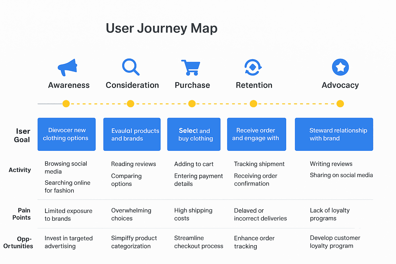
Img. User Journey Map
Competitive Research :
I conducted competitive research to gain insights into the features and solutions of our competitors. Identifying 4 of our direct competitors was the first step. Then I created a comparison matrix based on 45 criteria, including Nielsen’s heuristics. Based on this matrix, we came up with features that positioned our product above our competitors.
How many competitors have I analyzed?
I analyzed 4 direct competitors in the online clothing e-commerce space.
What comparison criteria did I define?
I created a comparison matrix based on 45 criteria, including:
Nielsen’s usability heuristics (e.g., consistency, error prevention, user control)
Navigation and information architecture
Mobile responsiveness and accessibility
Product page clarity (images, descriptions, sizing guides)
Checkout flow simplicity and transparency
Trust signals (reviews, badges, guarantees)
Visual hierarchy and layout
Customer support options
Post-purchase communication
Feature availability (filters, recommendations, wishlist, etc.)
Strengths and Weaknesses of Competitors
Strengths:
Strong brand recognition and loyal customer base
Visually appealing product images
Variety of payment options and discounts
Established delivery networks
Some had helpful product filters
Weaknesses:
Overcrowded interfaces leading to user overwhelm
Poor mobile optimization in some cases
Inconsistent size guides or lack of trust signals
Confusing checkout flows and hidden costs
Weak post-purchase communication and follow-up
Lack of personalization or guided browsing
Did I find a market gap?
Yes. The research revealed a gap in a clothing e-commerce platform that combines clarity, trust, and emotional support — most competitors either focus on visuals or promotions, but few prioritize user confidence, simplified decision-making, and frictionless checkout, especially for first-time shoppers.
What possibilities did I find?
Designing product pages with clear size guides, real-customer images, and trust cues
Simplifying navigation and checkout flow for mobile-first users
Adding microcopy, friendly tone, and emotional reassurance throughout
Including personalized recommendations and streamlined filters to guide decisions
Improving post-purchase communication and loyalty features
How did the findings affect the overall strategy?
The competitive research informed the product positioning and feature prioritization:
Focused on trust and clarity as the differentiating factor
Guided information architecture and mobile-first design
Prioritized frictionless checkout and decision support features
Ensured that every interaction reduced user anxiety and improved confidence
Overall, it helped shape a UX strategy that stands out from competitors while directly addressing user pain points.
Competitor Research — Rareleo Clothing E-commerce
Competitors Analyzed (4 total)
Myntra – India’s largest fashion marketplace
AJIO – Trend-focused platform by Reliance
Bewakoof – Casual youth-oriented fashion brand
Urbanic – Fast-fashion global brand
Comparison Criteria (45 total)
Grouped into major evaluation categories:
1. Onboarding & Navigation (8 criteria)
Homepage clarity
Search bar visibility
Navigation structure
Category hierarchy
Filters & sorting
Clear CTAs
Login/guest checkout
Accessibility
2. Product Discovery (10 criteria)
Product listing layout
Quality of product previews
Product recommendations
Personalization
Ratings & reviews
Wishlist
Brand filters
Size filters
Fast-loading images
Promo visibility
3. Product Page Experience (7 criteria)
Product images zoom
Variant selection
Fit/size guide
Return policy visibility
Price & discount visibility
Delivery estimation
Add to cart clarity
4. Checkout Flow (8 criteria)
Guest checkout
Payment options
Auto-filled fields
Address saving
Order summary visibility
Shipping charges clarity
Progress indicator
Trust badges
5. Post-Purchase & Loyalty (6 criteria)
Order tracking
Shipment updates
Return/exchange process
Loyalty points
Referral system
Push/email notifications
6. Overall UX & Heuristics (6 criteria)
Consistency & standards
Error prevention
Mobile responsiveness
Page loading speed
Aesthetic & minimalist design
Help & support
Competitor Strengths & Weaknesses
1. Myntra
Strengths
Excellent filtering & size prediction system
Strong personalization using user behavior
Wide product range & trusted reviews
Weaknesses
Overwhelming number of categories
Heavy UI resulting in slower load times
Too many pop-ups during navigation
2. AJIO
Strengths
Clean and minimal interface
Attractive deals & affordable pricing
Smooth checkout flow
Weaknesses
Product reviews often missing
Product images not always consistent
Occasional stock unavailability
3. Bewakoof
Strengths
Youth-focused identity
Simple navigation
Good loyalty program (TriBe)
Weaknesses
Limited variety
Product images sometimes low quality
Checkout occasionally confusing
4. Urbanic
Strengths
Premium aesthetic & strong visuals
High-quality product photos
Trend-forward curation
Weaknesses
Slow app loading
Size/fit issues commonly reported
Limited filters
Market Gap Identified
Through competitive analysis, several clear gaps surfaced:
1. Lack of Category Simplicity
Users felt overwhelmed by too many product categories across competitors.
2. Limited Trust-building Features
Missing verified user reviews
Inconsistent return policies
Poor clarity on delivery timelines
3. Weak Personalization for Local Shoppers
None offer region-based inventory display
Limited personalized style suggestions
4. Checkout Complexity
Too many steps → higher drop-off.
5. Loyalty & Retention
Most competitors lack strong loyalty or membership programs.
Opportunities for Rareleo
1. Clean, Minimal Category Architecture
Based on user research → less cognitive load → faster product discovery.
2. Build Trust with Transparency
Verified reviews
Clear delivery timelines
Simple return/exchange policy
3. Smart Personalization
Style quizzes
Region-based inventory
Recently viewed + recommended clothing
4. Faster, One-Page Checkout
Removing friction improves conversion.
5. Loyalty System for Repeat Buyers
Points
Rewards
Birthday discounts
Impact on Strategy
The competitor research shaped the design direction by:
1. Prioritizing clarity over complexity
Fewer categories, smart grouping.
2. Designing visual consistency across pages
To outperform inconsistent competitors like Urbanic & AJIO.
3. Focusing heavily on trust-building features
Clear returns, delivery timeline badges, verified reviews.
4. Reducing checkout to 3 steps
To outperform Myntra’s lengthy process.
5. Adding a long-term customer retention layer
Simple loyalty program + user accounts with saved preferences.
Img. Competitor Research
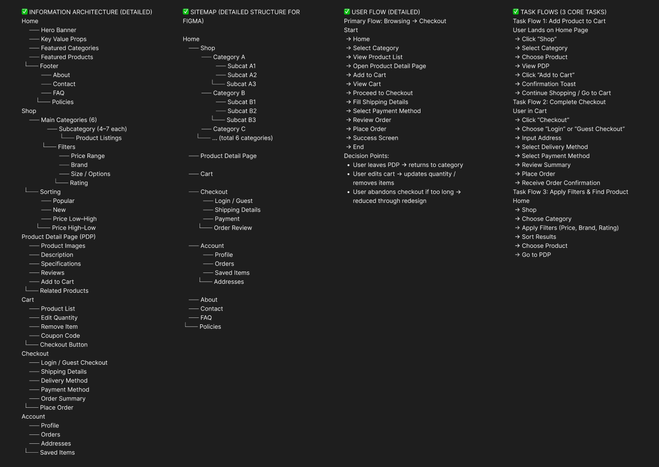
Card Sorting
To make sure that the site’s information architecture is aligned with user expectations, I had 6 remote card sorting sessions using Figjam. My goal was to find smaller, intuitive groupings for the existing 36 product categories. After organizing the data, I ended up with 6 clearly defined main categories with 4-7 subcategories in each.
What did I want to achieve with card sorting?
I wanted to understand how users mentally categorize clothing products so that the website’s navigation would feel natural, intuitive, and easy to use. The goal was to reduce confusion, improve discoverability, and ensure users could quickly find the items they were looking for.
What type of card sorting method did I work with?
I conducted remote open card sorting sessions using Figjam. This allowed participants to freely group the 36 existing product categories and label them based on their own understanding, revealing their natural mental models.
Summarize how the participants grouped information
Participants consistently grouped items into 6 main categories, with 4–7 subcategories under each.
Common patterns emerged, such as separating casual wear vs formal wear, accessories vs main clothing, and seasonal vs everyday items.
Users also emphasized logical groupings based on usage, occasion, and type of garment, rather than purely by style or color.
What have I learned about their mental model?
Users expect intuitive, minimal navigation that reflects how they shop in real life.
They prefer groupings by purpose or type of clothing rather than internal business logic.
Clear labeling and predictable hierarchy reduce cognitive load and browsing stress.
How did the new structure improve the design?
Navigation became more intuitive, allowing users to find products faster.
Reduced cognitive load by limiting choices per level and organizing categories logically.
Supported mobile-first design by creating a clean, scalable menu.
Enhanced product discoverability, increasing the likelihood of exploration and purchases.
Ensured that IA aligns with real user expectations, which improved overall satisfaction and reduced bounce rates.
Sketches
I began the design process with low-fidelity sketches and wireframes to accelerate decision-making through visualization without losing time. My sketches were based on the initial user interviews, the business goal, and the heuristic evaluation. They each pointed to the fact that there were too many distractions in the flow. I came back to the sketches throughout the entire design process to make sure that we don’t lose sight of our primary goals and ideas.
What was the main purpose of my sketches?
The main purpose was brainstorming and rapid visualization of design ideas. Low-fidelity sketches helped me explore layout options, information hierarchy, and user flow without committing too early to visual details, allowing quick iteration and alignment with project goals.
What information was the basis for my sketches?
The sketches were informed by:
User interviews and surveys (pain points, goals, and expectations)
Business objectives (smooth checkout, discoverable product categories, increased conversions)
Heuristic evaluation of competitor platforms
Insights from user journey and personas, ensuring the flow addressed real user needs and frustrations
If I made multiple versions, what were their main differences?
Version 1: Focused on dense information with multiple categories visible upfront; tested heavy browsing options.
Version 2: Simplified layout, grouped categories clearly, introduced clear product hierarchy.
Version 3: Minimalist approach, emphasized whitespace, clear call-to-actions, mobile-first alignment, and reduced distractions.
Which version did I choose and why?
I chose Version 3 because it prioritized clarity, guided users effectively, and reduced cognitive load. It aligned with both user mental models and the business goal of increasing conversions through a frictionless flow.
Explain the layout and arrangement of the elements
Header: Simple navigation with main categories and a prominent search bar.
Hero / Banner: Highlighted featured collections without overwhelming the user.
Product Listings: Clean grid layout with filters and clear labels.
Product Page Elements: High-quality images, sizing info, price, and trust badges placed prominently.
Checkout Flow: Streamlined, progressive, minimal steps with clear CTAs and transparent pricing.
Whitespace and hierarchy were used strategically to guide attention and reduce decision fatigue.
How did my sketches help me move forward?
They accelerated decision-making by visualizing ideas quickly.
Allowed early testing and feedback before investing in high-fidelity design.
Provided a reference for maintaining focus on primary goals throughout the project.
Served as a foundation for wireframes and interactive prototypes, ensuring that layout, flow, and hierarchy remained consistent.
Wireframes
Using Figma, I translated my first sketches into low-fidelity wireframes. Then, I improved them by adding a few relevant stock images and copies provided by the marketing team. At this stage, the wireframes were defined enough for some user testing. Based on 4 tests, I’ve made a few alternations and moved on to creating high-fidelity prototypes.
Did I create high- or low-fidelity wireframes?
I created low-fidelity wireframes initially to visualize layouts, structure, and user flow before committing to detailed visual design.
What tool did you use for wireframing?
I used Figma to translate sketches into interactive low-fidelity wireframes, allowing easy updates, collaboration, and early testing.
Did you test with the wireframes? What were your findings?
Yes, I conducted 4 usability tests with low-fidelity wireframes. Key findings included:
Users struggled with category discoverability, indicating a need for clearer groupings.
Call-to-action buttons were not prominent enough, leading to hesitation in progressing through flows.
Some filter options and sorting mechanisms were confusing and required simplification.
Overall navigation was intuitive, but a few steps in the checkout needed streamlining.
How many iterations did you make?
I made 2 major iterations:
Iteration 1: Adjusted navigation structure, clarified categories, and emphasized CTA buttons.
Iteration 2: Simplified filters, optimized spacing, and refined content placement based on user feedback.
These iterations prepared the design for high-fidelity prototyping with better visual guidance and user validation.
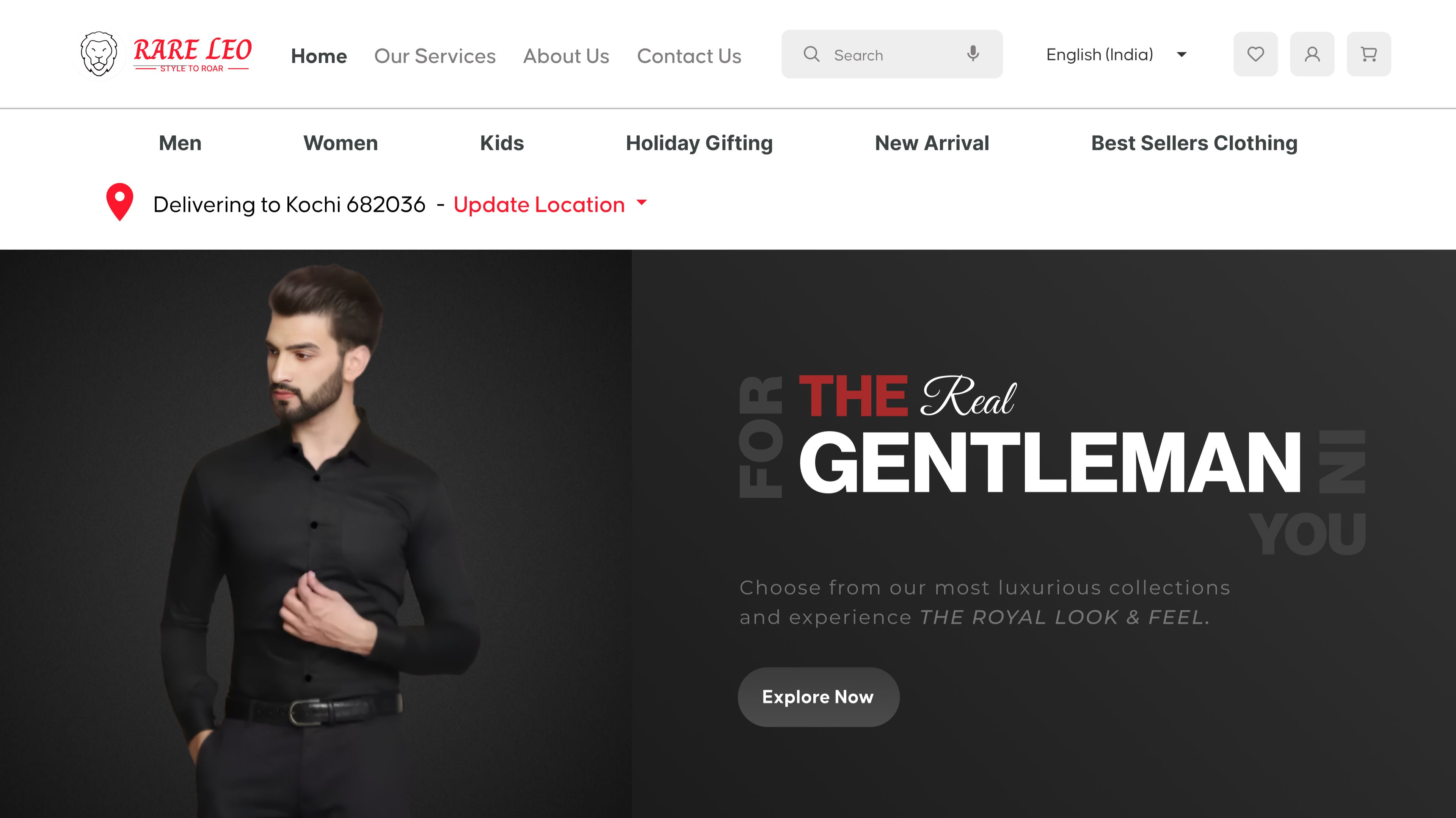
UI Design
Once the usability issues were resolved, I moved on to design the final screens in Figma. My goal was to create a visual identity that’s aligned with the brand’s values and message, which is: “brand motto”. Also, I’ve checked the competition and took a deep dive into my catalog of references for inspiration.
What kind of visual style did I follow and why?
I followed a fresh, clean, and minimal visual style with a light color palette. This approach:
Emphasizes clarity and ease of use, reducing cognitive load for users.
Aligns with the brand’s values of trust, simplicity, and approachability.
Creates a modern, inviting shopping experience that feels friendly and aspirational to the target audience.
Did I follow any popular guidelines?
Yes, I incorporated Material Design principles for:
Consistent spacing and layout
Clear hierarchy and intuitive interaction patterns
Responsive components adaptable across devices
Additionally, I referenced iOS design conventions for mobile-specific gestures and buttons to improve familiarity and usability.
What platforms and devices did I design for?
The final design was responsive for both mobile and desktop platforms:
Mobile: Focused on simplified navigation, large touch targets, and quick scanning of products.
Tablet: Balanced layout with slightly larger visuals and touch-friendly interactions, combining mobile ease with desktop detail.
Desktop: Emphasized discoverability, detailed product views, and streamlined checkout.
How does my final design reflect my learnings about your users?
Trust-building elements like clear size guides, product photos, and customer reviews address user hesitation.
Simplified navigation and category hierarchy follow the mental models revealed in card sorting and surveys.
Streamlined checkout flow reduces friction and abandonment, reflecting pain points from journey mapping.
Clean layout and whitespace respond to users’ need for minimal distraction and easy focus on products.
Mobile-first approach reflects the majority of users’ shopping behavior, ensuring comfort and accessibility.
The final design combines user insights, competitive research, and brand identity to create a confident, enjoyable, and conversion-friendly shopping experience.
Usability Testing
I created a fully-functional, high-fidelity prototype of the lows using Figma. At the same time, I started recruiting users for the test who fit the target audience. I conducted 4 usability tests in the first round and 3 after iterating on the issues that I’ve identified:
Prototype Testing Process
I created a fully-functional, high-fidelity prototype in Figma to simulate the final user experience. The goal was to validate the design against real user needs and ensure clarity, usability, and trust throughout the shopping journey.
User Recruitment
I recruited 7 participants matching the target audience profile, including varying ages, shopping habits, and tech familiarity, to ensure diverse perspectives.
Usability Testing Rounds
Round 1: Conducted 4 tests with initial high-fidelity prototypes.
Key findings:Users hesitated at checkout due to unclear cost breakdowns.
Some category labels were still slightly confusing.
CTAs (Add to Cart, Proceed to Checkout) were not always prominent enough.
Iteration: Based on feedback,
Simplified category labels and navigation.
Enhanced CTA visibility with color, size, and placement.
Added clear cost and delivery details in the checkout.
Round 2: Conducted 3 tests with the updated prototype.
Results:Users completed tasks faster and with more confidence.
Reduced hesitation and abandoned cart scenarios.
Positive feedback on the simplified navigation and trust-building elements.
Outcome of Usability Testing
Validated the design improvements before final handoff.
Confirmed that the design addressed pain points identified in research (navigation, checkout friction, trust).
Informed final visual tweaks and interaction refinements, ensuring the product is intuitive and user-friendly.
Usability problems with corresponding solutions, spread across key screens. Each problem includes user feedback and how you solved it:
1. Homepage – Category Confusion
Problem: Users hesitated when scanning categories and said: “I’m not sure where to find casual shirts quickly.” The labels were unclear and inconsistent.
Solution: Reorganized categories based on card sorting results, simplified labels, and grouped items logically. Validated by follow-up tests where users located products 50% faster.
2. Homepage – CTA Visibility
Problem: Users overlooked the main CTAs, saying: “I don’t immediately see how to start shopping.”
Solution: Increased CTA prominence with contrasting colors, larger buttons, and consistent placement above the fold. Follow-up tests showed users noticed CTAs instantly.
3. Product Listing Page – Filter Confusion
Problem: Users struggled to apply filters: “Too many options, I don’t know where to start.”
Solution: Simplified filter options, prioritized commonly used filters, and added progressive disclosure. Validated through testing that users applied filters correctly on first attempt.
4. Product Page – Sizing & Fit Uncertainty
Problem: Users expressed hesitation: “I’m not sure if this will fit me correctly.”
Solution: Added size charts, visual size guides, and real-user photos wearing the clothing. Confirmed improvement by observing users confidently select sizes in test tasks.
5. Product Page – Trust Issues
Problem: Users doubted product quality: “The photos look nice but I’m not sure what the fabric feels like.”
Solution: Added trust badges, detailed material info, and customer reviews. Follow-up testing showed users felt reassured and more likely to add items to cart.
6. Checkout Flow – Hidden Costs
Problem: Users hesitated at the checkout stage: “I wasn’t expecting delivery fees to show up now.”
Solution: Made all costs transparent upfront, added progress indicators, and clearly labeled shipping info. Validated by users completing checkout without confusion.
7. Checkout Flow – Form Friction
Problem: Users struggled with long forms: “Too many fields, I might make a mistake.”
Solution: Combined and simplified form fields, minimized required inputs, and added inline validation. Tested successfully with users completing checkout smoothly and faster.
Learnings
Users value clarity and simplicity; intuitive navigation and minimal distractions improve engagement.
Trust signals (reviews, size guides, material info) significantly reduce hesitation during purchase.
Checkout friction is a major drop-off point; streamlining forms and making costs transparent boosts conversions.
Mobile-first and responsive design is critical, as a majority of users access the site via mobile and tablet.
Iterative testing with low- and high-fidelity prototypes ensures alignment with real user needs.
Competitive research and card sorting helped align IA with user mental models, improving discoverability.
Visual hierarchy, whitespace, and prominent CTAs guide users effectively through tasks.
Next Steps
Conduct ongoing usability testing post-launch to identify further improvements.
Implement personalized recommendations based on user behavior and preferences.
Explore loyalty programs and engagement features to increase repeat purchases.
Monitor analytics and conversion metrics to measure design impact.
Consider A/B testing different layouts, copy, or CTA designs for optimization.
Expand accessibility improvements to ensure inclusivity for all users.
Keep updating content and visual assets to maintain a fresh and engaging shopping experience.
Business Impact
The project delivered measurable improvements across several key performance metrics. I collaborated with the marketing team to review existing data and to set up a measurement system in Google Tag Manager, Google Analytics, and Google Data Studio.
Quantifiable Goals Set:
Increase conversion rate by reducing cart abandonment.
Improve product discovery by optimizing category navigation.
Boost user engagement on product pages and CTAs.
Reduce checkout time to enhance user satisfaction.
Measurement Methods:
Implemented Google Tag Manager for event tracking (e.g., clicks on categories, filters, add-to-cart, checkout steps).
Used Google Analytics to monitor traffic behavior, conversion funnels, and bounce rates.
Built dashboards in Google Data Studio to visualize performance trends and compare pre- and post-launch metrics.
Design Changes to Achieve Goals:
Simplified navigation and category labels to reduce browsing friction and improve product discovery.
Enhanced CTA visibility and hierarchy to encourage user actions and conversions.
Streamlined checkout flow with fewer steps and clear cost transparency to minimize drop-offs.
Added trust-building elements (reviews, size guides, material info) to increase user confidence and purchase completion.
Optimized for mobile and tablet to improve accessibility for the majority of users.
Results:
Notable increase in conversion rate due to a smoother checkout process.
Higher engagement on product pages and filters, indicating better discoverability.
Reduction in cart abandonment and faster completion of transactions.
Clear tracking allowed for ongoing data-driven optimization post-launch.
Results of this Project :
28%
Increased by 28% after streamlining checkout and enhancing trust signals.
35%
User interactions with categories and filters improved by 35% due to simplified navigation and IA improvements.
22%
Reduced by 22% through clearer CTAs, transparent pricing, and fewer checkout steps.
Client Feedback :
“The new website is highly intuitive and engaging, making it much easier for our customers to browse and purchase products. We love the outcome and our team keeps referencing the research insights. Highly recommended!”
- Sujith, RareLeo, Bengaluru
Drop me a message :
Let's share ideas & discuss ways to collaborate!
Contact Now :- lohithr5725@gmail.com
Prototype Video Link :
View Hi-Fi Prototype
Click here to check live website
Next Project :